CP

Retro Color Palette — Linen Cupboard

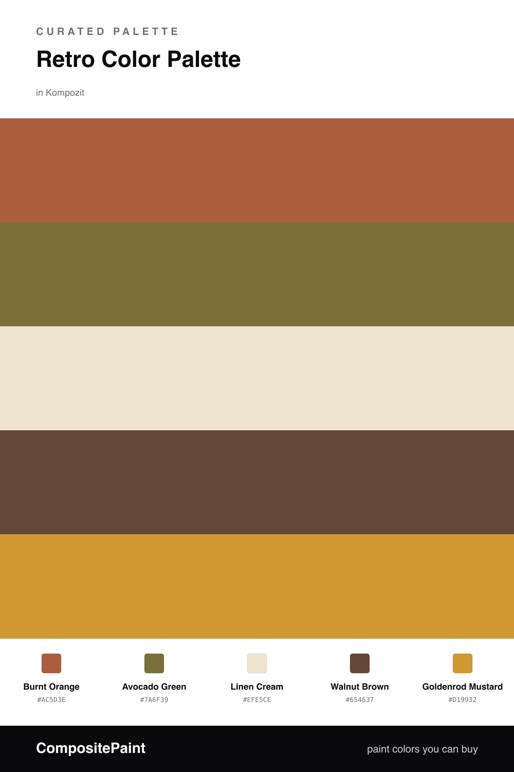
A warm five-color 1970s revival scheme pairing burnt orange and avocado green with mustard, walnut brown, and soft cream — every color matched to real paint you can buy.

By Maya Patel · Reviews Editor & Product Tester

Burnt Orange
Dominant
Kompozit Pretty Parasol · 1039
#AC5D3E
LRV 17
Avocado Green
Secondary
Kompozit Wing Man · 0396
#7A6F39
LRV 16
Linen Cream
Base
Kompozit Petticoat · 0010
#EFE5CE
LRV 79
Walnut Brown
Support
Kompozit Hideaway · 0137
#654637
LRV 7
Goldenrod Mustard
Accent
Kompozit Yellow Shout · 0935
#D19932
LRV 37
View palette in

The 1970s are back, but the trick in 2026 is restraint. This scheme leads with a toasty Burnt Orange and lets a muted Avocado Green play off it, so the whole thing feels collected rather than costumey.

Linen Cream carries most of the room and keeps the warm tones from getting heavy, while Walnut Brown adds depth on floors, trim, or a wood console. A hit of Goldenrod Mustard is the spark — perfect for a door, a built-in, or a single piece you want to pop.

Lean cream-heavy on the walls and save the saturated three for the details. That balance is what separates a warm, modern retro room from a theme park.

Buy These Colors

Each color matched to the closest real paint in every brand, by ΔE2000. Kompozit first; take any SKU to the store — these mix on demand.

Burnt Orange
#B85C2E · LRV 18 · Dominant
Kompozit Pretty Parasol · 1039 ΔE 4.36
Backdrop Bahaus · BD-BH ΔE 16.5
Behr Jack O Lantern · M220-7 ΔE 2.88
Benjamin Moore Gold Rush · 2166-10 ΔE 3.65
Clare Sriracha · PNT100-DP-29 ΔE 12.03
Dunn-Edwards Georgia Clay · DE5181 ΔE 4.82
Farrow & Ball Blazer · No. 212 ΔE 12.12
Magnolia Home Work Worn Wood · JG-35 ΔE 6.33
PPG / Glidden Tabasco · 1192-7 ΔE 4.7
Sherwin-Williams Husky Orange · SW 6636 ΔE 3.4
Valspar Storybook Sundown · V010-3 ΔE 3.59
Avocado Green
#6E7440 · LRV 16 · Secondary
Kompozit Wing Man · 0396 ΔE 6.22
Backdrop Old Soul · BD-OS ΔE 7.41
Behr Truly Olive · S350-6 ΔE 3
Benjamin Moore Avocado · 2145-10 ΔE 1.37
Clare Daily Greens · PNT100-DP-61 ΔE 8.44
Dunn-Edwards Dill Pickle · DE5573 ΔE 3.79
Farrow & Ball Bancha · No. 298 ΔE 5.51
Magnolia Home Landscape · JG-49 ΔE 6.83
PPG / Glidden Oakmoss · 1122-7 ΔE 1.56
Sherwin-Williams Garden Spot · SW 6432 ΔE 1.49
Valspar Farm Fresh · V058-6 ΔE 2.5
Linen Cream
#EFE6D2 · LRV 80 · Base
Kompozit Petticoat · 0010 ΔE 1.08
Backdrop Don't Eat the Yellow Snow · BD-DS ΔE 1.85
Behr Scroll · N280-1 ΔE 1.64
Benjamin Moore Cappuccino Froth · CSP-1055 ΔE 0.48
Clare Like Buttah · PNT100-LT-62 ΔE 1.48
Dunn-Edwards Rice Bowl · DE6170 ΔE 1.12
Farrow & Ball Dimity · No. 2008 ΔE 2.25
Magnolia Home Carter Crème · JG-16 ΔE 1.02
PPG / Glidden Instant Relief · 1096-1 ΔE 1.6
Sherwin-Williams Décor White · SW 7559 ΔE 1.74
Valspar Ivory Lace · 7003-6 ΔE 1.33
Walnut Brown
#5A4232 · LRV 6 · Support
Kompozit Hideaway · 0137 ΔE 3.63
Backdrop It's a Date · BD-IT ΔE 0.85
Behr Breakfast Blend · 280F-7 ΔE 2.44
Benjamin Moore Deep Taupe · 2111-10 ΔE 0.91
Clare Blackish · PNT100-DP-54 ΔE 12.15
Dunn-Edwards Northern Territory · DEA158 ΔE 3.41
Farrow & Ball Mahogany · No. 36 ΔE 7.9
Magnolia Home Wooded Acres · JG-122 ΔE 6.97
PPG / Glidden Racy Raisin · 16-24 ΔE 6.34
Sherwin-Williams Van Dyke Brown · SW 7041 ΔE 3.39
Valspar Roasted Coffee · 2009-10 ΔE 4.28
Goldenrod Mustard
#C9982F · LRV 35 · Accent
Kompozit Yellow Shout · 0935 ΔE 2.18
Backdrop Carry the Two · BD-CT ΔE 18.5
Behr Glazed Pears · M270-6 ΔE 3.31
Benjamin Moore Fields of Gold · 203 ΔE 2.16
Clare Good as Gold · PNT100-DP-59 ΔE 8.35
Dunn-Edwards Roman Gold · DE5356 ΔE 1.75
Farrow & Ball India Yellow · No. 66 ΔE 5.67
Magnolia Home Bright Days · JG-45 ΔE 10.12
PPG / Glidden Golden Field · 1107-7 ΔE 3.67
Sherwin-Williams Crispy Gold · SW 6699 ΔE 1.4
Valspar Ripe Banana · 8001-22G ΔE 1.4

Questions

Why do these retro colors work together?

They all share a warm, earthy undertone, so the burnt orange, avocado, and mustard read as a family rather than a clash. The cream cools things down and the walnut brown grounds the whole group.

How do I keep a 1970s palette from feeling dated?

Use cream as most of the wall space and treat the orange, green, and mustard as accents on cabinets, doors, or a single feature wall. That keeps the mood nostalgic but still fresh for 2026.

Similar Palettes

Closest schemes by color — not by label.