CP

Retro Color Palette — Diner Booth Nostalgia

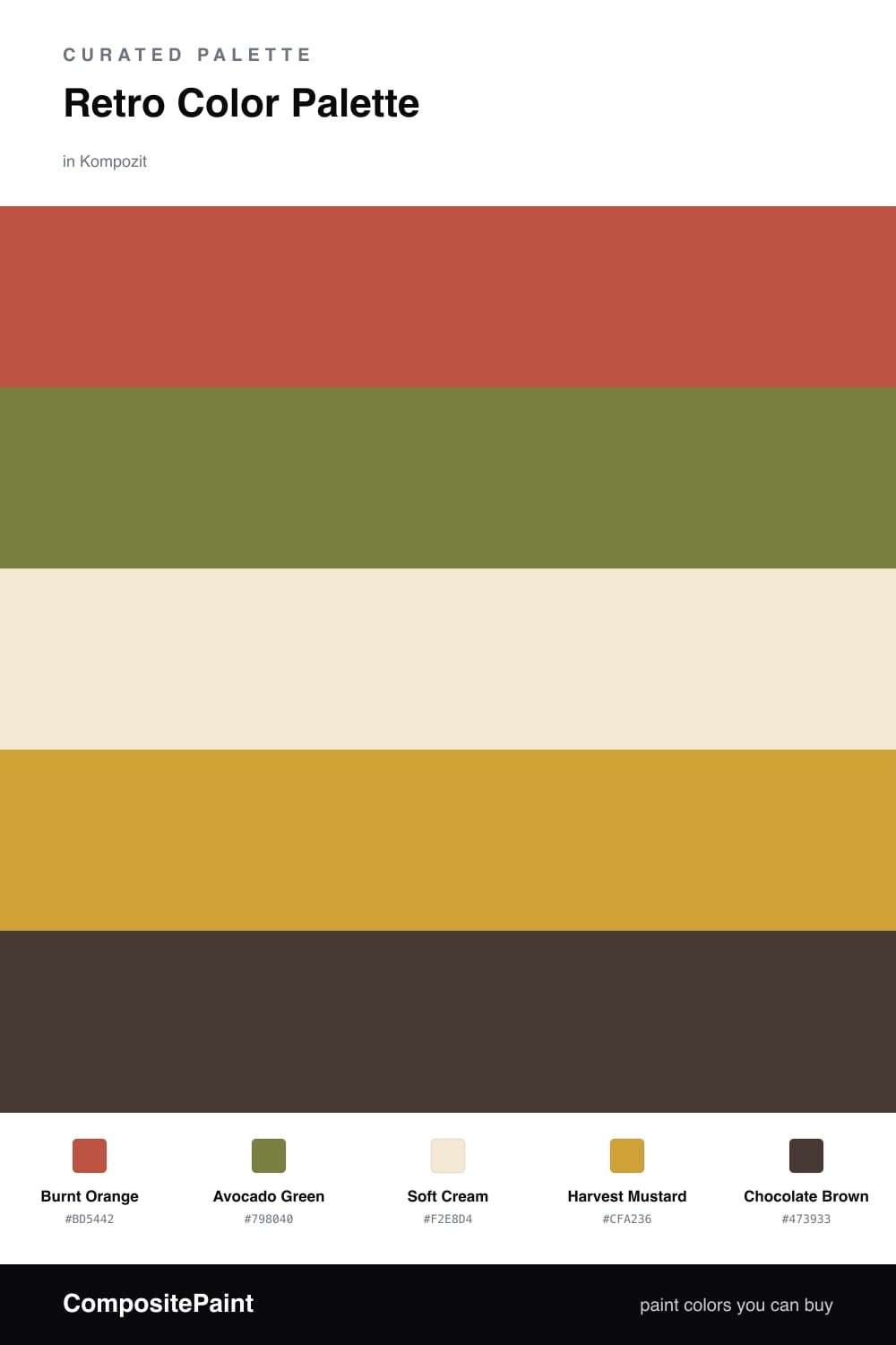
A warm five-color 1970s scheme built on burnt orange, avocado green, and mustard, grounded by chocolate brown and soft cream — every color matched to real paint you can buy.

By David Chen · Formulation Lead & Resident Chemist

Burnt Orange
Dominant
Kompozit Best of the Bunch · 1068
#BD5442
LRV 18
Avocado Green
Secondary
Kompozit Green Glow · 0788
#798040
LRV 20
Soft Cream
Base
Kompozit Eugenia · 0285
#F2E8D4
LRV 81
Harvest Mustard
Support
Kompozit Sin City · 0816
#CFA236
LRV 39
Chocolate Brown
Accent
Kompozit Film Noir · 0144
#473933
LRV 5
View palette in

The 1970s color story was never loud for its own sake — it was warm, earthy, and oddly cozy. This scheme rebuilds that mood around a confident Burnt Orange as the lead, the kind of toasty terracotta that still feels current in 2026 when you give it room.

Avocado Green is the partner that makes this read as genuinely retro rather than generic warm-neutral, and Harvest Mustard bridges the two with a golden, sunlit middle tone. Use them in measured doses so they feel chosen, not loud.

Underneath it all, Soft Cream keeps the big surfaces calm and lets the brights breathe, while a deep Chocolate Brown anchors the darkest edges. Lead with the orange, support with the green and mustard, and let cream and brown do the quiet structural work.

Buy These Colors

Each color matched to the closest real paint in every brand, by ΔE2000. Kompozit first; take any SKU to the store — these mix on demand.

Burnt Orange
#C25B2C · LRV 19 · Dominant
Kompozit Best of the Bunch · 1068 ΔE 8.24
Backdrop Bahaus · BD-BH ΔE 16.83
Behr Jack O Lantern · M220-7 ΔE 1.52
Benjamin Moore Racing Orange · 2169-10 ΔE 2.98
Clare Sriracha · PNT100-DP-29 ΔE 11.73
Dunn-Edwards Spicy Tomato · DE5139 ΔE 4.24
Farrow & Ball Charlotte's Locks · No. 268 ΔE 5.91
Magnolia Home Work Worn Wood · JG-35 ΔE 6.79
PPG / Glidden Tabasco · 1192-7 ΔE 4.14
Sherwin-Williams Raucous Orange · SW 6883 ΔE 3.05
Valspar Storybook Sundown · V010-3 ΔE 3.67
Avocado Green
#7A8233 · LRV 20 · Secondary
Kompozit Green Glow · 0788 ΔE 2.74
Backdrop Old Soul · BD-OS ΔE 10.61
Behr Seaweed Salad · S370-6 ΔE 5.03
Benjamin Moore Dark Celery · 2146-10 ΔE 2.97
Clare Daily Greens · PNT100-DP-61 ΔE 13.32
Dunn-Edwards Fresh Artichoke · DE5545 ΔE 3.56
Farrow & Ball Calke Green · No. 34 ΔE 12.52
Magnolia Home Celery Seeds · JG-58 ΔE 9.03
PPG / Glidden Lucky · 1118-7 ΔE 4.31
Sherwin-Williams Gecko · SW 6719 ΔE 2.45
Valspar Palm Leaf · 6003-6C ΔE 1.99
Soft Cream
#F2E8D2 · LRV 81 · Base
Kompozit Eugenia · 0285 ΔE 0.77
Backdrop Don't Eat the Yellow Snow · BD-DS ΔE 1.41
Behr Rye Flour · HDC-FL13-5 ΔE 1.84
Benjamin Moore Sandy Beaches · 946 ΔE 1.05
Clare Like Buttah · PNT100-LT-62 ΔE 1.84
Dunn-Edwards Rice Bowl · DE6170 ΔE 1.57
Farrow & Ball New White · No. 59 ΔE 1.31
Magnolia Home Carter Crème · JG-16 ΔE 1.7
PPG / Glidden Golden Mushroom · 1207-2 ΔE 0.87
Sherwin-Williams Crème · SW 7556 ΔE 0.95
Valspar Lemon Meringue · M321 ΔE 0.72
Harvest Mustard
#D6A136 · LRV 40 · Support
Kompozit Sin City · 0816 ΔE 2.31
Backdrop Eames · BD-EA ΔE 11.23
Behr Plantain Chips · M290-6 ΔE 1.87
Benjamin Moore Golden Bounty · 294 ΔE 3.12
Clare Good as Gold · PNT100-DP-59 ΔE 8.74
Dunn-Edwards Copper Cove · DE5320 ΔE 2.33
Farrow & Ball India Yellow · No. 66 ΔE 5.75
Magnolia Home Bright Days · JG-45 ΔE 8.8
PPG / Glidden Curry Sauce · 1210-7 ΔE 1.15
Sherwin-Williams Glitzy Gold · SW 6691 ΔE 1.05
Valspar Ripe Pear · P091 ΔE 2.43
Chocolate Brown
#4A3526 · LRV 4 · Accent
Kompozit Film Noir · 0144 ΔE 5.18
Backdrop After Hours · BD-AH ΔE 15.41
Behr Wild Horse · S-G-770 ΔE 6.2
Benjamin Moore Tarpley Brown · CW-170 ΔE 3.74
Clare Blackish · PNT100-DP-54 ΔE 12.32
Dunn-Edwards Black · DEA187 ΔE 11.83
Farrow & Ball Pitch Black · No. 256 ΔE 11.07
Magnolia Home Moments · JG-150 ΔE 7.29
PPG / Glidden Black Magic · 1001-7 ΔE 12.04
Sherwin-Williams French Roast · SW 6069 ΔE 3
Valspar Thoroughfare · 8004-6G ΔE 5.38

Questions

How do I keep a 1970s palette from looking dated?

Let the cream do most of the heavy lifting on big surfaces and use the burnt orange and avocado as deliberate moments rather than wall-to-wall color. A 2026 read of this scheme is mostly soft cream with one orange feature and small avocado and mustard touches, which reads warm and intentional instead of stuck in the past.

Can I use all five of these colors at once?

Yes, but give each a clear job. Lead with burnt orange, support it with avocado and mustard in smaller doses, keep cream as the quiet backdrop, and save chocolate brown for the darkest grounding details like a frame or a base trim.

Similar Palettes

Closest schemes by color — not by label.