CP

Retro Color Palette — Harbor Seventies

A warm five-color scheme rooted in 1970s nostalgia, pairing burnt orange and avocado green with mustard, brown, and cream — every color matched to real paint you can buy.

By Jessica Williams · Color Stylist & Interior Editor

Burnt Orange
Dominant
Kompozit Best of the Bunch · 1068
#BD5442
LRV 18
Avocado Green
Secondary
Kompozit Martina Olive · 0795
#8E8E41
LRV 25
Soft Cream
Base
Kompozit Petticoat · 0010
#EFE5CE
LRV 79
Toasted Mustard
Support
Kompozit Yellow Shout · 0935
#D19932
LRV 37
Walnut Brown
Accent
Kompozit Hideaway · 0137
#654637
LRV 7
View palette in

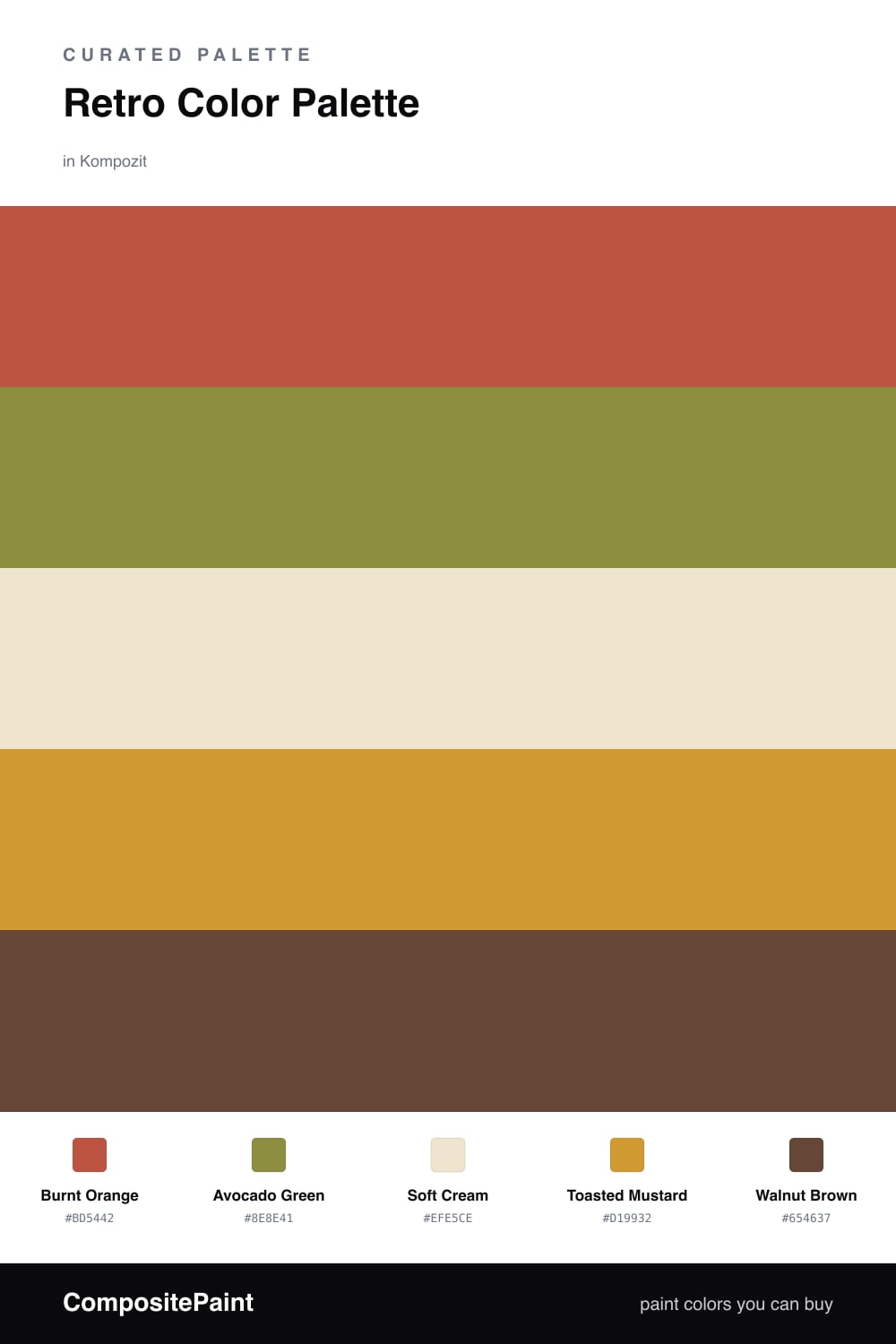
There is something deeply comforting about a 1970s color story, and this one leans into the warmth without tipping into a theme party. Burnt Orange is the heartbeat here, sun-baked and a little spicy, the shade that makes a room feel lived-in the moment you walk in.

Around it, Avocado Green brings that unmistakable retro softness, while Toasted Mustard adds a glow like late-afternoon light. I like to keep Soft Cream on the broad surfaces so the eye has somewhere to rest, then let Walnut Brown anchor the corners — a wooden frame, a low shelf, a band of trim.

For a 2026 feel, treat these as moody and tactile rather than loud. Pair them with natural textures, matte finishes, and plenty of cream, and the whole palette settles into something nostalgic but genuinely modern.

Buy These Colors

Each color matched to the closest real paint in every brand, by ΔE2000. Kompozit first; take any SKU to the store — these mix on demand.

Burnt Orange
#C05A2B · LRV 19 · Dominant
Kompozit Best of the Bunch · 1068 ΔE 8.19
Backdrop Bahaus · BD-BH ΔE 16.53
Behr Jack O Lantern · M220-7 ΔE 1.63
Benjamin Moore Fireball Orange · 2170-10 ΔE 4.49
Clare Sriracha · PNT100-DP-29 ΔE 11.8
Dunn-Edwards Spicy Tomato · DE5139 ΔE 4.31
Farrow & Ball Charlotte's Locks · No. 268 ΔE 6.35
Magnolia Home Work Worn Wood · JG-35 ΔE 6.93
PPG / Glidden Tabasco · 1192-7 ΔE 4.17
Sherwin-Williams Raucous Orange · SW 6883 ΔE 3.03
Valspar Storybook Sundown · V010-3 ΔE 3.6
Avocado Green
#7A8C4A · LRV 23 · Secondary
Kompozit Martina Olive · 0795 ΔE 6.27
Backdrop Old Soul · BD-OS ΔE 10.48
Behr Green Scene · S350-5 ΔE 0.73
Benjamin Moore Oregano · 2147-10 ΔE 6.94
Clare Daily Greens · PNT100-DP-61 ΔE 11.86
Dunn-Edwards Sea Turtle · DEA170 ΔE 3.31
Farrow & Ball Calke Green · No. 34 ΔE 9.2
Magnolia Home Magnolia Green · JG-08 ΔE 9.4
PPG / Glidden Wistful Walk · 11-15 ΔE 3.75
Sherwin-Williams Gecko · SW 6719 ΔE 4.19
Valspar Palm Leaf · 6003-6C ΔE 3.59
Soft Cream
#EFE6D2 · LRV 80 · Base
Kompozit Petticoat · 0010 ΔE 1.08
Backdrop Don't Eat the Yellow Snow · BD-DS ΔE 1.85
Behr Scroll · N280-1 ΔE 1.64
Benjamin Moore Cappuccino Froth · CSP-1055 ΔE 0.48
Clare Like Buttah · PNT100-LT-62 ΔE 1.48
Dunn-Edwards Rice Bowl · DE6170 ΔE 1.12
Farrow & Ball Dimity · No. 2008 ΔE 2.25
Magnolia Home Carter Crème · JG-16 ΔE 1.02
PPG / Glidden Instant Relief · 1096-1 ΔE 1.6
Sherwin-Williams Décor White · SW 7559 ΔE 1.74
Valspar Ivory Lace · 7003-6 ΔE 1.33
Toasted Mustard
#D49A3A · LRV 37 · Support
Kompozit Yellow Shout · 0935 ΔE 1.33
Backdrop Carry the Two · BD-CT ΔE 18.54
Behr Solar Fusion · UL150-3 ΔE 2.25
Benjamin Moore Apple Crisp · 2159-30 ΔE 2.62
Clare Good as Gold · PNT100-DP-59 ΔE 7.98
Dunn-Edwards Roman Gold · DE5356 ΔE 2.25
Farrow & Ball India Yellow · No. 66 ΔE 4.64
Magnolia Home Bright Days · JG-45 ΔE 10.17
PPG / Glidden Mayan Treasure · 1208-6 ΔE 1.9
Sherwin-Williams Trinket · SW 6685 ΔE 1.05
Valspar Golden Avocado · 3008-5A ΔE 4.54
Walnut Brown
#5A4129 · LRV 6 · Accent
Kompozit Hideaway · 0137 ΔE 5.96
Backdrop It's a Date · BD-IT ΔE 4.09
Behr Breakfast Blend · 280F-7 ΔE 1.83
Benjamin Moore Taupe · 2110-10 ΔE 1.96
Clare Blackish · PNT100-DP-54 ΔE 13.75
Dunn-Edwards Northern Territory · DEA158 ΔE 6.79
Farrow & Ball Mahogany · No. 36 ΔE 10.9
Magnolia Home Wooded Acres · JG-122 ΔE 8.74
PPG / Glidden Dark Granite · 1005-7 ΔE 9.51
Sherwin-Williams Van Dyke Brown · SW 7041 ΔE 4.53
Valspar Brown Hen · M122 ΔE 1.69

Questions

Why do these retro colors still feel fresh in 2026?

They share a warm, earthy undertone, so they read as grounded rather than dated. Pulling the orange a touch cleaner and letting cream carry the walls keeps the nostalgia gentle instead of costume-like.

How do I keep this palette from feeling too heavy?

Let the soft cream lead on the largest surfaces and use burnt orange as the headliner. Avocado, mustard, and walnut work best in smaller doses — a chair, a shelf, a single accent wall.

Similar Palettes

Closest schemes by color — not by label.