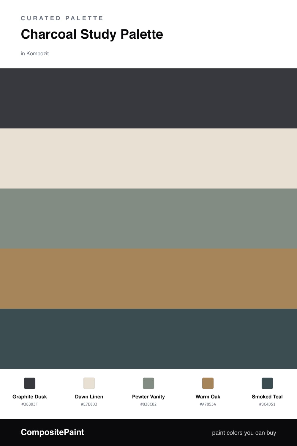
Charcoal Study Palette — Graphite Dusk & Dawn Linen
A grounded five-color study scheme led by deep graphite charcoal, softened with warm linen, crisp trim white, oak, and a smoky teal accent — every color matched to real paint you can buy.
By Emily Roberts · DIY Editor & First-Timer's Guide
A study is the one room where a deep color earns its keep. Graphite Dusk wraps the walls in a soft, smoky charcoal that quiets distractions and makes the space feel like it was built for thinking. It reads almost like dusk light settling in — moody, but never heavy.
To keep it from going cave-like, Dawn Linen brightens the trim and ceiling, and Pewter Vanity gives built-ins or a desk cabinet a mid-gray that bridges the dark and light without competing. Warm Oak comes in through the floor or a wood desk, adding the bit of warmth that stops the gray from feeling cold.
The spark is Smoked Teal, a contemporary near-neutral that leans blue-green in lamplight. Use it sparingly — a single accent wall behind shelving, a chair, or the inside of a bookcase — and let the charcoal lead while everything else does the quiet work.
Buy These Colors
Each color matched to the closest real paint in every brand, by ΔE2000. Kompozit first; take any SKU to the store — these mix on demand.
Questions
Not if you balance them. Charcoal actually blurs the edges of a room, so the walls feel like they recede into shadow rather than close in. Keep the trim and ceiling in Dawn Linen and let daylight or a warm lamp do the lifting.
Go matte or eggshell for the walls — a flat sheen hides imperfections and keeps the color soft and quiet. Save a satin or semi-gloss for the trim so the lighter edges catch a little light.
Similar Palettes
Closest schemes by color — not by label.