CP

Forest Color Palette — Forest Tide

A calming five-color scheme led by deep forest green with sage, warm stone, and a soft brass accent — every color matched to real paint you can buy.

By Jessica Williams · Color Stylist & Interior Editor

Deep Pine
Dominant
Kompozit Black Licorice · 0529
#3A3B3B
LRV 4
Sage Mist
Secondary
Kompozit Lucky Day · 0428
#929A7D
LRV 31
Warm Stone
Base
Kompozit White Elephant · 0223
#E3DBC8
LRV 71
Soft Linen
Support
Kompozit Queen Anne's Lace · 0558
#F0ECE2
LRV 84
Antique Brass
Accent
Kompozit Gold Ransom · 0892
#B39260
LRV 31
View palette in

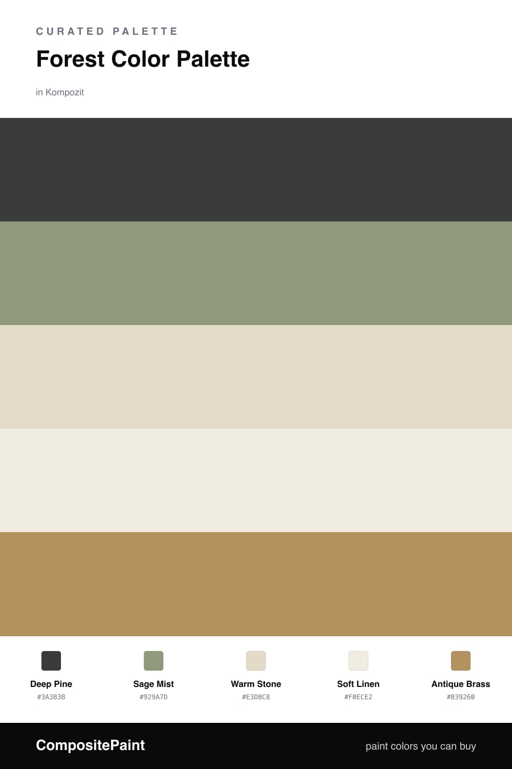
Forest Tide starts where the woods go quiet — that deep, shadowed green you find under a canopy. Deep Pine is the heart of this scheme, rich enough to feel grounding without tipping into black. It is the color I keep reaching for in 2026, when people want rooms that feel sheltered rather than showy.

Around it, Sage Mist softens the edges like light filtering through leaves, while Warm Stone and Soft Linen open everything back up and keep the green from feeling heavy. These two neutrals are the breathing room of the palette.

The last note is Antique Brass, warm and a little weathered. Used sparingly — a frame, a lamp, a thread of hardware — it catches the light and makes the whole forest feel lived in.

Buy These Colors

Each color matched to the closest real paint in every brand, by ΔE2000. Kompozit first; take any SKU to the store — these mix on demand.

Deep Pine
#2C3B30 · LRV 4 · Dominant
Kompozit Black Licorice · 0529 ΔE 10.28
Backdrop After Hours · BD-AH ΔE 7.2
Behr Thorny Branch · S-H-780 ΔE 3.7
Benjamin Moore Waller Green · CW-510 ΔE 5.67
Clare Blackish · PNT100-DP-54 ΔE 11.62
Dunn-Edwards Black · DEA187 ΔE 11.53
Farrow & Ball Pitch Black · No. 256 ΔE 11.67
Magnolia Home Blackboard · JG-05 ΔE 13.02
PPG / Glidden Black Magic · 1001-7 ΔE 11.84
Sherwin-Williams Jasper · SW 6216 ΔE 5.21
Valspar Aged Pine · 6011-5 ΔE 3.2
Sage Mist
#8B9A82 · LRV 30 · Secondary
Kompozit Lucky Day · 0428 ΔE 3.15
Backdrop Anita · BD-AN ΔE 15.37
Behr Gray Squirrel · N320-5 ΔE 2.18
Benjamin Moore High Park · 467 ΔE 1.62
Clare Shade · PNT100-MD-14 ΔE 10.02
Dunn-Edwards Linden Spear · DE6285 ΔE 2.09
Farrow & Ball Card Room Green · No. 79 ΔE 5.34
Magnolia Home Garden Essential · JG-57 ΔE 4.83
PPG / Glidden Farm Fresh · 1129-5 ΔE 2.05
Sherwin-Williams Jade Dragon · SW 9129 ΔE 3.53
Valspar Irish Paddock · 5006-4A ΔE 1.99
Warm Stone
#E4DCCC · LRV 72 · Base
Kompozit White Elephant · 0223 ΔE 1.25
Backdrop Cookies & Cream · BD-CC ΔE 2.96
Behr Vintage Linen · PPU7-16 ΔE 0.47
Benjamin Moore Fossil · AF-65 ΔE 0.94
Clare No Filter · PNT100-LT-19 ΔE 1.88
Dunn-Edwards Stucco Tan · DE6205 ΔE 1.12
Farrow & Ball School House White · No. 291 ΔE 1.05
Magnolia Home Castle Cream · JG-153 ΔE 0.45
PPG / Glidden Fossil Stone · 1102-2 ΔE 1.2
Sherwin-Williams Divine White · SW 6105 ΔE 1.22
Valspar Cream in My Coffee · 3003-10C ΔE 0.99
Soft Linen
#F2EDE2 · LRV 85 · Support
Kompozit Queen Anne's Lace · 0558 ΔE 0.6
Backdrop Jane · BD-JA ΔE 1.42
Behr Bleached Linen · PPU5-09 ΔE 1.58
Benjamin Moore Arbor White · ES-01 ΔE 1.3
Clare Wing It · PNT100-LT-24 ΔE 2.92
Dunn-Edwards Bone China · DEW339 ΔE 1.62
Farrow & Ball White Tie · No. 2002 ΔE 3.21
Magnolia Home Silos White · JG-107 ΔE 2.01
PPG / Glidden Accolade · 1208-1 ΔE 1.2
Sherwin-Williams Westhighland White · SW 7566 ΔE 0.21
Valspar Cream Delight · 7002-14 ΔE 0
Antique Brass
#B08D55 · LRV 29 · Accent
Kompozit Gold Ransom · 0892 ΔE 2.11
Backdrop Anita · BD-AN ΔE 11.65
Behr Asian Pear · HDC-FL14-7 ΔE 2.09
Benjamin Moore Bryan Ochre · CW-390 ΔE 2.86
Clare Good as Gold · PNT100-DP-59 ΔE 5.64
Dunn-Edwards Maple View · DE6152 ΔE 2.46
Farrow & Ball Mouse's Back · No. 40 ΔE 11.15
Magnolia Home Vintage Crown · JG-152 ΔE 4.48
PPG / Glidden Gathering Field · 12-24 ΔE 2.52
Sherwin-Williams Peristyle Brass · SW 43 ΔE 1.95
Valspar Sand Mountain · 8003-21E ΔE 1.53

Questions

Why is this palette so easy to live with?

Green is the color we see most in nature, so a forest-led scheme reads as restful before you even think about it. The neutrals keep things light, and the brass adds just enough warmth to stop it feeling cold.

How much of the dark green should I actually use?

Let Deep Pine lead but not swallow the space — think one feature wall or the lower half of a room, with the sage and stone tones carrying the rest and brass showing up only in small touches.

Similar Palettes

Closest schemes by color — not by label.