CP

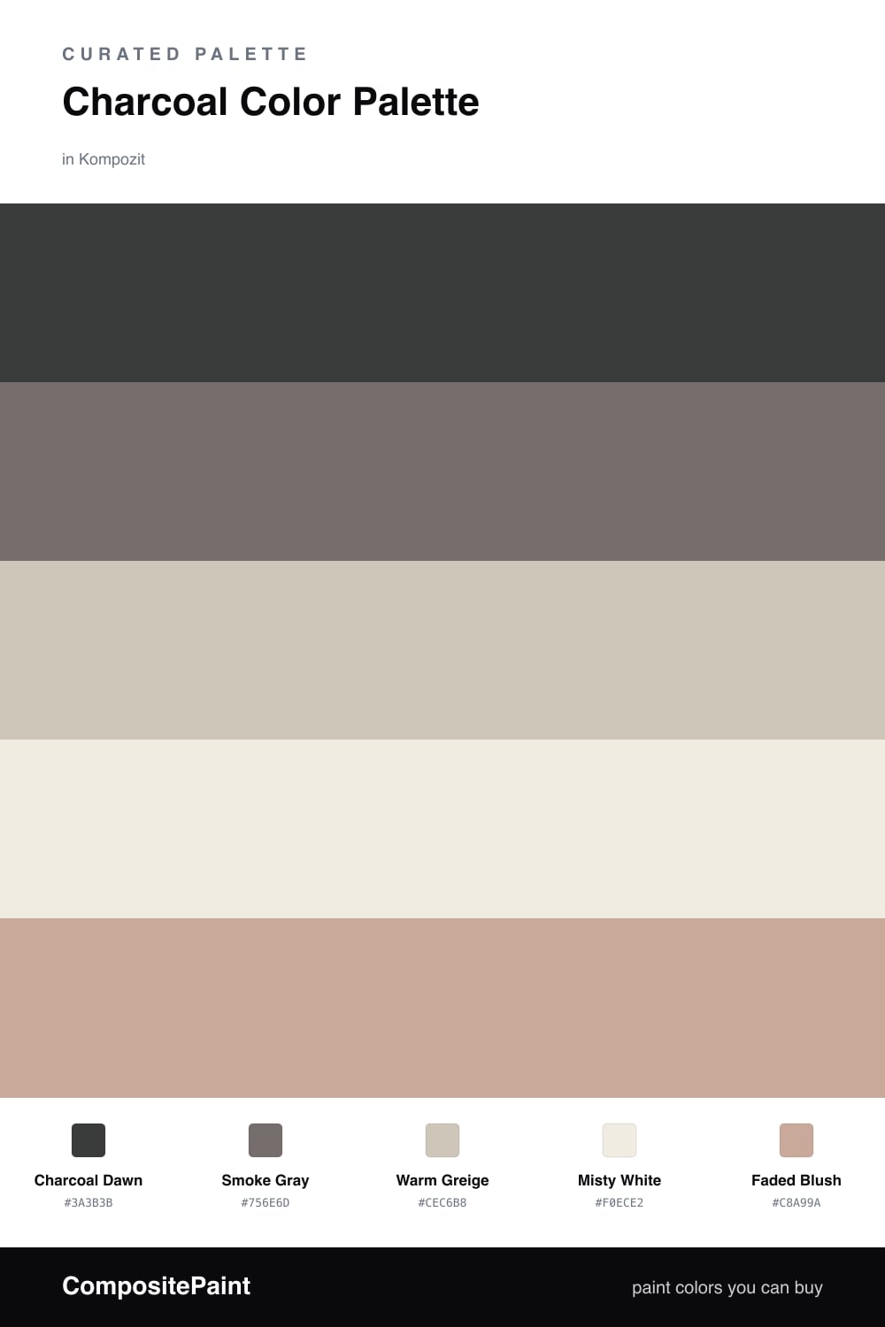
Charcoal Color Palette — Charcoal Dawn

A moody five-color scheme led by deep charcoal, softened with warm greige and a quiet blush accent — every color matched to real paint you can buy.

By Emily Roberts · DIY Editor & First-Timer's Guide

Charcoal Dawn
Dominant
Kompozit Black Licorice · 0529
#3A3B3B
LRV 4
Smoke Gray
Secondary
Kompozit Emu · 0549
#756E6D
LRV 16
Warm Greige
Base
Kompozit Overgrown · 0196
#CEC6B8
LRV 57
Misty White
Support
Kompozit Queen Anne's Lace · 0558
#F0ECE2
LRV 84
Faded Blush
Accent
Kompozit Oak Plank · 0148
#C8A99A
LRV 43
View palette in

Charcoal is having a real moment, and Charcoal Dawn shows why. It is that soft, smoky dark that feels cozy instead of stark — perfect when you want depth without the drama of pure black. Let it lead on a feature wall or a set of cabinets.

From there, Smoke Gray steps it down a shade so the palette has room to breathe, while Warm Greige and Misty White keep the lighter surfaces feeling fresh and warm. These are the colors you will use most, painting walls and ceilings so the charcoal has something quiet to lean against.

The little spark is Faded Blush, a dusty pink that warms the whole scheme up. Use it sparingly — a chair, some pillows, a single piece of art — and the moody charcoal suddenly feels welcoming instead of serious. That balance is exactly what makes this one easy to live with.

Buy These Colors

Each color matched to the closest real paint in every brand, by ΔE2000. Kompozit first; take any SKU to the store — these mix on demand.

Charcoal Dawn
#3A3B3D · LRV 4 · Dominant
Kompozit Black Licorice · 0529 ΔE 1.38
Backdrop After Hours · BD-AH ΔE 5.39
Behr Limousine Leather · MQ5-5 ΔE 0.87
Benjamin Moore Black Iron · 2120-20 ΔE 0.68
Clare Blackish · PNT100-DP-54 ΔE 4.82
Dunn-Edwards Black · DEA187 ΔE 1.62
Farrow & Ball Pitch Black · No. 256 ΔE 2.47
Magnolia Home Moments · JG-150 ΔE 6.47
PPG / Glidden Black Magic · 1001-7 ΔE 2.36
Sherwin-Williams Greenblack · SW 6994 ΔE 2.16
Valspar Black Heron · V120-3 ΔE 1.08
Smoke Gray
#6E6F71 · LRV 16 · Secondary
Kompozit Emu · 0549 ΔE 4.34
Backdrop Mom Jeans · BD-MJ ΔE 8.8
Behr Magnet · MQ2-61 ΔE 2.09
Benjamin Moore Gunmetal · 1602 ΔE 2.45
Clare Prince · PNT100-DP-33 ΔE 10.25
Dunn-Edwards Draw Your Sword · DE6348 ΔE 3.42
Farrow & Ball London Clay · No. 244 ΔE 8.46
Magnolia Home Storm Chaser · JG-86 ΔE 6.01
PPG / Glidden Up In Smoke · 1010-6 ΔE 3.25
Sherwin-Williams Exclusive Plum · SW 6263 ΔE 5.21
Valspar Almost Charcoal · 4008-2B ΔE 2.43
Warm Greige
#CBC3B6 · LRV 55 · Base
Kompozit Overgrown · 0196 ΔE 0.86
Backdrop Real Real · BD-RR ΔE 3.43
Behr Sculptor Clay · PPU5-08 ΔE 0.51
Benjamin Moore Smokey Taupe · 983 ΔE 0.87
Clare Motor City · PNT100-LT-09 ΔE 5.91
Dunn-Edwards Birchwood · DEC752 ΔE 3.06
Farrow & Ball Pavilion Gray · No. 242 ΔE 2.69
Magnolia Home Anatolian · JG-127 ΔE 2.71
PPG / Glidden Great Gray · 15-28 ΔE 1.09
Sherwin-Williams Alpaca · SW 7022 ΔE 2.3
Valspar Mushroom Risotto · M243 ΔE 1.85
Misty White
#EFECE5 · LRV 84 · Support
Kompozit Queen Anne's Lace · 0558 ΔE 1.32
Backdrop Jane · BD-JA ΔE 1.6
Behr Silky White · PPU7-12 ΔE 0.53
Benjamin Moore Sand Dollar · 877 ΔE 1.01
Clare Classic · PNT100-LT-12 ΔE 2.57
Dunn-Edwards Frostbite · DE6274 ΔE 1.02
Farrow & Ball Wevet · No. 273 ΔE 3.08
Magnolia Home Panna Cotta · JG-111 ΔE 1.01
PPG / Glidden Commercial White · 1025-1 ΔE 0.98
Sherwin-Williams Pure White · SW 7005 ΔE 0.98
Valspar Bistro White · 7006-4 ΔE 0.54
Faded Blush
#C9A8A0 · LRV 43 · Accent
Kompozit Oak Plank · 0148 ΔE 3.52
Backdrop Rosita · BD-RO ΔE 4.34
Behr Art Deco Pink · MQ1-50 ΔE 1.4
Benjamin Moore Allspice · 2101-50 ΔE 1.06
Clare Subrosa · PNT100-MD-76 ΔE 4.61
Dunn-Edwards Teatime Mauve · DEC700 ΔE 1.07
Farrow & Ball Cinder Rose · No. 246 ΔE 4.66
Magnolia Home Rosy Pink · JG-154 ΔE 4.67
PPG / Glidden Parfait · 1059-4 ΔE 1.54
Sherwin-Williams Pinky Beige · SW 79 ΔE 4.88
Valspar Damask Dunes · 1006-10B ΔE 1.41

Questions

Why does charcoal work as the main color?

Charcoal reads softer than true black, so it grounds a room without feeling heavy. Pairing it with warm neutrals keeps the whole scheme calm rather than cold, which is the look so many people are after for 2026.

How do I keep a dark palette from feeling gloomy?

Let the light neutrals do most of the work on big surfaces and save the charcoal for one wall, cabinets, or trim. A touch of the blush accent adds just enough warmth to lift the mood.

Similar Palettes

Closest schemes by color — not by label.