Wild Poppy
The muted red Sherwin-Williams calls a poppy, reviewed honestly: the light that turns it burgundy, the trim that turns it muddy, and the doses where it actually earns its keep.

Jessica has spec'd whites and neutrals for more than 300 rooms and keeps a sample wall of painted drawdowns in her studio. Every color review is checked against real reader rooms in the comments and re-tested when a formula changes. About the testing process →
- 1Rumors8
- 2Million Dollar Red13
- 3Wild Poppy18
- 4Daring25
- 5Rejuvenate30
The Fast Verdict
Wild Poppy is Sherwin-Williams filing a red under its most misleading name: it looks like a clean poppy-red on the fan deck and lives like a dusty burgundy on the wall. At LRV 18 it holds real color instead of washing out, but which color you get depends entirely on the light — warm lamps pull it toward wine, flat daylight pushes it toward brick. It is not the pick for someone who wants one predictable red; it is the pick for a front door or a dining room that is allowed to change mood after dark.
Front doors and entry doors · dining rooms used mostly by lamplight · kitchen islands and cabinetry in doses · powder rooms and small jewel-box spaces · anyone who wants red without it reading like a fire truck
You want a true bright, saturated poppy-orange red · your trim and bulbs are all cool white · you're painting a large, bright, all-day room · you need the wall to read one fixed color in every light
- Holds real, saturated color at LRV 18 instead of washing out like paler dusty reds
- Turns rich, wine-warm burgundy under lamp light — one of SW's better "grown-up red" options
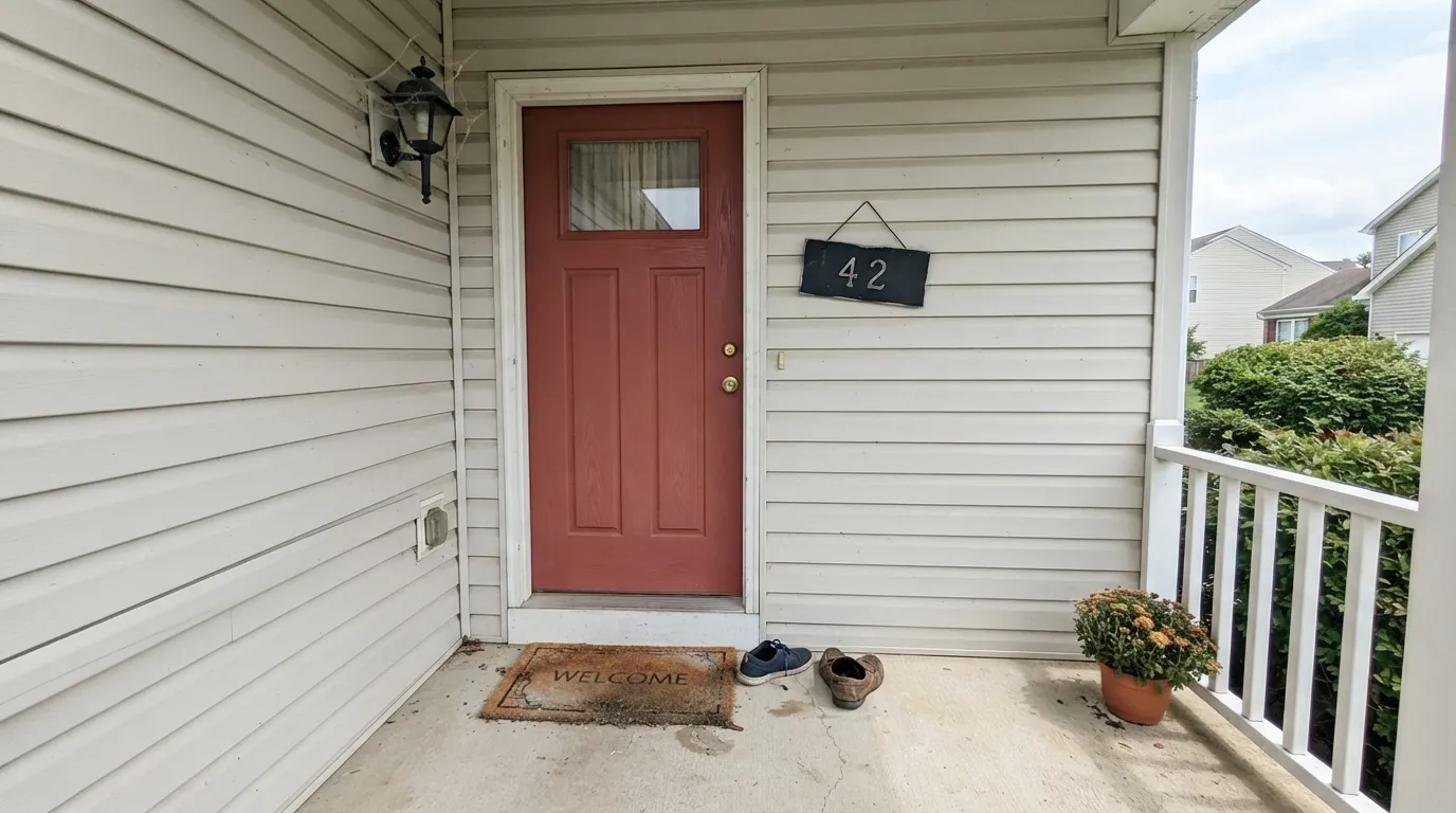
- Reads like aged brick outdoors, especially on a front door
- Small-room and accent-wall use is close to foolproof
- Pairs easily with warm whites, dark neutrals, and sage or olive greens
- Not the bright, true poppy-orange red the name suggests
- Cool white trim and cool LEDs flatten it toward muddy brown
- Needs a tinted primer and real coat count — deep reds are notorious for uneven coverage
- Too heavy for most full rooms in bright, all-day daylight
What Color Is Wild Poppy, Really?
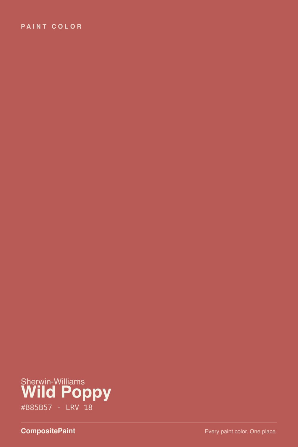
Wild Poppy is a Sherwin-Williams red carrying more restraint than its name suggests. Real poppies are a clean, saturated orange-red; this color is grayed down well past that — a muted, earthy version that reads closer to a dusty brick or aged wine than a garden flower. At hex #B85B57 the green and blue channels sit almost even (91 and 87), which is the technical reason it never tips orange the way a lot of "brick" reds do: there is just enough blue in the mix to hold it in true-red-to-burgundy territory instead of sliding toward terracotta.
That balance is also why real buyers describe it two different ways. Sample reviewers call it "an amazing burgundy" with "just enough purple to not look brown" — praise for exactly the quality that keeps this color from reading flat. At LRV 18 it is dark enough to hold that saturation in full daylight, unlike a paler dusty red that would wash out; it will not disappear on you the way a higher-LRV clay tone can.
Undertone in one line: warm red first, with a wine-purple lean that shows up in warm or dim light and a browner, brick lean that shows up in flat, cool light. If your sample reads muddy or plain brown, that is cool light or a cool-white trim fighting it — not the paint failing.
Where It Shines
Give it a front door, warm lamp light, or a small room it can own, and Wild Poppy earns its name. Under 2700K bulbs the wine-purple in it comes forward and the color goes rich and almost velvety — genuinely one of the better "red without looking like a fire engine" options in the SW deck. Its second home is the exterior: on a door against a warm-white or greige house it reads like an old brick townhouse, not a trend color.
Where It Fails
Almost every disappointed review of Wild Poppy comes from one of three situations, and all three are predictable before the first coat. None of them are the paint's fault — but if your room matches one, this is not your red, and a bigger sample will only confirm it.
The name promises a garden flower; the paint delivers a dusty, LRV 18 burgundy-brick. If you pictured a clean orange-red like a stop sign or a real poppy petal, Wild Poppy will read muted and almost brownish by comparison. For that brighter, truer red, look at a higher-saturation color instead — this one is built for restraint, not vibrance.
Cool light drains the wine-purple out of this color and leaves the flatter, browner half of its personality — readers describe it going muddy or dull under cool LEDs and next to stark cool-white trim. Pair it with a warm white (Greek Villa, Alabaster) and 2700K bulbs, or the color never gets to show its best side.
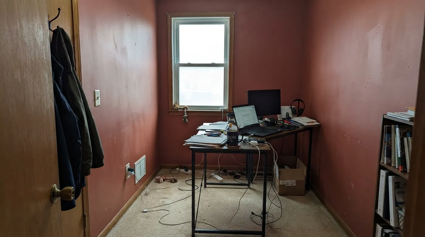
At this depth and saturation, four walls of Wild Poppy in a large sun-filled room reads heavy fast — it was built to be a door, an accent wall, or a small room's whole personality, not a great room. Readers who painted an open-plan living area report it feeling closer than they expected within the first week.
Room by Room
This is where Wild Poppy earns its keep. Against a warm white or greige house with black or bronze hardware, it reads like an old brick townhouse door — confident, not trendy. Full sun brightens it slightly toward true red; shaded porches keep it closer to burgundy. Exterior-grade semi-gloss, two coats minimum.
A Wild Poppy front door carried a few feet inside — on the door itself, a bench, or a narrow accent wall by the coat hooks — extends the moment without committing the whole hallway. Keep the surrounding walls a warm white so the color has somewhere quiet to land.
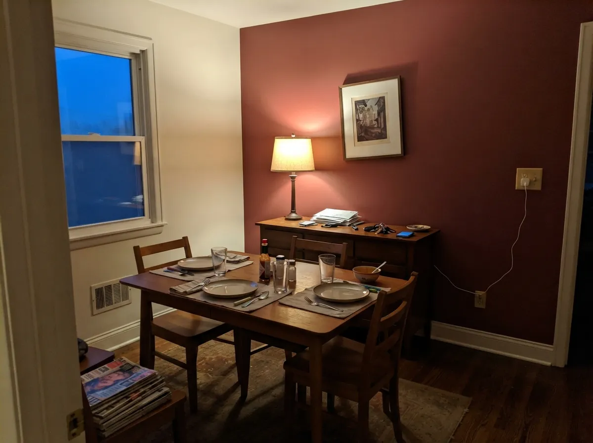
Rooms used mostly at dinner hour are Wild Poppy's ideal use case: warm bulbs bring the wine-purple forward exactly when the room is occupied. On four walls it is dramatic but not garish at LRV 18; on a single accent wall behind a buffet it is close to foolproof.
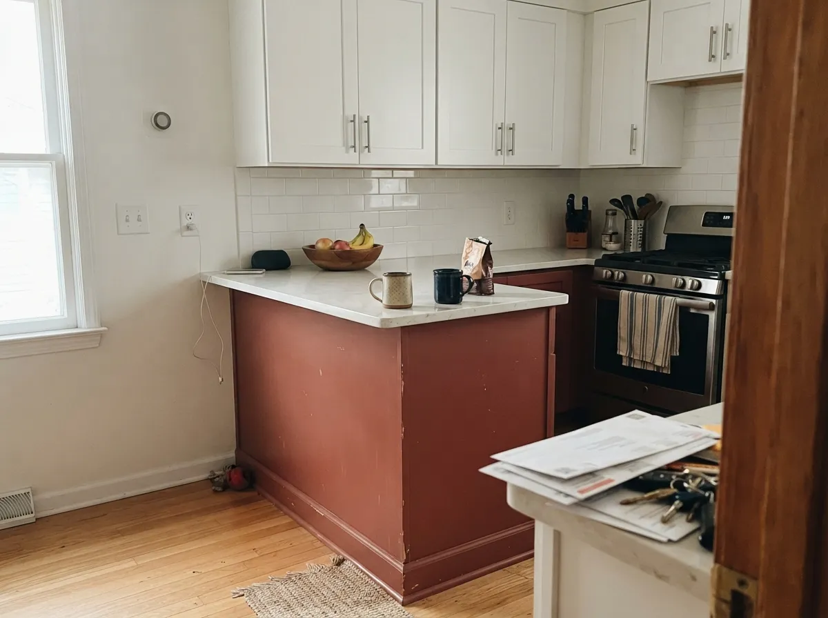
On an island or a run of lower cabinets under white uppers, Wild Poppy is a genuinely striking, unexpected choice that still resells fine because it is contained. A full kitchen of Wild Poppy cabinets is a bolder, harder-to-reverse bet — save that commitment for someone who already knows they love this exact red.
Small, low-traffic rooms take deep, complicated color best, and a powder room in Wild Poppy with a warm white ceiling and brass fixtures reads custom and expensive for the cost of a gallon. This is the lowest-risk way to try the color.
Full walls of a saturated red in a room meant for rest is a hard sell for most people, but a single headboard wall in Wild Poppy under warm lamp light is genuinely cozy rather than aggressive. Keep the other three walls a warm neutral and save the red for the wall you actually look at.
Your Light Is the Risk
2700K bulbs pull the wine-purple forward and the color goes rich and velvety — the light this red was built for.
Cool light strips the purple out and leaves a flatter, browner red that reads muddy — the situation behind most disappointed reviews.
Direct sun brightens it a step toward true red; a shaded porch or north wall keeps it closer to burgundy. Both are honest — check your exposure before committing to a door color.
Warm bulbs: deep, wine-toned, cozy. Cool LEDs: flatter, browner, less alive. This is a color worth swapping bulbs for before repainting.
Most complaints about Wild Poppy are a light mismatch. Upload a photo of your actual room and see it on your walls — then ask for the same wall in north light or evening lamps before you buy a single sample.
Need It From Another Brand?
Any paint counter can custom-tint Sherwin-Williams SW 9694 directly. If you would rather stay in one brand's own deck, these are the closest stock matches, measured as ΔE2000. Under 2 is a difference you will not see on the wall.
| Brand | Closest color | ΔE | LRV | |
|---|---|---|---|---|
| Behr | Hibiscus FlowerP140-6 · Behr | 4.2 | 18 | Color page → |
| Benjamin Moore | Crimson1299 · Benjamin Moore | 2.8 | 19 | Color page → |
| Valspar | Dressed to the NinesV043-5 · Valspar | 3.8 | 16.2 | Color page → |
| PPG / Glidden | BonfirePPG1187-6 · PPG / Glidden | 3.0 | 19 | Color page → |
| Glidden | Antique Brick Red10YR 19/389 · Glidden | 1.8 | 19 | Color page → |
| Dutch Boy | Tandoor Spice205-5DB · Dutch Boy | 2.8 | 21 | Color page → |
Similar Sherwin-Williams Colors
The nearest shades to Wild Poppy within Sherwin-Williams's own range, ranked by perceptual color distance — useful when you want the same look a touch lighter, darker, or warmer.
WCAG 2.1: AA is 4.5 : 1 for normal text, 3 : 1 for large text, AAA is 7 : 1.
Wild Poppy vs the Colors You're Also Considering
Every Wild Poppy sample board has the same rivals on it. The numbers show the real lightness gap — then it comes down to which risk you would rather live with.
Pick this for more genuine red saturation — Wild Poppy holds its color in flatter light where Cavern Clay goes muddy.
Sherwin-Williams SW 7701 · LRV 24Cavern ClayPick this for a softer, browner terracotta that leans orange instead of red — its own review flags it as light-dependent too.
Pick this when you want unmistakable red, not a debate about whether it's pink or beige.
Sherwin-Williams SW 9081 · LRV 27Redend PointPick this for a lighter, pinker clay that reads more like a neutral across a whole wall.
Wild Poppy Coordinating Colors
The rule for coordinating with Wild Poppy is to keep everything else warm and quiet: warm whites, dark warm neutrals, and one muted green if you want a complement instead of a match. Cool grays and stark cool whites are the one thing to avoid — they're what turns this red muddy in photos and in person. These are the partners that keep showing up in rooms that work:
Wild Poppy on a Front Door and Exterior
Outside is where Wild Poppy makes the most sense, and it behaves more consistently there than the indoor light-shifting story above suggests. A single door gets at least some direct sun even on a shaded porch, which keeps the color from sinking all the way into flat brown the way a north-facing interior wall can. It reads as a confident, heritage red rather than a trend color — closer to an old brick townhouse door than a poppy field.
The house body decides the mood. A warm white or greige (Greek Villa, Alabaster) lets the door read clearly without competing; black or bronze hardware and a dark trim color (Iron Ore, Peppercorn) sharpen the contrast. What to skip: cool gray or blue-toned siding, which pushes the red toward brown the same way cool interior light does, and stark cool-white trim, which can make the door look dull instead of rich by comparison.
Wild Poppy With Wood Tones and Metals
Reddish-brown woods are this color's easiest partners — walnut, cherry, and reclaimed barn wood all sit in the same warm family, so a Wild Poppy door or accent wall next to them reads deliberate rather than like two different reds arguing. Pale or gray-washed wood is the safer, more neutral option if you'd rather the floor stay quiet.
Golden honey oak is the one wood to sample first: its yellow-orange cast can pull Wild Poppy toward a flatter brick-brown instead of the wine-red it's capable of. Metals are simpler — aged or unlacquered brass and matte black both work, and polished chrome or nickel is the one finish that reads noticeably cold against this warm a red.
Three Ready Palettes Built on Wild Poppy
A color is never alone on the wall. These are complete combinations in the 60-30-10 pattern, with the reason each one holds together. Every one opens in the visualizer.
A warm white body keeps the door from fighting for attention, and a near-black trim frames it the way a real brick townhouse would — Iron Ore's own review holds up as a whole-house dark, which is exactly the job here.
Try this palette in your roomAlabaster keeps the room bright enough that one Wild Poppy wall reads intentional, not overwhelming; Peppercorn on the trim or a built-in hutch gives the room a second dark note so the red isn't carrying the whole mood alone.
Try this palette in your roomGreen is red's complement, and Evergreen Fog is muted enough not to compete — it echoes the same dusty, grayed-down energy as Wild Poppy instead of turning the kitchen into two loud colors.
Try this palette in your roomWild Poppy FAQ
Is Wild Poppy more red or more burgundy?
Both, depending on the light — and that's the honest answer, not a dodge. Real buyers who've sampled it describe it as "an amazing burgundy" with "just enough purple to not look brown." Warm lamp light brings that wine-purple forward; flat, cool daylight pushes it toward a plainer brick-red. Sample it in your own light before deciding which version you're getting.
What trim white goes best with Wild Poppy?
A warm white — Greek Villa or Alabaster — rather than a stark, cool white. Cool trim fights the red's warmth and can make the wall look dingy or muddy by comparison, the same problem that shows up under cool LEDs.
Is Wild Poppy a good front door color?
Yes — it's arguably its best use. Against a warm-white or greige house with black or bronze hardware it reads like aged brick, and the color holds up in both full sun and a shaded porch without going flat, since LRV 18 keeps it saturated either way.
Can I paint a whole room in Wild Poppy?
You can, but it works best as a room used mostly at night — a dining room or a lamp-lit bedroom — rather than a bright, all-day living space. In strong daylight, four walls at this depth and saturation can feel heavier than expected within the first week.
How many coats does Wild Poppy need?
Plan on a tinted gray primer and two finish coats minimum over any lighter existing color — deep, saturated reds are famous for needing extra coverage, and skipping the tinted primer is the most expensive way to find that out.
Does Wild Poppy work with wood tones and metals?
Walnut and other reddish-brown woods keep the color from feeling like two competing warm tones; pale or gray-washed wood is the safer, more neutral option. For metal, matte black and aged brass both work — polished chrome is the one finish that reads cold next to it.
Have you painted with Wild Poppy?
Rate it — one tap helps the next reader decide.
Ask a Question