Mega Greige
The greige Sherwin-Williams actually built for outside a house, reviewed honestly: the exterior it was made for, the dim rooms where it disappoints, and what to pick instead.

Jessica has spec'd whites and neutrals for more than 300 rooms and keeps a sample wall of painted drawdowns in her studio. Every color review is checked against real reader rooms in the comments and re-tested when a formula changes. About the testing process →
- 1Anonymous20
- 2Felted Wool28
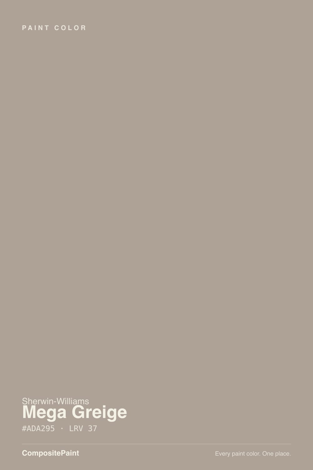
- 3Mega Greige37
- 4Agreeable Gray60
- 5Balboa Mist66
The Fast Verdict
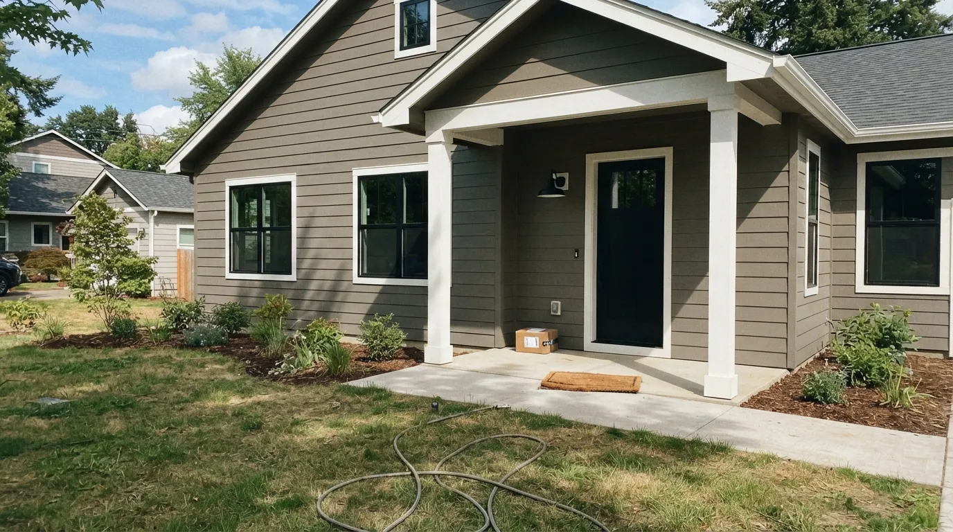
Mega Greige is the greige Sherwin-Williams built for the outside of a house, not for a Pinterest board. At LRV 37 it sits deeper than the safe living-room greiges — deep enough to shrug off exterior sun instead of bleaching out, warm enough to avoid the cold-concrete look cheaper "gray" sidings get. Indoors it can do the same job, but only in a room with real daylight; without one, it sinks into something duller than the fan-deck chip promised.
Exterior siding, especially modern-farmhouse builds · south- and west-facing rooms with real daylight · pairing with warm white trim and black windows · anyone who wants greige with real depth, not a pastel version of it
Your main living space is dim or north-facing · you want a light, bright whole-house neutral · your trim is a stark cool white you won't repaint · you were expecting something close to Agreeable Gray's depth
- Built to survive direct exterior sun without washing out or chalking
- Genuinely warm greige — never pink, never a cold blue-gray
- The modern-farmhouse siding standard, and it earns that reputation
- Holds its color and hides dirt better than paler exterior neutrals
- Flatters warm white trim, black windows, and warm wood without a fight
- Reads noticeably darker than the chip suggests — surprises buyers expecting a light greige
- Goes flat and muddy in dim, north-facing rooms
- Fights stark cool-white trim; needs a warm white partner
- Too deep to be the safest single whole-house neutral in mixed-light homes
What Color Is Mega Greige, Really?
A warm greige built on a taupe-gray base, with a trace of green hiding underneath that almost never surfaces — the kind of undertone people mostly describe by what it isn't: not pink, not purple, and not the cold blue-gray that ruins so many "greige" colors in the wrong light. Sherwin-Williams built Mega Greige as a genuinely warm neutral, closer to the beige end of greige than a color like Repose Gray, but it never tips into full tan the way Accessible Beige can.
At LRV 37 it sits noticeably deeper than the living-room-safe greiges homeowners usually reach for first — Agreeable Gray (LRV 60) and Repose Gray (LRV 58) are both close to twice as reflective. That depth is the whole point outdoors: a pale exterior color washes out and looks chalky under direct sun, while Mega Greige's mid-depth body holds its color, and its dirt-hiding ability, through a full afternoon. Bring that same depth onto four interior walls in a dim room, though, and it reads considerably darker than most buyers expect from a color called "greige."
Mega Greige has never been a Color of the Year and it doesn't trend on design blogs the way Agreeable Gray or Repose Gray do — its reputation lives with exterior painters and modern-farmhouse builders, who reach for it specifically because it behaves outdoors. That's not a knock. A color built to do one job extremely well, quietly, for over a decade, is its own kind of recommendation — just don't buy it expecting a viral wall color.
Where It Shines
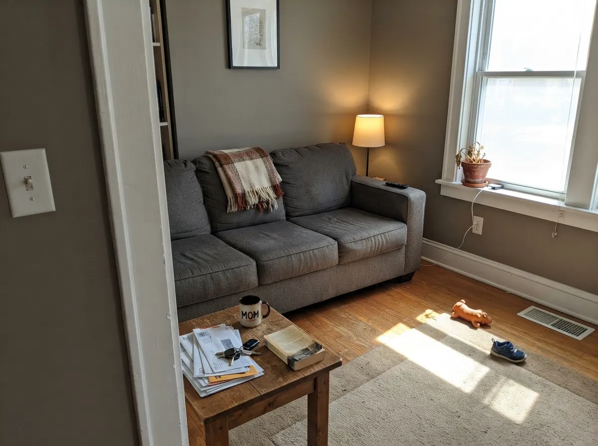
Put it on siding under real sun and it does exactly what it was built to do: hold a warm, grounded body color that doesn't chalk out by 2pm and doesn't read cold the way a lot of "greige" sidings do. Indoors, give it the same thing — a south- or west-facing room with honest daylight — and it works as a deep, grounded wall color that flatters white trim and black window frames without the flat, dead look cheaper mid-tones get in the same light.
Where It Fails
Almost every disappointed review of Mega Greige comes from one of three mismatches, and all three are avoidable before the first gallon is opened.
At LRV 37, Mega Greige is roughly half as reflective as Agreeable Gray or Repose Gray. On the fan-deck chip it looks like an ordinary mid-tone; on four walls, especially in a smaller or dimmer room, it reads noticeably darker and more enclosing than buyers expect. If you want the light, airy greige everyone else has, this isn't it — try Worldly Gray (SW 7043, LRV 57) instead.
A blue-leaning white like Extra White fights Mega Greige's warmth and makes the body color look dirty by comparison — this shows up on exteriors as often as it does on interior walls. Pair it with a warm white like Alabaster instead, and the same contrast reads clean rather than muddy.
Without real daylight the warmth drops out and the color sinks toward a flat, muddy gray-brown that reads dingy rather than grounded. Every mid-depth greige has this weakness; it's just more noticeable here because the color starts deeper than most.
Room by Room
This is the job it was built for. The mid-depth LRV resists sun blow-out, the warm base avoids the cold-concrete look, and it's a modern-farmhouse standard for exactly that reason. Satin on the body, semi-gloss on trim and shutters.
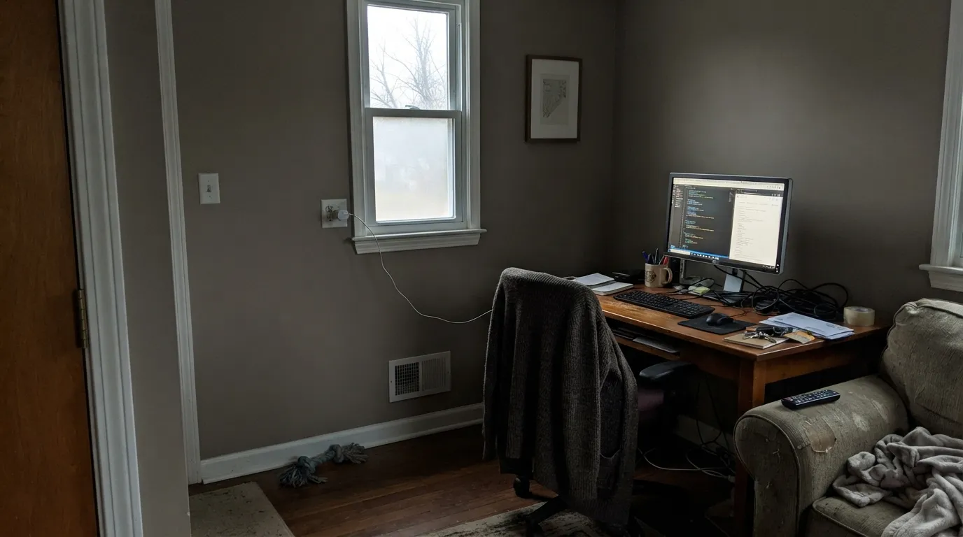
In a south- or west-facing room it reads as a grounded, warm greige that flatters wood floors and dark furniture. In a dim or north-facing room, size up your sample before committing to four walls.
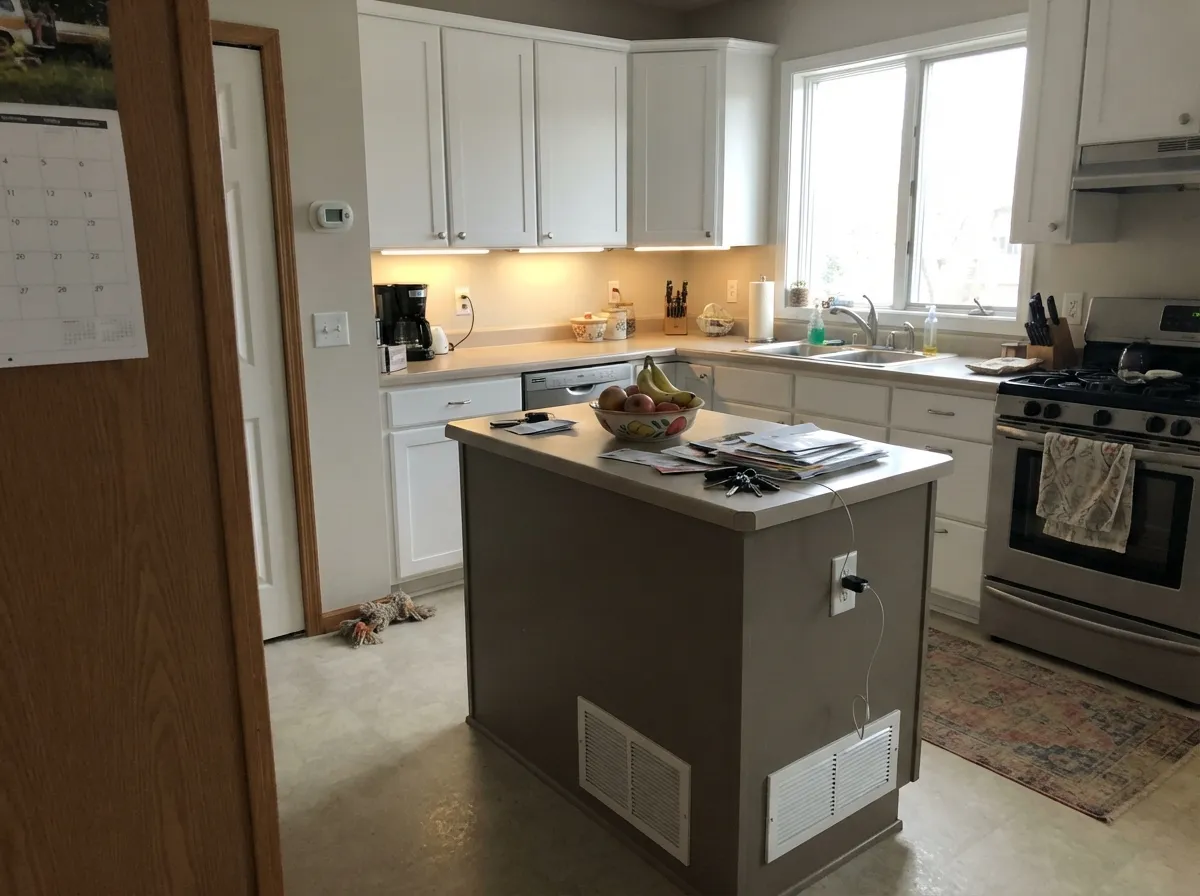
A Mega Greige island under white cabinets is a well-lit, well-liked pairing. A full kitchen of it needs strong daylight, or it goes heavy against pale counters and cabinets.
Under 2700K bulbs it turns cozy and taupe-leaning at night. Skip it if the room stays dim all day and you don't want that mood around the clock.
The same daylight rule applies here as anywhere. A west-facing office gets a warm, grounded backdrop late in the day; a windowless or north-lit one goes flat and heavy.
Its depth makes it a strong single-room color, not the safest one-neutral-for-every-room pick a lighter greige like Agreeable Gray or Repose Gray handles more forgivingly across mixed light.
Your Light Is the Risk
Direct sun is where it belongs: the mid-depth body holds its warmth and resists blow-out better than paler exterior colors. This is the light it was built for.
Without real daylight the warmth drains out and the color sinks toward flat, muddy gray-brown. Test a large sample before committing indoors.
Warmer and more taupe at the sun hours, cooler and grayer at midday. The swing is real but gentle, indoors and out.
2700K bulbs pull it toward a cozy taupe-brown; cool LEDs flatten it back toward plain gray. Keep bulbs warm if you want the taupe side to show.
Most complaints about Mega Greige are a light mismatch. Upload a photo of your actual room and see it on your walls — then ask for the same wall in north light or evening lamps before you buy a single sample.
Need It From Another Brand?
Any paint counter can custom-tint Sherwin-Williams SW 7031 directly. If you would rather stay in one brand's own deck, these are the closest stock matches, measured as ΔE2000. Under 2 is a difference you will not see on the wall.
| Brand | Closest color | ΔE | LRV | |
|---|---|---|---|---|
| Behr | Quail RidgeECC-18-1 · Behr | 1.0 | 37 | Color page → |
| Benjamin Moore | QuicksandCSP-200 · Benjamin Moore | 0.7 | 38 | Color page → |
| Valspar | Smoked Oyster6005-1C · Valspar | 0.3 | 36.3 | Color page → |
| PPG / Glidden | Cuppa CoffeePPG1076-4 · PPG / Glidden | 2.7 | 36 | Color page → |
| Glidden | Heron Grey20YY 37/094 · Glidden | 0.8 | 37 | Color page → |
| Dutch Boy | Drifted Wood443-3DB · Dutch Boy | 0.0 | 37 | Color page → |
Similar Sherwin-Williams Colors
The nearest shades to Mega Greige within Sherwin-Williams's own range, ranked by perceptual color distance — useful when you want the same look a touch lighter, darker, or warmer.
WCAG 2.1: AA is 4.5 : 1 for normal text, 3 : 1 for large text, AAA is 7 : 1.
Mega Greige vs the Colors You're Also Considering
Every Mega Greige sample board has the same rivals on it. The numbers show the real lightness gap — then it comes down to which risk you would rather live with.
Pick this for exteriors specifically — Mega Greige's extra depth resists sun blow-out a shade better.
Sherwin-Williams SW 6073 · LRV 42Perfect GreigePick this for the deeper, original greige Mega Greige gets compared to constantly — a touch lighter and it came first.
Pick this for the warmer, more taupe-leaning version at essentially the same LRV.
Sherwin-Williams SW 7017 · LRV 39Dorian GrayPick this if you want the same near-identical depth pulled cooler and grayer, with less visible taupe.
Pick this for the exterior-grade depth and dirt-hiding that Worldly Gray, at LRV 57, simply doesn't have.
Sherwin-Williams SW 7043 · LRV 57Worldly GrayPick this for interior walls when Mega Greige's depth is more than your room needs — same warm family, far more forgiving with mixed light.
Morris Room Grey SW 37 at LRV 37 is the closest neighbor, with a hex of #ADA193 against Mega Greige's #ADA295. Those values are nearly on top of each other, so expect no meaningful difference on a wall. Functional Gray SW 7024, also LRV 37, sits at #ABA39A with more blue, so it reads cooler and grayer.
Taupe Tone SW 7633 at LRV 36 goes warmer and more yellow at #ADA090. Restoration SW 9578 at LRV 38 is a shade lighter, while Western Reserve SW 9597 at LRV 36 is a touch deeper and greener.
Across brands, Valspar Smoked Oyster 6005-1C at LRV 36.3 is a deltaE of 0.3 away and Benjamin Moore Quicksand CSP-200 at LRV 38 is 0.74 away, both effectively the same color. Behr Quail Ridge ECC-18-1 at LRV 37 is 0.96 away, also a direct equivalent. Farrow and Ball Light Gray No. 17 at LRV 38 is 2.99 away, very close but sample first, and Backdrop Carry the Two BD-CT at LRV 33 is 3.63 away, close but visibly different side by side.
Mega Greige Coordinating Colors
The rule for coordinating with Mega Greige is simple: keep trim and doors warm, and let the darkest accent do the contrast work the body color doesn't. It sits close in family to Perfect Greige and Dorian Gray — both worth a look if you're not sure this is the right depth — and it takes a genuine near-black far better than a cool blue-black would.
Mega Greige on Exteriors
This is where Mega Greige earns its reputation, and the pairing rules are well established by the builders who use it constantly. Warm white trim always beats cool white: a blue-leaning white like Extra White (SW 7006, LRV 86) fights the greige's warmth and makes the body look dingy by comparison, while a warm white like Alabaster (SW 7008, LRV 82) sets it off cleanly. Windows and doors in a true black (Tricorn Black) or a near-black charcoal give the whole facade the crisp modern-farmhouse edge the color is known for.
The mid-depth LRV is doing real work outdoors, not just aesthetics: it resists the chalky, washed-out look full sun gives to pale exterior colors, and at LRV 37 it hides dust, pollen and light staining better than anything lighter would. The trade-off is the same one that shows up indoors — a shaded, north-facing elevation of the same house reads noticeably flatter and grayer than the sun-facing sides, so walk the full perimeter with a sample before committing to the whole exterior.
Mega Greige With Wood Tones and Floors
Warm mid-tone woods are the safe pairing — natural oak, cedar, and warm walnut decking all sit comfortably against Mega Greige because their warmth meets its own halfway. It's a common pick for houses with a cedar garage door or a covered porch in stained wood, since the greige reads as a neutral backdrop rather than competing with the wood.
Cool gray-washed decking or driftwood-toned flooring is the one combination that needs a sample first — two cool-leaning neutrals next to each other can read flat and lifeless rather than layered. Inside, honey oak floors are fine, since Mega Greige is warm enough not to fight them, but very dark espresso floors paired with dim interior light can push a whole room toward heavy; keep the lamps warm and the room bright if that's your flooring.
Three Ready Palettes Built on Mega Greige
A color is never alone on the wall. These are complete combinations in the 60-30-10 pattern, with the reason each one holds together. Every one opens in the visualizer.
This is the pairing Mega Greige built its reputation on: warm greige body, warm white trim — a cool white fights it — and black windows and door for the contrast that makes modern farmhouse read modern instead of just farmhouse.
Try this palette in your roomThis scheme needs the real daylight the room section keeps insisting on, but with it, Pure White keeps the trim crisp instead of muddy, and Kendall Charcoal gives the room one grounded dark note without going full black.
Try this palette in your roomWhite cabinets keep the room light enough that Mega Greige's depth reads intentional on the island instead of heavy; Iron Ore on a hood or pantry door adds the one near-black accent the room wants.
Try this palette in your roomMega Greige FAQ
Is Mega Greige more gray or more beige?
More toward the warm, taupe-beige end of greige than a true gray. There's a whisper of green hiding under the surface that almost never shows, but no pink and no purple — it just reads as a warm, grounded neutral. It leans warmer than Repose Gray and cooler than a straight beige like Accessible Beige.
Will Mega Greige look too dark on my walls?
It can, if you're picturing something like Agreeable Gray (LRV 60) or Repose Gray (LRV 58). Mega Greige sits at LRV 37 — genuinely mid-depth, not a light neutral — and it reads darker still in a room without much daylight. Sample a large board and view it at different times of day before committing to four walls; if it's too much, Worldly Gray (SW 7043, LRV 57) is the lighter cousin.
What's the best trim color for a Mega Greige exterior?
A warm white, not a cool one. Alabaster (SW 7008) is the classic pairing — a stark, blue-leaning white like Extra White fights the greige's warmth and makes the siding look dingy by comparison. Black or near-black windows and doors (Tricorn Black, Iron Ore) give the modern-farmhouse contrast the color is best known for.
Does Mega Greige have pink or green undertones?
No pink. There's a trace of green underneath the warm taupe-gray base, but by most accounts it rarely surfaces — it's not a color people report going minty or olive on the wall. The undertone people actually notice is warmth: it leans toward beige more than a straight gray does.
Is Mega Greige good for a whole-house interior neutral?
Only if every room gets decent daylight. Its depth makes it a strong choice for one well-lit room at a time — a living room with south exposure, a kitchen island — but it's not the forgiving, works-anywhere pick that a lighter greige like Agreeable Gray or Repose Gray is across a house with mixed light.
What's the difference between Mega Greige and Perfect Greige or Dorian Gray?
All three sit in the same deep-greige neighborhood. Perfect Greige (SW 6073, LRV 42) is a shade lighter and is the original color the others get compared to. Dorian Gray (SW 7017, LRV 39) is nearly the same depth as Mega Greige but reads cooler and grayer, with less visible taupe. Mega Greige is the warmest and best documented for exterior use of the three.
Have you painted with Mega Greige?
Rate it — one tap helps the next reader decide.
Ask a Question