Taupe Tone
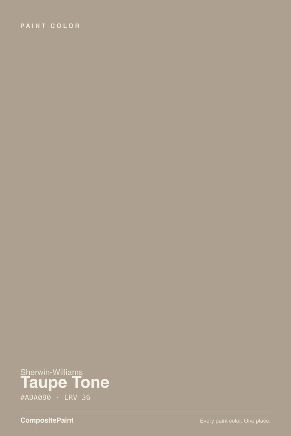
SW 7633 · #ADA090 · LRV 36 — warm red-orange tone, mid-tone — versatile but shifts visibly with light.
- 1Anonymous20
- 2Felted Wool28
- 3Taupe Tone36
- 4Agreeable Gray60
- 5Balboa Mist66
What Color Is Taupe Tone, Really?
Taupe Tone SW 7633 is a mid-tone warm neutral. Its LRV is 36, which puts it in the middle of the scale, so it has real color and weight on a wall without going dark. The hue sits at 33 degrees with about 15 percent saturation, so the warmth is present but well muted. The result is a proper taupe: a brown that has been grayed down until it behaves like a neutral.
People reach for it when beige feels too yellow and gray feels too cold. At LRV 36 it is dark enough to give a room definition, which makes it useful for walls that need to feel grounded rather than airy, and for exteriors where a light neutral would wash out in sun. It is a quiet, adult color that reads as a background rather than a statement.
The catch is the middle of the scale. A 36 LRV shifts more than a light or a dark one, and this color will look browner in warm evening light and grayer under cool daylight. In a room with little natural light it can flatten out and read muddy. Sample it on more than one wall and look at it at night, because the version you choose in the store is not the version you will live with.
The base is warm. A hue of 33 degrees sits between orange and yellow, in the earth range, and the hex #ADA090 confirms it: red leads, green follows, blue trails behind. What keeps it from looking like plain brown is the low saturation, roughly 15 percent, which grays the whole thing down.
Because it holds both sides, the neighbors decide what you see. Next to a clean gray it looks warm, almost pinkish brown. Next to a yellow beige it looks cool and stony. Against oak flooring the shared warmth can blur the line between wall and floor, so a change in value or a strong trim white helps keep them separate.
Hold it against your flooring, your counters, and your largest piece of upholstery at the same time. A mid-tone neutral is only as good as the things it sits between, and this one takes on their character quickly.
Best Rooms and Uses for Taupe Tone
This is a walls color first. At LRV 36 it gives a living room, dining room, or bedroom enough depth to feel finished without dropping the light level the way a dark color would. It is particularly good in rooms with a lot of white trim and millwork, where the contrast does the work and the wall stays quiet.
It also suits hallways and stairwells, which take scuffs and where a mid-tone hides wear better than a pale neutral.
On cabinets it reads as a soft, earthy alternative to gray, and it works well on a lower run or an island with lighter uppers above.
Outside it is a strong body color. Mid-tone neutrals hold their character in full sun where light ones bleach out, and this one sits naturally with brick, stone, cedar, and a darker trim or door. It is less suited to small, dim rooms, where it can go flat.
How Lighting Changes Taupe Tone
At LRV 36 this color reflects a moderate amount of light, so it neither brightens a room nor swallows it. That middle position is exactly why it moves so much through the day. North-facing rooms give it cool, indirect light that pulls out the gray and lets it read as a soft stone color, which is often its best look.
South and west light bring the warmth forward. In strong afternoon sun the brown side dominates and the walls can look distinctly tan. East rooms read warm early and settle to gray by afternoon.
Artificial light matters just as much. Warm 2700K bulbs push it toward brown and can make it feel heavy at night. Cooler 3500K to 4000K bulbs hold the gray and keep it crisp. In rooms with little daylight, a 36 LRV can look dull and closed, so check it after dark before committing a whole floor to it.
Most complaints about Taupe Tone are a light mismatch. Upload a photo of your actual room and see it on your walls — then ask for the same wall in north light or evening lamps before you buy a single sample.
Need It From Another Brand?
Any paint counter can custom-tint Sherwin-Williams SW 7633 directly. If you would rather stay in one brand's own deck, these are the closest stock matches, measured as ΔE2000. Under 2 is a difference you will not see on the wall.
| Brand | Closest color | ΔE | LRV | |
|---|---|---|---|---|
| Behr | Sierra SandUL170-20 · Behr | 0.9 | 36 | Color page → |
| Benjamin Moore | Indian River985 · Benjamin Moore | 1.7 | 37 | Color page → |
| Valspar | Smoked Oyster6005-1C · Valspar | 1.4 | 36.3 | Color page → |
| PPG / Glidden | Cuppa CoffeePPG1076-4 · PPG / Glidden | 2.2 | 36 | Color page → |
| Glidden | Neutral Wheat10YY 35/094 · Glidden | 1.2 | 35 | Color page → |
| Dutch Boy | Breakwall405-3DB · Dutch Boy | 0.9 | 37 | Color page → |
Similar Sherwin-Williams Colors
The nearest shades to Taupe Tone within Sherwin-Williams's own range, ranked by perceptual color distance — useful when you want the same look a touch lighter, darker, or warmer.
WCAG 2.1: AA is 4.5 : 1 for normal text, 3 : 1 for large text, AAA is 7 : 1.
Taupe Tone vs Similar Colors
Tony Taupe SW 7038 at LRV 37 is the closest relative in feel. Its hex #B1A290 carries slightly more red, so it reads a touch warmer and browner where Taupe Tone stays more balanced. Mega Greige SW 7031, also LRV 37, has more blue in it at #ADA295 and comes across as a truer greige. Intellectual Gray SW 7045 at LRV 36 is the grayest of the group, and Fawn Brindle SW 7640 at LRV 36 sits between the two.
Across brands, Dutch Boy Breakwall 405-3DB at LRV 37 has a deltaE of 0.89 and Behr Sierra Sand UL170-20 at LRV 36 is 0.92, so both are effectively the same color. Benjamin Moore Indian River 985 at LRV 37 measures 1.66, which looks visually identical in normal room light.
Further out, Dunn-Edwards Sycamore Bark DEGR33 at LRV 36 is 3.35 and Farrow and Ball Dead Salmon No. 28 at LRV 35 is 4.07. The first is very close and worth sampling first; the second is close but visibly different side by side, with a pinker cast.
Colors That Go With Taupe Tone
White trim is the main partner, and the direction you choose changes the whole room. A warm white keeps the scheme soft and continuous. A cleaner, less yellow white sharpens the walls and makes the taupe look more deliberately gray. Either works; picking one and using it everywhere matters more than which one.
Natural wood is the easy companion. White oak, walnut, and rattan all share its warm base, and leather and jute belong in the same room. For metals, brass and aged bronze play into the warmth, while matte black gives a crisper, more modern edge.
Within Sherwin-Williams the close neighbors are alternatives rather than partners. Fawn Brindle SW 7640 at LRV 36 and Western Reserve SW 9597 at LRV 36 sit at the same depth, so they will not read as a second color beside it. For a two-tone scheme, put clear distance in value: a much lighter warm white above, or a much deeper brown below on cabinetry or a door.
Coordinated palette
Generated by hue-rotating #ADA090 in HSL space. Pair Taupe Tone with one accent and one neutral — the swatches below are starting points, not final picks.
Taupe Tone FAQ
Is Taupe Tone warm or gray?
It is a warm color that has been grayed down. The hue sits at 33 degrees in the earth range, but the saturation is only about 15 percent, so it behaves like a neutral. In cool north light it reads gray and stony, and in warm afternoon sun the brown side comes forward.
What LRV is Taupe Tone?
Taupe Tone has an LRV of 36, which is a true mid-tone on the 0 to 100 scale. It reflects a moderate amount of light, so it gives a room depth and definition without going dark. It also means the color shifts noticeably through the day, more than a very light or very dark shade would.
Does Taupe Tone work in a dark room?
It can look flat and muddy in a room with little daylight. At LRV 36 there is not much reflected light to work with, so a north-facing basement or an interior room may make it feel closed in. If you like the color for a dim space, test a large sample under your evening lighting first and consider cooler bulbs to keep the gray side visible.
What white trim goes with Taupe Tone?
Both warm and clean whites work, and the choice sets the mood. A warm white keeps the room soft and continuous with the taupe's earthy base. A cleaner, less yellow white gives sharper contrast and makes the walls read grayer and more modern. Use the same trim white throughout so the wall color stays the one variable.
Is Taupe Tone good for exteriors?
Yes, mid-tone neutrals like this hold their character outdoors where pale colors bleach out in direct sun. At LRV 36 it stays readable as a color on a full house body and sits naturally with brick, stone, and cedar. Pair it with a white or cream trim and a deeper door color for definition.
How is Taupe Tone different from Mega Greige?
Mega Greige SW 7031 has an LRV of 37, so the lightness is nearly the same, but its hex #ADA295 holds more blue than Taupe Tone's #ADA090. That makes Mega Greige read as a truer greige while Taupe Tone keeps a browner, earthier lean. Choose Mega Greige if you want the gray to lead and Taupe Tone if you want the warmth to.
Have you painted with Taupe Tone?
Rate it — one tap helps the next reader decide.
Ask a Question