Full Bloom
A warm coral-terracotta Sherwin-Williams files under orange but everyone reads as pink, reviewed honestly: the light that makes it glow, the rooms it overwhelms, and what to pick instead.

Jessica has spec'd whites and neutrals for more than 300 rooms and keeps a sample wall of painted drawdowns in her studio. Every color review is checked against real reader rooms in the comments and re-tested when a formula changes. About the testing process →
- 1Rumors8
- 2Cinnamon Slate19
- 3Full Bloom26
- 4Fresno32
The Fast Verdict
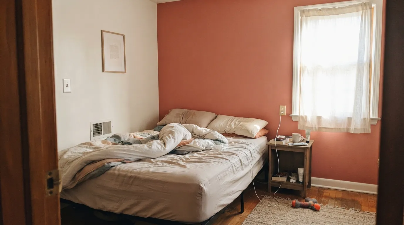
Full Bloom is what happens when you push pink toward clay and stop right before it becomes orange. At LRV 26 it holds real color in any light, and against warm whites and dark wood it reads like a hand-mixed hue, not a paint-chip trend. It is not a whole-house neutral and was never trying to be — this is a doses color: one wall, one door, one small room, done with conviction.
Bedroom or dining accent walls · powder rooms and small baths · a front door with real character · kitchen islands or a single run of cabinets · rooms with warm wood and brass that need one confident color
You want a color that reads the same in every light · your room gets only cool north daylight · you were hoping for a true pink or a true orange, not something between · you're painting more than one full room in it
- Genuinely specific color — reads as neither generic pink nor generic orange
- Holds its saturation at LRV 26 instead of washing out in bright rooms
- Excellent front-door and powder-room color — small doses look designer-picked
- Flatters warm wood, brass, and black hardware
- Works well in warm lamplight and candlelight, not just daylight
- Turns muddy and salmon-drab in cool, north-facing light
- Too much color for a whole open-plan room — needs to stay a doses color
- Clashes if placed next to a true pink or a true orange
- Sherwin-Williams cataloging it as orange while it reads as coral-pink can make ordering the wrong sample easy
What Color Is Full Bloom, Really?
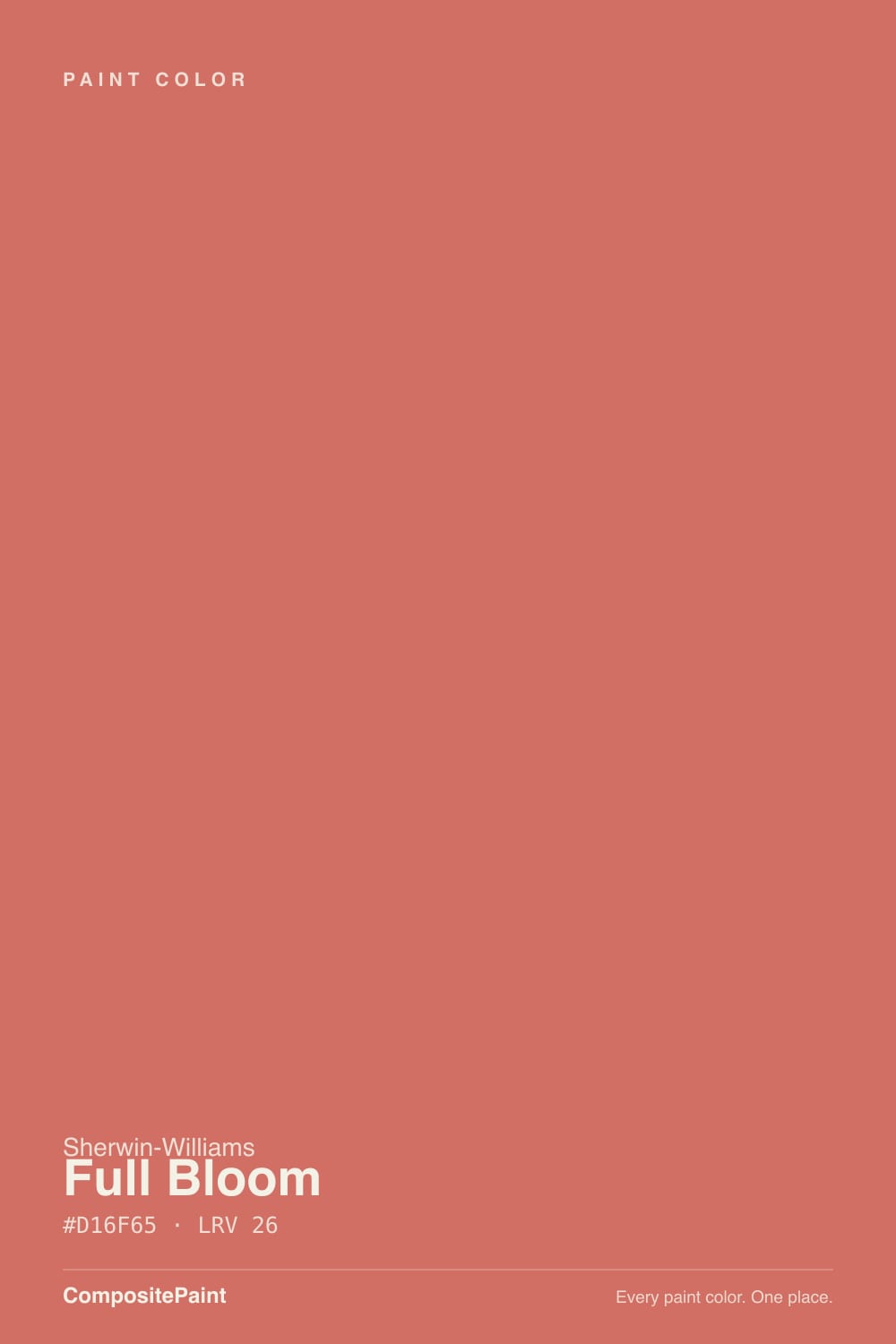
Full Bloom sits in the crowded space between coral, clay, and rose, and the confusion is baked into its own paperwork: Sherwin-Williams catalogs it on the company's orange-paint-colors page, yet the color behind it — RGB 209, 111, 101 — reads on a wall as a warm coral-pink with a distinct terracotta cast, not orange in any conventional sense. That is not a mislabel so much as proof of how blurry the line between clay, coral, and rose gets once you're at a medium-saturation red-orange like this one. Whatever shelf Sherwin-Williams keeps it on, expect people to call it pink, coral, and terracotta in the same conversation — and all three are right.
At LRV 26 it is a genuine midtone: darker than a blush, noticeably lighter and more saturated than the deck's browner clay tones. Sherwin-Williams' own Coming up Roses sits close in depth at LRV 30 but leans pinker; Cavern Clay (LRV 24) and Redend Point (LRV 27) sit at nearly the same depth but pull browner and dustier. That LRV band is exactly why Full Bloom holds its identity instead of washing out — a paler coral goes chalky in bright rooms, but this one keeps enough pigment load to read as a deliberate color even at noon.
Undertone in one line: red-orange first, with a warm rose finish — never a cool pink, never a true brick-red. In warm afternoon or lamp light the orange comes forward and it leans terracotta; in flat morning or overcast light the rose steps up and it reads closer to a dusty coral-pink. If your sample looks muddy or salmon-drab, that is cool, north-facing daylight doing exactly what it does to every warm mid-toned color in this family — not a flaw specific to this one.
Where It Shines
Give it warm light and a warm room and Full Bloom is genuinely striking — not loud, not sugary, just confidently colored. It is built for the single-surface commitment: an accent wall behind a headboard, a front door, a powder room, a kitchen island. Against creamy trim, brass hardware, rattan, and dark wood it reads expensive and intentional, the kind of color a client pays a designer to find rather than picks off a fan deck by accident.
Where It Fails
Almost every disappointed review of a warm mid-toned coral like this one comes from the same handful of situations, and Full Bloom is no exception. None of them are the paint's fault — they are what happens when a color this specific meets the wrong light or the wrong ambition.
At LRV 26 and this much saturation, four walls of Full Bloom stop reading as "a warm coral accent" and start reading as "I painted my living room orange." Sherwin-Williams' own Coming up Roses has the same problem at a similar depth — colors this specific are doses colors. Save the full-room commitment for a powder room or a small den where the scale works in the color's favor.
Take the warmth away and the red-orange in Full Bloom goes muddy and salmon-drab instead of coral. It is the same physics that flattens every warm mid-tone in the deck — Cavern Clay and Redend Point both do it too. If your room is dim and north-facing, sample it there before committing; you may be looking at a duller color than the fan deck promised.
Full Bloom's whole appeal is that it sits between categories — which means a saturated true pink or a true orange right next to it makes it look like neither, or like a mistake. Keep its neighbors neutral (warm white, cream, wood, black) and let Full Bloom be the only saturated color in the room.
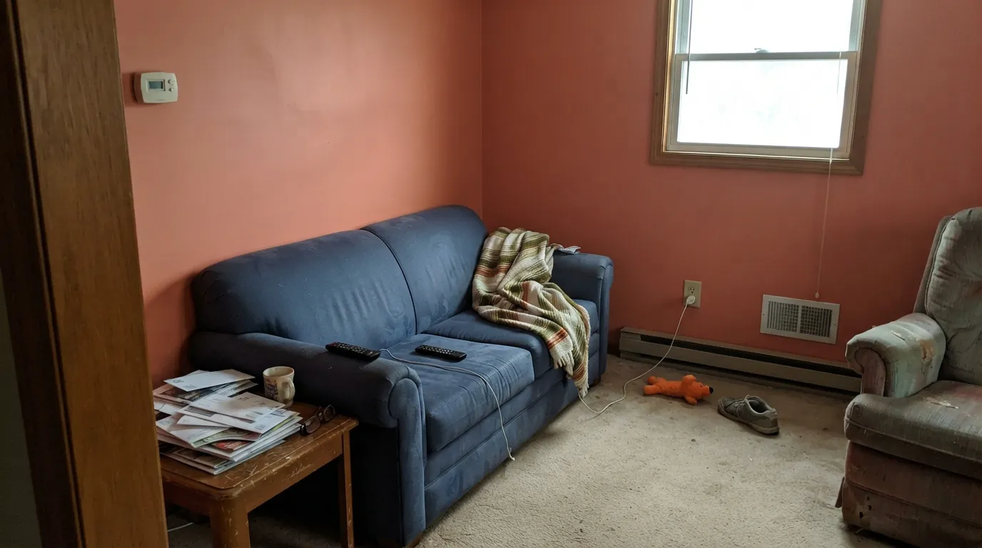
Room by Room
Behind a headboard or on the ceiling of a nook, it reads warm and grounding without turning the whole room hot. Eggshell finish; keep the other three walls a warm white like Alabaster so the accent stays legible.
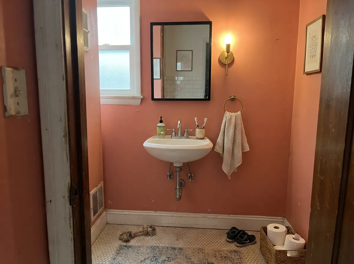
Full Bloom under a warm chandelier or dimmed sconces is one of its best jobs — the color deepens toward terracotta and flatters skin tones and wood furniture. Eggshell wipes clean of splashes.
Small rooms take saturated color well, and a powder room means you commit for a weekend, not a decade. Pair with a bright white trim and black or brass fixtures; the color carries the whole room.
Sherwin-Williams lists it for cabinets, and it earns the listing on an island or a single bank of lowers under a warm white perimeter. A full kitchen of Full Bloom cabinetry is a much bigger bet — test it on the island first.
Beautiful as a single accent wall with warm wood and brass; risky as the dominant color in an open-plan space where it has to negotiate with every adjoining room's undertone. Keep it to one wall or one furniture-scale surface.
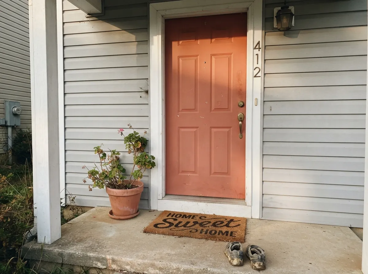
This is a legitimately good front-door color: saturated enough to read from the street, warm enough to work with brick, stone, and most siding colors. Semi-gloss, and expect it to look a shade brighter and more orange in full sun than it did on the chip.
Your Light Is the Risk
The orange steps forward and the color reads full terracotta-coral — the best version of this paint, and the reason to buy it.
Cool daylight strips the warmth and leaves a duller, muddier salmon. Test in your actual room before committing to a whole wall.
Warm and glowing at the sun hours, quieter and rosier once the direct light passes — a real shift, not a subtle one.
2700K bulbs push it toward terracotta and deepen the color nicely. Cool white LEDs flatten it toward a dusty, slightly gray coral — swap the bulbs before you blame the paint.
Most complaints about Full Bloom are a light mismatch. Upload a photo of your actual room and see it on your walls — then ask for the same wall in north light or evening lamps before you buy a single sample.
Need It From Another Brand?
Any paint counter can custom-tint Sherwin-Williams SW 9700 directly. If you would rather stay in one brand's own deck, these are the closest stock matches, measured as ΔE2000. Under 2 is a difference you will not see on the wall.
| Brand | Closest color | ΔE | LRV | |
|---|---|---|---|---|
| Behr | Dash Of CurryM170-6 · Behr | 2.2 | 25 | Color page → |
| Benjamin Moore | Coral Bronze1298 · Benjamin Moore | 1.7 | 26 | Color page → |
| Valspar | Rhapsody2002-5C · Valspar | 3.4 | 25 | Color page → |
| PPG / Glidden | Sahara SunPPG1064-6 · PPG / Glidden | 3.5 | 25 | Color page → |
| Glidden | Coral Berry10YR 24/399 · Glidden | 2.5 | 24 | Color page → |
| Dutch Boy | Preppy Pink204-5DB · Dutch Boy | 3.6 | 27 | Color page → |
Similar Sherwin-Williams Colors
The nearest shades to Full Bloom within Sherwin-Williams's own range, ranked by perceptual color distance — useful when you want the same look a touch lighter, darker, or warmer.
WCAG 2.1: AA is 4.5 : 1 for normal text, 3 : 1 for large text, AAA is 7 : 1.
Full Bloom vs the Colors You're Also Considering
Every Full Bloom sample board has the same rivals on it. The numbers show the real lightness gap — then it comes down to which risk you would rather live with.
Pick this for the brighter, more clearly coral-pink half of the same terracotta family.
Sherwin-Williams SW 7701 · LRV 24Cavern ClayPick this if you want the same warm-clay mood pulled deeper and browner — more Southwest adobe, less flower stand.
Pick this when you want the color to actually announce itself as coral, not sit quietly as a beige with a secret.
Sherwin-Williams SW 9081 · LRV 27Redend PointPick this for a dustier, more muted clay-pink that reads closer to a neutral in most rooms.
Pick this for the clay anchor that keeps the color from tipping into candy-pink territory.
Sherwin-Williams SW 6585 · LRV 30Coming up RosesPick this if you want the rose to win over the orange — it drops the terracotta cast that keeps Full Bloom from reading as straight pink.
Full Bloom Coordinating Colors
The rule for coordinating with Full Bloom: keep its neighbors quiet. Warm whites, dark neutrals, and warm woods all let the coral carry the room; another saturated color competing next to it usually loses. These are the partners that keep it looking deliberate:
Filed As Orange, Read As Pink: Full Bloom's Identity Problem
This is not a one-off. Sherwin-Williams' own Sable is a brown the company quietly filed under orange, and Cocoa Berry is a mauve-brown filed under red — color families are marketing buckets built for a website's navigation menu, not a physical description of what is actually on your wall. Full Bloom just happens to be a particularly clear example: a genuinely coral-terracotta color sitting on a page labeled "orange," one click away from paint chips that are unmistakably true orange.
The practical upshot: don't shop Full Bloom by browsing the orange wall at the paint store, and don't be surprised if a search for "Sherwin-Williams pink" or "Sherwin-Williams terracotta" surfaces it instead. Order the sample by name and SKU (SW 9700), not by trusting whatever color family a website happened to file it under.
Full Bloom With Wood Tones and Floors
Warm wood is the easy pairing here: walnut, cherry, and richly stained oak all deepen the terracotta side of Full Bloom and keep it from tipping too far into pink. Rattan, wicker, and unlacquered brass do the same job on furniture and hardware — this is a color that wants texture and warmth around it, not cool polish.
Pale, cool-toned floors are the one combination worth sampling first. Gray-washed wood or cool LVP can push Full Bloom toward its pinker, dustier side and make the floor read slightly muddy by contrast. It is rarely a dealbreaker in a single accent wall or a small powder room, but in a larger room with cool flooring, test a big sample before committing to the full wall.
Three Ready Palettes Built on Full Bloom
A color is never alone on the wall. These are complete combinations in the 60-30-10 pattern, with the reason each one holds together. Every one opens in the visualizer.
Alabaster keeps the rest of the room quiet and warm-white so the coral wall reads intentional instead of overwhelming. Urbane Bronze on the door adds one grounding dark note without competing with Full Bloom for attention.
Try this palette in your roomTwo warm clay tones close in depth read as one deliberate warm room instead of two colors arguing. Alabaster overhead keeps the room from feeling boxed in by all that saturation.
Try this palette in your roomCrisp Pure White trim keeps a small room feeling bright while the coral carries all the drama; black hardware and mirror frame ground the color so it reads finished, not accidental.
Try this palette in your roomFull Bloom FAQ
Is Full Bloom pink or orange?
Both and neither, technically. Sherwin-Williams catalogs it on its orange-paint-colors page, but the underlying color reads on a wall as a warm coral-pink with a terracotta cast — most people call it coral or clay-pink before they call it orange. Don't let the official filing talk you out of what you're actually seeing on your own wall.
What trim color goes with Full Bloom?
A warm white — Alabaster or Pure White both work — keeps the coral looking intentional instead of dirty. A stark, cool white trim will fight the warmth in the wall color, so go warm.
Is Full Bloom good for a bedroom accent wall?
Yes — it's one of its best jobs. Keep it to one wall (the headboard wall is the classic choice), the other three in a warm white, and expect it to glow under evening lamplight.
Can I use Full Bloom on kitchen cabinets?
Yes, and Sherwin-Williams lists it for exactly that — but start with an island or a single run of lower cabinets, not the whole kitchen. Use a durable cabinet enamel.
Will Full Bloom look too orange or too pink in my house?
It depends almost entirely on your light. Warm afternoon sun or lamp light pulls it toward terracotta-orange; cool north daylight or cool LEDs push it toward a duller rose-pink. Sample it in your actual room at the times of day you'll actually be in it.
Does Full Bloom work on a front door or exterior?
Yes — it's a legitimately strong front-door color, saturated enough to read from the curb and warm enough to sit well with brick and most siding. Expect full sun to read it a shade brighter and more orange than the chip.
Have you painted with Full Bloom?
Rate it — one tap helps the next reader decide.
Ask a Question