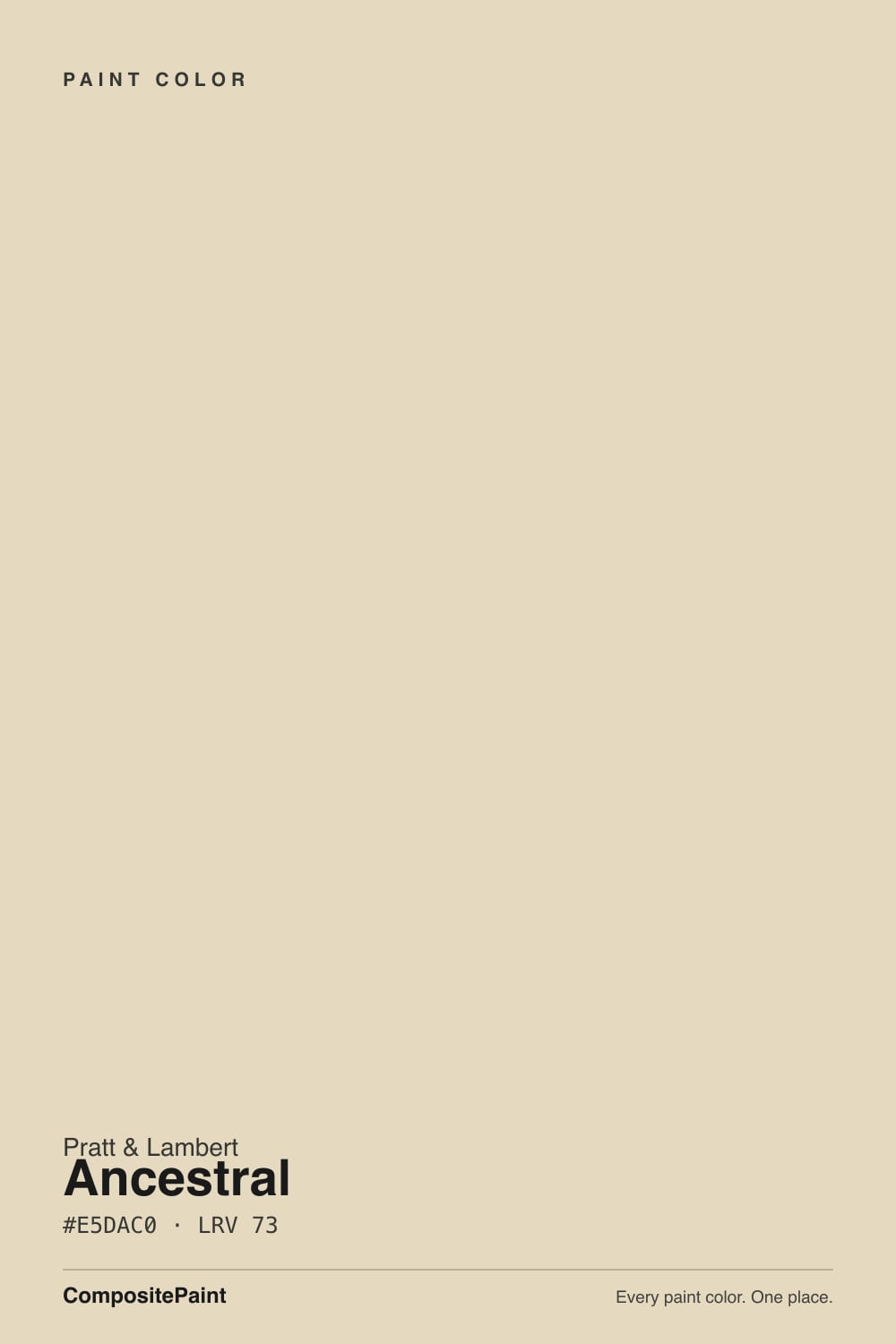
Ancestral
A true cream, not a white that pretends: where Pratt & Lambert 32-29 glows on colonial woodwork, the pairings that turn it yellow, and what to pick instead.

Jessica has spec'd whites and neutrals for more than 300 rooms and keeps a sample wall of painted drawdowns in her studio. Every color review is checked against real reader rooms in the comments and re-tested when a formula changes. About the testing process →
- 1Agreeable Gray60
- 2Balboa Mist66
- 3Ancestral73
- 4Shoelace78
- 5Dover White83
The Fast Verdict
Ancestral is cream with a spine. At LRV 73 it is too deep to pass for white and too pale to read beige, which is why old-house painters still spec it: the wall looks finished and golden, not painted and yellow. Pratt & Lambert is a specifier brand, not a big-box default, so this is the cream that shows up in a 1920s parlor with the same color on crown, wainscot, and walls — and stays there for a decade.
Vintage and colonial-revival living rooms · one-color walls + trim · kitchens with warm wood and brass · anyone who actually wants cream, not a white that pretends
You wanted a white · your trim stays a brighter white · cool grey marble or gray LVP · a dim north room running on cool LEDs
- True cream with body (LRV 73) — not a white in disguise
- One-color walls + trim is the intended, and best, look
- Flatters oak, walnut, honey floors, brass, and traditional millwork
- Holds warmth in rooms that make pale whites look chalky
- A specifier cream: designers who know P&L keep reaching for it
- Looks yellow and unwashed next to any brighter white
- Fights cool gray marble, gray LVP, and chrome-modern kitchens
- Goes dingy in dim north light and under cool LEDs
- Pratt & Lambert is harder to buy than Benjamin Moore or Sherwin-Williams
What Color Is Ancestral, Really?
A warm golden cream — not an off-white, not a beige. Pratt & Lambert files Ancestral with the whites and neutrals, but on a wall it reads as pale butter with the yellow grayed just enough to look like plaster, not like a paint-store sample named Harvest. Designers who know this deck reach for it when the house is colonial, Craftsman, or a client who said cream and meant it. Laurel Bern lived with it for twelve years on walls and trim as one color and called it a lovely cream, not green, not pink. That one-color millwork trick is still the smartest way to use it.
At LRV 73 it sits in the committed-cream band, not the white band. Put a chip next to White Dove (LRV 85) or Swiss Coffee (LRV 82) and Ancestral suddenly has body — a full step deeper, clearly golden. That gap is the point. On four walls it holds enough color to soften shadows, flatter oak, and make brass look inherited instead of new. It will never read as a bright white, even in full sun; if that is what you wanted, stop here.
Undertone in one line: warm yellow-gold, with a drop of red that keeps it from going lemon. Never pink, never green on the wall. If a sample flashes pink, that is a reflection — a brick floor, a cedar ceiling, late sun bouncing off a neighboring wall — not the formula. If it flashes green, look at the grass outside or a cool north exposure pulling the mute. Sample on the actual wall, in the actual light, next to the actual trim white you plan to keep.
Where It Shines
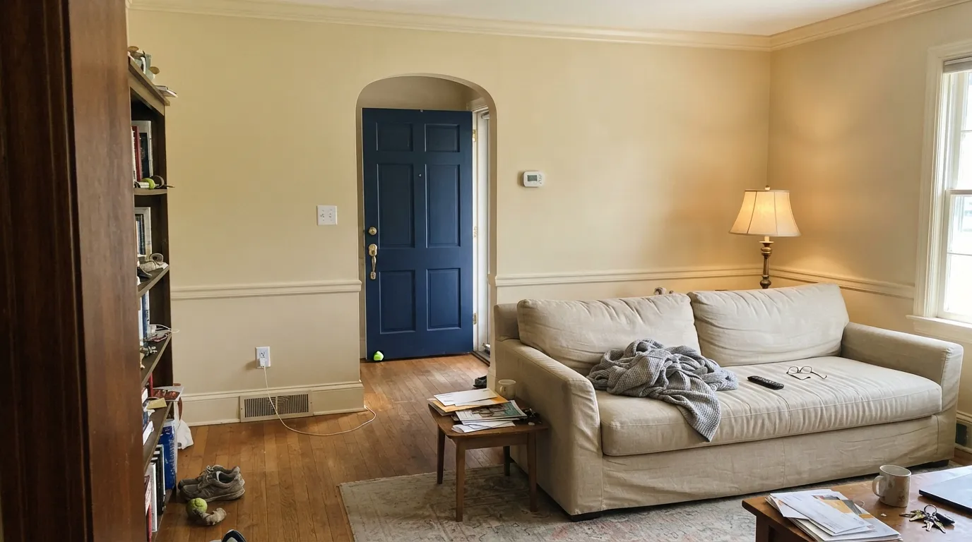
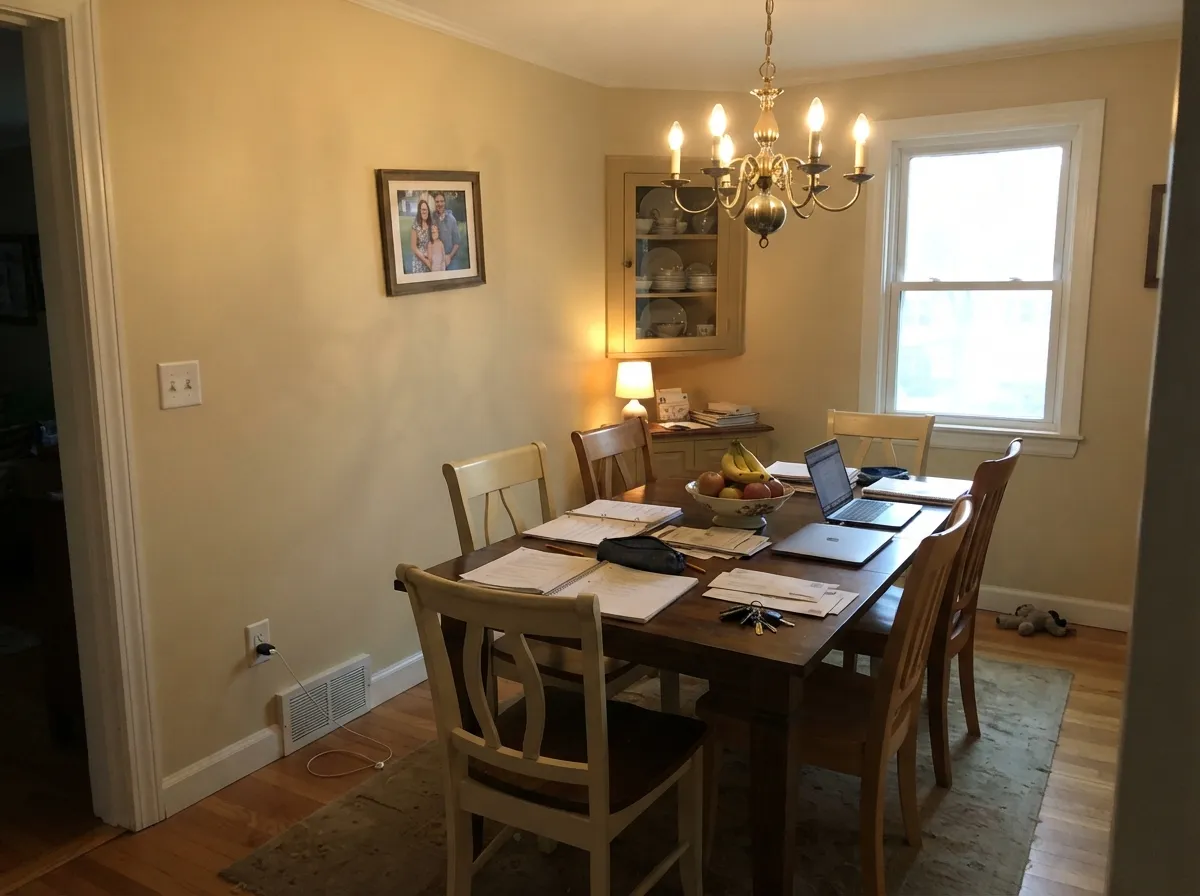
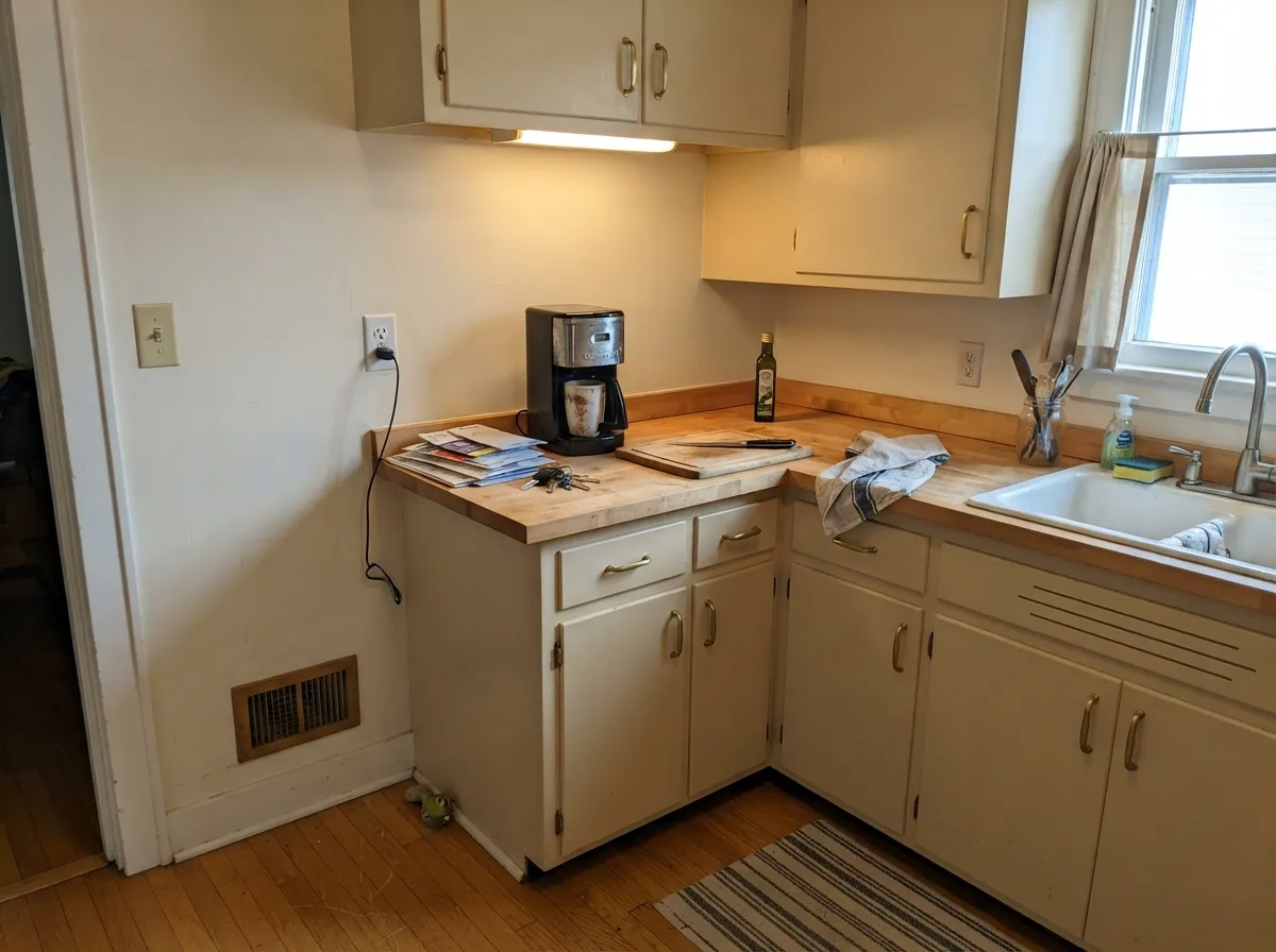
Give it real daylight, wood, and the same cream on the millwork and it behaves like plaster that never went out of style. The one-color room — walls in eggshell, crown and base in satin — is how this color earns its keep: no contrast line, no yellow-next-to-white problem, just a finished colonial parlor. Kitchens are the second home: satin cabinets against butcher block and unlacquered brass look older than the renovation. Honey oak floors, which fight half the deck, sit comfortably against it.
Where It Fails
Almost every regret about Ancestral is a pairing or a light problem, not a formula problem. The three below are predictable before the first coat. If your room matches one, this is not your cream, and a bigger sample will only confirm it.
The most common cream failure, and Ancestral is not immune. White Dove (LRV 85), Swiss Coffee (LRV 82), or any builder white on the trim makes the walls look yellow and unwashed. The fix is the one-color rule: walls, trim, and ceiling all Ancestral, sheen change only. If you need contrast, go darker — never brighter.
Carrara-type stone and cool gray floors sit at the opposite temperature and shove Ancestral toward yellow. The cream did not change; the neighbor did. With gray-modern everything, pick a quieter white. Ancestral wants oak, walnut, cream stone, and brass — or it argues all day.
North light is gray and stingy. It strips the gold and leaves a dingy, slightly muddy cream that readers describe as dirty. Cool-white bulbs finish the job. Warm 2700K lamps are part of this paint job; if the room stays dim and you refuse lamps, pick a color that does not depend on warmth.
Room by Room
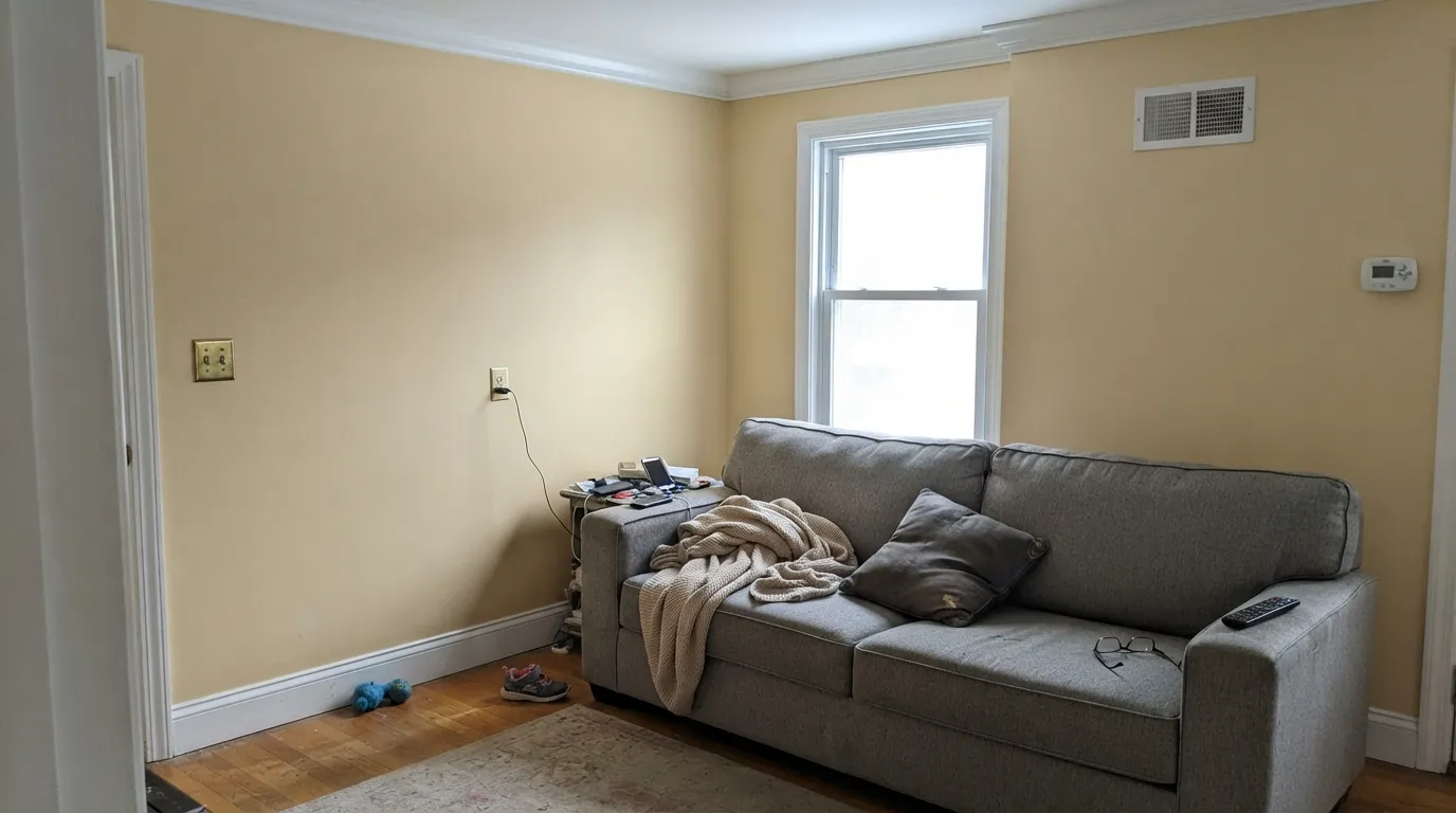
South or west light, oak floors, a worn sofa, same cream on the millwork: this is the room the color was mixed for. Eggshell on walls, satin or semi-gloss on trim. It makes traditional furniture look deliberate instead of inherited-by-accident.
Evening lamps wake the gold and the room goes candlelit even on a Tuesday. Walnut or oak table, brass chandelier, cream linen. Keep the trim the same color so the wainscot does not telegraph a second white.
Satin Ancestral cabinets with butcher block, brass, and terracotta are a colonial classic. Whole-kitchen walls work too if the counters are warm. Cool gray quartz is the dealbreaker — the cabinets will look yellow by lunch. Urethane-fortified satin on anything you touch.
Under 2700K bulbs it turns softly golden at night without going nursery-yellow. If the bedroom faces north and stays dim, this is not the cream; step to a lighter warm white or commit to lamps. Eggshell; same color on the trim.
Hallways are where a cream either connects the house or yellows against every doorway. Run Ancestral walls and trim together and the run of millwork reads as one plane. A Hale Navy door at the end is the single dark note the scheme needs.
Full sun washes it lighter and more buttery than indoors, which is what you want on a clapboard colonial or a 1920s foursquare. Pair with Kendall Charcoal or Hale Navy shutters and a dark door. Skip it on a gray-modern facade — from the street it will read as yellow siding.
Your Light Is the Risk
The gold glows all day without tipping lemon. This is the light the cream was mixed for — whole-parlor safe.
Cool gray daylight strips the gold and leaves a dingy, slightly muddy cream. Test a big sample, or pick a lighter warm white.
Quiet cream in the morning, clearly golden through afternoon and at golden hour. The shift is the color being honest, not a new paint.
2700K lamps: warmer, candlelit, the colonial parlor version. Cool LEDs: dirty-yellow — swap the bulbs, not the paint.
Most complaints about Ancestral are a light mismatch. Upload a photo of your actual room and see it on your walls — then ask for the same wall in north light or evening lamps before you buy a single sample.
Need It From Another Brand?
Any paint counter can custom-tint Pratt & Lambert 32-29 directly. If you would rather stay in one brand's own deck, these are the closest stock matches, measured as ΔE2000. Under 2 is a difference you will not see on the wall.
| Brand | Closest color | ΔE | LRV | |
|---|---|---|---|---|
| Sherwin-Williams | Roycroft VellumSW 2833 · Sherwin-Williams | 1.7 | 71 | Color page → |
| Behr | Stucco WhiteBXC-50 · Behr | 1.3 | 70 | Color page → |
| Benjamin Moore | Lighthouse Landing1044 · Benjamin Moore | 1.3 | 69 | Color page → |
| Valspar | Vanilla PuddingT560 · Valspar | 1.0 | 71.7 | Color page → |
| PPG / Glidden | Deserted BeachPPG1104-3 · PPG / Glidden | 0.9 | 71 | Color page → |
| Glidden | Deserted BeachPPG1104-3 · Glidden | 0.7 | 71 | Color page → |
Contrast and Legibility
WCAG 2.1: AA is 4.5 : 1 for normal text, 3 : 1 for large text, AAA is 7 : 1.
Ancestral vs the Colors You're Also Considering
Every Ancestral sample board has the same rivals on it. The numbers show the real lightness gap — then it comes down to which risk you would rather live with.
Pick this when the job is already specified in Pratt & Lambert, or you want the slightly more golden, less beige read of the same idea.
Sherwin-Williams SW 6126 · LRV 72Navajo WhitePick this if your painter works in Sherwin-Williams — it is the same old-school cream depth, the deepest warm white in that deck.
Pick this when cream is the point, not a hint. Ancestral has the body Creamy gives up.
Sherwin-Williams SW 7012 · LRV 81CreamyPick this if you want cream that still winks at white — lighter, airier, and easier in a bright open plan.
Pratt & Lambert does not list a direct in-brand sibling for Ancestral, but its nearest warm neutrals help place it. Antique White 1-1 at LRV 78 is lighter and reads a touch softer and less saturated on the wall, so if Ancestral feels a little too golden in your light, Antique White is the gentler step up. Ancestral, being marginally deeper at LRV 73, holds more visible warmth and looks less washed out in bright rooms.
Pearly White 5-1 at LRV 75 sits almost between the two and works when you want warmth without much color commitment. Off-White 11-1 at LRV 80 is the brightest of the group and the closest to a true light neutral, so it is the pick when you want the room to feel airier and the cream tone to stay subtle. In short, choose Ancestral when you want the warmth to actually show, and step lighter when you want it quieter.
Ancestral Coordinating Colors
Stay on the warm side of the fence and keep brighter whites off the millwork. Ancestral wants other creams, warm greiges, deep navy, and behaved charcoals. It argues with icy whites, cool grays, and blue-gray stone. These are the partners that keep showing up in rooms that work:
A Specifier Cream, Not a Trend Color
Pratt & Lambert is not hanging at the big-box, which is why Ancestral never had a Color of the Year moment and never went viral on a television set. It lives in the specification world: painters who already carry the deck, restoration jobs, colonial-revival houses where the cream on the parlor has to match the cream on the wainscot. Owners have put it on exteriors. Interior designers who list favorite creams still name it — a soft, warm cream, period — then move on, because the color does not need a campaign.
That obscurity is useful. You are not buying last year's beige or this year's white. You are buying a cream that has sat in the P&L fan deck long enough for people to live with it for a decade and still recommend it. The tradeoff is availability: you will special-order it, and your painter may try to match it in Benjamin Moore or Sherwin-Williams. If they do, SW Navajo White (LRV 72) is the honest handoff; a bright OC white is not.
Ancestral With Wood Tones and Floors
Warm wood is the easy yes. Red oak, white oak, walnut, pine, cedar, and butcher block all sit on the same side of the temperature line, so the cream meets them halfway. Honey oak — the floor that ruins half the gray deck — is actually good company here. The gold in the wall softens the orange in the floor instead of amplifying it, which is why this color keeps showing up in unrenovated colonials that still have the original strip oak.
The flooring that needs a large sample is cool gray LVP, gray-washed oak, and anything with a blue cast. Gray floors pull Ancestral's warmth into relief, and the wall can read yellow against them. A big rug and brass can paper over a small clash; they will not save a whole-house gray-plank job. Metals: unlacquered brass, antique bronze, and oil-rubbed bronze. Polished chrome is the cold one.
Three Ready Palettes Built on Ancestral
A color is never alone on the wall. These are complete combinations in the 60-30-10 pattern, with the reason each one holds together. Every one opens in the visualizer.
Same cream at two sheens is how Ancestral avoids the yellow-next-to-white trap, and it makes small parlors and hallways read as one finished plane. The navy door is the single dark note a colonial facade or foyer needs.
Try this palette in your roomAccessible Beige and Ancestral share the warm side of the fence, so the wall-to-cabinet handoff does not yellow. The navy island grounds the cream and loves brass pulls; keep the counters on the warm side of the stone aisle.
Try this palette in your roomSun-washed cream clapboard with charcoal shutters is the colonial-revival picture from the sidewalk. Kendall Charcoal is a behaved dark gray, so the contrast stays crisp without going black-modern; the navy door keeps the whole thing from reading as a yellow house.
Try this palette in your roomAncestral FAQ
Is Ancestral a white or a cream?
A cream. LRV 73 is too deep to pass for white on a wall, and the gold is visible from the doorway. People who buy it hoping for a soft white are the ones who call it yellow. If you want white with a hint of warmth, look at Swiss Coffee or Creamy instead.
What trim color goes with Ancestral walls?
Ancestral itself, in satin or semi-gloss. A brighter trim white — White Dove at LRV 85, Swiss Coffee at LRV 82, anything in the builder-white range — makes the walls look dirty. If you want contrast, go darker (Kendall Charcoal, Hale Navy), never lighter.
Will it look yellow in a south-facing room?
It will look golden, which is the color working. South light is its best light: the cream glows without tipping lemon. The yellow-regret stories almost always come from pairing it with a brighter white, not from the sun. Sample next to your actual trim.
Is it good for kitchen cabinets?
Yes, if the counters and floors are warm. Satin Ancestral cabinets with butcher block, oak, and brass are a colonial classic and hide knuckle marks better than a bright white. Cool gray quartz or gray LVP will shove the cabinets toward yellow — do not fight that pairing.
How is it different from Sherwin-Williams Navajo White?
Same job, different deck. Navajo White (SW 6126, LRV 72) is the old-school warm cream in Sherwin-Williams; Ancestral is Pratt & Lambert's version at LRV 73, a hair more golden. If your painter is already in SW, use Navajo White. If the spec is P&L, stay with Ancestral.
Does Ancestral work on exteriors?
On the right house, yes — clapboard colonials and 1920s foursquares with dark shutters. Full sun washes it lighter and more buttery than the interior read. Pair it with Kendall Charcoal or Hale Navy, and walk the shaded north side with a sample; that elevation will read a step creamier than the sunny south.
Have you painted with Ancestral?
Rate it — one tap helps the next reader decide.
Ask a Question