Yeabridge Green
The bright avocado green Farrow & Ball found under an old gun cupboard, reviewed honestly: where it glows like fresh grass, the sun that turns it neon, and what to pick instead.

Jessica has spec'd whites and neutrals for more than 300 rooms and keeps a sample wall of painted drawdowns in her studio. Every color review is checked against real reader rooms in the comments and re-tested when a formula changes. About the testing process →
- 1Vintage Vogue12
- 2Sage Green22
- 3Yeabridge Green32
- 4Clary Sage41
- 5October Mist47
The Fast Verdict
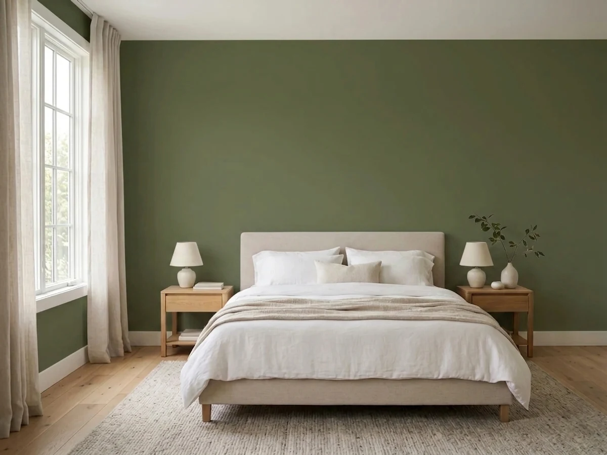
Yeabridge Green is Farrow & Ball's most straightforwardly cheerful green: not a moody heritage olive, not a gray-fogged sage, just a clean, yellow-leaning grass green at a workable mid-depth. It was found hiding under an old gun cupboard in a Georgian farmhouse and it still reads like the lawn outside that house — bright, uncomplicated, and happiest on a front door, a kitchen island, or a garden room, not necessarily a whole dim living room.
Front doors and exterior joinery · kitchen islands and cabinetry · garden rooms, sunrooms, and conservatories · mudrooms, entryways, and powder rooms that can take one bold color
Your kitchen counters are cool gray quartz · the room is dim, north-facing, and lamp-free · your door or sunroom bakes in direct afternoon sun and you don't want it flashing lime · you're picturing 1970s avocado-appliance green, not this one
- A true, fresh grass-green — not gray-fogged, not brown-khaki
- LRV 32 holds real color in daylight without going heavy or cave-like
- A genuine 18th-century find, not a manufactured trend color
- Loves brass, butcher block, warm wood, and Farrow & Ball's creamy whites
- A bold move that fits on one door or one small room, not a whole-house bet
- Strong direct sun can push it toward neon lime for part of the day
- Cool gray stone and white oak fight its warm yellow base
- Full Gloss trim, the classic F&B door finish, shows every prep flaw
- The word "avocado" in the brand's own description scares off buyers who haven't seen the actual chip
What Color Is Yeabridge Green, Really?
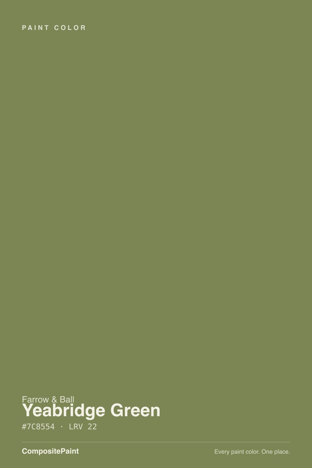
Farrow & Ball's own story for this color is unusually specific: it was discovered in an 18th-century Georgian farmhouse in the village of Yeabridge, Somerset, when an old gun cupboard was removed from a wall. Untouched for decades, the green underneath was still, in the brand's words, astonishingly bright — reminiscent of the lush grass surrounding the house. That is still the best one-line description of the paint today: a clean, uncomplicated grass green, not a murky heritage olive. In F&B's own green lineup it sits with more yellow than its dining-room-toned sibling Breakfast Room Green and less yellow than the brighter Churlish Green — the straightforward, grassy middle ground of the family.
At LRV 32 it is a genuine mid-depth color: light enough to read as fresh rather than somber, dark enough to hold its own against direct sun instead of washing out. This entry replaces an earlier, darker listing on the site — a corrected sync now matches Farrow & Ball's own published swatch, which is noticeably lighter and greener than the old data, closer to a spring lawn than a jar of khaki. If you compared samples against an older printout or an old paint chip and it looked muddier than what shows on screen here, the newer, brighter reading is the accurate one.
Undertone in one line: yellow-green, plainly and honestly — no gray haze over it, no blue creeping in at the edges. If your sample reads brown or khaki, that is a warm cast bouncing off your floor or old yellowed trim, not the paint; if it reads closer to neon or highlighter, that is direct strong sun doing exactly what direct strong sun does to every saturated green.
Where It Shines
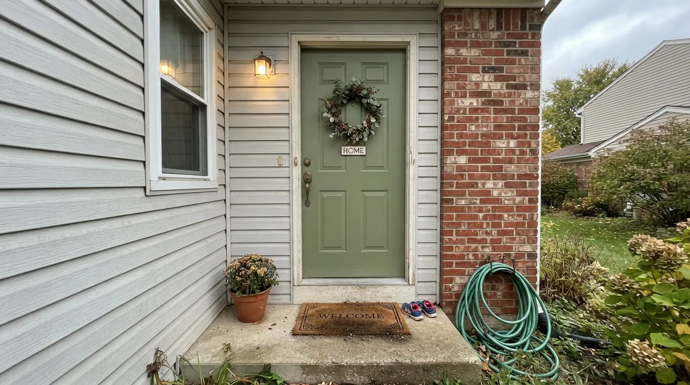
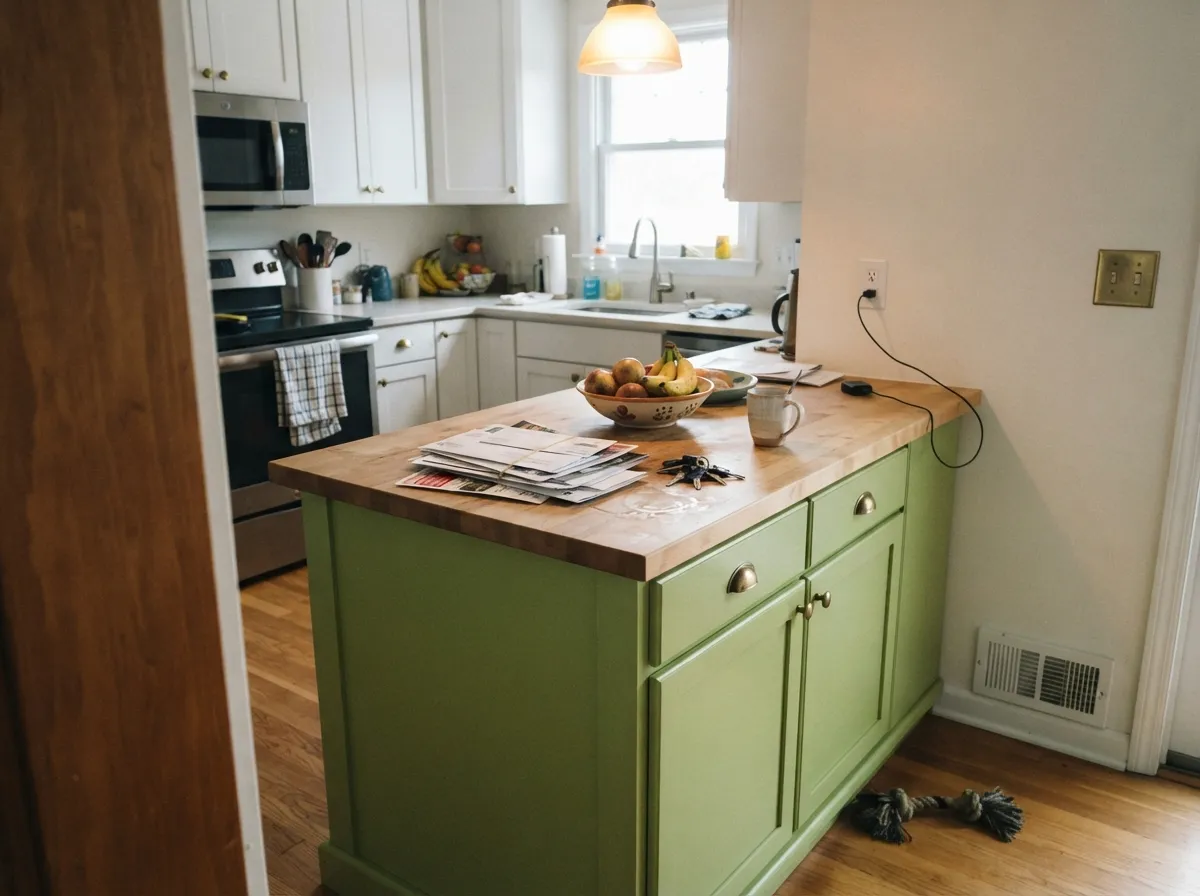
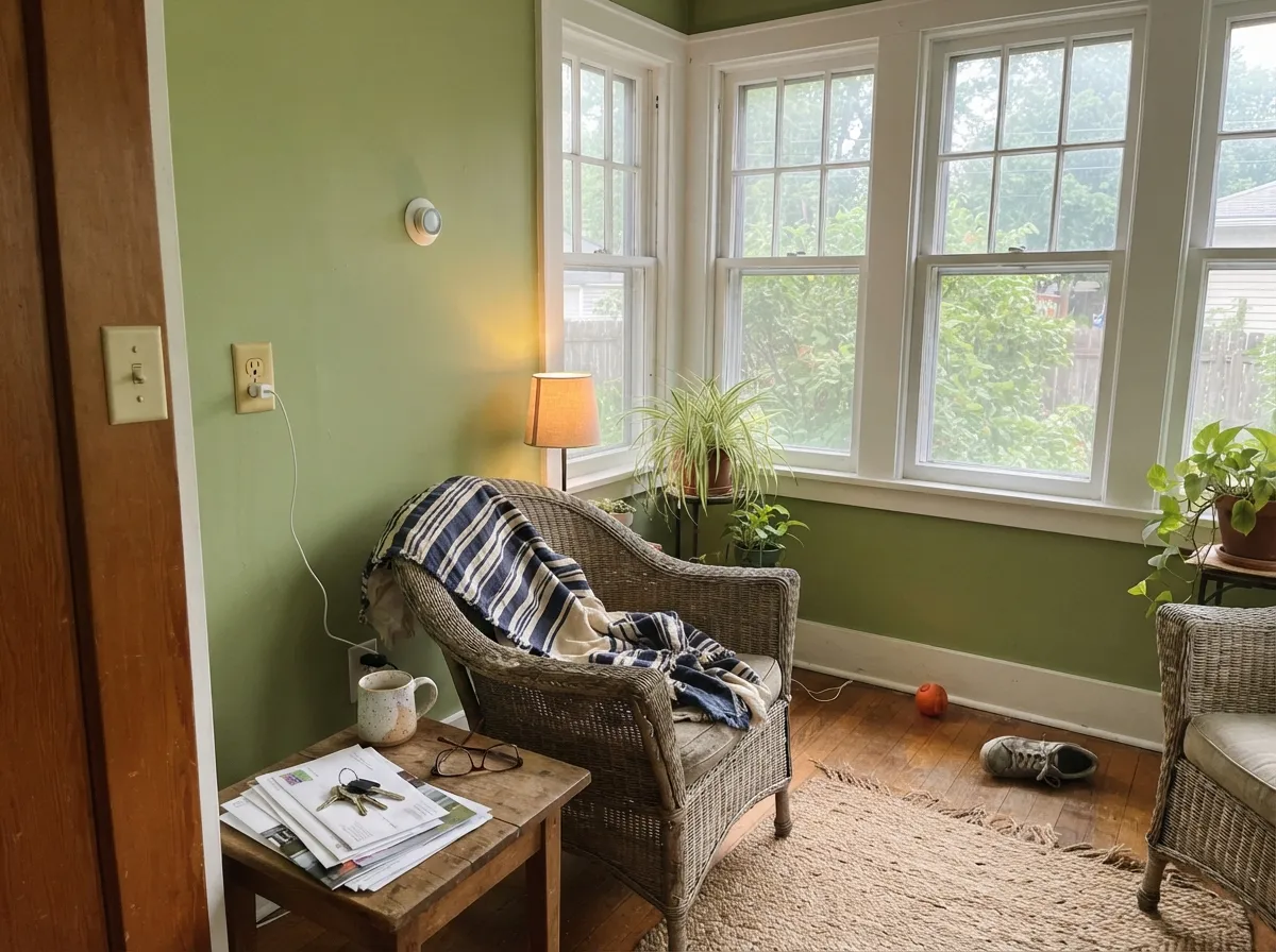
This is a color built for the parts of a house that get to be a little joyful. On a front door under real daylight it looks confident and current, not costume-y — closer to an English garden gate than a dated kitchen. On an island or a run of cabinets it warms up next to brass hardware and butcher block, and in a garden room or sunroom with an actual view of grass and leaves, indoors and outdoors genuinely blur together, which is the whole reason Farrow & Ball keeps steering people toward that use.
Where It Fails
Almost every disappointed story about Yeabridge Green comes from one of three predictable situations. None of them are the paint failing — they're the color meeting a light or a material it was never going to get along with.
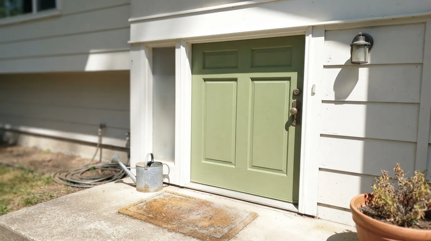
A south- or west-facing front door, or a sunroom with unfiltered afternoon sun, pushes the yellow in this green hard. For the brightest hour of the day it can flash toward neon lime or highlighter-green instead of the calmer grass tone on the chip. Some people love that jolt; others are genuinely startled by it. Sample it taped up at midday, not just at 10am, before committing a whole door or wall.
Farrow & Ball's own copy calls it "a bright avocado green," and that single word does a lot of unnecessary damage — it makes people brace for the yellow-brown, harvest-gold avocado of old range hoods and refrigerators. This isn't that color; it's a cleaner grass green with none of that dated warmth. If the only thing holding you back is the word in the description, ignore the word and look at the actual chip.
Cool gray quartz counters and gray-washed floors sit at the opposite temperature from this green's warm yellow base, and the two can leave each other looking slightly off — the stone a touch dingy, the green a touch flat. It is not a hard no, but test a large sample against your actual counter and floor before painting a full run of cabinetry.
Room by Room
Full Gloss, the classic Farrow & Ball door finish, is where this color earns its reputation. It reads confident against brick, gray or white siding, and pale stucco alike. Test in your door's actual light — a shaded porch and a sun-baked south exposure will give you two different colors.
An island or a full run of cabinets in eggshell warms up beautifully next to brass hardware and butcher block, and LRV 32 hides fingerprints better than a pale sage would. Skip it if your counters are cool gray stone — test first.
Low-traffic entry walls, or a wall of built-in lockers and cubbies, take saturated color well and hide scuffs at this depth. Pair with Slipper Satin or Wevet on trim to keep the entry from feeling closed-in.
This is the use Farrow & Ball itself points toward, and it earns the spot: with real daylight and an actual garden view outside the glass, the wall color and the landscape stop feeling like separate things.
Drench all four walls in a small windowless powder room and the boldness a whole house couldn't carry becomes exactly the point. One room, one strong decision, no negotiation with the rest of the house.
Beautiful as an accent wall or in a closed-door den; riskier as the color running through an open floor plan, where it has to negotiate with the undertones of every adjacent room. Use it as the one strong color in the story, not as background.
Your Light Is the Risk
A north-lit kitchen or a covered, bright porch is where it reads exactly as advertised: a true, fresh grass green, neither yellow-brown nor neon. This is the light Farrow & Ball shows it in.
Full unfiltered sun pushes the yellow forward hard and can flash the color toward neon-lime for the brightest part of the day. Sample it taped up at noon, not just in the morning.
Cooler and slightly blue-edged in early morning light, it warms and deepens toward late afternoon. The shift stays within "green" — it never drifts toward brown or gray.
2700K bulbs pull it toward moss and olive after dark — cozier, less grassy. Cool LEDs keep the true grass-green but can flatten it slightly; warm bulbs are the better match for evening rooms.
Most complaints about Yeabridge Green are a light mismatch. Upload a photo of your actual room and see it on your walls — then ask for the same wall in north light or evening lamps before you buy a single sample.
Need It From Another Brand?
Any paint counter can custom-tint Farrow & Ball No. 287 directly. If you would rather stay in one brand's own deck, these are the closest stock matches, measured as ΔE2000. Under 2 is a difference you will not see on the wall.
| Brand | Closest color | ΔE | LRV | |
|---|---|---|---|---|
| Sherwin-Williams | BroccoflowerSW 9039 · Sherwin-Williams | 1.4 | 33 | Color page → |
| Behr | Shortgrass Prairie760D-5 · Behr | 3.0 | 32 | Color page → |
| Benjamin Moore | Mountain Lane488 · Benjamin Moore | 2.6 | 32 | Color page → |
| Valspar | Cool Green6001-6B · Valspar | 1.5 | 33.2 | Color page → |
| PPG / Glidden | Leafy RomainePPG11-14 · PPG / Glidden | 4.0 | 31 | Color page → |
| Glidden | Garden Path30GY 31/202 · Glidden | 3.1 | 31 | Color page → |
Similar Farrow & Ball Colors
The nearest shades to Yeabridge Green within Farrow & Ball's own range, ranked by perceptual color distance — useful when you want the same look a touch lighter, darker, or warmer.
WCAG 2.1: AA is 4.5 : 1 for normal text, 3 : 1 for large text, AAA is 7 : 1.
Yeabridge Green vs the Colors You're Also Considering
Every Yeabridge Green sample board has the same rivals on it. The numbers show the real lightness gap — then it comes down to which risk you would rather live with.
Pick this when Calke Green would read too dark or too khaki for the room you have in mind.
Farrow & Ball No. 34 · LRV 22Calke GreenPick this for a deeper, mistier heritage olive with less yellow and more weight.
Pick this for real daylight rooms and open kitchens, where Card Room Green can look flat and gray.
Farrow & Ball No. 79 · LRV 26Card Room GreenPick this for a quieter, grayer Georgian green built for a formal dining room under lamplight.
Pick this for a true saturated grass green when Evergreen Fog reads more gray than green on your wall.
Sherwin-Williams SW 9130 · LRV 30Evergreen FogPick this if your painter works in Sherwin-Williams and you want the safer, more muted American cabinet-sage take on this family.
Yeabridge Green Coordinating Colors
The rule for coordinating with Yeabridge Green is simple: keep whites and neutrals warm or cool-but-pale, save true cool gray for elsewhere, and let one near-black or one deeper green do the grounding work. These are the partners that keep showing up alongside it:
The Georgian Farmhouse Behind the Name
Yeabridge Green owes its name and its color to a real place: an 18th-century Georgian farmhouse in the village of Yeabridge, Somerset. When an old gun cupboard was removed from a wall inside the house, the green paint underneath it had been sealed away, untouched, for decades — and it was still, by Farrow & Ball's own account, astonishingly bright, reminiscent of the lush grass surrounding the house. That is the color the brand matched and released.
It slots into Farrow & Ball's own family of greens as the straightforward, grassy middle ground — more yellow than the brand's dining-room-toned Breakfast Room Green, less yellow than the brighter Churlish Green. Where those colors lean moody or acidic, Yeabridge Green stays plainly, cheerfully green, which is exactly why it works as well on a front door as it does in a period sitting room.
Yeabridge Green With Wood Tones and Metals
Warm wood is the easy pairing: butcher block, pale oak, and honey-toned trim all sit comfortably against this green, since both share a yellow base. Aged or unlacquered brass is its best metal match by a wide margin — polished chrome and stainless read a step cooler and more clinical next to it, though they can still work in a deliberately modern kitchen.
Where floors and counters run cool — gray-washed wood, white oak with an ashy finish, gray quartz — sample generously before committing. The green itself won't change, but the pairing can look slightly mismatched in temperature; a warm-toned rug or wood accent nearby usually settles the argument.
Three Ready Palettes Built on Yeabridge Green
A color is never alone on the wall. These are complete combinations in the 60-30-10 pattern, with the reason each one holds together. Every one opens in the visualizer.
A classic English front-door move: the cool, pale Wevet trim keeps the green reading fresh instead of heavy, and the near-black hardware gives the eye one grounding, unambiguous dark note against brick or pale siding.
Try this palette in your roomSlipper Satin's warm cream walls give Yeabridge Green room to be the star of the kitchen instead of fighting a bright white. One dose of near-black Studio Green on shelving or a pantry door deepens the palette without competing with the island.
Try this palette in your roomAll White's brightest trim keeps a green-walled garden room from feeling like a greenhouse gone dark. The deeper Calke Green on one built-in piece ties the room back to the garden it's looking out on, without a second full wall of color.
Try this palette in your roomYeabridge Green FAQ
Is Yeabridge Green too bright for a whole room?
At LRV 32 it holds real color without going dark, but it is a genuinely saturated grass green, not a safe neutral. It is easiest to live with on a front door, an island, or a small room like a powder room; running it across an entire open-plan main floor is a bolder, more deliberate decision. Test a big sample in your actual light before committing to four full walls.
What's the difference between Yeabridge Green and Calke Green?
Calke Green (LRV 22, #75866C) is deeper, warmer, and reads closer to a heritage olive. Yeabridge Green (LRV 32, #8F9F72) is lighter and more yellow — the fresher, brighter, more grass-toned sibling of the two.
Is it good for kitchen cabinets?
Yes, in Farrow & Ball's Eggshell — it flatters brass hardware and warm wood and is durable enough for daily kitchen use. The one real caution is cool gray quartz or white oak, which can fight its warm yellow base; test a large sample against your actual counter first.
What colors go with Yeabridge Green on a front door?
Keep the house trim pale and cool — Wevet or Strong White both work — and add one near-black note in the hardware or lantern, like Off-Black. It reads well against brick, gray siding, and white clapboard alike.
Does it work in a north-facing or low-light room?
It holds its color better than a pale sage would, but without direct daylight it settles into a more muted, olive-leaning green rather than the bright grass tone on the swatch. It won't look bad, but it won't glow — add warm 2700K lamps if the room reads flat.
What sheen should I use?
Modern Emulsion on walls for a washable, low-sheen finish; Full Gloss on the front door and exterior joinery, the traditional Farrow & Ball look; Eggshell on cabinetry and any surface that gets touched daily.
Have you painted with Yeabridge Green?
Rate it — one tap helps the next reader decide.
Ask a Question