Black Tie
A cool near-black gray Dunn-Edwards keeps for islands and fascia, reviewed honestly: where the charcoal shows up, the noon sun that proves it is not black, and the dim rooms that swallow it.

Jessica has spec'd whites and neutrals for more than 300 rooms and keeps a sample wall of painted drawdowns in her studio. Every color review is checked against real reader rooms in the comments and re-tested when a formula changes. About the testing process →
- 1Black Tie6
- 2Pewter Green12
- 3Retreat21
The Fast Verdict
Black Tie is a near-black gray with the chroma knocked almost out of it — black from across the room, a cool charcoal only when real light hits. Dunn-Edwards files it in Cool Neutrals and points it at architectural contrast: an island against cream boxes, fascia on a cream stucco house, a door next to stainless or marble. Ask it to stay black at noon, or to carry four dim walls, and the chip will feel like a lie.
Kitchen islands and cabinet runs · front doors, fascia, and garage doors · a well-lit accent wall or vanity · anyone who wants cool charcoal, not brown-black
You are painting four walls of a dim room · you wanted true black that stays black at noon · your floors are honey oak · you need a nationally famous color with thousands of photos
- Cool charcoal that still reads as a color in good light, not a flat black hole
- Built for islands, fascia, garage doors, and vanities — the jobs Western counters actually mix
- Sits next to stainless, marble, pale oak, and cream without a fight
- Deep enough (LRV 6) to hold in a bright kitchen without washing out
- Never a Color of the Year, so it will not age like one
- Not black — noon sun on a door or island proves it
- Dim interiors flatten it to a hole in the wall
- Honey oak and golden wood pull it colder and a little dirty
- Thin national photo record compared with Iron Ore or Peppercorn
What Color Is Black Tie, Really?
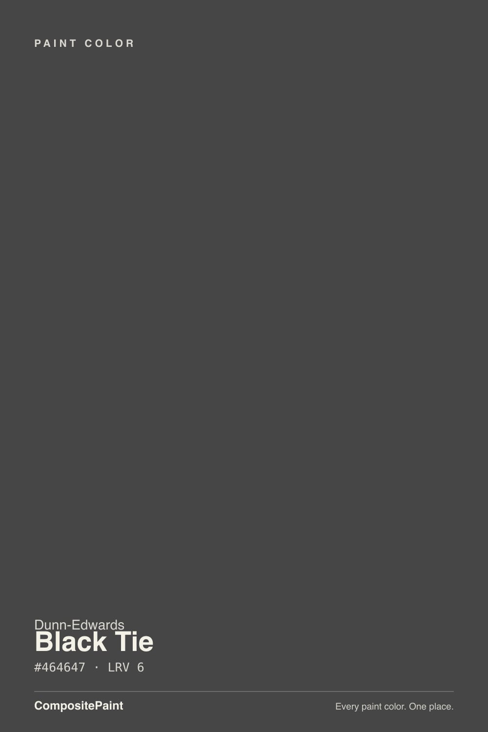
A near-black gray, not a true black and not a brown-black. The hex sits at 70, 70, 71 — one point of blue — and Dunn-Edwards publishes the Munsell as 6.20PB at chroma 0.2, which is the whole personality: smoky gray first, a purple-blue rumor so quiet most rooms never name it. The company files it under Cool Neutrals in the Perfect Palette and writes it for contrast with stainless, marble, and light wood, not as a launch color. It has never been a Color of the Year, and the photo record is thin on purpose — this is a counter chip Western painters pull for an island or a fascia, not a viral room.
At LRV 6 it lives in the same near-black band as Iron Ore: deep enough that a wall starts behaving like a shadow the moment the light drops. Outdoors that number is useful on a door, a garage, or a fascia line — full sun lifts it off black and shows the cool gray, so the house still reads charcoal instead of a hole in the street. Indoors it is a dose color. Plan for the field to read a step deeper and blacker than the chip — every near-black does this, and it is the number-one surprise when people sample a card and then paint a room.
Undertone in one line: cool, with a purple-blue whisper so low most daylight never names it. If your sample looks brown, you are seeing bounce from stucco, terracotta, honey oak, or late west sun. If it looks violet or steely, check the cool LEDs or a cream that is actually yellow. If it looks like a hole, you do not have enough light. The paint itself is charcoal.
Where It Shines
Give it an island, a fascia line, or one wall that actually sees a window, and it earns the job Dunn-Edwards wrote it for. Against Whisper or Swiss Coffee the charcoal reads decided instead of cave-like; stainless, marble, pale oak, and brass keep it architectural rather than gloomy. Hard daylight is what keeps it charcoal instead of inky. Satin on cabinets and semi-gloss on a door are what keep fingerprints and hose-water from etching a matte field. This is the dark note in a bright room — not the whole house.
Where It Fails
Almost every regret about this color is a lighting or identity problem, not a bad batch. The chip is charcoal. Shade, dim rooms, and a head full of true black will all make you think you bought the wrong can.
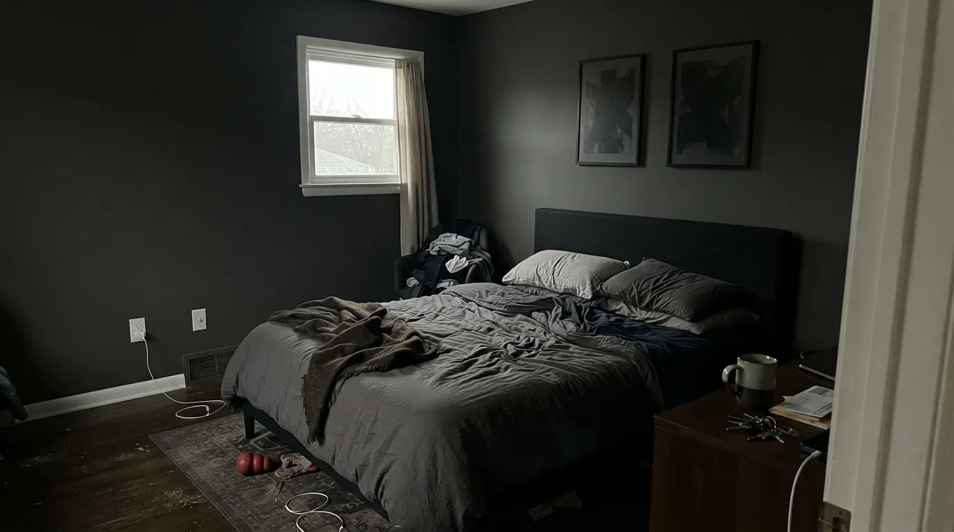
Without real light, LRV 6 stops being a color and starts being a hole. A north bedroom, a basement office, a hallway with one overhead LED — the gray disappears, art disappears, and the trim gets swallowed. Keep it to a door, an island, a fascia, or one wall that actually sees a window. A whole dim room in this paint is a cave with extra steps.
At noon on a south door, island, or fascia, LRV 6 is not black. It lifts to a clear cool charcoal you can name from the sidewalk. If the photo you saved was inky, you wanted Dunn-Edwards Black (DEA002, LRV 4) or Tricorn Black (LRV 3). This can is the one that still shows gray in Western sun, which is a feature on a fascia and a failure if black was the point.
Black Tie is a cool charcoal. Yellow-orange oak, golden builder trim, and honey floors sit at the opposite temperature, so the wood goes more orange and the paint reads colder, slightly dirty. Dunn-Edwards itself points this can at light wood, marble, and stainless — pale white oak, walnut, and stone. If the honey floor is staying, pick Espresso Macchiato and keep the dark note without the fight.
Room by Room
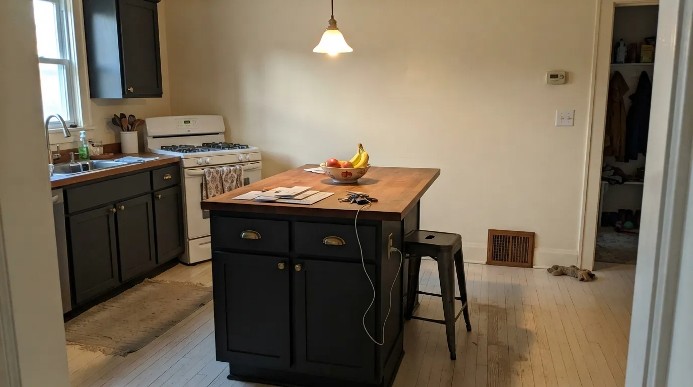
Satin Black Tie on an island or a lower run under Whisper, Swiss Coffee, or Classic White walls is the move the color was mixed for: one charcoal note, plenty of bounce light, brass or stainless pulls. Perimeter boxes stay light so the dark actually reads as color instead of a hole. Cabinet enamel, not wall paint — fingerprints and cooking film will etch a matte door.
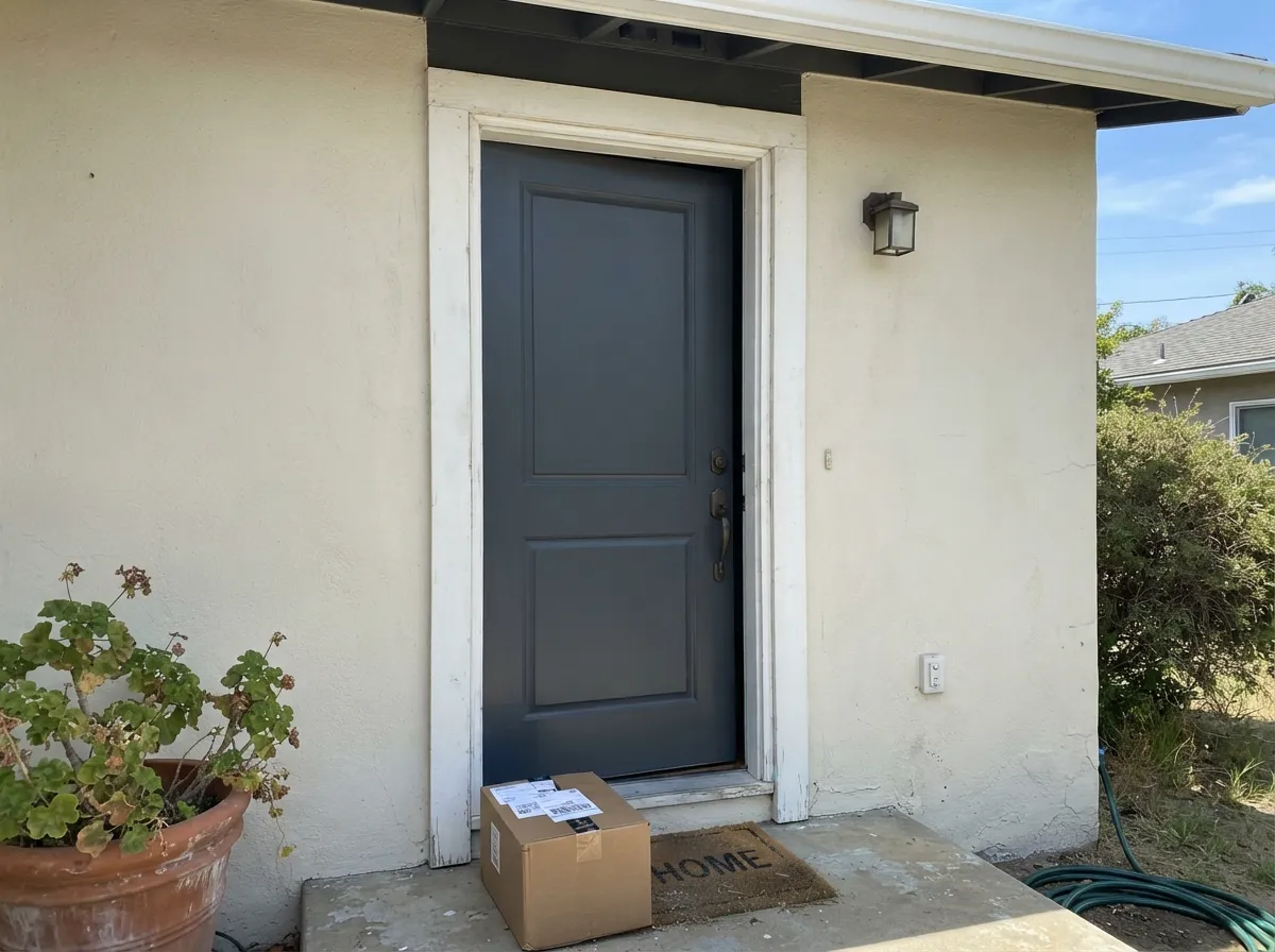
Western painters actually use this can here. Semi-gloss on a door, a garage, or a fascia line against Swiss Coffee or Whisper stucco is the classic contrast: cream body, cool charcoal punctuation. A Fairfax spec sheet called it out for fascias; Houzz threads compare it with DEA002 for the same job. Check the door manufacturer's heat notes before you go this dark on wood in full south sun; LRV 6 is in the band some warranties care about.
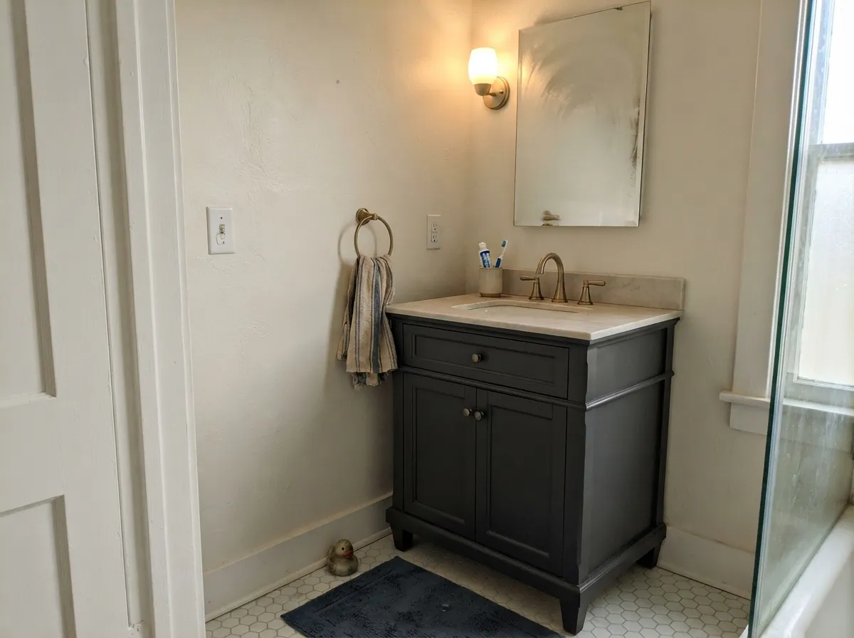
A Black Tie vanity under a marble top, or a drenched powder room with a window and warm sconces, reads custom without betting the house. Satin so it wipes. A windowless powder with one cool overhead is the cave version of the same idea — 2700K bulbs are part of the paint job.
One fireplace wall or a wall of built-ins, in a room with a real window, looks tailored and modern. In a windowless nook it just disappears into shadow. Sample a large board on that wall for a full day before you commit — noon charcoal and 6 p.m. near-black are both this paint. Eggshell on the wall, satin on the shelves.
Black Tie doors against cream or greige walls look expensive for one quart per door. Semi-gloss. Dark sash makes glass read as a picture frame, which is the architectural-contrast job the company wrote on the chip. Prime with a gray-tinted primer or the white will keep grinning through the edges.
Bedrooms, living rooms, and hallways do not want this as a field color. At LRV 6 the room shrinks, art disappears, and every scuff around a light switch becomes a highlight. Full siding in the Southwest shows every dust streak and heat-stresses a wood slab. Keep Black Tie on the island, the door, and the fascia, and let the body stay Whisper, Swiss Coffee, or a mid-tone beige.
Your Light Is the Risk
Hard daylight on a cabinet door, island, fascia, or front door is the light this charcoal was mixed for. It lifts off black, shows the cool gray, and looks like a designed box instead of a void. Sample it on the sunny side first.
Without bounce light the gray collapses and the wall, door, or box reads as flat near-black, sometimes with a dull violet-gray edge from the purple-blue base. North bedrooms, covered porches, and windowless halls are where people decide they hate it.
Morning shade is the darkest, near-black read. Midday south sun is the honest cool charcoal. Late west light can flash a faint warm edge for an hour; it is bounce from the sky and the stucco, not a new undertone. Sample at noon and at 6 p.m. on the same surface.
2700K bulbs keep it charcoal and civil after dark. Cool 4000K–5000K LEDs name the purple-blue whisper and push it steely, a little violet-flat. If you use this inside, the bulbs are part of the paint job.
Most complaints about Black Tie are a light mismatch. Upload a photo of your actual room and see it on your walls — then ask for the same wall in north light or evening lamps before you buy a single sample.
Need It From Another Brand?
Any paint counter can custom-tint Dunn-Edwards DE6357 directly. If you would rather stay in one brand's own deck, these are the closest stock matches, measured as ΔE2000. Under 2 is a difference you will not see on the wall.
| Brand | Closest color | ΔE | LRV | |
|---|---|---|---|---|
| Sherwin-Williams | CyberspaceSW 7076 · Sherwin-Williams | 2.9 | 6 | Color page → |
| Behr | Black BoudoirPPU26-23 · Behr | 1.2 | 6 | Color page → |
| Benjamin Moore | Midnight Oil1631 · Benjamin Moore | 0.7 | 8 | Color page → |
| Valspar | Muskeg Grey4005-2C · Valspar | 1.3 | 6.5 | Color page → |
| PPG / Glidden | OnyxPPG1011-7 · PPG / Glidden | 0.8 | 6 | Color page → |
| Glidden | OnyxPPG1011-7 · Glidden | 1.4 | 6 | Color page → |
Similar Dunn-Edwards Colors
The nearest shades to Black Tie within Dunn-Edwards's own range, ranked by perceptual color distance — useful when you want the same look a touch lighter, darker, or warmer.
WCAG 2.1: AA is 4.5 : 1 for normal text, 3 : 1 for large text, AAA is 7 : 1.
Black Tie vs the Colors You're Also Considering
Every Black Tie sample board has the same rivals on it. The numbers show the real lightness gap — then it comes down to which risk you would rather live with.
Pick this when you are already at a Dunn-Edwards counter and want the cooler, more clearly gray version of the same depth, especially on an island or a fascia.
Sherwin-Williams SW 7069 · LRV 6Iron OrePick this if you want the nationally famous near-black that can carry a whole house — same LRV 6, slightly steely, and it still gives a room some light back.
Pick this when the job should still read charcoal in Western sun — a fascia, a garage, an island that should not go inky.
Dunn-Edwards DEA002 · LRV 4BlackPick this when you actually want black on a door, an island, or sash — no gray left at noon, no undertone, the true black in this deck.
Pick this when you want it closer to black, cooler, and less willing to pick up brown or green from the neighbors.
Sherwin-Williams SW 7674 · LRV 11PeppercornPick this if you want more gray left after dark — a great dark gray that borrows its undertone from your room, and a full step lighter.
Pick this when you want it a step darker and cooler, especially on an island, a fascia, or a garage that should still show gray at noon.
Benjamin Moore 2124-10 · LRV 8Wrought IronPick this if you wanted the softest near-black in the BM deck — a hair lighter, a hair gentler, as long as soft was the point.
Black Tie Coordinating Colors
The rule is cream or soft white on the field, charcoal on the edge. Black Tie is the dark punctuation in a Dunn-Edwards house: it wants Whisper or Swiss Coffee next to it, Classic White if the stone is already cool, Stonish Beige if the body is stucco, and a navy only if the room already has light. Cool, icy whites can make it look a little dirty; yellow-gold trims make it look colder. These are the partners that keep showing up in rooms that work:
A Cool Neutral That Does Island And Fascia Duty
Black Tie is not a famous color, and pretending otherwise would be the wrong review. There is no Color of the Year plaque and no pile of Reddit before-and-afters. What exists is quieter and more useful: Dunn-Edwards keeps it in Cool Neutrals, has shown it on a dark kitchen island in a white open-concept kitchen, and Western job sites keep writing it onto fascia and garage-door specs. Designer Amber Sokolowski used it as an exterior hue on her SoCal house — Domino noticed — which is a real credit, not a movement.
If you sampled this thinking it was true black, you wanted DEA002. If you wanted the warmer espresso door Western painters pull in the desert, you wanted Espresso Macchiato. Stay on DE6357 when the job is cool charcoal contrast, sample it on the actual door or box, and do not shop by the name — other brands have a Black Tie too, and they are not this paint.
Black Tie With Wood Tones And Floors
This decision gets made at the floor and the box, not the paint store. Pale white oak, maple, and walnut are the color's best friends — that is the light-wood company the chip was mixed for, and marble and stainless sit in the same temperature. Brass, unlacquered bronze, and matte black hardware all work; polished chrome is fine here in a way it is not on a warm charcoal.
The honest no is golden: honey oak floors, orange-stained trim, yellow-beige carpet. Cool charcoal and yellow-orange each exaggerate the other — the floor reads more orange, the walls or boxes read colder and a little dirty, and no amount of coats fixes geometry. If the golden floor is staying, put a large rug between it and this paint, or choose Espresso Macchiato and keep the dark note without the fight. Cool gray LVP and gray-washed wood are safer than they are with a warm charcoal, but still sample a board above the actual floor before the painter shows up.
Three Ready Palettes Built on Black Tie
A color is never alone on the wall. These are complete combinations in the 60-30-10 pattern, with the reason each one holds together. Every one opens in the visualizer.
Swiss Coffee is the Southwest's default cream, and it keeps the kitchen bright enough for Black Tie to read as charcoal instead of a hole. Whisper — Dunn-Edwards' own trim partner on this chip, and its answer to White Dove — frames the boxes without the graphic cut of a true white. Brass or stainless pulls finish the argument.
Try this palette in your roomThis is the Houzz-thread combo: cream body, cool charcoal punctuation. Lighthouse is the crisp cool white that needs real sun to stay clean, so sample it on the shady elevation. Black Tie on the door, fascia, and garage is one dark note, not a black house. Walk the sunny and shaded sides with a board before you commit.
Try this palette in your roomClassic White is the snowy high-hide white this deck sells for cabinets and millwork; against Black Tie boxes it stays white, not cream, which is the stainless-and-marble read Dunn-Edwards wrote on the chip. Whisper on the trim keeps the edge from going hospital. Skip this palette over honey-oak floors.
Try this palette in your roomBlack Tie FAQ
Is Black Tie black or gray?
Charcoal — which means both, depending on the light. In shade or at night it reads near-black. In full sun on a door, island, or fascia it is clearly a cool medium-dark gray you can name from the street. If you need it to stay black at noon, Dunn-Edwards Black (DEA002, LRV 4) or Tricorn Black (LRV 3) are the deeper cans.
Is it the same as other paints named Black Tie?
No. This review is Dunn-Edwards DE6357 only. Other brands have used the same name on different colors. If a saved photo is not a Dunn-Edwards chip, sample this can on the actual door or box — do not shop by the words Black Tie.
Is it good for kitchen cabinets?
That is its best indoor job. Satin on an island or a lower run, light cream or snowy-white walls, brass or stainless pulls, and enough daylight or under-cabinet light to keep it from going black. A full kitchen of it needs a glass-walled room; most kitchens do not have that light. Use a urethane-fortified cabinet enamel.
What white goes with a Black Tie door or island?
Dunn-Edwards lists Whisper as the trim partner, and it earns the listing. Swiss Coffee is the creamier Southwest default on the field. Classic White is the snowy, cooler wall if the stone and metal are already cool. Lighthouse is the crisper modern trim in real sun. A bright gallery white (Chantilly Lace territory) can make the charcoal look slightly dirty by comparison.
Can I paint a whole house this color?
Almost never as a body. LRV 6 on four walls or a closed ranch with small windows is a bunker. Keep it on the door, the fascia, the garage, and the island. If you want a dark-gray house, you wanted Iron Ore — the near-black that can carry a whole house if you respect LRV 6 — and a building with big glass and light trim.
Does Black Tie work with oak floors?
Depends entirely on the oak. Pale white oak, walnut, and espresso are the easy yes — that is the light-wood company Dunn-Edwards wrote it for. Golden honey oak is the honest no: yellow-orange sits opposite this cool charcoal, so the floor goes more orange and the paint reads colder. A large rug helps; with wall-to-wall honey tones pick Espresso Macchiato instead.
Have you painted with Black Tie?
Rate it — one tap helps the next reader decide.
Ask a Question