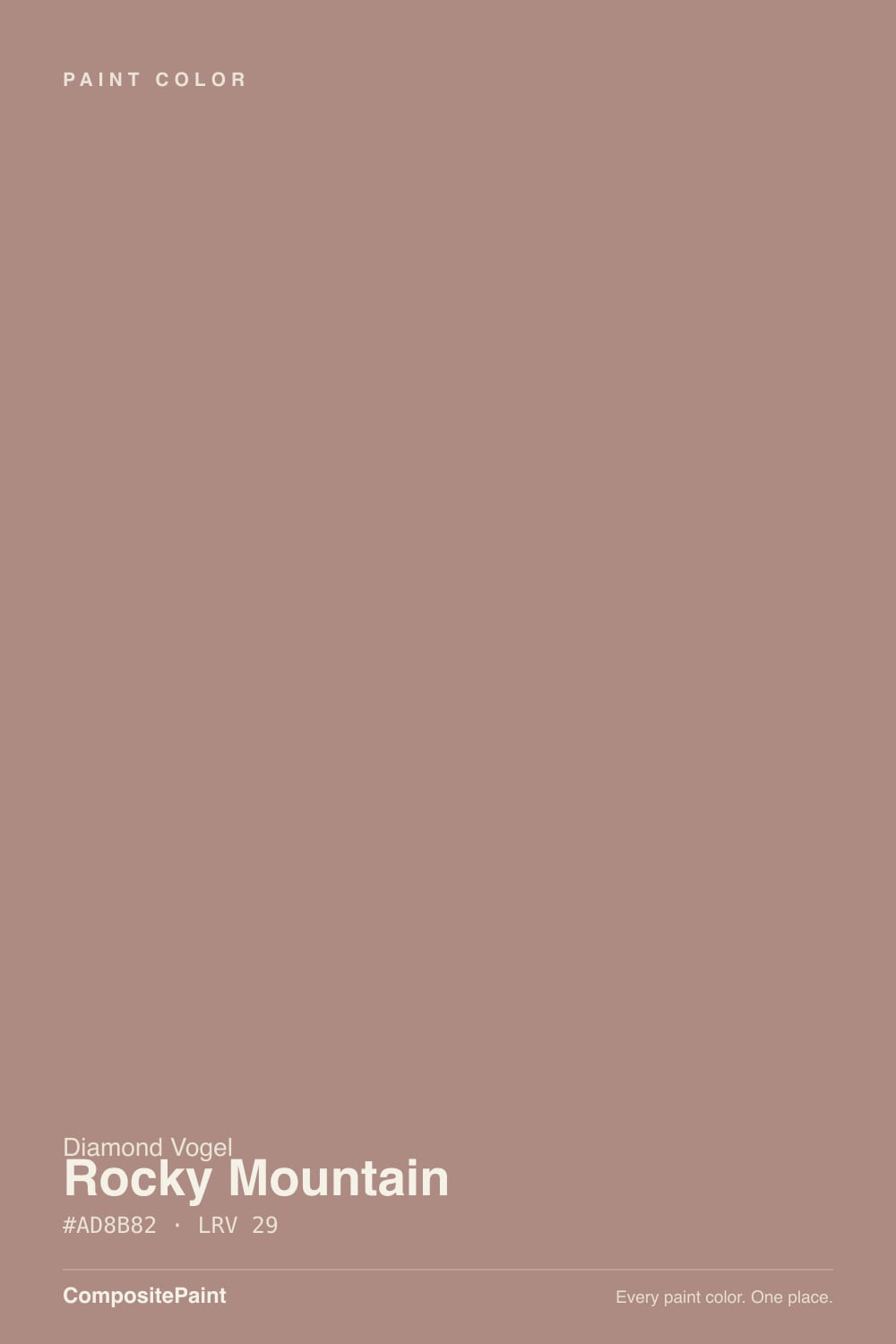
Rocky Mountain
A Midwest dusty clay reviewed honestly: where the rose shows, the light that turns it muddy, and the famous colors it quietly matches.

Jessica has spec'd whites and neutrals for more than 300 rooms and keeps a sample wall of painted drawdowns in her studio. Every color review is checked against real reader rooms in the comments and re-tested when a formula changes. About the testing process →
- 1Turkish Coffee5
- 2Porpoise13
- 3Rocky Mountain29
The Fast Verdict
Rocky Mountain is what dusty clay looks like when you refuse terracotta. At LRV 29 it is a mid-depth rosy brown with a real red undertone — warm enough to feel lived-in, grayed enough that it does not flash pumpkin on a west wall. It is not beige, not millennial pink, and not the internet's terracotta. If you want the clay-pink mood without Sherwin-Williams fame or Farrow & Ball prices, this is the regional version — sample it in your actual light before you buy a gallon.
Bedrooms and dining rooms with warm daylight · powder rooms and accent walls · anyone who wants dusty clay without terracotta orange
You actually wanted beige · your floors and stone are cool gray · the room is dim and north-facing · you need a resale-safe greige
- Warm without tipping terracotta — the rare clay that stays dusty
- LRV 29 holds its color in bright rooms instead of washing pink
- Bedrooms and dining rooms feel finished with one color decision
- Quiet regional analog to Redend Point and Sulking Room Pink
- Small-commitment hero: powder rooms, islands, one accent wall
- Not beige — buyers expecting brown see rose by the second wall
- Cool gray floors and stone push it toward dirty mauve
- Dim north light and cool LEDs turn it pantyhose-flat
- Midwest-regional deck — harder to match if you leave Diamond Vogel country
What Color Is Rocky Mountain, Really?
A muted rosy brown — clay first, rose second — built on red rather than yellow oxide. That is the whole trick. Most mid-tone earth colors in this range go terracotta the moment afternoon sun hits them; Rocky Mountain keeps the warmth and then gray-dusts it, so the wall reads like faded sandstone instead of a clay pot. Diamond Vogel files it as 0128 in a Midwest regional deck, not as a trend launch, which is why almost nobody is fighting about it online. It has been sitting there as a workaday earth tone while Cavern Clay and Redend Point took the internet.
At LRV 29 it is a genuine mid-tone, the same depth as Farrow & Ball Sulking Room Pink (LRV 29) and a hair deeper than Sherwin-Williams Redend Point (LRV 30). That depth is what makes it usable: a paler blush washes out to baby-pink in a bright room, but Rocky Mountain holds a dusty clay body in daylight and then sinks toward a cocoa-rose after dark. Plan for four walls to read a step deeper and more rose than the chip — every muted red-brown does this, and it is the number-one surprise once it is on the wall.
Undertone in one line: red-brown first, rose second — never yellow-orange. If your sample goes terracotta, that is west sun or a golden floor bouncing into it. If it goes muddy mauve, your light is cold. Both versions are the same paint being honest about the room.
Where It Shines
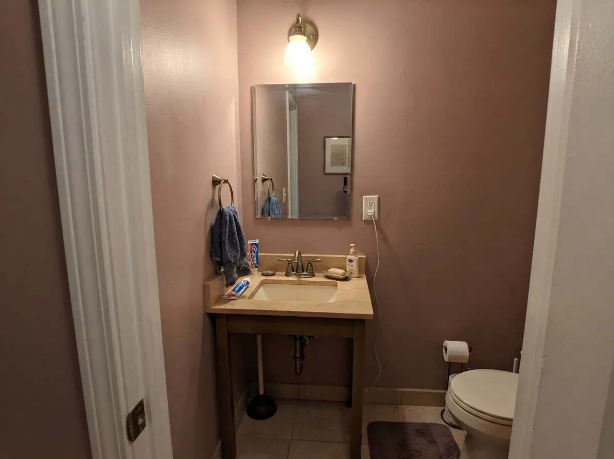
Give it warm daylight, wood, and a cream trim and it looks older than the house in the good way — like plaster that has always been this color. Bedrooms and dining rooms are its natural home: LRV 29 is deep enough to feel finished without going cave-dark, and the rose stays quiet next to walnut, leather, and brass. Its second job is the small commitment — a powder room, an accent wall, a bank of satin cabinets — where dusty clay reads custom instead of beige-again.
Where It Fails
Almost every regret about a color in this family follows one of three scripts, and Rocky Mountain is no exception. None of them are the paint's fault — but if your room matches one, this is not your brown, and a bigger sample will only confirm it.
On the chip it passes for a dusty taupe. On four walls the rose is unmistakable — depth multiplies undertone. If your goal was greige or a safe warm brown, Rocky Mountain is too much personality; look at Pashmina and let the pink stay out of it.
This color wants wood and cream. Cool gray tile, gray carpet, and Carrara-type stone sit at the opposite temperature and push the walls toward dirty mauve while the stone goes colder. Both sides lose. If the hard surfaces are already gray, pick a color that can live with them.
Cool daylight strips the red and leaves a flat pantyhose-mauve that readers of every dusty-rose brown describe as dingy. Warm 2700K bulbs are part of this paint job. If the room stays dim and you refuse lamps, this family of color will never look expensive.
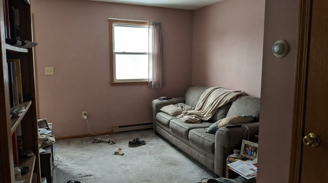
Room by Room
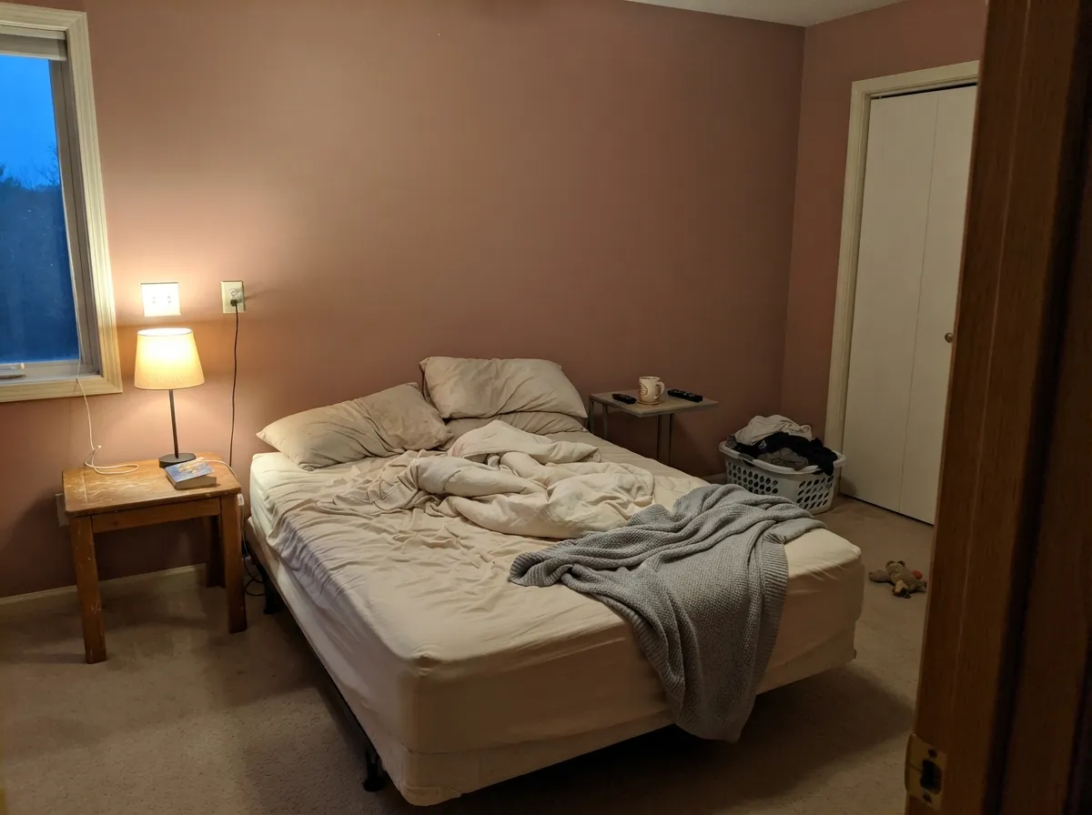
Dusk-colored without going purple. Matte or eggshell deepens it; White Dove trim keeps the edges soft. With cream bedding, walnut, and 2700K lamps it is restful instead of themed — the rare mid-tone that still reads like a place to sleep.
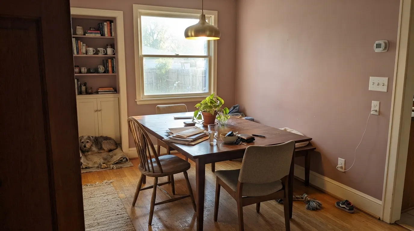
Evening rooms love this depth. Walnut or oak table, brass, linen, one warm pendant — Rocky Mountain makes the walls recede into clay so the table carries the room. Eggshell; same cream on trim and ceiling.
Beautiful in a south- or west-facing living room with oak or walnut and cream upholstery. Riskier in an open plan that still has builder-gray carpet or cool kitchen stone: the rose will argue with both. Pale Oak next door is a safer handoff than any true gray.
Drench all four walls and the color looks expensive in 40 square feet. Satin on a vanity under a warm stone top and brass pulls is the weekend version. Keep the bulbs warm; cool LEDs will dirty it overnight.
Satin Rocky Mountain on an island or a hutch under cream walls is the current clay-cabinet look without Cavern Clay's orange. A full kitchen of dusty-rose cabinets is a real commitment, and a losing one over cool gray quartz. Warm wood counters and brass only.
Full sun dusts it toward faded stucco and the rose reads as discoloration from the street. The exception is a shaded front door on a cream or pale-stone house, where the clay reads intentional. Do not put it on siding.
Your Light Is the Risk
Afternoon sun wakes the rose without turning it orange. This is the expensive read: dusty clay, a little pink at the edges, clearly a color. Sample on a west wall first.
Cool gray daylight kills the red and leaves a flat mauve-taupe. Fine if you half-wanted gray-pink; disappointing if you wanted brown. This is the pantyhose shot.
Cooler and browner before noon; rosier and more clay through the afternoon. The shift is real but it stays in the same family — it does not become a new color at 6pm the way a true terracotta does.
Warm 2700K bulbs keep the clay-rose and are non-negotiable at night. 3500K–4000K LEDs gray it toward dusty mauve and make the walls look dirty. If the house runs on cool bulbs, change the bulbs or change the paint.
Most complaints about Rocky Mountain are a light mismatch. Upload a photo of your actual room and see it on your walls — then ask for the same wall in north light or evening lamps before you buy a single sample.
Need It From Another Brand?
Any paint counter can custom-tint Diamond Vogel 0128 directly. If you would rather stay in one brand's own deck, these are the closest stock matches, measured as ΔE2000. Under 2 is a difference you will not see on the wall.
| Brand | Closest color | ΔE | LRV | |
|---|---|---|---|---|
| Sherwin-Williams | Redend PointSW 9081 · Sherwin-Williams | 3.6 | 30 | Color page → |
| Behr | Regency RoseUL110-11 · Behr | 2.1 | 27 | Color page → |
| Benjamin Moore | Barberry1244 · Benjamin Moore | 3.6 | 27 | Color page → |
| Valspar | Western Ridge1008-9C · Valspar | 3.5 | 29 | Color page → |
| PPG / Glidden | Bedford BrownPPG1060-5 · PPG / Glidden | 0.9 | 28 | Color page → |
| Glidden | Bedford BrownPPG1060-5 · Glidden | 1.1 | 28 | Color page → |
Similar Diamond Vogel Colors
The nearest shades to Rocky Mountain within Diamond Vogel's own range, ranked by perceptual color distance — useful when you want the same look a touch lighter, darker, or warmer.
WCAG 2.1: AA is 4.5 : 1 for normal text, 3 : 1 for large text, AAA is 7 : 1.
Rocky Mountain vs the Colors You're Also Considering
Every Rocky Mountain sample board has the same rivals on it. The numbers show the real lightness gap — then it comes down to which risk you would rather live with.
Pick this for the rosier, slightly more mauve version of the same depth, without the Sherwin-Williams debate.
Sherwin-Williams SW 9081 · LRV 30Redend PointPick this if you want the famous clay-pink with a slightly yellower, more terracotta lean — and you are ready for the internet argument that comes with it.
Pick this when dusty clay is the point and orange is the dealbreaker.
Sherwin-Williams SW 7701 · LRV 20Cavern ClayPick this if you actually want terracotta that glows orange in the right light — deeper, redder, and much more committed.
Rocky Mountain Coordinating Colors
The rule for coordinating with Rocky Mountain: warm whites, tonal red-browns, and one near-black — and keep cool gray at arm's length. It pairs with cream far better than with beige, loves walnut and brass, and layers with deeper members of its own dusty-clay family. These are the partners that keep showing up in rooms that work:
The Color Nobody Blogged: A Regional Stand-In For Famous Clay-Pinks
Rocky Mountain has no Color of the Year plaque and no viral living room. Diamond Vogel is an Iowa-based regional brand; 0128 is a workaday chip in a Midwest deck, not a launch color. That obscurity is useful. While Redend Point split comment sections in half and Sulking Room Pink became a designer shorthand for dusty mauve-clay, this color has been doing a quieter version of the same job in Iowa, Nebraska, and the Dakotas.
If you are shopping nationally, treat it as the regional cousin: same LRV neighborhood as Sulking Room Pink, rosier than Redend Point, and deliberately less orange than Cavern Clay. If you move out of Diamond Vogel territory, those three are the matches to take with you — not a random beige with a mountain in the name.
Wood Tones, Stone, And Metal
Walnut, medium oak, and espresso are the easy yes. Pale white oak works when it is actually pale, not yellow. Honey oak is the one to sample in place: yellow-orange bounce can drag Rocky Mountain toward the terracotta it is trying not to be. A large wool rug between the wall and a golden floor is cheaper than a repaint.
Stone: creamy limestone, honed travertine, and warm marble are friends. Cool gray quartz and blue-gray tile are not — they make the rose look dirty. Metals: unlacquered brass, aged bronze, and oil-rubbed bronze. Chrome and cool nickel flatten it. If the kitchen already has cool hardware and cool counters, this is the wrong cabinet color.
Three Ready Palettes Built on Rocky Mountain
A color is never alone on the wall. These are complete combinations in the 60-30-10 pattern, with the reason each one holds together. Every one opens in the visualizer.
Two depths of the same red-brown family, separated by a warm white. White Dove matters here — a stark bright trim white would make the walls read dirty by comparison. Cinnamon Slate on one wall or a dresser keeps the room tonal instead of themed.
Try this palette in your roomCream and dusty clay is the grown-up pairing — Swiss Coffee keeps the room from going cave, and one near-black note (Iron Ore, LRV 6, used in doses) stops the scheme from reading all-blush. Walnut table and brass finish it. Watch Swiss Coffee in very warm evening light; it can go creamier than you sampled.
Try this palette in your roomAlabaster is a superb cabinet-adjacent white; keep it on the walls and let Rocky Mountain carry the island. Pewter Green is outstanding on cabinets and doors, and a sage-clay pairing keeps the kitchen from becoming a dusty-rose theme. Warm wood counters only — cool gray quartz will fight both colors.
Try this palette in your roomRocky Mountain FAQ
Is Rocky Mountain brown or pink?
Both, which is why people miss. On the chip it reads as a dusty brown; on four walls the rose comes forward and nobody will call it taupe. If brown-with-no-pink is what you actually want, this is the wrong color — that mismatch is behind most of the bad reviews in this family.
What trim white goes with Rocky Mountain?
A warm, soft white — White Dove is the default, Swiss Coffee if you want a creamier vintage look. A stark bright white (Chantilly Lace territory) makes the walls read dusty and tired next to the crisp edge. Semi-gloss on the trim, eggshell on the walls.
Is it good for a bedroom?
It is the best room for it. LRV 29 is deep enough to feel finished and light enough to sleep in, and warm lamps pull the rose without turning it sweet. Use eggshell or matte, keep the bulbs at 2700K, and pair with cream bedding rather than beige, which reads yellow against it.
Does Rocky Mountain work with oak floors?
Walnut, espresso, and medium oak are excellent. Pale white oak is fine if it is not yellow. Golden honey oak is the risk: the yellow in the floor can push the walls toward terracotta, which is the one shift this color is trying not to make. A large rug helps; wall-to-wall honey tones deserve a sample board on the floor first.
How close is it to Redend Point or Sulking Room Pink?
Very. Redend Point (SW 9081, LRV 30) is the slightly yellower, more clay-pink national version. Sulking Room Pink (No. 295, LRV 29) sits even closer in depth and dustiness, with a touch more mauve. Rocky Mountain lands between them: rosier than Redend Point, a hair browner than Sulking Room Pink. If you love one of those and live near a Diamond Vogel store, sample this before you pay for a special-order match.
Will dusty clay date itself?
Saturated terracotta and millennial pink will timestamp a room. Rocky Mountain is grayed down far enough to sit closer to a muted earth tone, and it was never a Color of the Year — Diamond Vogel's recent picks have been blues and greens, not this. It carries more repaint risk than a greige, less than Cavern Clay on four walls.
Have you painted with Rocky Mountain?
Rate it — one tap helps the next reader decide.
Ask a Question