Concord Ivory
The deepest of Benjamin Moore's historic soft yellows, reviewed honestly: where the gold glows on a colonial exterior, the rooms where it turns mustard, and what to pick instead.

Jessica has spec'd whites and neutrals for more than 300 rooms and keeps a sample wall of painted drawdowns in her studio. Every color review is checked against real reader rooms in the comments and re-tested when a formula changes. About the testing process →
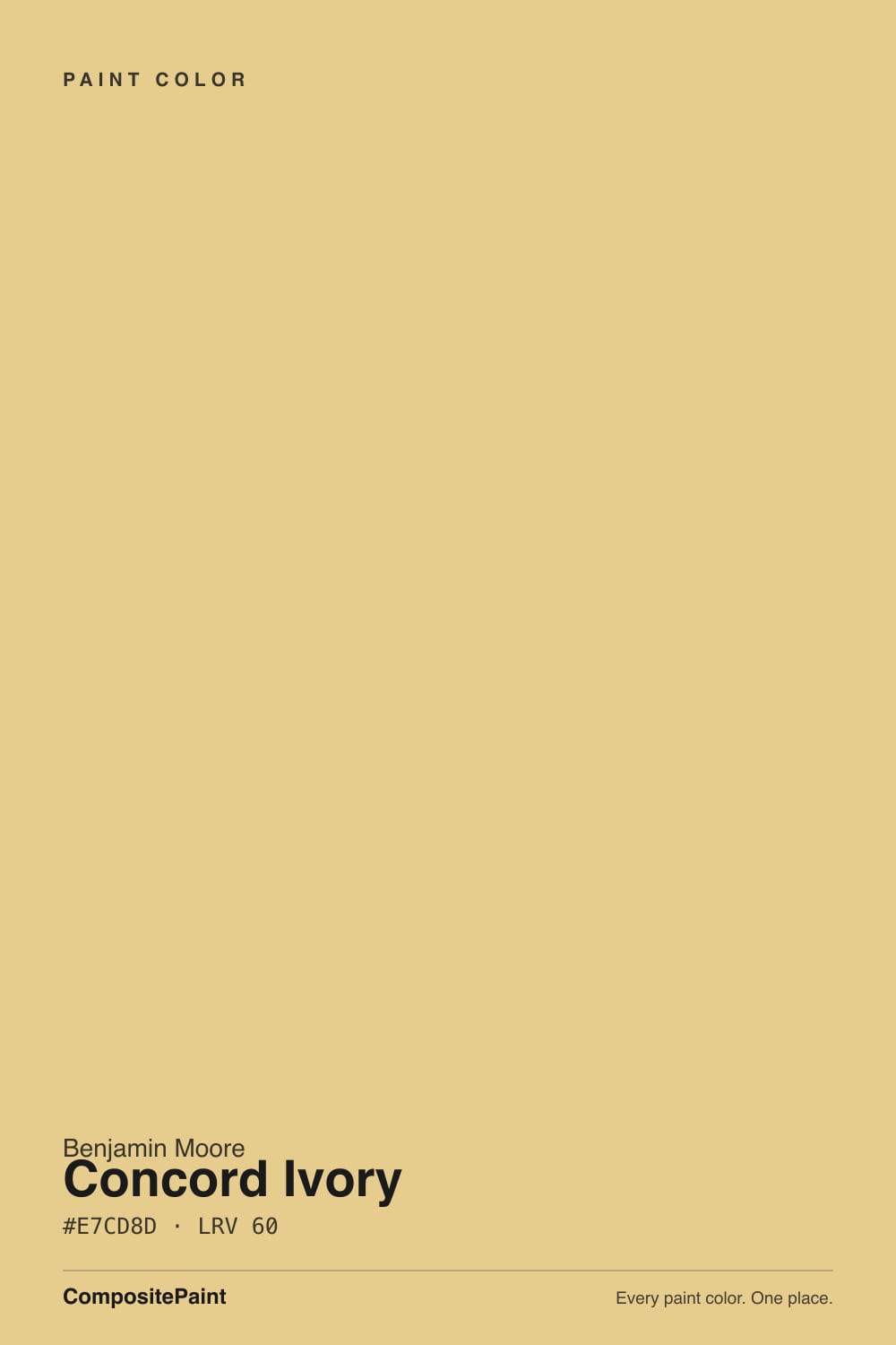
- 1Chilled Wine41
- 2Honey Tea52
- 3Concord Ivory60
- 4Banana Cream71
- 5Lemon Chiffon79
The Fast Verdict
Concord Ivory is a real, saturated golden-yellow with a quiet apricot undertone — not a safe cream wearing a yellow name. Benjamin Moore built it for the Historical Collection, the same family that gave us Hawthorne Yellow, and it is the deepest, most confident of that soft-yellow trio. On a colonial exterior with white trim and a dark door it is one of the best gold siding colors BM sells. On four interior walls in full sun, that same confidence reads mustard fast — this is a color you dose, not a default.
Exterior siding on a colonial or farmhouse-style house · kitchen islands and cabinets with warm wood and brass · dining rooms and center-hall foyers in older homes · anyone who wants a real historic gold, not a beige pretending to be cheerful
You want a soft butter yellow · your room runs on cool LEDs or stays dim most of the day · you already struggle to coordinate warm colors · you were hoping for something closer to beige
- A genuine historic gold with real depth — not a flat, generic yellow
- Holds its color in strong exterior sun better than paler yellows
- One of the classic colonial-farmhouse siding colors with white trim and a dark door
- Reads custom and grounded on a kitchen island or cabinet run
- Part of a well-matched historic yellow family (with Hawthorne Yellow) for easy room-to-room transitions
- Reads noticeably more mustard/gold on four walls than most chips suggest
- Cool LEDs and dim north rooms flatten it into a muddy beige-tan
- Genuinely hard to coordinate — cool grays and blue-whites fight it
- Too saturated for most bedrooms and low-light rooms
What Color Is Concord Ivory, Really?
Benjamin Moore's own description calls Concord Ivory a sophisticated yellow-gold with quiet apricot undertones, and that is accurate for the chip in your hand. It comes out of the Historical Collection — roughly 190 colors researched from American historic landmarks and restoration projects — and it sits in a well-known trio of soft yellows with Hawthorne Yellow and Weston Flax that design bloggers group together for a reason: they share the same apricot-gold family, just at different depths. Concord Ivory is the deepest of the three.
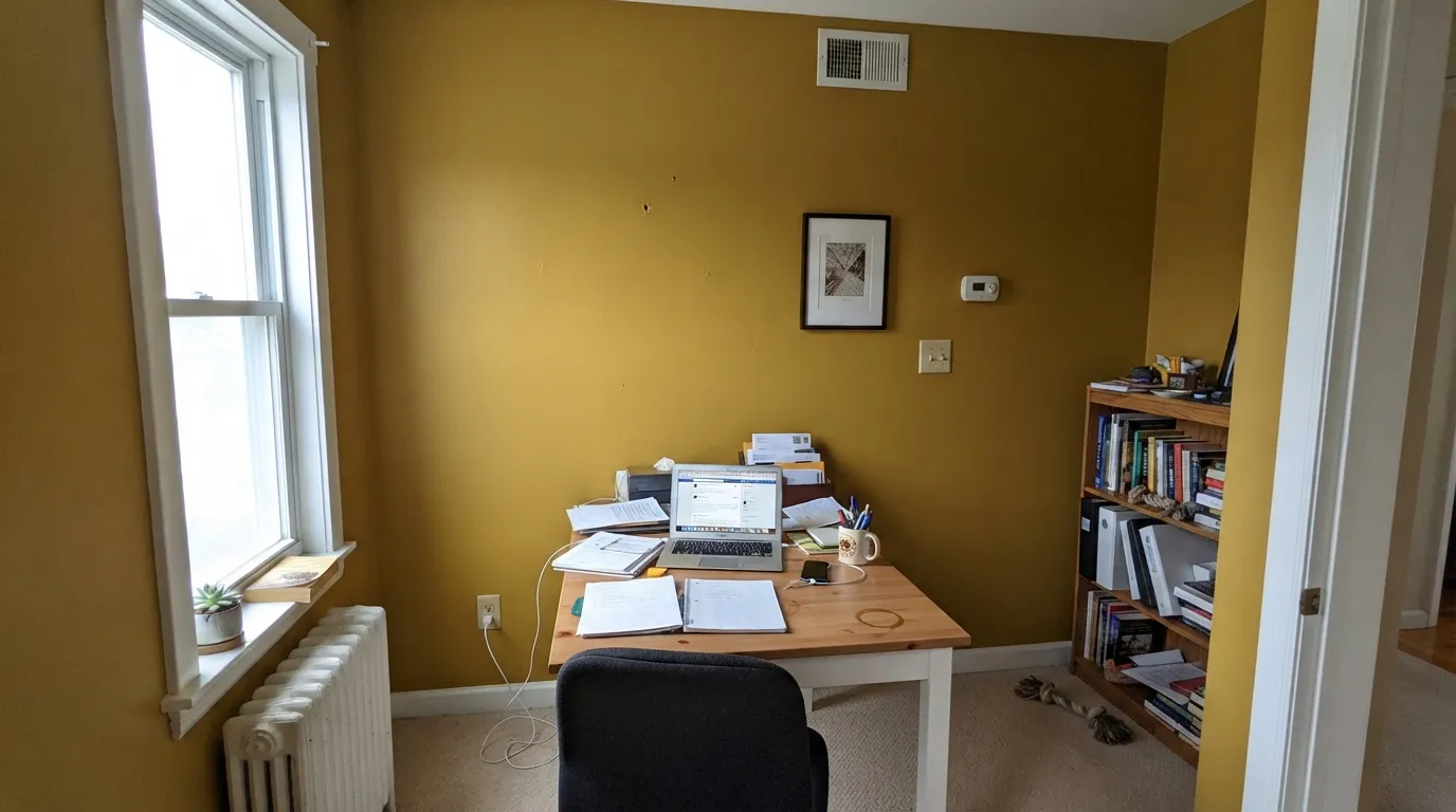
At LRV 60 it is a mid-depth color, not a pastel. That depth is exactly why it holds its gold in bright exterior sun instead of washing out, and why customer reviews split into two camps: some call it "a nice light beige" in low interior light, and Houzz threads describe the exact same paint looking "too yellow and bright" once it is up on real walls. Both are true — the color genuinely shifts that much between a shaded sample and a sunlit wall, more than most colors this deep.
Undertone in one line: golden-apricot, never green, never true orange. If your sample reads close to beige, that is dim or north light doing its job at LRV 60; if it reads like mustard or old gold, that is the same paint in real daylight being exactly as saturated as it actually is.
Where It Shines
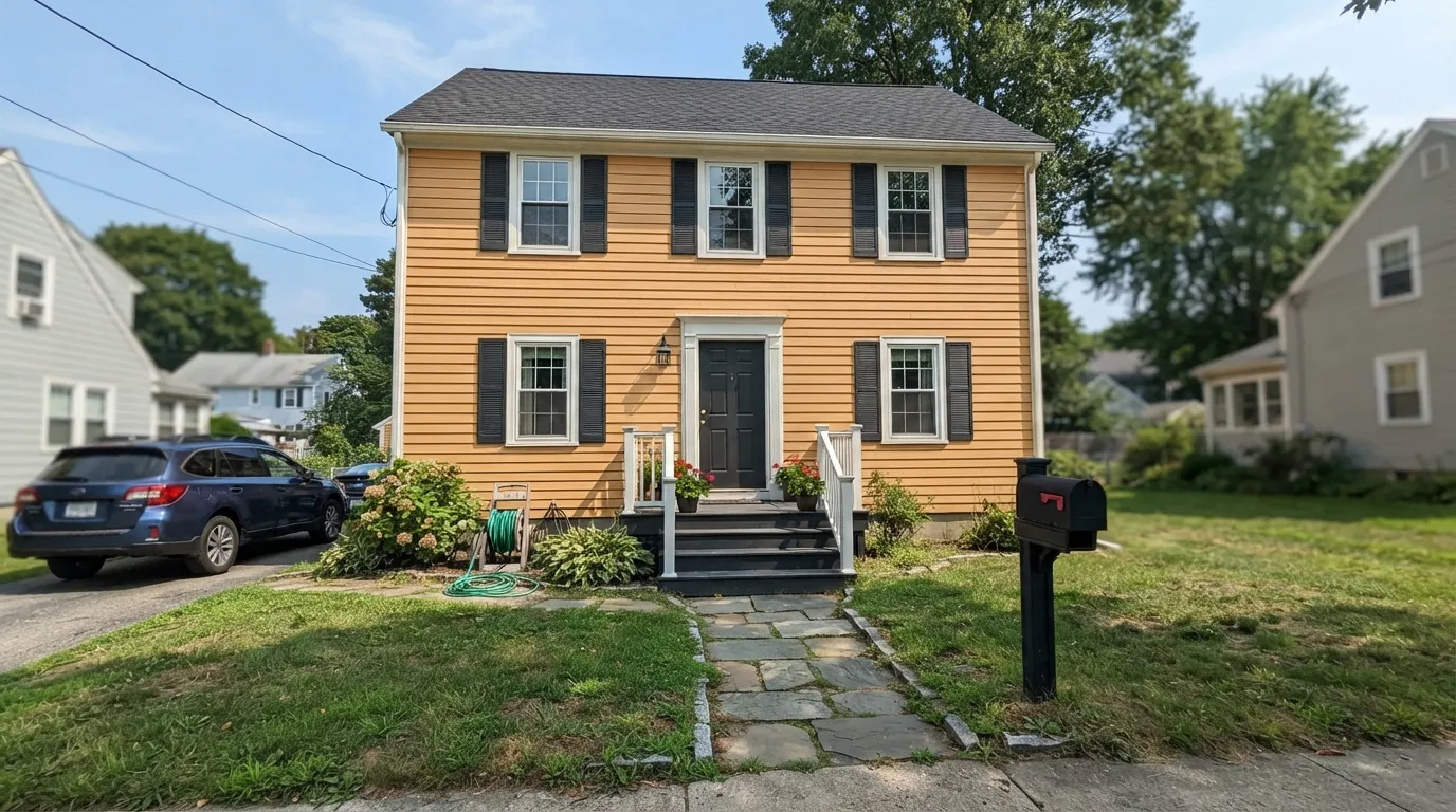
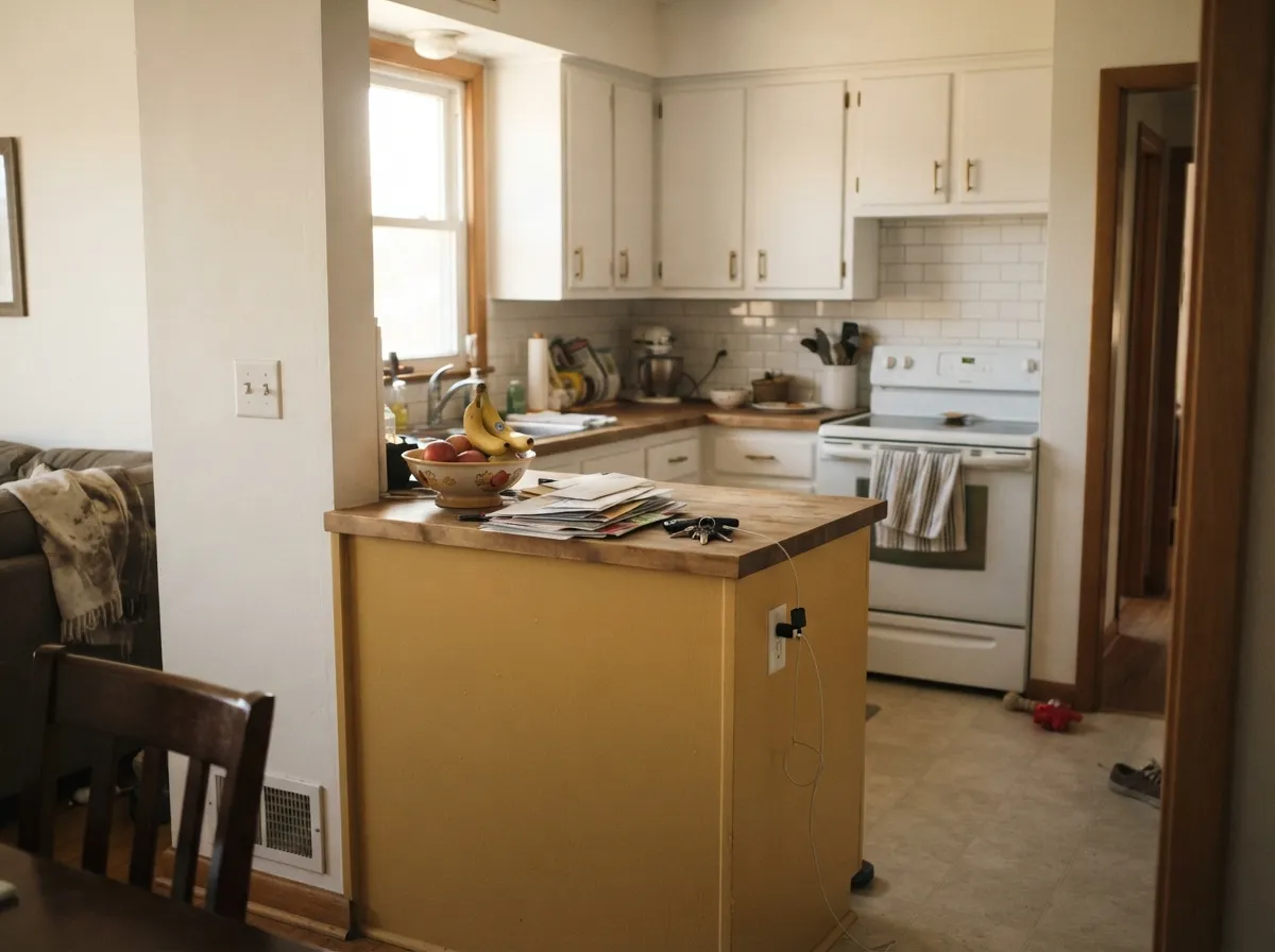
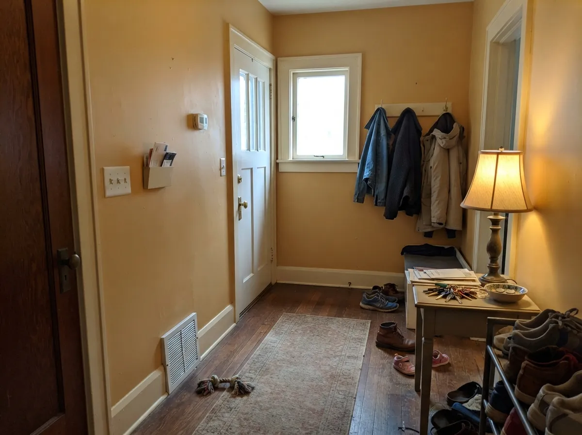
This is fundamentally an exterior and accent color first, a whole-room wall color second. Painted as siding with crisp white trim and a dark door or shutters, it is a genuine colonial-farmhouse classic — real buyers have used it this way with Benjamin Moore Simply White trim and Kendall Charcoal doors and shutters. Indoors, it is at its best in doses: a kitchen island, a foyer, a dining room used mostly at night, anywhere the gold gets to be the accent instead of negotiating with every wall in an open floor plan.
Where It Fails
Almost every regret story about Concord Ivory follows one of three scripts, and none of them are a defect in the paint — they are what happens when a genuinely saturated historic gold gets treated like a safe neutral.
Real owner threads describe exactly this: the chip and the sample chip look like a warm, muted gold, but four walls in real daylight read closer to mustard or old brass. Depth multiplies undertone — this is a known pattern with saturated golds, and Concord Ivory is one of the deeper ones. If you want the soft version, go with the lighter end of the same historic family instead.
Concord Ivory needs warm light to show its apricot side. Under blue-white LEDs or in a north-facing room with little sun, the gold flattens into a dull, slightly muddy beige-tan — nobody's favorite version of a yellow. If the room stays dim most of the day, this is not the color for it.
There is a whole Houzz thread just asking what coordinates with Concord Ivory, and that is not an accident — a real gold this deep argues with cool grays and blue-whites, and a lot of "safe" trim whites turn chalky next to it. Stay warm: warm trim whites, charcoal or bronze accents, wood tones. Cool gray anywhere near it is the most common mismatch.
Room by Room
The color it was practically built for. With white or cream trim and a black, bronze or charcoal door and shutters, it reads as a confident, historic gold-farmhouse exterior. Satin finish; expect it to look brighter and more saturated outdoors than any interior sample suggests.
On an island or a run of lower cabinets under white uppers, with brass hardware and warm wood, it looks custom and grounded. A full kitchen of Concord Ivory walls under bright can lights is where the mustard complaints come from — keep the gold to one surface.
Under warm lamplight and a chandelier it turns rich and golden rather than harsh — a good pick for a room that mostly gets used after dark. Eggshell finish, walnut or dark oak table.
In older, center-hall homes this is close to a period-correct color, and a foyer is a room you pass through rather than sit in all day, which suits how strong it reads. White or cream trim keeps it feeling finished rather than dated.
Workable in a large, bright, warm-toned room with plenty of wood and white trim to balance it, but this is the room where the "too yellow" complaints usually happen. Test a two-foot sample on the wall that gets the least direct sun before committing to all four walls.
A color this saturated and energizing works against what most people want from a bedroom. If you love the family, use Hawthorne Yellow or Weston Flax instead and save Concord Ivory for a room you don't sleep in.
Your Light Is the Risk
This is the light it was built for — the gold glows and the apricot undertone comes through clean. Best case for siding.
The apricot drains out and it goes flat, muddy beige-tan. Test on the darkest wall in your room before committing.
Warmest and most golden at the sun hours, noticeably quieter the rest of the day. Expect real movement, not a subtle one.
2700K lamps push it rich and golden, close to brass. Cool white LEDs dull it toward tan — swap the bulbs before you swap the paint.
Most complaints about Concord Ivory are a light mismatch. Upload a photo of your actual room and see it on your walls — then ask for the same wall in north light or evening lamps before you buy a single sample.
Need It From Another Brand?
Any paint counter can custom-tint Benjamin Moore HC-12 directly. If you would rather stay in one brand's own deck, these are the closest stock matches, measured as ΔE2000. Under 2 is a difference you will not see on the wall.
| Brand | Closest color | ΔE | LRV | |
|---|---|---|---|---|
| Sherwin-Williams | ChartreuseSW 73 · Sherwin-Williams | 4.4 | 64 | Color page → |
| Behr | Lol YellowT12-6 · Behr | 0.4 | 63 | Color page → |
| Valspar | Home Brew8002-24C · Valspar | 0.6 | 61 | Color page → |
| PPG / Glidden | Wayward WindPPG1108-4 · PPG / Glidden | 2.3 | 64 | Color page → |
| Glidden | Vintage Yellow45YY 61/368 · Glidden | 1.3 | 61 | Color page → |
| Dutch Boy | Glimmer of Green221-3DB · Dutch Boy | 1.9 | 62 | Color page → |
Similar Benjamin Moore Colors
The nearest shades to Concord Ivory within Benjamin Moore's own range, ranked by perceptual color distance — useful when you want the same look a touch lighter, darker, or warmer.
WCAG 2.1: AA is 4.5 : 1 for normal text, 3 : 1 for large text, AAA is 7 : 1.
Concord Ivory vs the Colors You're Also Considering
Every Concord Ivory sample board has the same rivals on it. The numbers show the real lightness gap — then it comes down to which risk you would rather live with.
Pick this when you want more confidence and depth than Hawthorne Yellow gives.
Benjamin Moore HC-4 · LRV 71Hawthorne YellowPick this for the lighter, gentler member of the same historic family — if Concord Ivory's depth feels like too much.
Pick this when you want the fuller, unmistakably gold version instead of a soft buff.
Benjamin Moore HC-9 · LRV 53Chestertown BuffPick this for a paler, more neutral buff-yellow that reads almost like a warm beige — the classic center-hall color.
Concord Ivory Coordinating Colors
The rule for coordinating with Concord Ivory is simple: stay warm, and don't fight it with a cool white. It flatters warm trim whites, charcoal and bronze accents, and warm wood tones — and it visibly argues with cool grays and stark blue-whites, which is exactly the pairing question real buyers have gone looking for help with. These are the partners that keep showing up in rooms and exteriors that work:
The Historical Collection's Soft-Yellow Family
Concord Ivory comes out of Benjamin Moore's Historical Collection, a set of roughly 190 colors researched from American landmarks and restoration projects rather than invented for a current trend — which is part of why it reads more like a real pigment and less like a marketing color. Within that collection, design writers have long grouped Concord Ivory with two close relatives, Hawthorne Yellow and Weston Flax, as a trio of soft, apricot-leaning yellows at different depths.
Concord Ivory is the deepest and most confident of the three. That is useful to know before you buy: if a sample of it looks stronger than the soft, muted yellow you had pictured, you have not picked the wrong family — you have picked the boldest member of the right one, and Hawthorne Yellow is the lighter option one step over.
Concord Ivory on Exteriors
Outdoors is where this color does its best work. Full sun reads it brighter and more golden than any interior swatch, and real homeowners have used it as siding with Benjamin Moore Simply White trim and Kendall Charcoal for the door and shutters — a combination that lands as confident colonial-farmhouse rather than dated 1990s builder-yellow.
The same logic that makes it risky indoors makes it work outside: exteriors are viewed from a distance, in constantly shifting light, so the saturation that can feel overwhelming on four close interior walls reads as character on a facade instead. Keep the trim genuinely white or cream, not a warm off-white, or the two colors blur together instead of contrasting.
Three Ready Palettes Built on Concord Ivory
A color is never alone on the wall. These are complete combinations in the 60-30-10 pattern, with the reason each one holds together. Every one opens in the visualizer.
A real combination buyers have used: crisp white trim keeps the gold looking intentional rather than dated, and the charcoal door and shutters give the facade one confident dark note that reads modern-farmhouse, not old-fashioned.
Try this palette in your roomKeeping the gold to the island is how this color earns its keep in a kitchen — White Dove cabinets and walls give it room to be the accent, and Edgecomb Gray carries the warmth into the next room without repeating the yellow.
Try this palette in your roomA period-appropriate combination for an older center-hall home: the gold reads historic rather than trendy against Cloud White trim, and Chelsea Gray on the stair rail or front door anchors the hallway with one grounded dark note.
Try this palette in your roomConcord Ivory FAQ
Is Concord Ivory yellow or beige?
Yellow — a genuine, saturated golden-yellow with an apricot undertone, at LRV 60. In dim or shaded light it can read close to a warm beige, which is where some "it's basically a nice beige" reviews come from, but in real daylight on four walls it is unmistakably gold. If you want actual beige, this is the wrong color.
What's the difference between Concord Ivory and Hawthorne Yellow?
Both are Benjamin Moore Historical Collection soft yellows in the same apricot-gold family, but Concord Ivory (LRV 60) is deeper and more saturated than Hawthorne Yellow (LRV 71). Hawthorne Yellow is the safer, lighter choice for a first-time yellow; Concord Ivory is the fuller-commitment version.
Does it work as an exterior color?
Yes — this is arguably its best use. It is a genuine colonial/farmhouse gold siding color, especially with white or cream trim and a dark door and shutters. Expect it to read brighter and more saturated in outdoor sun than any interior sample suggests.
What goes with Concord Ivory?
Stay warm: warm whites (not stark cool whites), charcoal or bronze accents, brass hardware, and warm wood tones. Cool grays and blue-whites are the most common mismatch — real buyers have specifically gone looking for coordinating colors because this gold is strong enough to fight a cool neutral.
Is it good for kitchen cabinets or an island?
Yes, in doses. An island or a lower cabinet run under white uppers, with brass hardware and warm wood, looks custom rather than dated. A full kitchen of Concord Ivory walls under bright overhead lighting is where the "too yellow" complaints usually come from — let it be the accent, not every surface.
Will it look too bright or too yellow?
It can, and real owner reviews describe exactly that experience once the color is up on full walls in bright light — this is a genuinely saturated gold, not a soft cream. If that risk worries you, sample big before committing, use it as an accent (island, foyer, exterior) rather than a whole-room color, or step down to Hawthorne Yellow.
Have you painted with Concord Ivory?
Rate it — one tap helps the next reader decide.
Ask a Question