Chestertown Buff
The historic golden buff behind countless restored colonials, reviewed honestly: the sun it needs to glow, the light that turns it mustard, and what to pick instead.

Jessica has spec'd whites and neutrals for more than 300 rooms and keeps a sample wall of painted drawdowns in her studio. Every color review is checked against real reader rooms in the comments and re-tested when a formula changes. About the testing process →
- 1Peristyle Brass30
- 2Chilled Wine41
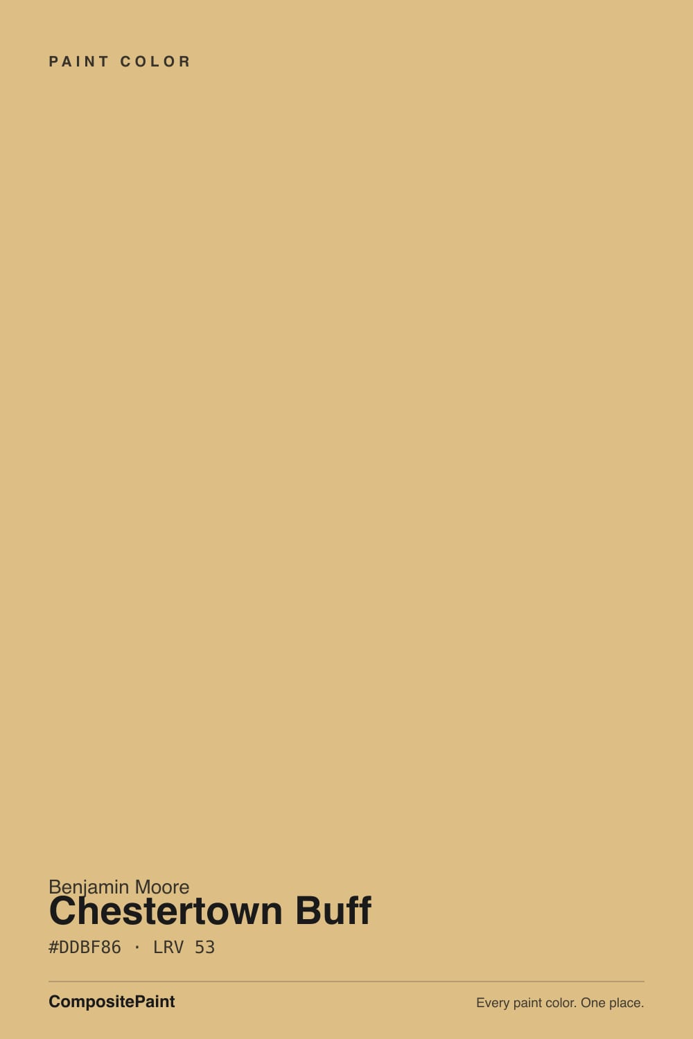
- 3Chestertown Buff53
- 4Jackfruit62
- 5Lemon Chiffon79
The Fast Verdict
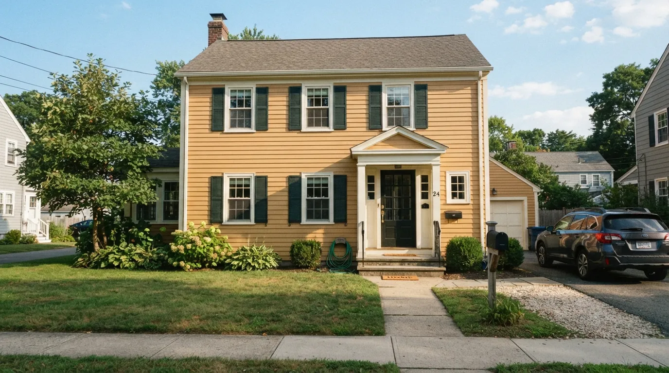
Chestertown Buff is what a lot of people picture when they hear "historic colonial gold": a warm, honeyed buff with real chroma, not a grayed-down neutral tan. Benjamin Moore files it in the Historical Collection, and it earns the label — this is the color on countless restored center-hall colonials and farmhouses, glowing against white trim and dark shutters. Give it real daylight and it looks expensive and period-correct. Starve it of sun and it slides toward flat, dated mustard-khaki fast.
Colonial, farmhouse, and historic-style exteriors with real sun · entryways and center halls · dining rooms with walnut and brass · black, hunter-green, or near-black shutters and doors
Your exterior wall stays shaded most of the day · your brick is pink-toned or your roof is cool gray-blue · you actually want a quiet neutral tan, not visible gold · your room runs on cool white LEDs with no natural light
- Genuine historic gold-buff — glows warm in real sun instead of reading as generic beige
- One of BM's most-used Historical Collection colors for restoring colonial and farmhouse exteriors
- Handsome against white or cream trim and near-black or hunter-green shutters and doors
- Deep enough (LRV 53) to hide dirt, streaking, and shadow lines on a big exterior wall
- Warms up an entry or dining room without the intensity of a true orange or ochre
- Goes flat, dull khaki-mustard fast in shade, overcast light, or a north-facing room
- Reads as real visible gold, not a quiet neutral tan, on a full wall or facade
- Clashes with pink-toned brick and fights cool gray-blue stone or slate roofing
- Cool white LEDs mute the warmth the color depends on
What Color Is Chestertown Buff, Really?
"Buff" is an old American paint term for a warm golden tan, and Chestertown Buff plays it straight: a honeyed, yellow-gold color with real color intensity, not the muted grayed-out tan that word sometimes gets diluted into today. It sits in the Benjamin Moore Historical Collection alongside colors named for early American towns and landmarks, and it wears that history — this is a body color built for clapboard siding, brick trim, and center-hall entries, not a soft accent shade. It has a genuine following among people restoring or repainting colonial and farmhouse-style homes, and Benjamin Moore sells it through its Element Guard exterior line specifically for that job.
At LRV 53 it sits mid-tone, the same reflectance as Manchester Tan, another BM historical warm neutral — but the two read very differently on a wall. Manchester Tan is grayed down and quiet; Chestertown Buff carries far more chroma, so it photographs as "gold" or "honey" long before anyone calls it "tan." That depth is useful on a big exterior wall: it holds its color across a whole facade and hides dirt, shadow lines, and downspout streaking better than a pale exterior white does, which is part of why it has stayed in steady rotation for exteriors.
Undertone in one line: warm golden-yellow with a touch of red-orange — never green, never gray. If your sample reads flat khaki or dull olive, that is an overcast day or cool light doing it, not the paint; if it reads almost amber or orange, that is direct afternoon sun intensifying the same undertone.
Where It Shines
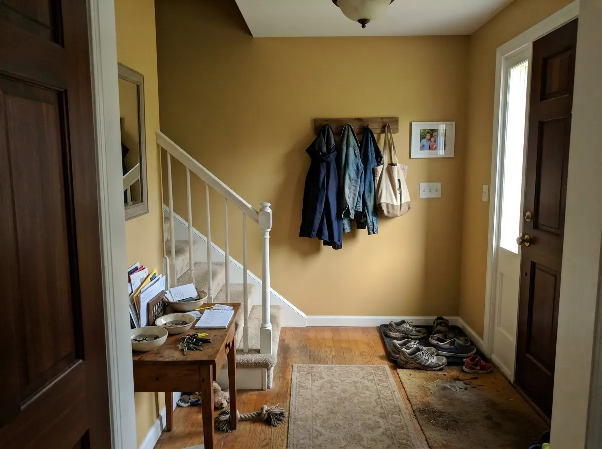
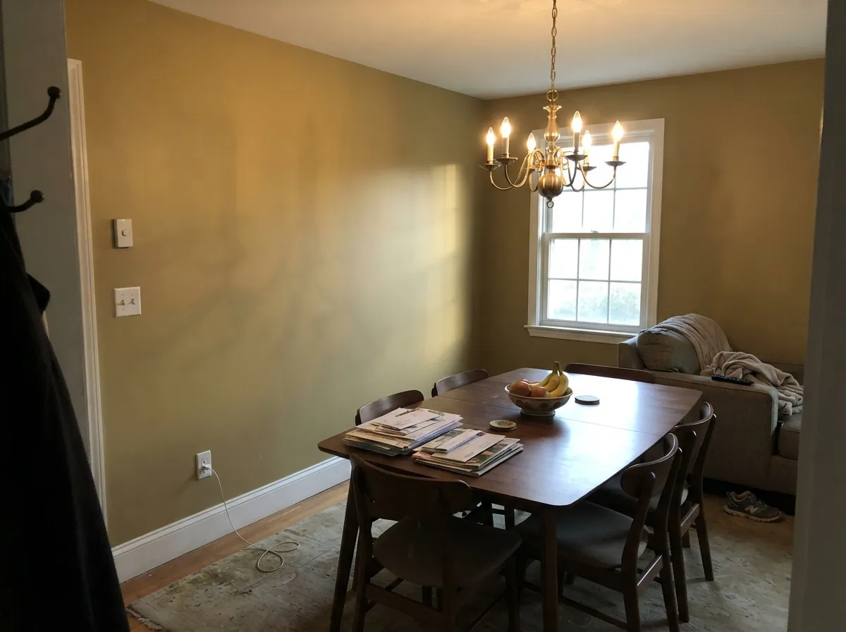
This is a sun-fed color. On a colonial or farmhouse exterior in real daylight it looks exactly like the historic-restoration photos it is famous for — rich, warm, and period-correct against white trim and a dark door. Indoors, its best rooms are the ones with real exposure and warm materials: a center-hall foyer that gets morning light, a dining room with walnut and brass under evening lamps. Give it sun or warm bulbs and wood and brass to play against, and it looks considered rather than dated.
Where It Fails
Nearly every disappointed review of Chestertown Buff traces back to one of three situations, and all three are predictable before the first gallon. None of them are the paint failing — they're the color meeting a light or a material it was never going to win against.
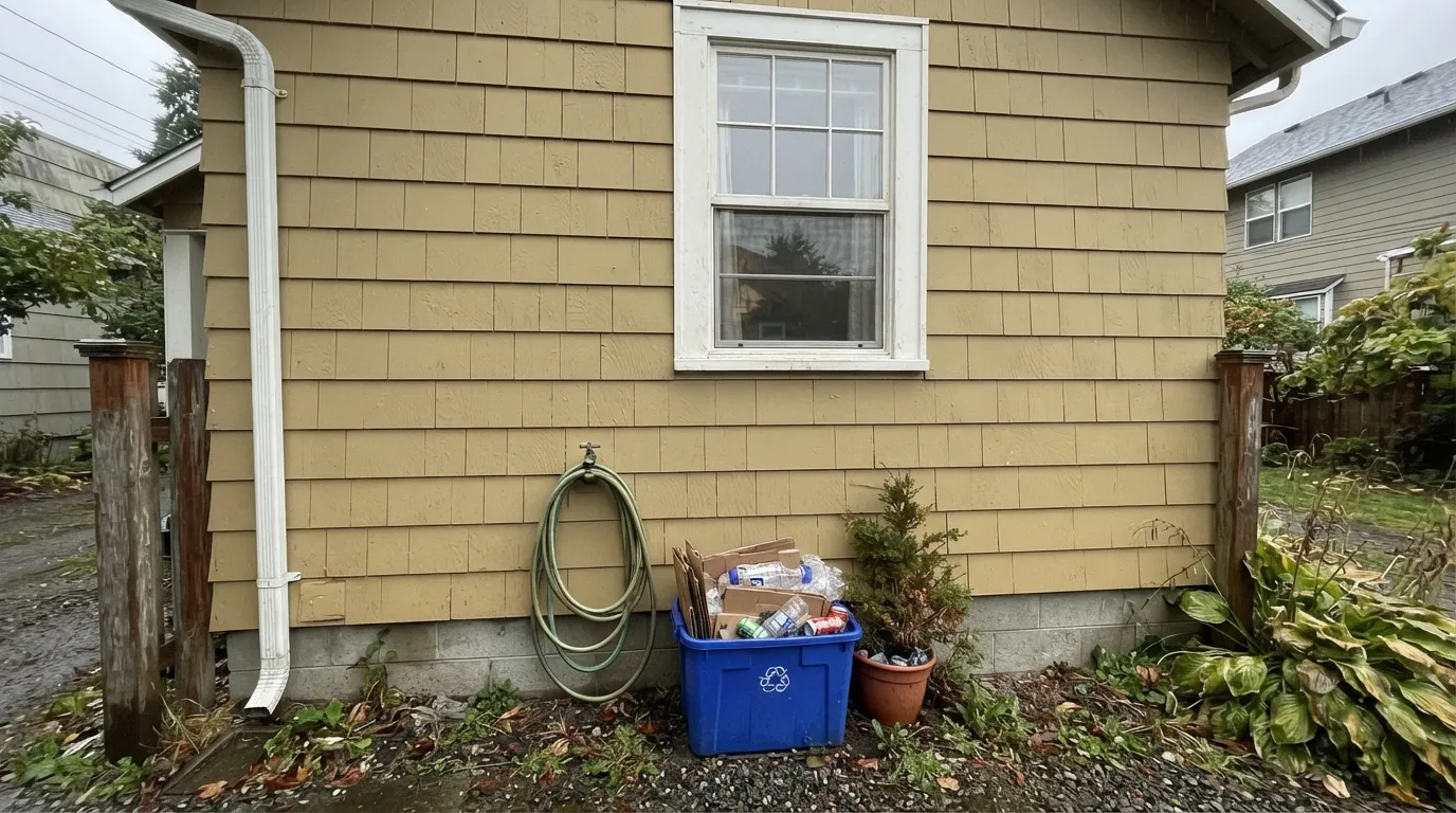
Without direct sun the gold drains out fast and the wall reads flat, dull khaki-mustard — the exact "looks like 90s builder beige" complaint you'll find in paint-store reviews. The color did not fail; the light did. Walk the actual house before committing, and expect the shaded side to read a full step flatter than the sunny side.
This is not a grayed-out greige — it carries real gold chroma, and on four walls or a whole facade that reads as visible color, not "just a warm neutral." If the goal was subtle, this will look louder than the chip promised. Manchester Tan is the quieter, grayer alternative in the same LRV range.
Warm gold siding against pink or salmon-toned brick puts two competing warm undertones next to each other and both lose. A cool blue-gray slate roof or gray stone foundation does the opposite — the temperature clash makes the gold look muddier than it is. Sample a large board against your actual masonry and roofline before ordering paint.
Room by Room
The reason this color exists in the deck. Full sun reads it bright honey-gold; white or cream trim and a dark door or shutters give it the classic colonial contrast. Use Element Guard or another exterior-grade line and expect the shaded elevation to look noticeably flatter than the sunny one.
The color's namesake use. Morning or south light keeps it glowing rather than heavy, and a stair rail or door in near-black or charcoal gives the entry the deliberate, historic-house look.
Under warm lamplight and against walnut and brass it turns rich and formal, closer to a burnished gold than a daytime tan. Eggshell holds up to chair-back scuffs better than matte.
With warm wood cabinetry, butcher block, or brass hardware it is genuinely handsome. With cool white quartz, gray-toned cabinets, or brushed nickel throughout, the gold starts to look like the odd piece out — test a large sample against the actual counters.
Beautiful with leather, walnut shelving, and warm lamp light in a room that gets real exposure. In an open-plan space it has to negotiate with every adjacent room's undertone, so a closed-off den is the safer bet.
It is a saturated, active gold, not a restful neutral — most people who want calm in a bedroom will find it too much color for four walls. It works better as an accent (a headboard wall or a single door) than as the whole room, and it needs warm bulbs to avoid going dull under cool overhead LEDs.
Your Light Is the Risk
The gold reads bright, historic, and alive — the light every exterior photo of this color was taken in.
Cool, indirect light drains the warmth and leaves a flat, dated khaki-mustard. Sample the actual shaded side of the house first.
Low sun intensifies it toward amber for an hour; midday sun gives the truest, most honest read of the buff.
2700K lamps push it richer and more golden. Cool LEDs flatten it toward khaki — swap bulbs before you swap paint.
Most complaints about Chestertown Buff are a light mismatch. Upload a photo of your actual room and see it on your walls — then ask for the same wall in north light or evening lamps before you buy a single sample.
Need It From Another Brand?
Any paint counter can custom-tint Benjamin Moore HC-9 directly. If you would rather stay in one brand's own deck, these are the closest stock matches, measured as ΔE2000. Under 2 is a difference you will not see on the wall.
| Brand | Closest color | ΔE | LRV | |
|---|---|---|---|---|
| Sherwin-Williams | SequinSW 6394 · Sherwin-Williams | 1.4 | 57 | Color page → |
| Behr | Warm Muffin330D-4 · Behr | 1.5 | 55 | Color page → |
| Valspar | Harpswell Green3007-5C · Valspar | 2.0 | 52.7 | Color page → |
| PPG / Glidden | HummusPPG16-10 · PPG / Glidden | 1.3 | 52 | Color page → |
| Glidden | Flaxen Hair30YY 54/306 · Glidden | 0.8 | 54 | Color page → |
| Dutch Boy | Winsome Ecru220-4DB · Dutch Boy | 0.5 | 54 | Color page → |
Similar Benjamin Moore Colors
The nearest shades to Chestertown Buff within Benjamin Moore's own range, ranked by perceptual color distance — useful when you want the same look a touch lighter, darker, or warmer.
WCAG 2.1: AA is 4.5 : 1 for normal text, 3 : 1 for large text, AAA is 7 : 1.
Chestertown Buff vs the Colors You're Also Considering
Every Chestertown Buff sample board has the same rivals on it. The numbers show the real lightness gap — then it comes down to which risk you would rather live with.
Pick this when you want the gold to actually show — Manchester Tan is deliberately muted by comparison.
Benjamin Moore HC-81 · LRV 53Manchester TanPick this if you want the same mid-tone depth but grayed down into a quieter, truer neutral tan.
Pick this for the deeper, more historic exterior weight Golden Straw doesn't carry.
Benjamin Moore 2152-50 · LRV 70Golden StrawPick this for a lighter, airier wheat-gold that reads more like a warm wall color than a body-color statement.
Chestertown Buff Coordinating Colors
The rule for coordinating with Chestertown Buff: warm whites and true darks, never cool grays or icy blues. It's a body color built for contrast — a crisp warm-white trim, a hunter-green or near-black shutter and door, and it reads instantly historic. These are the partners that keep showing up on real restored colonials and farmhouses:
Chestertown Buff On Exteriors
This is where Chestertown Buff does its most famous work. It sits in the Benjamin Moore Historical Collection, a lineup built around America's historic architecture, and Benjamin Moore sells it through the Element Guard exterior line specifically for siding, trim, and clapboard jobs — this is a working exterior color, not just an interior accent that happens to be sold outdoors.
Sun exposure decides the result more than anything else. A south- or west-facing elevation in full sun reads bright, honeyed gold and photographs like the historic-restoration images the color is known for. The same paint on a shaded north elevation or under heavy tree cover reads a full step flatter and duller — plan to sample the actual shaded side of the house, not just the sunny front, before committing to gallons.
Masonry and roofing set the other half of the equation. Warm brown or tan brick, cedar shake, and wood-toned roofing are natural partners. Pink or salmon brick competes with the gold instead of complementing it, and a cool gray-blue slate or asphalt roof can make the buff look muddier by contrast — both are worth testing with a large sample board against the real materials before painting the whole house.
Chestertown Buff With Wood Tones and Brass
Indoors, the pairing logic is simple: warm materials agree with it, cool ones argue. Walnut, oak, and other warm wood tones sit comfortably against the gold, and unlacquered brass or aged bronze hardware looks like it was chosen on purpose rather than by accident.
Cool white oak, gray-washed floors, and chrome or polished nickel fixtures are the pairing that needs a sample first — those cooler finishes can make the buff look slightly heavier and more mustard-toned by contrast. It isn't a dealbreaker in every room, but it's worth testing a large swatch against the actual floor and hardware before painting a full room in this color.
Three Ready Palettes Built on Chestertown Buff
A color is never alone on the wall. These are complete combinations in the 60-30-10 pattern, with the reason each one holds together. Every one opens in the visualizer.
Gold body, warm white trim, deep hunter-green shutters and door — this is the archetypal Mid-Atlantic colonial combination, and it's why Benjamin Moore's own styling guides pair this exact buff with a hunter-toned green rather than a black.
Try this palette in your roomA soft cream trim keeps the gold glowing instead of stark, and the charcoal door supplies the single dark, grounding note that a bright center hall needs so it doesn't feel like one flat wash of color.
Try this palette in your roomGold walls and a navy accent balance warm against cool, and both flatter brass hardware and walnut furniture — a classic formal-dining pairing that reads considered rather than matchy.
Try this palette in your roomChestertown Buff FAQ
Is Chestertown Buff yellow or tan?
It reads as gold or honey before anyone calls it plain tan. The undertone is warm yellow with a touch of red-orange, and it carries real color intensity — this is not the grayed-down neutral tan that word usually means today. If you want that quieter neutral, Manchester Tan is the closer match.
What trim color goes with Chestertown Buff?
A soft warm white — White Dove or Swiss Coffee — keeps the gold glowing instead of making it look dirty by contrast. For doors and shutters, near-black (Kendall Charcoal, Wrought Iron) or a deep hunter green gives the classic colonial contrast; a stark bright white can make the buff look slightly yellowed next to it.
Does it work on a brick exterior?
With tan, brown, or red-brown brick it's a natural, harmonious match. With pink or salmon-toned brick the two warm undertones compete and both look worse for it — sample a large board against the actual brick before ordering paint.
Is it a good whole-house exterior color?
Yes — this is arguably its primary job, and part of why Benjamin Moore offers it through the Element Guard exterior line. At LRV 53 it hides dirt and shadow lines better than a pale exterior color, though the shaded side of the house will read noticeably flatter than the sunny side, so walk the property with a sample first.
What shutter color goes with Chestertown Buff siding?
Dark green (a true hunter green) or near-black are the two classic choices. Hunter green leans period-correct and historic; near-black or true black reads a touch more crisp and modern. Both hold up better than a mid-tone shutter color, which tends to disappear against the gold.
Will it look dated, like 90s builder beige?
Only in the wrong light. The 90s-beige complaint almost always comes from a shaded wall or an overcast day, where the gold drains to flat khaki-mustard. In real sun, with warm white trim and a dark door or shutters, it reads historic rather than dated — that pairing is the whole difference.
Have you painted with Chestertown Buff?
Rate it — one tap helps the next reader decide.
Ask a Question