Calico Blue
A Classics-collection color that calls itself blue but reads green-black on the wall, reviewed honestly: the light it needs to prove its name, the rooms where it just disappears, and what to pick instead.

Jessica has spec'd whites and neutrals for more than 300 rooms and keeps a sample wall of painted drawdowns in her studio. Every color review is checked against real reader rooms in the comments and re-tested when a formula changes. About the testing process →
- 1Rookwood Shutter Green4
- 2Calico Blue9
- 3Sage Green22
- 4Evergreen Fog30
The Fast Verdict
Calico Blue is a near-black at LRV 9 that spends most of its life looking like a very dark, slightly warm charcoal — and only reveals the blue-green underneath when direct light or a gloss finish catches it. The name oversells the blue: on the wall it is greener than it is blue, closer to a deep bottle-green with a cool cast than to anything you'd point to and call "navy." Nobody sampling it for a trendy blue statement wall should buy it on the name alone. Buy it for what it actually is: a quiet, well-made near-black with more personality than plain charcoal, at its best on a gloss cabinet or a sunlit front door.
Kitchen islands and cabinets in real light · a powder room or vanity that can afford to go dark · a front door or shutters with direct sun · anyone who wants a near-black with more depth than flat charcoal or true black
You are buying it hoping for an actual blue wall · your room is dim, north-facing, or matte-only · you want to paint all four walls with no lighter partner · you're chasing a color with real design-world fame behind it
- Real depth and undertone once it gets gloss or direct light — more interesting than flat charcoal or true black
- Formulated and sold for cabinets: BM's own Advance high-gloss enamel line carries it
- Classics collection formula — a stable, long-tested color, not a one-season trend
- Small, high-light doses (island, door, vanity) are low-risk and high-payoff
- Reads as a sophisticated near-black rather than plain black on trim and doors
- The name promises blue; the pigment delivers green first — a real mismatch for buyers searching for blue
- In matte sheen and ordinary light it mostly just reads black, not blue or green
- No design-world fame, no coordinated marketing, no ready-made pairing guide beyond BM's own two suggestions
- Whole-room, no-contrast use reads like a cave rather than a designed dark room
What Color Is Calico Blue, Really?
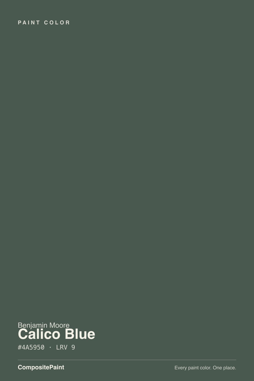
Do the math on the hex and the name gets awkward: #4A5950 breaks down to a green channel that outranks the blue channel, which outranks red. That is a green-blue, and the green wins. Benjamin Moore's own copy calls it "a dark, traditional hue that offers a unique blending of blue and green," which is honest enough, but on four walls or a chip in daylight most people read it as a deep, cool-leaning bottle green first and a whisper of blue second — not the reverse the name implies. It lives in the Classics® Color Collection, BM's long-running library of historical-feeling colors, not in a Color of the Year lineup or a designer press release. There is no famous room behind Calico Blue, no viral before-and-after, no Reddit thread arguing about it. It is exactly what an honest, unglamorous workhorse color looks like: solid, tested, and completely unmarketed.
At LRV 9 it sits in true near-black territory — one step darker than Hale Navy's LRV 6 is not the comparison; Calico Blue is closer in depth to Blue Note and Narragansett Green, both LRV 8–9 colors that also need real light to prove what family they belong to. In flat matte sheen under ordinary room light, Calico Blue reads as a very dark, faintly warm charcoal-black more often than it reads as either blue or green. The color only opens up under two conditions: strong direct daylight, or a gloss sheen that catches and bounces light across the surface. That second condition is not incidental — Benjamin Moore sells Calico Blue in its Advance high-gloss enamel, the line built for cabinets and trim, which tells you where the brand actually expects this color to work.
Undertone in one line: green first, a cool blue whisper second, never a true navy. If your sample reads flatly black with no color at all, that's normal for an LRV 9 color in ordinary indoor light — it is not a defect. If it reads muddy or slightly brown, that's incandescent bulbs warming a cool-based dark color; switch to a neutral-white LED and the green-blue comes back.
Where It Shines
Give it gloss and real light and Calico Blue stops being an anonymous near-black and turns into a genuine, deep green-blue with actual dimension — more interesting than flat charcoal, less severe than true black. Cabinets are the job it was formulated for: BM sells it through the Advance high-gloss enamel line specifically built for kitchens and vanities, and gloss is exactly the sheen that lets a dark color like this show its undertone instead of just absorbing light. An island, a vanity, or a front door in full sun is where the color actually earns the word "blue" in its name — small, gloss, well-lit surfaces, not broad matte walls.
Where It Fails
Almost every disappointed story with a color this dark follows the same three scripts, and all three are predictable before the first coat goes on. None of them are a defect in the paint — but if your plan matches one of these, this is not your color.
The name says Blue; the pigment load says green first. If you searched "blue paint" and landed here expecting a navy statement wall, you will be disappointed the moment the first coat dries. For an actual blue at this depth, look at Blue Note or Van Deusen Blue instead — both keep a real blue cast where Calico drifts green.
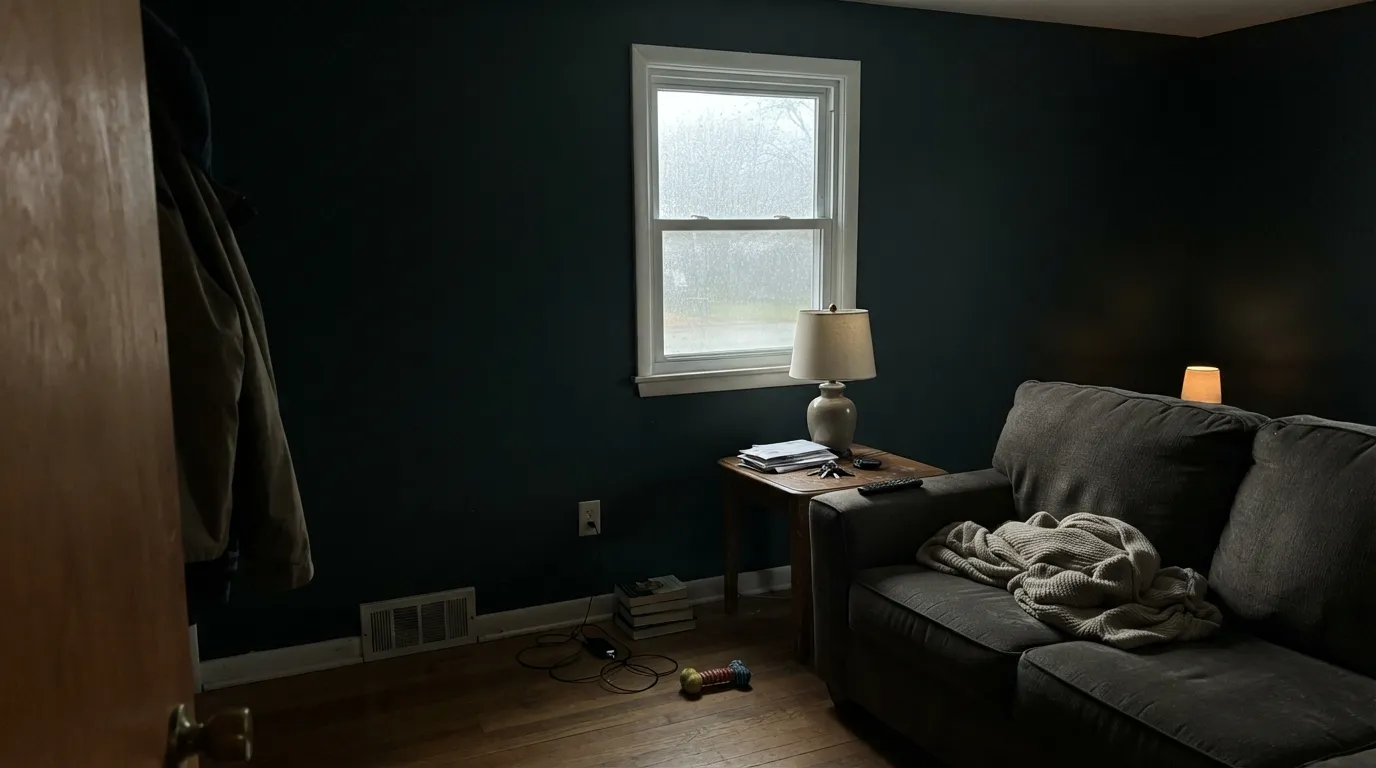
At LRV 9, matte finish plus indirect or north light is the recipe for a wall that reads flat, featureless black — no green, no blue, just dark. The color isn't failing; it simply has no light to work with. Either move it to a room with real daylight or switch to a gloss or semi-gloss enamel that can bounce what light there is.
A near-black on every wall with no white trim, no light ceiling, no contrast reads like a cave rather than a moody, intentional room. This color needs a partner — White Heron trim, a pale ceiling, or confining it to one wall or one cabinet run — to read as a design choice instead of an accident.
Room by Room
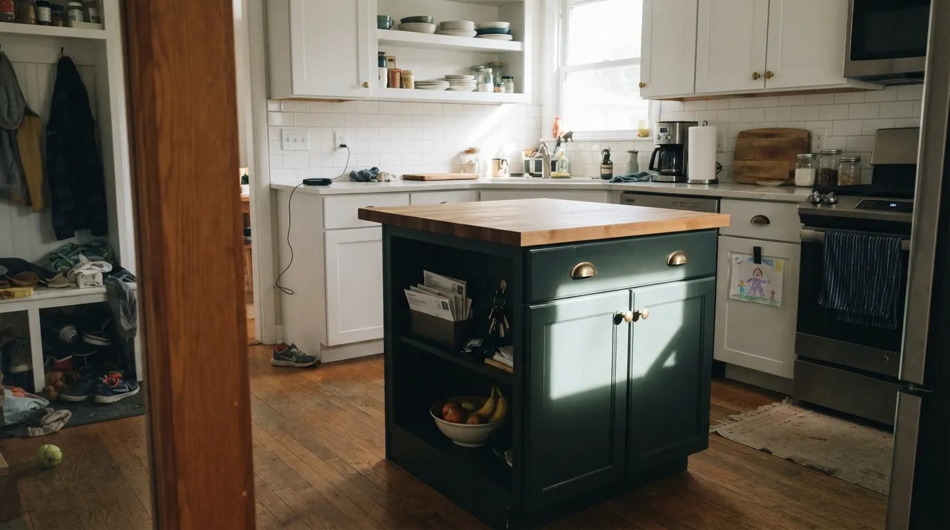
Gloss Advance enamel on an island, under real kitchen light, with white perimeter cabinets around it, is where Calico Blue actually looks like the color on its own name. Semi-gloss minimum; the high-gloss Advance line is the honest choice for a surface that gets touched daily.
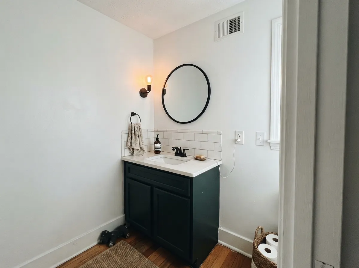
Small rooms take near-black well, and a powder room rarely needs the whole-day daylight a living room does — a single sconce or vanity light is often all it gets anyway. Pair with a white ceiling and trim so the room reads jewel-box, not closet.
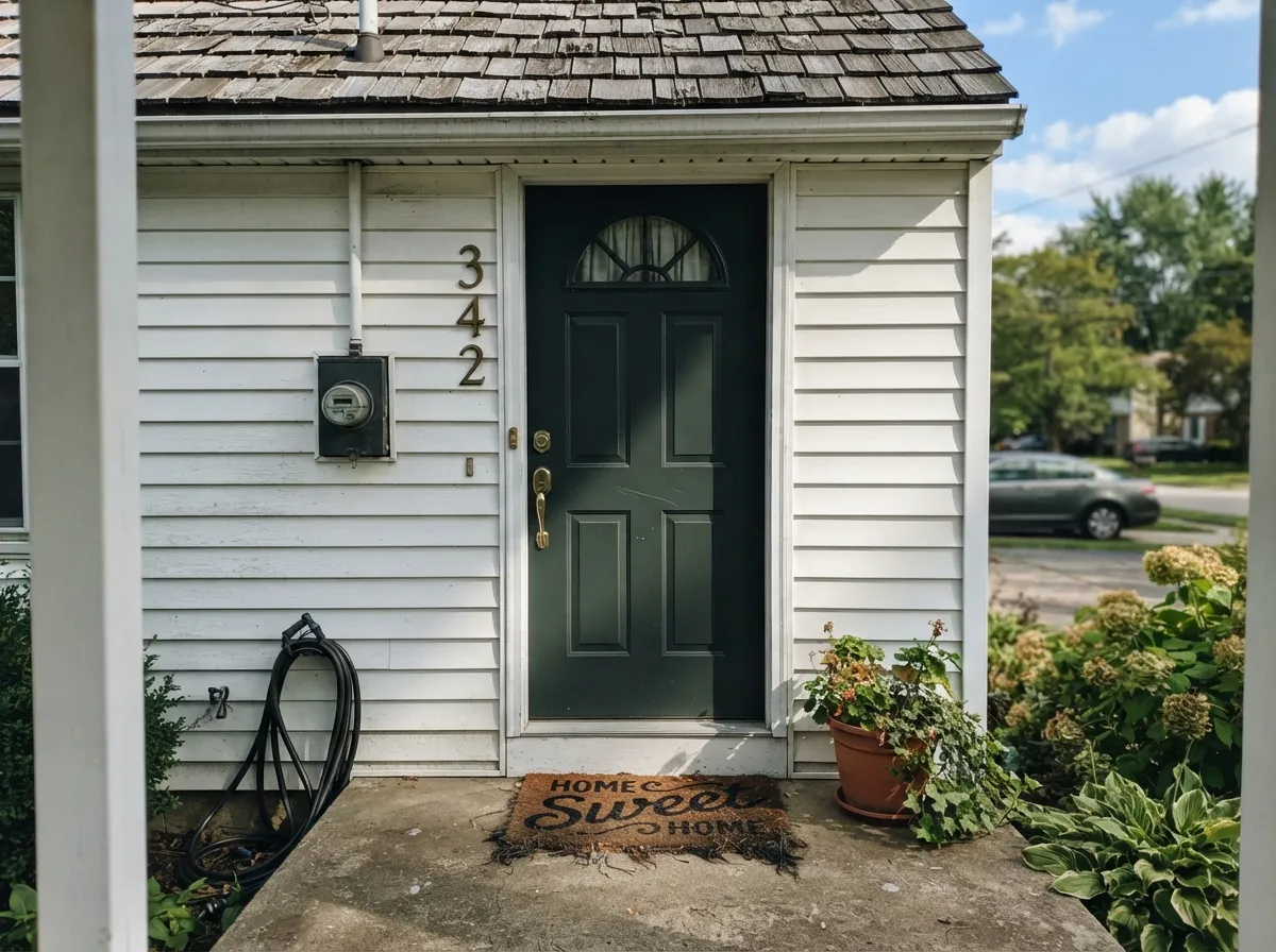
Full sun is the light this color asks for, and a front door gets it more reliably than most interior walls. On a white or pale-gray house it reads as a deep, sophisticated near-black-blue rather than plain black — more character, same low-maintenance darkness.
Warm lamp light plus leather and walnut makes this color feel grounded and quiet, closer to a dark forest tone than a blue one. If you go in expecting green-black moodiness rather than navy, it delivers exactly that.
One accent wall with a lighter partner color on the rest works; four walls of Calico Blue with no contrast is the cave scenario in the fails section above. If you want this much depth on every wall, budget for real windows and a pale ceiling.
Behind a headboard or on a single wall it reads cozy and dark rather than oppressive. As a whole-room color it needs the same daylight-and-contrast conditions as the living room — most bedrooms, with smaller windows, don't have it.
Your Light Is the Risk
Full daylight hitting a high-gloss cabinet or door is the only light where this color reliably shows both the green and the blue at once. This is the light to sample it in.
Indirect, cool daylight on a matte wall leaves almost no color signal — just a very dark, flat near-black. Don't judge the color from a north room; it isn't showing you anything there.
Morning or afternoon direct sun briefly pulls out real blue-green depth at the window wall; the far side of the same room stays near-black all day. Expect the color to look like two different paints in one room.
Warm 2700K lamps push it toward a muddy, brownish black. Neutral or cool-white LEDs keep the cool green-blue cast intact after dark — the opposite of most colors in this deck.
Most complaints about Calico Blue are a light mismatch. Upload a photo of your actual room and see it on your walls — then ask for the same wall in north light or evening lamps before you buy a single sample.
Need It From Another Brand?
Any paint counter can custom-tint Benjamin Moore 707 directly. If you would rather stay in one brand's own deck, these are the closest stock matches, measured as ΔE2000. Under 2 is a difference you will not see on the wall.
| Brand | Closest color | ΔE | LRV | |
|---|---|---|---|---|
| Sherwin-Williams | Billiard GreenSW 16 · Sherwin-Williams | 2.0 | 9 | Color page → |
| Behr | Secluded WoodsS420-7 · Behr | 0.9 | 9 | Color page → |
| Valspar | Jade Sea8003-36F · Valspar | 1.3 | 9 | Color page → |
| PPG / Glidden | Dark Green VelvetPPG1136-7 · PPG / Glidden | 0.9 | 10 | Color page → |
| Glidden | Dark Green VelvetPPG1136-7 · Glidden | 1.1 | 10 | Color page → |
| HGTV Home by Sherwin-Williams | Coriander & OliveHGSW 3251 · HGTV Home by Sherwin-Williams | 2.3 | 8 | Color page → |
Similar Benjamin Moore Colors
The nearest shades to Calico Blue within Benjamin Moore's own range, ranked by perceptual color distance — useful when you want the same look a touch lighter, darker, or warmer.
WCAG 2.1: AA is 4.5 : 1 for normal text, 3 : 1 for large text, AAA is 7 : 1.
Calico Blue vs the Colors You're Also Considering
Every Calico Blue sample board has the same rivals on it. The numbers show the real lightness gap — then it comes down to which risk you would rather live with.
Pick this for the version that at least keeps a whisper of blue in gloss and strong light, even if the name oversells it.
Benjamin Moore HC-157 · LRV 8Narragansett GreenPick this if you'd rather the name and the color agree — Narragansett is sold as a green and reads as one, no blue promised or delivered.
Pick this when green is fine with you and you'd rather have the older, more traditional Classics pedigree.
Benjamin Moore 2129-30 · LRV 9Blue NotePick this if you actually want the wall to read blue — Blue Note commits to navy where Calico Blue drifts toward green.
Within Benjamin Moore the neighbors are close but not interchangeable. Goodwin Green CW-555 at #435851 and LRV 9 and Crisp Romaine 686 at #445851 and LRV 9 are both slightly greener and less gray. Garden Cucumber 644 at #3E5C53 and LRV 9 is the most clearly green of the group. Dark Pewter 2122-10 at #4B5756 and LRV 9 is the most neutral, and Mediterranean Teal 2123-10 at #465956 and LRV 11 is a touch lighter and more blue-leaning.
Across brands, PPG Dark Green Velvet PPG1136-7 at deltaE 0.88 and Behr Conifer ECC-45-3 at deltaE 0.99 are effectively the same color. Valspar Jade Sea 8003-36F at deltaE 1.29 is visually identical in normal room light. Sherwin-Williams Billiard Green SW 16 at #45584D and deltaE 2 is very close, so sample first.
Further out, Farrow and Ball Grove Green No. G17 at deltaE 3.27 and Magnolia Home 1905 Green JG-151 at deltaE 3.53 are close but visibly different side by side.
Calico Blue Coordinating Colors
The safe rule with Calico Blue is to let a clean white or warm neutral carry the light the color can't provide on its own, and to reach for near-black metals and matte finishes rather than anything that competes with its own low-key depth. These are the partners that keep the color legible instead of swallowing it:
Why Calico Blue Never Became a Trend
Calico Blue's low, three-digit SKU (707) marks it as an old entry in Benjamin Moore's deck, sitting in the Classics® Color Collection alongside dozens of similarly quiet historical colors that never got a Color of the Year push or a designer press cycle. There is no famous room, no viral before-and-after, no wave of Houzz threads — searching for it turns up product pages and color-matching tools, not opinions.
Part of that obscurity is the name working against it. Shoppers browsing for a blue paint color are searching for blue, and a color that reads green-black in most light simply doesn't show up on their radar or match their expectations when it does. Its real audience is narrower and more practical: it's sold through Benjamin Moore's Advance high-gloss enamel line, positioned as a cabinet and trim color rather than a statement wall color — a workhorse doing a job, not a trend chasing attention.
Calico Blue With Wood Tones and Metals
Because it reads as a near-neutral near-black in most light, Calico Blue is more forgiving with wood than brighter blue-greens are. Pale white oak, walnut, and butcher block all sit comfortably against it — the color is dark enough that it doesn't fight for undertone attention the way a lighter teal would. Honey oak is the one floor to sample carefully; a strongly orange floor can make the color's green side look slightly muddier by contrast, though the effect is subtler than it would be on a brighter green.
Metals are unusually easy here. Unlacquered brass and warm bronze read rich against it, matte black nearly disappears into it, and — unlike most colors in the green-blue family — polished chrome and nickel don't fight it either, because a color this dark and low-chroma reads closer to neutral than to a true saturated hue. That flexibility is part of what makes it a dependable, if unglamorous, cabinet and trim color.
Three Ready Palettes Built on Calico Blue
A color is never alone on the wall. These are complete combinations in the 60-30-10 pattern, with the reason each one holds together. Every one opens in the visualizer.
The white walls and warm perimeter cabinets flood the room with the daylight this color needs, and the high-gloss finish on the island does the rest — catching light across the surface so the green-blue actually shows instead of reading flat black.
Try this palette in your roomA small room takes a near-black well, and the crisp white ceiling keeps it from tipping into cave territory. Wrought Iron fixtures and a mirror frame nearly disappear into the wall color at a glance, then separate cleanly under the vanity light — brass hardware is the finishing touch.
Try this palette in your roomDirect sun is the light Calico Blue was built for, and a front door reliably gets more of it than an interior wall. Against warm white siding and trim, the door reads as a deep, sophisticated green-blue instead of plain black — a quieter alternative to a navy or true-black door.
Try this palette in your roomCalico Blue FAQ
Is Calico Blue actually a blue paint color?
Not really — the pigment leans green first, with only a whisper of blue underneath. Benjamin Moore's own description calls it a blend of blue and green, but on a wall or chip in normal light, most people read it as a deep, cool bottle-green before they read it as blue. If you want an honest near-black blue, Blue Note or Van Deusen Blue commit to the color the name promises here.
Is Calico Blue good for kitchen cabinets?
Yes, and it's built for exactly that — Benjamin Moore sells it in the Advance high-gloss enamel line made for cabinets and trim. Gloss is what lets a dark, low-LRV color like this show its green-blue undertone instead of just reading as black. An island or lower cabinets under real kitchen light is its best use.
What white goes with Calico Blue?
Any of BM's clean whites work — White Heron and Chantilly Lace keep the pairing crisp and let the near-black carry all the color. Warmer whites like White Dove or Swiss Coffee soften the contrast slightly and suit an exterior or a warm-wood kitchen better than a stark gallery look.
Will Calico Blue look black in a dim room?
Largely, yes. At LRV 9, indirect or north-facing light on a matte wall leaves the color with almost nothing to reflect, and it reads as a plain dark charcoal-black rather than blue or green. Direct sun or a gloss sheen are the only reliable ways to see the actual undertone.
Is it a good front door color?
Yes — better outdoors than on most interior walls, because a front door usually gets the direct sun this color needs. In full sun it reads as a deep, quietly sophisticated green-blue rather than flat black, and it holds up well in high-gloss exterior enamel against a white or pale house.
Is Calico Blue a popular or trending color right now?
No — and that's worth saying plainly. It has no Color of the Year history, no viral design moment, and almost no online discussion. It's a Classics-collection color that Benjamin Moore quietly keeps in the deck and sells through its cabinet-paint line. That makes it a safe, undated choice for a small surface, not a color you're picking to chase a trend.
Have you painted with Calico Blue?
Rate it — one tap helps the next reader decide.
Ask a Question