Blue Heather
The dusty blue-violet Benjamin Moore calls Blue Heather, reviewed honestly: the light that keeps it blue, the light that turns it hazy lilac, and the trim that decides which one you get.

Jessica has spec'd whites and neutrals for more than 300 rooms and keeps a sample wall of painted drawdowns in her studio. Every color review is checked against real reader rooms in the comments and re-tested when a formula changes. About the testing process →
The Fast Verdict
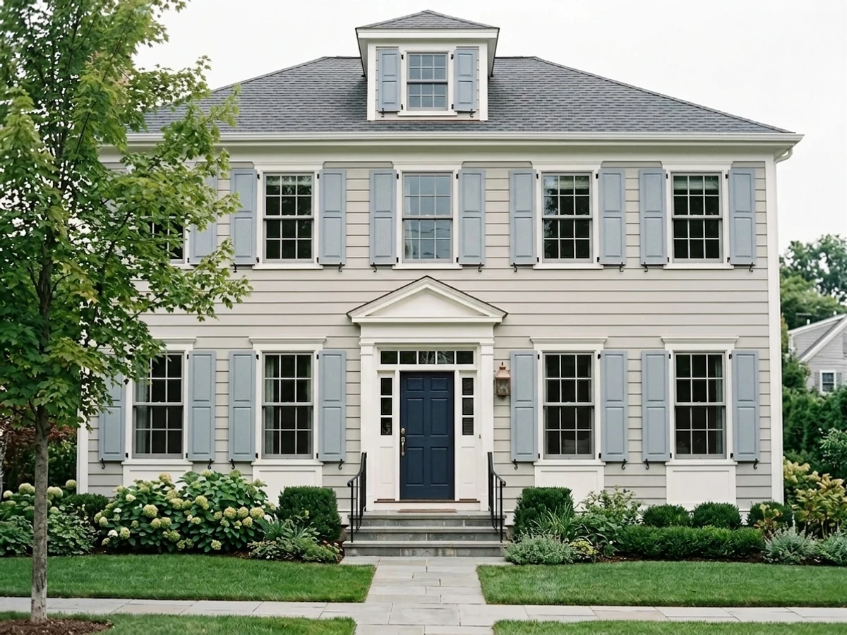
Blue Heather is a slate blue with a real violet undertone riding underneath it — not a gray wearing a blue name, and not a lavender wearing a blue one either. In daylight with a crisp white trim it reads exactly like its name: heathered, dusty, calm. Take the crisp trim away, or take the sun away, and the balance tips: warm cream trim pulls the violet forward into something closer to chalky lilac, and a north-facing room on an overcast day does the same thing from the other direction. It is a genuinely good bedroom blue that asks for two specific things in return.
Bedrooms and studies that want calm without going cold · powder rooms and small vanities as a jewel-box color · anyone circling gray-blue but wanting the room to actually read as blue · rooms that already have crisp white trim
You want a true blue with zero violet in it · your trim is warm cream, honey oak, or otherwise yellow-leaning · your only light is a dim north window and you skip lamps · you picked it off a swatch strip next to Heather Gray without checking the actual chip
- A genuine blue with a real violet undertone — not a gray pretending to be interesting
- Mid-depth (LRV 51) holds its color without the commitment of navy
- Restful, heathered bedroom mood without reading cold
- Excellent as a small-room or single-surface color — vanities, islands, doors
- Pairs beautifully with crisp white trim, walnut, and brass
- North light and overcast days pull the violet forward into a hazy lilac, not the clean blue the chip shows
- Warm cream or honey trim turns it chalky instead of blue-gray
- Easy to confuse by name with other BM "Heather" and "Gray" colors that are entirely different
- Full kitchens and open-plan living rooms need real daylight to carry it well
What Color Is Blue Heather, Really?
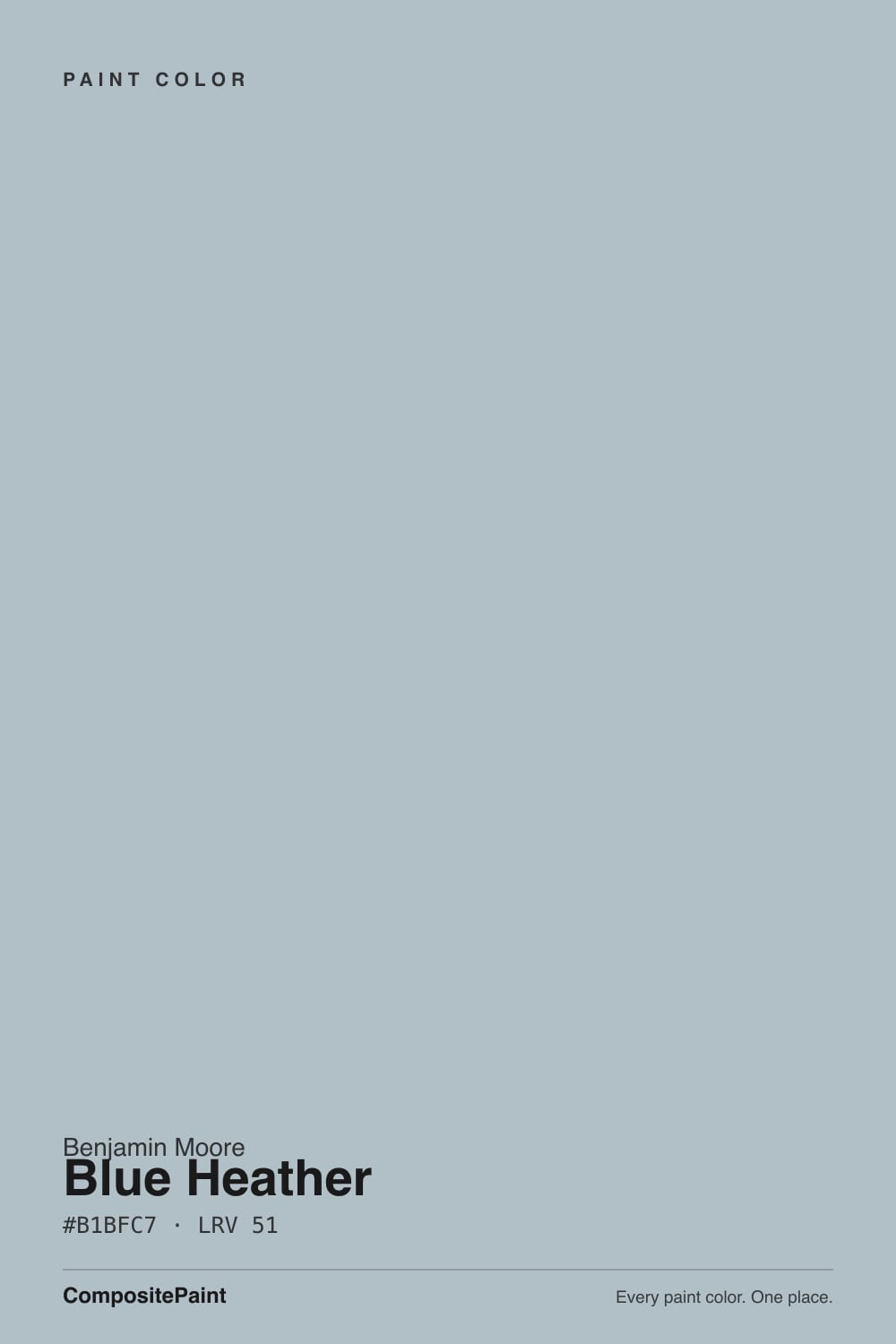
Blue Heather is Benjamin Moore's name for a soft slate blue with a genuine violet undertone — the "heather" in the name is doing real work, not just poetry. It sits in the Classics range under SKU 1620, and unlike a straight gray-blue, it never fully lets go of the lavender underneath. That is the whole personality of the color: enough blue to read as blue, enough violet to feel dusty and a little romantic instead of clinical.
At LRV 51 it sits well above true navy territory (Hale Navy is LRV 6) and above a lighter blue-gray sibling like Boothbay Gray (LRV 36), which puts it in genuine mid-tone country — deep enough to feel like a decision on the wall, light enough that a room does not go cave-dark without help. Plan for the wall to read a shade more saturated than the paint chip promises, the way every mid-depth color does once it covers four walls instead of a two-inch square.
Undertone in one line: blue first, a whisper of violet close behind — rarely green, never truly warm. If your sample looks flat and gray, warm light and warm trim are flattening the blue; if it looks hazy and lilac, cool cloudy light is pulling the violet forward. Both are the same paint, reacting honestly to two very different rooms.
Where It Shines
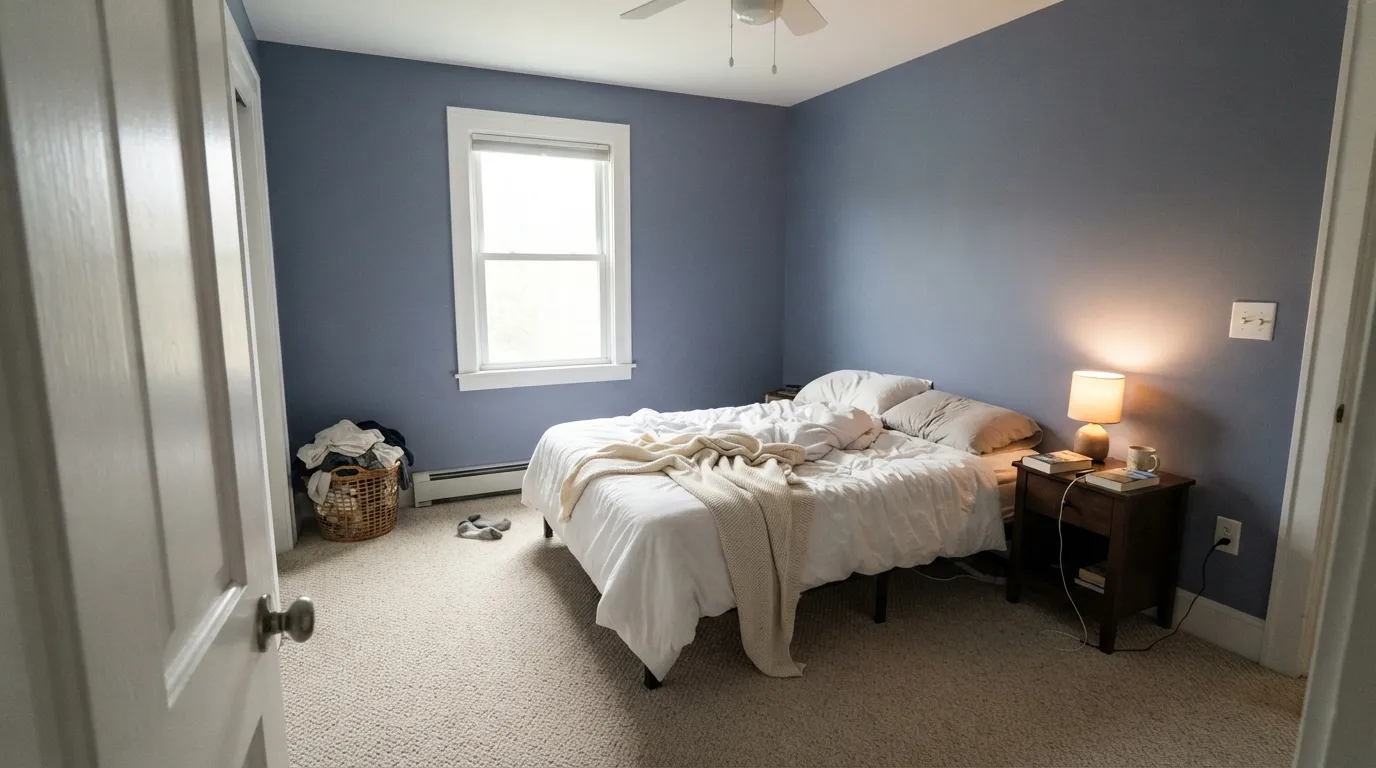
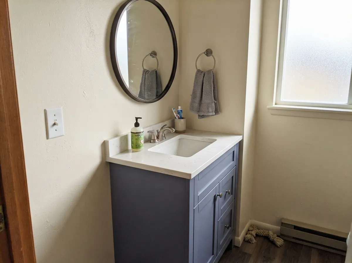
Give it a crisp white trim and real daylight and Blue Heather does exactly what its name promises: a soft, heathered blue-violet that reads restful rather than moody. Bedrooms are its home base — the depth is enough to feel enveloping without the commitment of navy, and the violet keeps it from reading cold the way a straight blue-gray can. Small rooms are its second calling: a powder room or a single vanity in Blue Heather, framed by white and a dark mirror, reads like a deliberate styling choice rather than an accident.
Where It Fails
The complaints about Blue Heather split into two honest categories — one about light, one about trim — and both are predictable before the first coat goes on. Neither is the paint's fault, but if your room matches one of these, sample big before you commit.
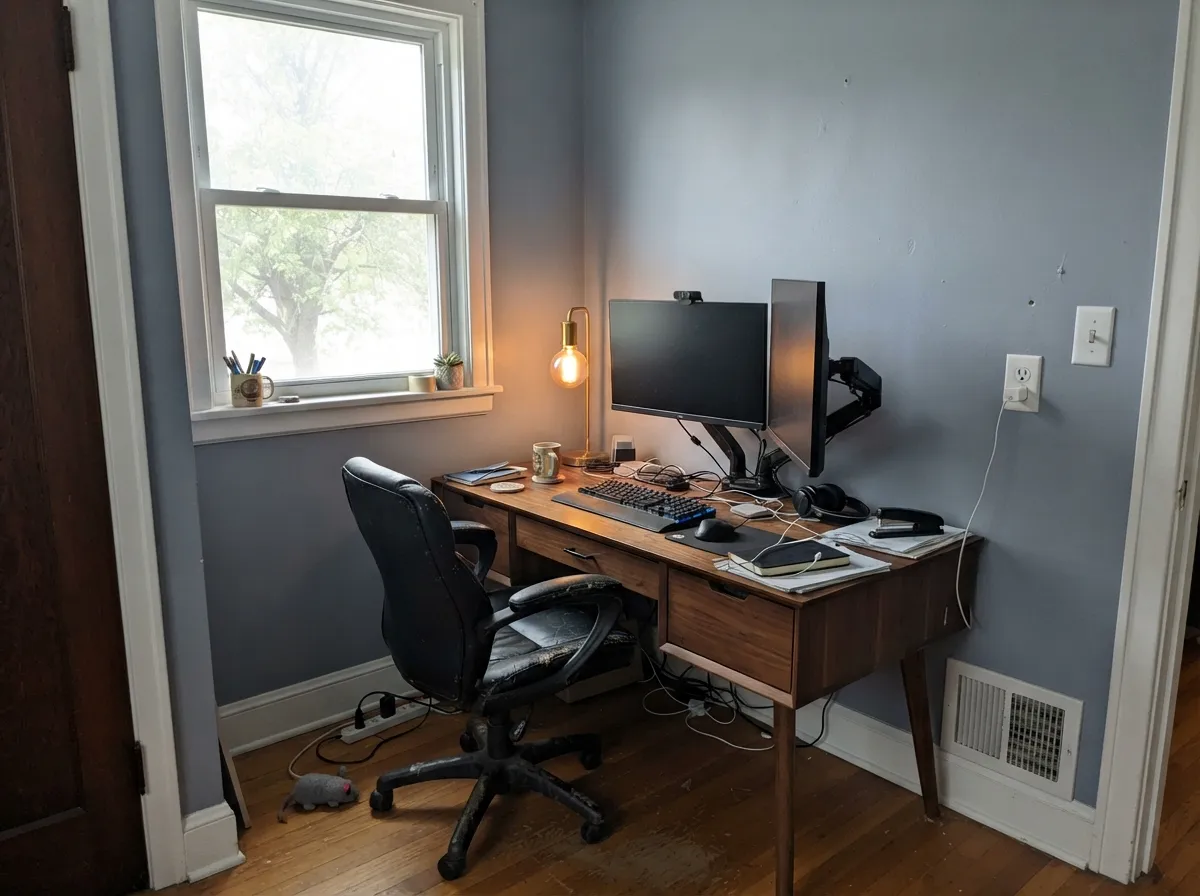
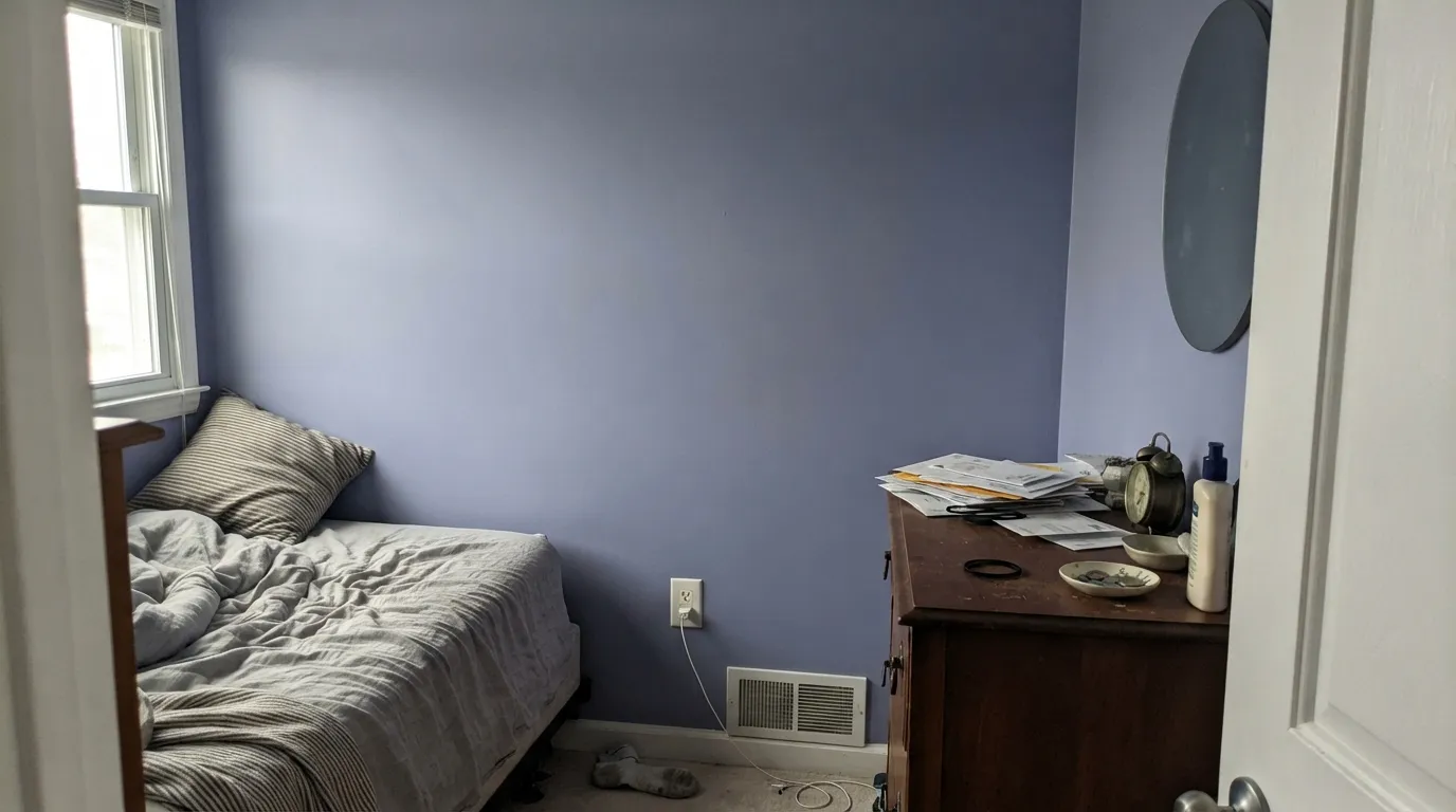
This is the opposite problem most blue-grays have. Cool, flat daylight does not just mute Blue Heather — it pulls the violet forward and the wall goes hazy, almost lilac, less clearly "blue" than the chip suggested. If your room only gets soft north light, sample a large board and look at it on a gray afternoon before you buy gallons, and plan on lamps to pull it back toward blue at night.
On a paint chip next to a stack of grays, Blue Heather can pass. On four walls the blue-violet is unmistakable — depth and coverage always amplify undertone. If "gray with a hint of something" is the actual goal, Boothbay Gray reads far closer to neutral; save Blue Heather for when you want the color to be the point.
Pair Blue Heather with a warm, creamy trim white and the violet reads chalkier and less resolved — the two undertones argue instead of agreeing. A crisp white trim (Chantilly Lace, Simply White) is what keeps the wall reading blue-gray instead of dusty purple; this is the single most fixable mistake with this color.
Room by Room
The depth without the darkness of navy, and the violet keeps it from feeling cold at night. Matte or eggshell on the walls, crisp white trim, and it earns its "heather" name — calm, a little romantic, never sterile.
Focused rather than sleepy, especially with walnut or oak furniture and brass hardware to warm it up. Good for a room used mostly in daylight, since evening bulbs can mute the blue toward gray.
A single small room or a vanity cabinet in Blue Heather, framed by crisp white walls and a dark mirror, reads custom without repainting a whole house on a mood color.
Works beautifully in a closed room with abundant south or west light and crisp trim. Riskier in an open plan, where it has to negotiate with whatever warm neutral the kitchen is already wearing.
On an island under white uppers and white counters it is a confident, current choice. A full kitchen in this depth of blue-violet is a bigger bet, and it fights honey-oak floors the same way any blue-violet does.
Reads crisper and more saturated in full sun than indoors — closer to a straightforward blue-gray. On a shaded, north-facing elevation it can pick up the same hazy-violet cast the interior does; sample on the actual wall before committing to the whole facade.
Your Light Is the Risk
Clean, dusty blue-violet, balanced between the two undertones — the read the paint chip actually promises. Sample here first.
Cool, flat daylight pulls the lavender forward and the wall goes hazy and less clearly blue. The one light that surprises buyers who expected a straightforward gray-blue.
Cooler and bluer in morning light, softer and slightly more violet as the light warms toward evening. A gentle shift, not a different color.
Warm 2700K lamps can mute it toward a soft, slightly muddy gray-blue rather than making it glow the way they do for warm neutrals. Cool LEDs keep it crisper and closer to the daytime read — the opposite of the usual "warm bulbs help" rule.
Most complaints about Blue Heather are a light mismatch. Upload a photo of your actual room and see it on your walls — then ask for the same wall in north light or evening lamps before you buy a single sample.
Need It From Another Brand?
Any paint counter can custom-tint Benjamin Moore 1620 directly. If you would rather stay in one brand's own deck, these are the closest stock matches, measured as ΔE2000. Under 2 is a difference you will not see on the wall.
| Brand | Closest color | ΔE | LRV | |
|---|---|---|---|---|
| Sherwin-Williams | KryptonSW 6247 · Sherwin-Williams | 2.9 | 52 | Color page → |
| Behr | OzonePPU13-14 · Behr | 2.2 | 51 | Color page → |
| Valspar | Shark Loop4007-3B · Valspar | 1.0 | 50.8 | Color page → |
| PPG / Glidden | Ocean DrivePPG1040-3 · PPG / Glidden | 0.6 | 50 | Color page → |
| Glidden | Ocean DrivePPG1040-3 · Glidden | 0.6 | 50 | Color page → |
| Dutch Boy | Chromed434-2DB · Dutch Boy | 2.9 | 52 | Color page → |
Similar Benjamin Moore Colors
The nearest shades to Blue Heather within Benjamin Moore's own range, ranked by perceptual color distance — useful when you want the same look a touch lighter, darker, or warmer.
WCAG 2.1: AA is 4.5 : 1 for normal text, 3 : 1 for large text, AAA is 7 : 1.
Blue Heather vs the Colors You're Also Considering
Every Blue Heather sample board has the same rivals on it. The numbers show the real lightness gap — then it comes down to which risk you would rather live with.
Pick this when you want the color to actually read as blue-violet, not just a gray with a whisper of one.
Benjamin Moore HC-165 · LRV 36Boothbay GrayPick this if you want blue-gray that reads gray first and violet barely at all — Boothbay stays close to neutral where Blue Heather leans lavender.
Pick this for the violet secret Upward doesn't have — Blue Heather leans lavender, Upward stays a cleaner, plainer blue.
Sherwin-Williams SW 6239 · LRV 39UpwardPick this if your painter only stocks Sherwin-Williams — a dusty blue with its own light-dependent trap worth testing first.
Pick this for warmth: the lavender undertone makes Blue Heather friendlier with wood and brass than Santorini's cooler green-blue.
Benjamin Moore 1634 · LRV 45Santorini BluePick this for the greener, more Aegean-coastal read — Santorini skips the violet Blue Heather leans into.
Pick this for a room that doesn't have abundant light — Blue Heather's LRV 51 works where Hale Navy needs real daylight to avoid going cave-dark.
Benjamin Moore HC-154 · LRV 6Hale NavyPick this if you want full commitment — a true navy at LRV 6 instead of a mid-tone blue-gray.
Athabasca CC-816 shares the exact same hex value, #B1BFC7, and the same LRV of 51. On a wall the two are indistinguishable, so pick whichever your dealer has on hand. Thundercloud Gray 2124-40 at LRV 50 and hex #B8BDC0 is the neutral version of the same idea: same lightness, much less blue.
Across brands the matches are unusually tight. Farrow and Ball Parma Gray No. 27 at #B0BEC6 and LRV 50 lands at a deltaE of 0.26, which is a true match. PPG and Glidden Ocean Drive PPG1040-3 at 0.57 is the same story. Valspar Shark Loop 4007-3B at 1.01 and Rodda Kefi R097 at 1.13 are visually identical in normal room light.
Further out, Behr Ozone PPU13-14 at 2.23 and Sherwin-Williams Krypton SW 6247 at LRV 52 and 2.9 are very close but worth sampling first. Dunn-Edwards Silver Springs DE6346 drops to LRV 47, so it is close but visibly darker side by side.
Blue Heather Coordinating Colors
The rule for coordinating with Blue Heather: crisp whites, not creamy ones, and let the violet do the warming instead of the trim. It pairs cleanly with cool-toned neutrals and gets along with walnut and brass without needing a warm off-white to soften it. These are the partners that keep showing up in rooms that work:
A Quiet Workhorse, Not a Trend Color
Blue Heather has never had a Color of the Year moment and isn't tied to a famous room or a viral before-and-after. It has simply sat in Benjamin Moore's Classics range doing steady work as a dusty, restful blue for people who want a bedroom or a small room with real color instead of another gray. That quiet history is part of why it is a safe pick now: it isn't riding a trend it will fall off of, and the dusty-blue bedroom look it fits has stayed in fashion for years, not months.
The one genuine trap in its history is its own name. Benjamin Moore's deck also includes Heather Gray (2138-40), a different, more neutral gray-green color with no blue-violet lean at all — and shoppers searching "heather" or browsing swatch cards by name alone regularly end up comparing the wrong two chips. Confirm the SKU (1620) before you buy, not just the word on the strip.
Blue Heather With Wood Tones and Floors
Cool, dark woods are this color's best company: walnut, espresso, and ebonized oak all let the violet read as intentional and rich rather than washed-out. Pale or gray-washed white oak is safe and keeps the overall room light and current.
The one wood to be careful with is honey or golden oak. Yellow-orange sits opposite blue-violet on the color wheel, so a strongly golden floor and Blue Heather walls tend to fight — the floor reads more orange, the wall reads more purple, and neither side wins. A large area rug helps if the golden floor is staying put; otherwise, a lighter neutral like Boothbay Gray gives a similar mood with less friction.
Metals follow the same logic as the trim rule: brushed nickel, chrome, and matte black all read cleanly against it, while very warm brass can occasionally nudge the wall's violet forward the same way a warm cream trim does — not a dealbreaker, just worth a glance at the sample together.
Three Ready Palettes Built on Blue Heather
A color is never alone on the wall. These are complete combinations in the 60-30-10 pattern, with the reason each one holds together. Every one opens in the visualizer.
Two depths of the same blue family, separated by a crisp warm white, keep the room layered instead of matchy. Hale Navy supplies the one dark note the scheme needs without fighting Blue Heather's violet lean.
Try this palette in your roomA cream wall keeps the small room airy while the vanity carries the color; Wrought Iron's near-black frame gives the scheme one deliberate dark note so it reads styled, not accidental.
Try this palette in your roomGray Owl shares the same cool, quiet family, so a Blue Heather den or a run of Blue Heather doors reads like the same house going a shade deeper — not a clashing accent. White Dove trim ties every room back together.
Try this palette in your roomBlue Heather FAQ
Is Blue Heather blue or gray?
Blue, with a real violet undertone underneath. On a small chip it can pass for a plain gray-blue, but on four walls the blue-violet is unmistakable. If you actually want gray with barely a hint of color, Boothbay Gray is the closer match.
Is Blue Heather warm or cool?
Cool overall, but not icy — the violet gives it a soft, slightly romantic edge that a straight blue-gray lacks. It leans cooler still in north light and warms up a touch in direct afternoon sun.
What trim white goes with Blue Heather?
A crisp white — Chantilly Lace or Simply White — keeps the wall reading blue-gray. A warm cream trim pulls the violet forward into something closer to chalky lilac, which is the most common styling mistake with this color.
Is it good for a bedroom?
Yes — it's arguably the room it's built for. The mid-depth (LRV 51) feels enveloping without navy's darkness, and the violet keeps it calm rather than cold. Pair with crisp white trim and don't rely on very warm bulbs to make it glow; it doesn't need that the way a beige does.
Does Blue Heather work with honey oak floors?
Not its best pairing. Blue-violet colors generally clash with golden, honey-toned wood the same way any cool color fights a strongly yellow-orange floor. Walnut, white oak, and gray-washed floors are safer company.
Is Blue Heather the same as Heather Gray?
No — a common mix-up by name only. Benjamin Moore's Heather Gray (2138-40) is a different, more neutral gray-green color with no blue-violet lean. Double-check the actual chip and SKU (1620) before you buy, not just the word "heather."
Have you painted with Blue Heather?
Rate it — one tap helps the next reader decide.
Ask a Question