Vine Leaf
Behr's deep, gray-cast forest green, reviewed honestly: the light it needs to prove it's green, the rooms where it turns near-black, and what to pick instead.

Jessica has spec'd whites and neutrals for more than 300 rooms and keeps a sample wall of painted drawdowns in her studio. Every color review is checked against real reader rooms in the comments and re-tested when a formula changes. About the testing process →
- 1Hunter Green5
- 2Vine Leaf10
- 3Sage Green22
- 4Evergreen Fog30
The Fast Verdict
Vine Leaf is Behr's deep, gray-cast forest green — the color you reach for when you want dark green that reads grounded and a little expensive, not garden-fresh. At LRV 10 it is genuinely dark: give it real daylight through a real window and it reads as a rich, muted forest green against wood and brass. Starve it of direct light and it slides toward near-black. It has no Color of the Year résumé and no viral before-and-after — it's a plain N400-family Behr green built for cabinets, doors, and trim, and it simply does that job well.
Kitchen cabinets + islands with real daylight · bathroom vanities · front doors and exterior trim or shutters · built-ins and library shelving · anyone who wants a dark green cabinet color that reads green, not black
Your room gets no direct daylight · you actually wanted a soft, pale sage · your trim and countertops are all stark cool white · you're painting all four walls of a small windowless room
- Reads as a genuine deep forest green, not a novelty bright green, once it has real light
- Grayed enough to feel grounded and a little expensive rather than garish
- A proven cabinet and vanity color — brass, butcher block, and stone all look good against it
- Solid front-door and exterior trim color that holds its read in real daylight
- Dark enough (LRV 10) to hide scuffs and fingerprints on cabinetry
- LRV 10 means it reads near-black in any room without direct light
- No track record of fame — no Color of the Year buzz, few documented before-and-afters to lean on
- Four walls of it in a small, dim room can feel like a cave
- Cool white trim or cool gray stone flattens its warmth into cold charcoal-green
What Color Is Vine Leaf, Really?
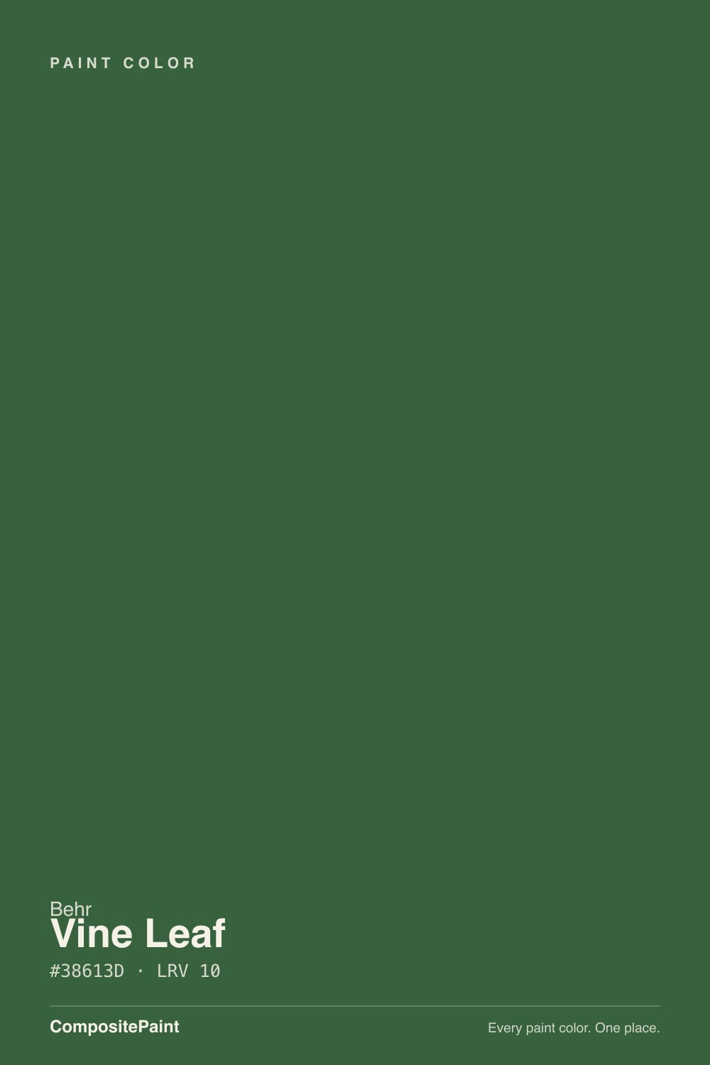
A deep, muted forest green with a noticeable gray cast — Behr's own language for it is a "garden-inspired" green with "a sense of calm timelessness," and that gray cast is the whole trick: it keeps the color grounded and substantial instead of bright or grassy. N400-7 places it in Behr's plain numbered green family, not a headline trend collection — it sells mainly as BEHR PREMIUM semi-gloss enamel for cabinets, doors and trim, and as BEHR ULTRA satin for exterior work. This is not a color with a marketing campaign behind it. It is a workhorse.
At LRV 10 it sits in the same dark tier as Benjamin Moore Green, Behr's own Black Evergreen, and Ashwood Moss — colors dark enough that light does most of the talking. Give it a bright kitchen window or a sunlit porch and it reads as a clear, deep forest green. Put it in a room with no direct light source and it behaves the way every color this dark behaves: it slides toward near-black, and the green only shows up as a hint at the edges. That is physics, not a flaw specific to this paint, but it is the single fact that decides whether you'll love or regret this color.
Undertone in one line: cool, grayed green — not yellow-olive, not blue-teal. It reads as a straightforward dark forest green rather than something that flashes a surprise color in different light, which is part of why it has stayed a quiet, dependable pick rather than a controversial one. If your sample looks flat charcoal instead of green, that is a lack of direct light in the room, not a hidden undertone — move the sample closer to the window before you decide it's wrong.
Where It Shines
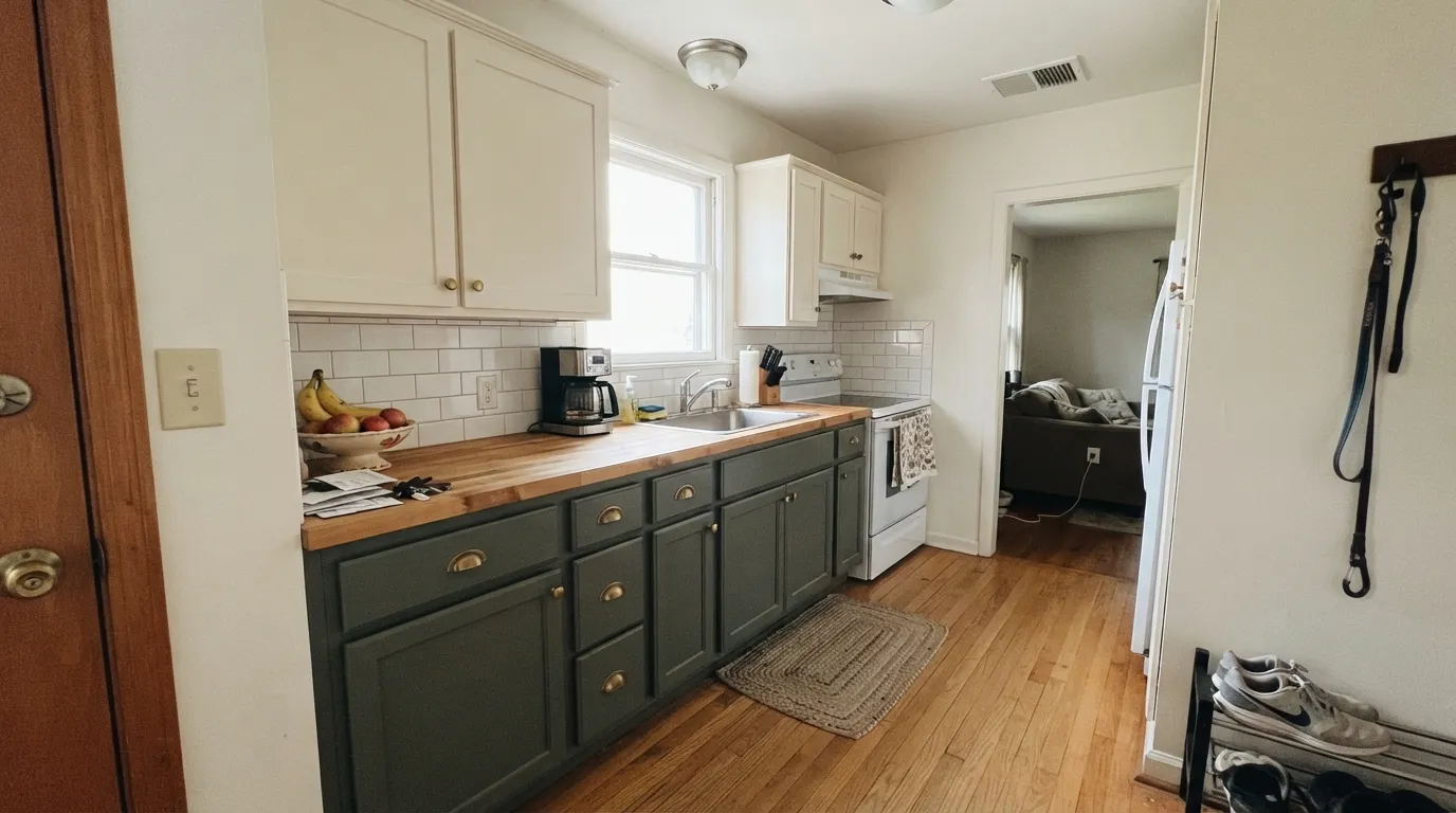
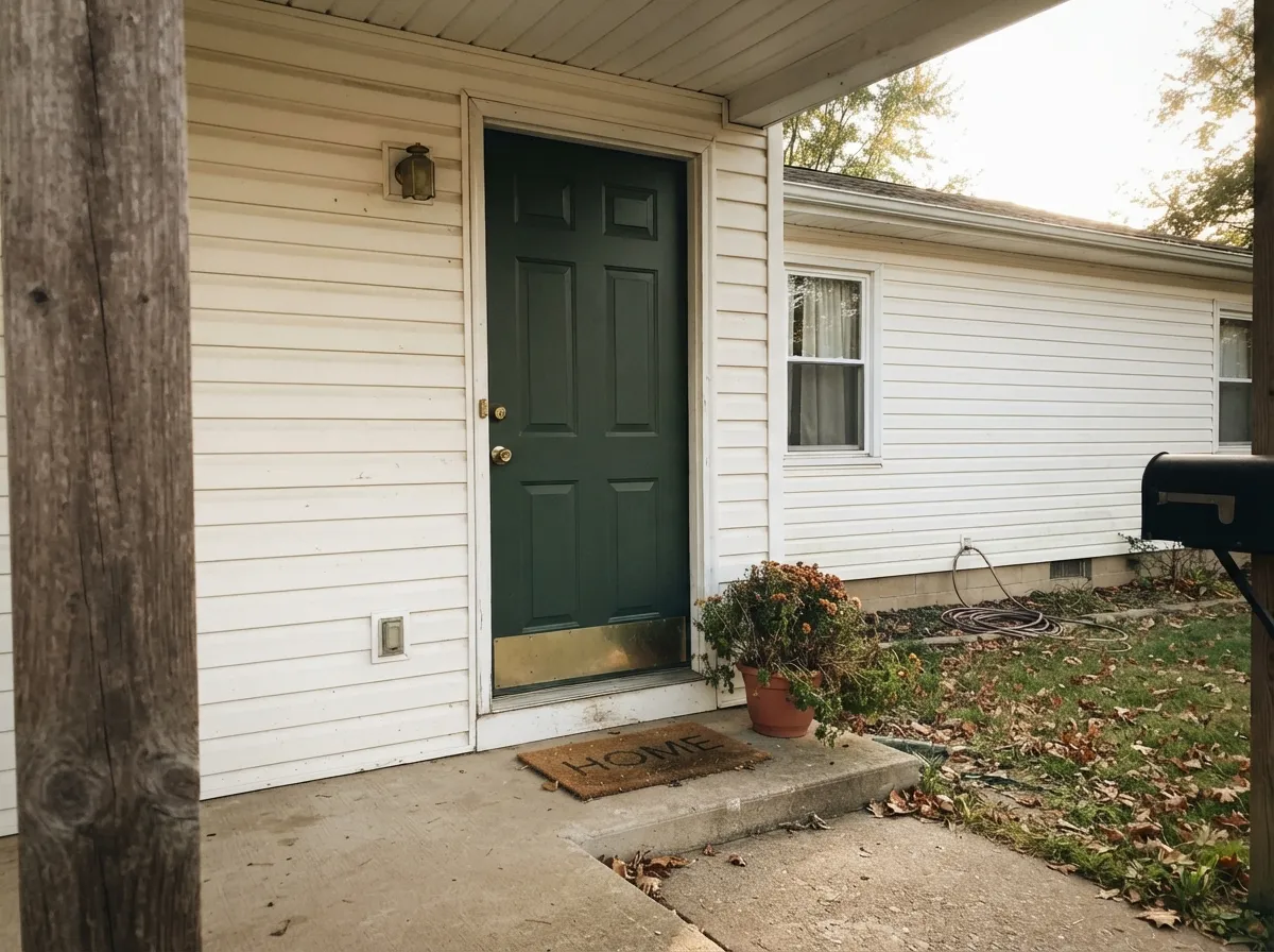
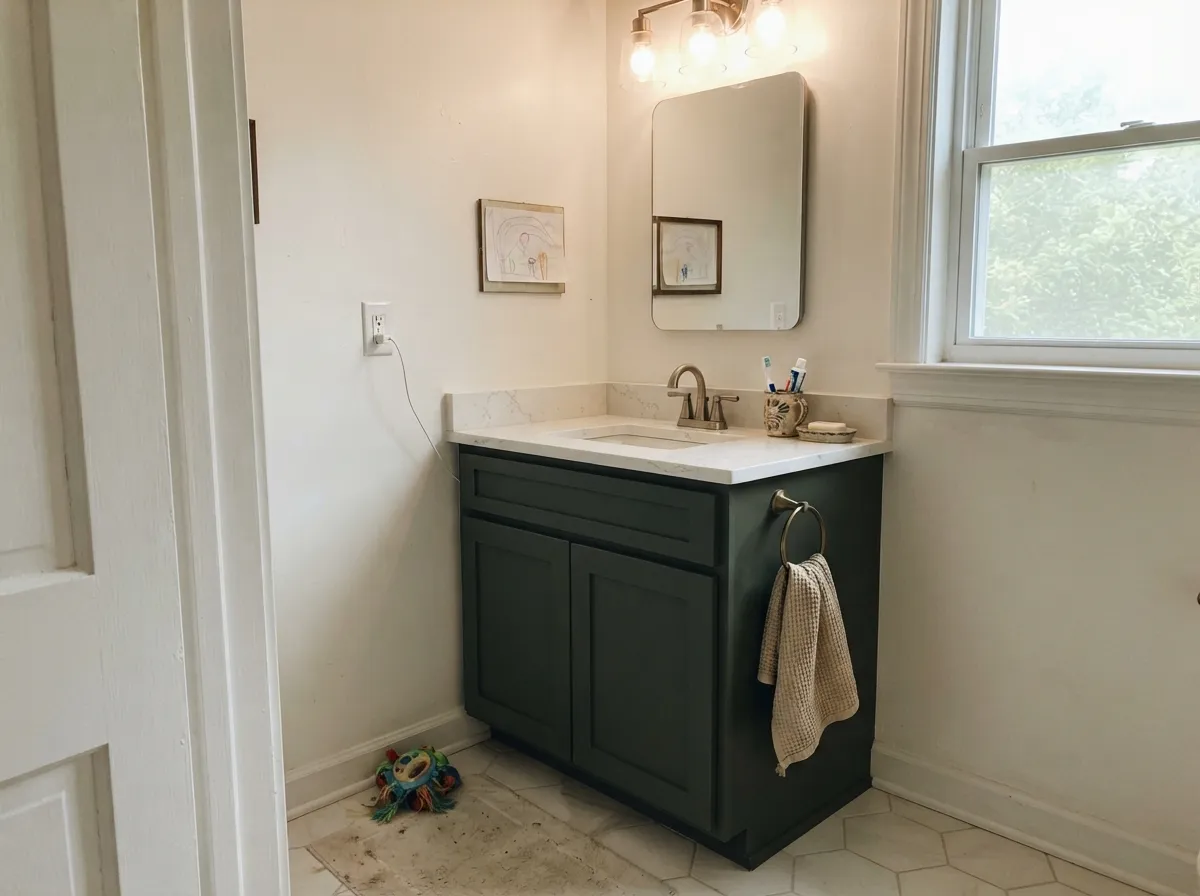
Give it real light and warm materials and it earns its keep without any drama. Cabinets and vanities are its main job — with brass hardware, butcher block, marble or quartz, it reads custom and a little expensive rather than trendy. Front doors and exterior trim are its second home: against light-colored siding in real daylight, a Vine Leaf door reads as a classic, grounded green rather than a shouty accent color, and it holds that read far better outdoors, where it almost always gets direct light, than it does on interior walls.
Where It Fails
Almost every disappointed story about Vine Leaf comes down to one of three predictable mismatches, and all three show up before the first coat if you're honest about your room. None of them are the paint failing — they're the paint being exactly as dark as its LRV says it is.
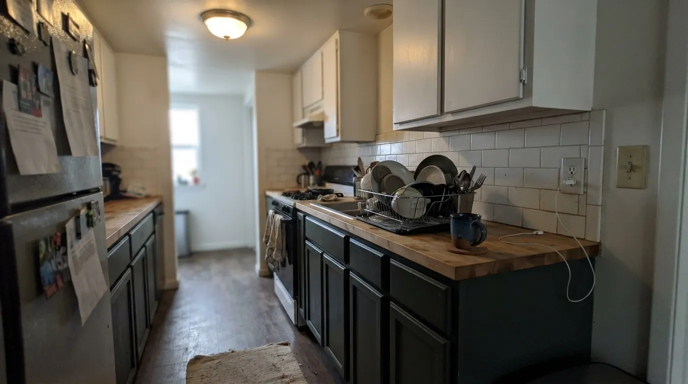
At LRV 10, Vine Leaf needs real direct light to prove it's green and not black. A galley kitchen, a windowless pantry, or an interior room lit only by overhead cans will read the cabinets as flat near-black most of the day. This is the single most common regret with this color, and it is entirely predictable from the light alone.
Vine Leaf is the deep, saturated end of green, not the pastel end. If you were picturing something closer to a chalky gray-green like Sherwin-Williams Sage or Benjamin Moore October Mist, this is a different, much darker color entirely — sample it before assuming "green paint" means the same thing across the deck.
The gray cast that keeps Vine Leaf grounded also means it has little warmth to spare. Pair it with icy white trim or cool blue-gray quartz and the whole combination reads flat and cold — a charcoal-green rather than a garden green. Warm white trim and warm-toned stone or wood keep the color alive.
Room by Room
With daylight from a real window and brass or unlacquered-bronze hardware, this is the job Behr built it for. Semi-gloss enamel wipes clean and hides fingerprints better than a lighter cabinet color would. Keep the walls a warm white, not stark cool white.
A single Vine Leaf vanity under a warm-white or marble-top counter with brass fixtures reads like a small, deliberate design choice rather than a full commitment. Morning window light is usually enough to keep it reading green, not black.
Outdoors it almost always gets the direct light it needs. Against light siding — a warm white or greige — a Vine Leaf door is a classic, grounded green that photographs well in real sun. Shaded, north-facing porches are the exception; expect it to read darker there.
In a room with a real window nearby, Vine Leaf built-ins next to walnut or oak shelving and a warm-white wall color look intentional and collected, not heavy. Skip it in a windowless interior office.
One wall, in a room with strong daylight, can work as a deep, quiet backdrop for art and wood furniture. It needs the sunniest wall in the room, not the darkest corner, or it will simply disappear into shadow.
Four walls of Vine Leaf in a small room with limited light turns it into a cave; this is the least-recommended use of the color. If you love the depth, use it on cabinetry, a door, or built-ins instead, where it's contained and lit from a specific angle.
Your Light Is the Risk
A bright kitchen window or a sunlit porch is where Vine Leaf proves it's green — clear, deep, and grounded, not muddy.
In a windowless room or one lit only by overhead cans, it reads flat near-black most of the day. Test before committing to a dim room.
Brighter and clearly green at the sun hours, quieter and darker the rest of the day. Sample on the actual wall or cabinet run, not a swatch on a desk.
Warm 2700K bulbs keep some green visible after dark; cool white LEDs flatten it toward black. Cabinet-run lighting matters as much as the paint.
Most complaints about Vine Leaf are a light mismatch. Upload a photo of your actual room and see it on your walls — then ask for the same wall in north light or evening lamps before you buy a single sample.
Need It From Another Brand?
Any paint counter can custom-tint Behr N400-7 directly. If you would rather stay in one brand's own deck, these are the closest stock matches, measured as ΔE2000. Under 2 is a difference you will not see on the wall.
| Brand | Closest color | ΔE | LRV | |
|---|---|---|---|---|
| Benjamin Moore | Boreal ForestAF-480 · Benjamin Moore | 2.4 | 11 | Color page → |
| Valspar | Sherwood Forest8003-34G · Valspar | 3.7 | 10 | Color page → |
| PPG / Glidden | Dark Green VelvetPPG1136-7 · PPG / Glidden | 3.0 | 10 | Color page → |
| Glidden | Dark Green VelvetPPG1136-7 · Glidden | 2.9 | 10 | Color page → |
| HGTV Home by Sherwin-Williams | Tee ShotHGSW 2251 · HGTV Home by Sherwin-Williams | 3.6 | 9 | Color page → |
| Dunn-Edwards | Mission JewelDET539 · Dunn-Edwards | 3.6 | 11 | Color page → |
Similar Behr Colors
The nearest shades to Vine Leaf within Behr's own range, ranked by perceptual color distance — useful when you want the same look a touch lighter, darker, or warmer.
WCAG 2.1: AA is 4.5 : 1 for normal text, 3 : 1 for large text, AAA is 7 : 1.
Vine Leaf vs the Colors You're Also Considering
Every Vine Leaf sample board has the same rivals on it. The numbers show the real lightness gap — then it comes down to which risk you would rather live with.
Pick this for the quieter, more grounded version of a dark green — less jewel-tone, more everyday-usable.
Benjamin Moore 2044-10 · LRV 9GreenPick this if you want more saturation — a true jewel-tone green for cabinets and doors, with less gray in the mix.
Pick this for a cooler, more classic forest-green read with less olive in it.
Sherwin-Williams SW 6187 · LRV 12RosemaryPick this for a slightly lighter, more olive-leaning dark green with a bit more daylight forgiveness.
Within Behr, Hampton Green 450F-7 at #38613A is the nearest twin, differing by two units of blue at the same LRV of 10. Pasture Green BXC-60 at #3C653F and LRV 11 is a fraction lighter and slightly warmer. Rainforest M440-7 at #33624A pulls clearly toward teal, and Fresh Herbs PMD-25 at #3A5F49 does the same to a lesser degree. Equestrian Green S410-7 at #40673B is the most yellow-leaning of the group. Across brands, Valspar Friendly Fairway P099 at LRV 10.2 has a deltaE of 0.95 and is the same color for practical purposes. Dutch Boy Zucchini Green 227-6DB at deltaE 2.34 and Sherwin-Williams Arugula SW 6446 at LRV 10 and deltaE 2.51 are very close, so sample before switching. Benjamin Moore Buffett Green CW-535 at LRV 11 and deltaE 4.21 is close but visibly different side by side, reading noticeably cooler and more emerald at #265D41.
Vine Leaf Coordinating Colors
The rule for coordinating with Vine Leaf is simple: keep the whites warm, keep the woods mid-to-warm-toned, and let it be the one dark, saturated note in the room rather than fighting for attention with a second bold color. These are the partners that keep it reading green instead of black:
Vine Leaf's Story: A Quiet Workhorse, Not a Headline Color
Vine Leaf did get one moment in the spotlight — Behr picked it as a December Color of the Month back in 2018 — but that's a routine monthly marketing slot Behr rotates through dozens of colors for, not the flagship Color of the Year, and it never sparked a wider trend. It sits in Behr's plain N400 numbered green family, sold mainly as a cabinet, door and trim enamel rather than a headline wall color — Behr's own marketing calls it a "garden-inspired" deep green with "a sense of calm timelessness," which is honest but modest as color-copy goes.
That's not a weakness. Plenty of genuinely good paint colors never get a real spotlight moment, and Vine Leaf is essentially one of them: a dark, gray-cast forest green that reliably does the job it's sold for — cabinets, vanities, and exterior trim — without needing a trend cycle to justify buying it.
Vine Leaf With Wood Tones and Floors
This pairing question has a clear answer: warm to mid-toned wood is Vine Leaf's best company. Walnut, white oak, and butcher block countertops all sit comfortably against it, and the depth of the paint makes those wood grains look richer by contrast, not competed with. Brass and unlacquered-bronze hardware warm the combination further — it's the pairing Behr itself points to, and the research backs it up.
The one flooring and countertop combination to think twice about is cool: gray-washed floors, cool white quartz, or icy white trim all pull the same direction, flattening Vine Leaf's already-limited warmth into a colder, more charcoal-leaning green. It's not unusable with cool materials, but it needs more direct light to compensate when everything around it is cool instead of warm.
Three Ready Palettes Built on Vine Leaf
A color is never alone on the wall. These are complete combinations in the 60-30-10 pattern, with the reason each one holds together. Every one opens in the visualizer.
Blank Canvas keeps the kitchen bright enough that Vine Leaf reads as a true green rather than black; Kendall Charcoal on the island adds a second dark note without doubling up on green. Brass hardware and butcher block finish the look Vine Leaf was built for.
Try this palette in your roomOne warm white carries the siding and trim so the house reads calm and unified, which lets the front door do all the talking. Vine Leaf gets real outdoor daylight almost by default, so this is one of its most reliable jobs — brass house numbers or a lantern finish it.
Try this palette in your roomNatural Cream keeps the room's overall light level high enough that Vine Leaf built-ins hold their color instead of vanishing into shadow; Alabaster trim frames the cabinetry without going stark. Walnut shelving and warm brass reading lamps complete it.
Try this palette in your roomVine Leaf FAQ
Is Vine Leaf too dark for kitchen cabinets?
It's genuinely dark — LRV 10 — but that's the point for a cabinet color. With real kitchen daylight it reads as a rich, deep forest green, not black. In a galley kitchen or a run of cabinets with no nearby window, it can read near-black most of the day. Get a large sample on the actual cabinet doors and look at it at different times before committing.
What is the undertone of Vine Leaf — blue or yellow?
Neither, strongly. It's a cool, grayed forest green without a noticeable yellow-olive or blue-teal lean. If your sample looks flat charcoal instead of green, that's almost always a lack of direct light in the room, not a hidden undertone showing through.
Is Vine Leaf a popular or trending color?
It's had one real moment: Behr named it a December Color of the Month back in 2018 — a minor monthly marketing pick, not the flagship Color of the Year, and it never turned into a wider trend. Since then it's been a plain-numbered Behr green sold mainly for cabinet, door and trim projects, with no viral before-and-after we could verify. That's not a knock: it's a dependable dark green that does its job without needing a marketing story behind it.
What white goes with Vine Leaf?
A warm white — Behr Blank Canvas or Behr Swiss Coffee both work — keeps the pairing alive. A stark, cool white trim tends to flatten Vine Leaf's warmth and push it toward cold charcoal-green instead of garden green.
Can I use Vine Leaf on a front door?
Yes — Behr sells it in an exterior satin enamel specifically for doors, shutters and trim. Front doors almost always get real daylight, which is Vine Leaf's best condition, so this is one of its most reliable uses. A shaded, north-facing porch is the one exception where it will read darker.
Does Vine Leaf work with wood floors and oak cabinets nearby?
Yes, with warm to mid-toned wood — walnut, white oak and butcher block all sit comfortably next to it, and brass hardware warms the pairing further. Cool gray-washed floors or cool white countertops are the one combination to avoid; they pull the color toward flat, cold charcoal instead of green.
Have you painted with Vine Leaf?
Rate it — one tap helps the next reader decide.
Ask a Question