Twinberry
The wine-dark berry red one SKU number from Behr's own Color of the Year, reviewed honestly: the rooms where it glows, the light that flattens it to black, and what to pick instead.

Jessica has spec'd whites and neutrals for more than 300 rooms and keeps a sample wall of painted drawdowns in her studio. Every color review is checked against real reader rooms in the comments and re-tested when a formula changes. About the testing process →
- 1Rookwood Dark Red3
- 2Twinberry8
- 3Million Dollar Red13
- 4Cinnamon Slate19
The Fast Verdict
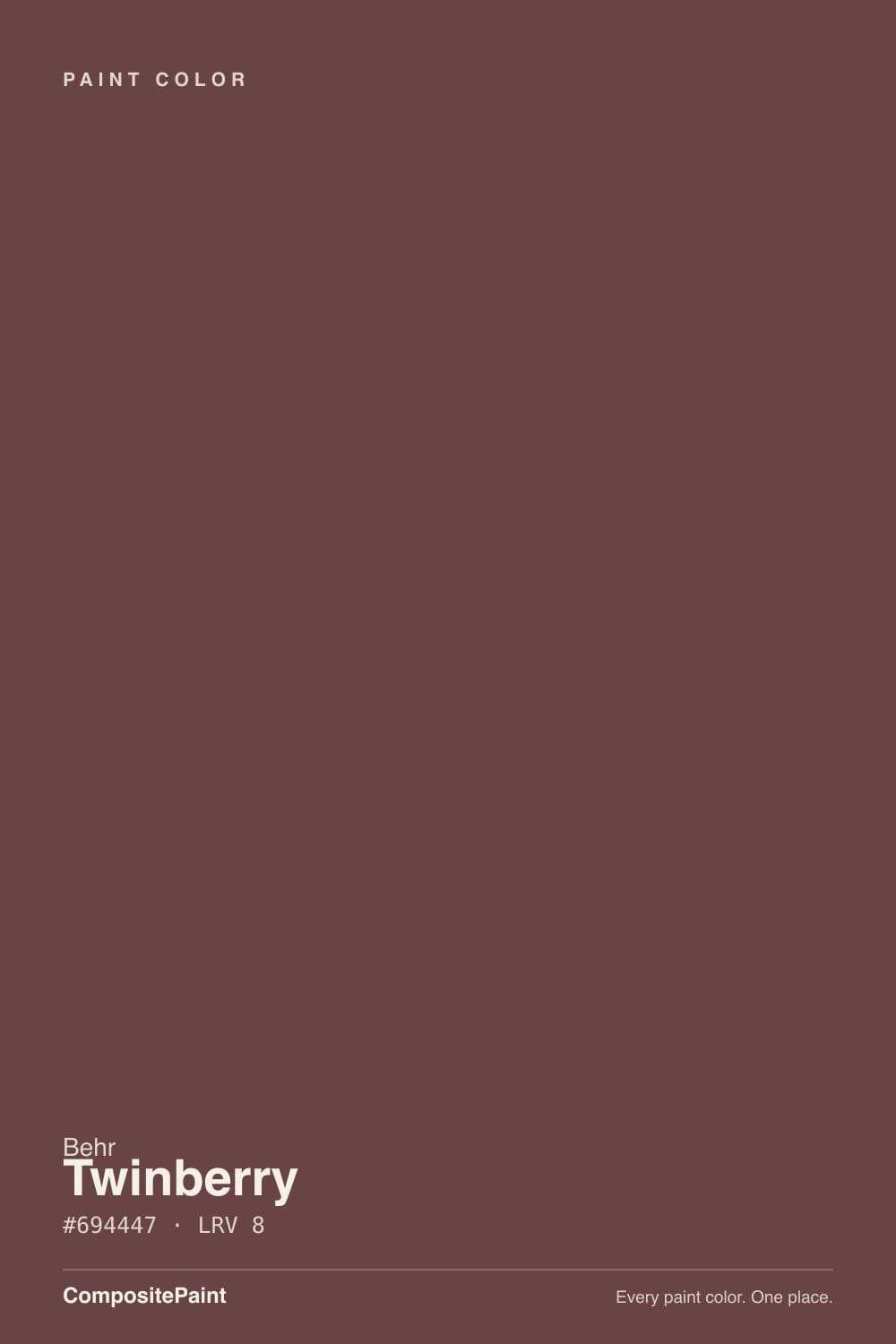
Twinberry is a deep wine red grayed down with brown until it reads more like burgundy leather than fruit punch. At LRV 8 it is genuinely dark — closer to a near-black than a red in dim light — and it depends on lamps and daylight to show its color at all. Give it either and it turns rich and cozy; deny it both and it goes flat and muddy. It is not a house color. It is a bedroom, a dining room, a vanity — one room that gets to feel like a wine cellar after dark.
Bedrooms and small, snug rooms · dining rooms and dinner-party walls · doors, vanities, and single accent walls · anyone who wants Rumors-style drama without chasing the Color of the Year
You want an actual true red, not a wine · your room is small, north-facing, and lamp-free · you're painting a whole house or an open-plan great room · your floors are honey-orange oak with no rug to break it up
- A genuine wine-berry depth that reads sophisticated, not candy-bright
- Brown undertone keeps it grounded — never slips pink or purple
- Sits one chip from Behr's own 2025 Color of the Year, Rumors, at essentially the same depth
- One-coat hide guarantee when tinted into Behr Dynasty or Marquee interior paint
- Small, closed rooms — vanities, powder rooms, dens — take the color beautifully
- Not a true red — anyone wanting bright crimson will be let down
- LRV 8 reads near-black without daylight or lamps
- Too dark and intense for a whole house or open-plan room
- Needs warm 2700K bulbs at night or it goes flat and muddy
What Color Is Twinberry, Really?
Twinberry sits at the intersection of berry and burgundy — Behr's own description calls it a "deep lavish wine" — and the brown underneath is doing the real work. A straight berry-red would read candy-bright or pink; the brown grays it down into something closer to old leather or dried wine, which is why it photographs cozy instead of loud. Behr ties it, along with several other MQ-prefixed colors, into its Marquee interior line, and it carries a one-coat hide guarantee when tinted into Behr Dynasty or Marquee paint — a real, useful detail if you're painting a small room fast.
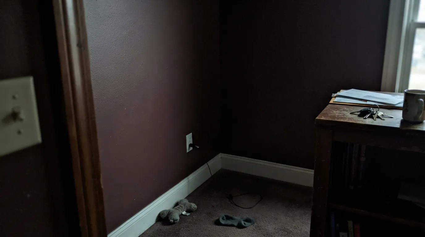
At LRV 8, Twinberry is dark by any measure — deeper than most colors people call "dark." That depth is the whole personality: in a room with real daylight or warm lamps, the wine color reads clearly and the brown stays a supporting note. In a dim, north-facing room with the lights off, the red drains out almost entirely and what's left is closer to a flat blackish-brown. Behr frames this as "coziness"; whether you agree depends on whether you wanted the color visible or just felt.
Undertone in one line: wine-red first, cocoa-brown second — never a clean crimson and never pink. If a sample looks pink or purple on your wall, that's usually cool light or a blue-toned bulb fighting the brown; if it looks flat brownish-black, that's a lack of light, not a flaw in the paint.
Where It Shines
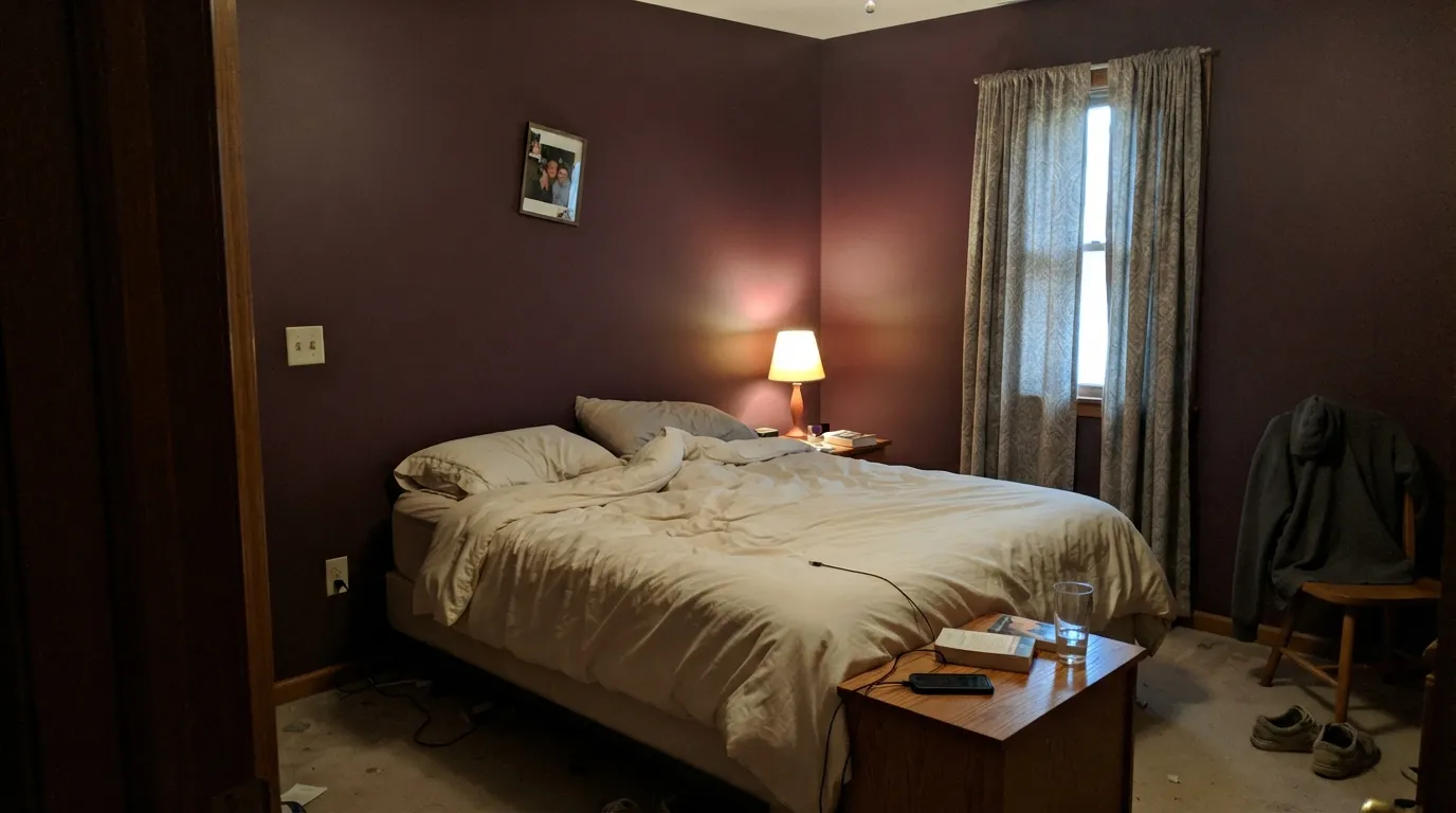
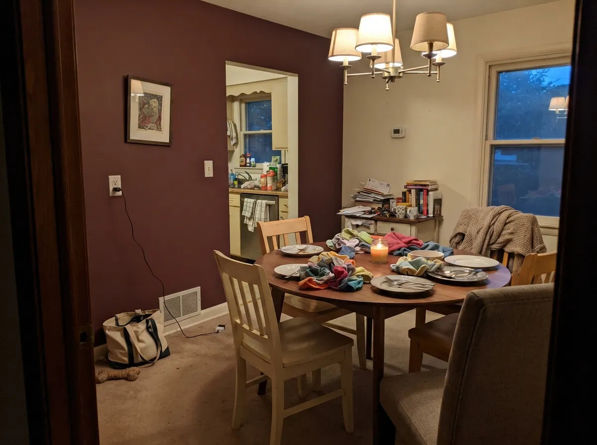
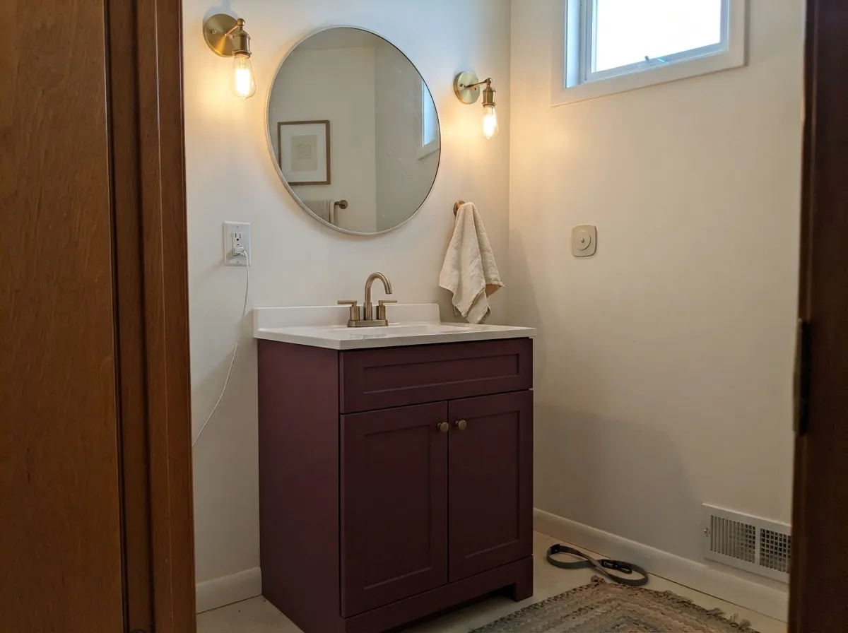
This is an after-dark color. Under warm lamplight the brown pulls back and the wine comes forward, and a Twinberry bedroom or dining room at 8pm looks like it belongs in a boutique hotel. It is also a genuinely good small-room color — a powder room, a vanity, a single accent wall — because depth this saturated reads as a deliberate design choice in a small space and a risky bet across four large walls. Pair it with brass, walnut, aged leather, and warm ivory trim and it looks expensive rather than heavy.
Where It Fails
Almost every disappointed Twinberry story comes from one of three mismatches, and all three are predictable before the first coat goes on. None of them are the paint's fault — but if your room or your expectation matches one of these, this is not your color.
Twinberry is a wine, not a red — the brown undertone is there specifically to soften and gray the color down. Buyers picturing a bright, saturated fire-engine red on the wall are disappointed by how brown and muted it reads in person. If true red is the goal, look at BM Caliente instead; Twinberry was never trying to be that color.
LRV 8 is close to black. In a north-facing or windowless room with only overhead light, the wine drains out almost entirely and the walls read as a flat, muddy near-black — Behr's own materials admit this turns "cozy" in low light, but cozy and disappointing look the same in a photo. Warm 2700K lamps are not optional here; they are part of the paint job.
This is a doses color. Four large walls of Twinberry running into an open kitchen or living space reads heavy rather than intentional, and it fights with everything else in an open sightline. Keep it to one closed room, one accent wall, a vanity, or a door — the same restraint every dark wine color rewards.
Room by Room
Warm lamplight plus a closed door is exactly the environment Twinberry wants. Matte finish softens wall texture; a warm ivory trim keeps the room from feeling like a cave. Best in a room with at least one window for daytime and lamps for night.
Evening entertaining is Twinberry's other natural home — candlelight and a chandelier bring out the wine tone the way daylight never fully does. Works especially well as the one saturated room in an otherwise neutral house.
A Twinberry vanity or a fully painted powder room takes the depth beautifully because the room is small enough to control the light. Satin on a vanity, matte or eggshell on powder-room walls, brass hardware.
A closed den or home library with warm task lighting and walnut furniture flatters the color; an open-plan office with cool overhead LEDs will flatten it to near-black by mid-afternoon.
One wall, not all four. A Twinberry accent wall behind a sofa or fireplace gives the depth without committing the whole room to a color that needs babysitting by lamps.
On an island or a run of lower cabinets under a light wall color, Twinberry reads rich and intentional. As a full kitchen wall color it competes with cabinet finishes and reads dark and heavy under typical kitchen lighting.
Your Light Is the Risk
Warm 2700K bulbs pull the wine forward and the brown recedes — this is the color at its most alive, and the reason to buy it.
Cool gray daylight with no artificial help drains the red almost entirely; the wall reads flat brownish-black. Test with the lamps you'll actually use, not just daylight.
Full sun is the most honest read: clearly a deep wine-red, not black, with the brown showing as a warm undertone rather than the whole story.
2700K bulbs: rich and wine-colored. Cool white or blue-toned LEDs flatten it toward a dull near-black — swap the bulb before you second-guess the paint.
Most complaints about Twinberry are a light mismatch. Upload a photo of your actual room and see it on your walls — then ask for the same wall in north light or evening lamps before you buy a single sample.
Need It From Another Brand?
Any paint counter can custom-tint Behr MQ1-14 directly. If you would rather stay in one brand's own deck, these are the closest stock matches, measured as ΔE2000. Under 2 is a difference you will not see on the wall.
| Brand | Closest color | ΔE | LRV | |
|---|---|---|---|---|
| Sherwin-Williams | Carriage DoorSW 7594 · Sherwin-Williams | 4.0 | 8 | Color page → |
| Benjamin Moore | Ruby Dusk1267 · Benjamin Moore | 2.1 | 9 | Color page → |
| Valspar | Purple Earth1004-7A · Valspar | 3.2 | 7.4 | Color page → |
| PPG / Glidden | Chocolate EclairPPG1054-7 · PPG / Glidden | 2.3 | 8 | Color page → |
| Glidden | Chocolate EclairPPG1054-7 · Glidden | 2.5 | 8 | Color page → |
| Dutch Boy | Aged Beauty401-7DB · Dutch Boy | 1.3 | 7 | Color page → |
Similar Behr Colors
The nearest shades to Twinberry within Behr's own range, ranked by perceptual color distance — useful when you want the same look a touch lighter, darker, or warmer.
WCAG 2.1: AA is 4.5 : 1 for normal text, 3 : 1 for large text, AAA is 7 : 1.
Twinberry vs the Colors You're Also Considering
Every Twinberry sample board has the same rivals on it. The numbers show the real lightness gap — then it comes down to which risk you would rather live with.
Pick this for the same drama without painting the color everyone already asked their painter about this year.
Behr MQ1-15 · LRV 8RumorsPick this if you want the officially hyped version — Behr's 2025 Color of the Year sits at the same depth, just a shade more ruby-red where Twinberry leans wine.
Pick this for a quieter, more grounded depth that reads sophisticated instead of bold.
Benjamin Moore AF-290 · LRV 8CalientePick this for an actual true red — Caliente is brighter and more saturated at the same LRV 8, with none of the brown pulling it toward wine.
In the Behr deck, Oxford QE-08 (#6A4444, LRV 8) is the nearest sibling and is difficult to tell apart on a wall. Estate Vineyard PMD-63 (#68454B, LRV 8) carries a little more plum, and Library Red ICC-82 (#6F4440, LRV 8) is warmer and more clearly brick-red.
Across brands, Diamond Vogel Kung Fu 0109 (#684449, LRV 8) has a deltaE of 0.99, so it is effectively the same color. C2 Tallulah C2-502 (#6D4649, LRV 8) at 1.04, Dunn-Edwards Jazz Berry Jam DET401 (#674247, LRV 7) at 1.09, Dutch Boy Aged Beauty 401-7DB (#664043, LRV 7) at 1.3, and Farrow and Ball Preference Red No. 297 (#6F4449, LRV 8) at 1.97 are all visually identical in normal room light.
Benjamin Moore Ruby Dusk 1267 (#6D4243, LRV 9) at 2.12 is very close, but sample first. Sherwin-Williams Carriage Door SW 7594 (#6E423E, LRV 8) at 3.98 is close but visibly different side by side, reading browner and more russet.
Twinberry's Neighbor Is Behr's Color of the Year
Twinberry (MQ1-14) sits one SKU number away from Rumors (MQ1-15), the deep ruby red Behr named its 2025 Color of the Year. The two colors are close enough in hex value and identical in LRV that they read as near-twins on a wall — Rumors leans a touch more ruby, Twinberry a touch more wine-brown, but they're clearly cut from the same part of Behr's palette.
That proximity is useful information, not just trivia: if you love the idea of Rumors's drama but don't want the color everyone's painter has been asked about all year, Twinberry gets you essentially the same room with a quieter reputation. Conversely, if you want the exact color Behr put its marketing weight behind, Rumors is the one to ask for by name.
Twinberry Coordinating Colors
The rule for coordinating with Twinberry is simple: stay warm and stay confident with the contrast. It wants a genuinely warm white or cream — not a cool, bright white — plus one near-black for hardware and trim accents. Avoid pale, icy neutrals; they make the wine read muddy instead of rich.
Twinberry With Wood Tones and Floors
Dark, warm woods are the color's best friends: walnut, espresso stains, and aged leather furniture all deepen the wine tone instead of fighting it. Brass and unlacquered metal hardware read as intentional and expensive against it; polished chrome is the one metal that leans cold and slightly at odds with the warmth.
The trickier floor is honey-orange builder oak. Twinberry's brown undertone can pull toward looking muddy against a strongly orange floor, and the floor in turn can look more orange next to the deep red wall. It isn't a hard no — a large rug and warm lamps usually settle the argument — but test a big sample directly above the actual floor before committing a whole room.
Three Ready Palettes Built on Twinberry
A color is never alone on the wall. These are complete combinations in the 60-30-10 pattern, with the reason each one holds together. Every one opens in the visualizer.
All three stay in the Behr deck and lean the same warm-brown direction, so the handoff from wall to trim to furniture never fights itself. The warm white trim keeps the wine from reading cold or purple; the near-black furniture doubles down on the brown undertone instead of contrasting it.
Try this palette in your roomBlank Canvas keeps most of the room bright enough for daytime use; a single Twinberry wall carries the drama for dinner parties without darkening the whole room. Cracked Pepper as a chair rail or trim line gives the eye a clean stopping point between the two.
Try this palette in your roomA small room lets Twinberry sit close enough to the light source (a vanity mirror light) to always look intentional rather than dark. White walls keep the room from feeling closed in, and the near-black frame finishes the jewel-box look without adding a second loud color.
Try this palette in your roomTwinberry FAQ
Is Twinberry more red or more brown?
Red first, brown second. It's built on a berry-wine base with brown grayed in to soften it, so it never reads as a clean crimson, but it also never tips fully into a neutral brown — with any real light it still clearly reads as a dark red.
Is Twinberry the same as Rumors, Behr's Color of the Year?
Not the same, but close — the two sit one SKU number apart (MQ1-14 vs MQ1-15) at nearly identical LRV and depth. Rumors reads a shade more ruby-red; Twinberry sits a touch more toward wine and brown. If you love the idea of Rumors but want something less talked-about, Twinberry is the closest thing in the deck.
Will it look black in a dark room?
Close to it. At LRV 8, a north-facing or lamp-free room will read Twinberry as a flat, muddy near-black rather than a visible red. It needs either daylight or warm 2700K lamps to show its actual color — this isn't a color you can paint and then leave the lights off.
What trim white goes with Twinberry?
A warm ivory or cream white — Behr Swiss Coffee or Blank Canvas — keeps the wine from reading cold. A stark, cool white trim can push Twinberry toward looking flat or purple by comparison; avoid the coolest whites in the deck.
Should I paint a whole room or just an accent wall?
Either works, but they're different bets. A full small room — bedroom, powder room, den — with good lamps rewards the commitment. In a larger or open-plan room, one accent wall gets you the drama without the color taking over the whole space or fighting adjacent rooms.
Does Twinberry work with oak floors?
It depends on the oak. Walnut, espresso, and darker stained floors are its best match — the depths reinforce each other. Honey-orange builder oak is the harder pairing; the warm floor and the brown-red wall can compete rather than complement, so test a large sample above the actual floor first.
Have you painted with Twinberry?
Rate it — one tap helps the next reader decide.
Ask a Question