Deep Merlot
The wine-dark plum Behr calls Deep Merlot, reviewed honestly: the light that finally shows the purple, the light that hides it completely, and the rooms where LRV 7 actually pays off.

Jessica has spec'd whites and neutrals for more than 300 rooms and keeps a sample wall of painted drawdowns in her studio. Every color review is checked against real reader rooms in the comments and re-tested when a formula changes. About the testing process →
- 1Liberty Blue1
- 2Deep Merlot7
- 3Blue Nova17
- 4Gothic Purple24
The Fast Verdict
Deep Merlot is Behr's dark, brown-based answer to the plum moment — and at LRV 7 it plays a different game than a lighter mauve. This is a near-black wine color first, purple second: Behr itself files it under Purples, but its own color notes admit the brown undertone takes over the moment the light drops. Give it real daylight and it glows like aged bordeaux against cream and brass. Give it a dim room and no lamps and it reads as a plain warm charcoal — beautiful, but not the color you'll show off as purple.
A dining room with a chandelier or wall sconces · a bedroom accent wall behind the headboard · a powder room drenched floor to ceiling · a kitchen island or bathroom vanity · anyone who wants "wine," not "lavender"
You want an obviously purple or lilac wall · the room only gets cool north daylight and no lamps · you're painting all four walls of a small room with nothing lighter to break it up · your counters or floor are already cool gray stone
- Genuine wine-dark drama without going flat pure black
- Small-room drenching (powder rooms, dining rooms) works beautifully at this depth
- Flatters brass hardware, walnut, and warm marble veining
- Reads sophisticated rather than garish on an island or a vanity
- Dark enough (LRV 7) to hide fingerprints and scuffs on cabinets and doors
- Loses its purple in anything but real daylight — mostly reads brown or near-black
- Like most saturated dark bases, it wants a tinted primer and more than one finish coat for even coverage
- Too dark for four walls of a small, dim room without a lighter ceiling or trim to break it up
- Easy to mistake for a plain near-black brown if you were actually hoping for visible purple
What Color Is Deep Merlot, Really?
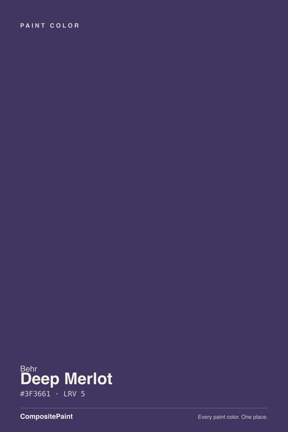
Deep Merlot is a dark, brown-leaning purple — the kind of color that reads as aged wine rather than lavender. Behr's own color notes describe it as carrying both brown and purple undertones at once: the brown supplies the earthy, wood-like warmth, and the purple supplies the depth that keeps it from just looking like a plain dark brown. That combination is exactly why it is filed under "Merlot" and not under a plain "plum" or "eggplant" name — Behr is pointing you toward a wine glass, not a flower.
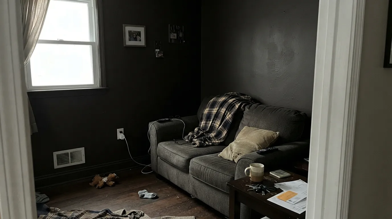
At LRV 7 it sits deep in near-black territory — darker than most colors people casually call "purple." A lighter mauve like Sleepy Hollow (LRV 28) announces its violet undertone in almost any light. Deep Merlot needs real daylight hitting the wall before the purple surfaces at all; take the light away and the brown side wins, and the wall reads like a warm charcoal or espresso rather than a color from the purple family. That is the single fact that decides whether this paint makes you happy or disappoints you.
Undertone in one line: brown and purple together, wine-red rather than violet-blue. If your sample looks flat near-black with no color at all, that is a dim or north room asking for lamps. If it looks distinctly plum or bordeaux, that is real daylight doing exactly what the color was built to do.
Where It Shines
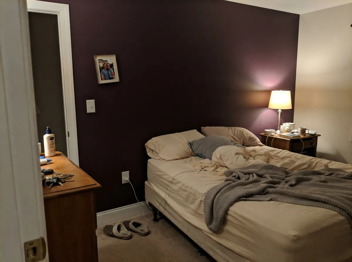
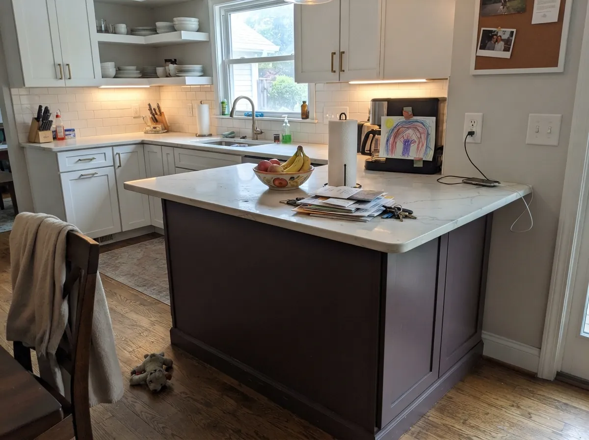
Put it where daylight actually reaches the wall and Deep Merlot earns the name: against cream trim, brass hardware and dark wood, it reads like a glass of wine held up to a window — rich, warm, expensive. It is also a natural for small-room drenching, since a color this dark and this saturated makes a compact dining room or powder room feel intentionally cozy rather than cramped. On an island or a vanity it is a sophisticated dose of color without committing a whole kitchen to it.
Where It Fails
Almost every disappointed review of a dark, saturated color like this comes from one of three predictable setups. None of them are the paint's fault — but if your room matches one, sample a bigger board before you commit a whole wall.
Without strong daylight hitting the wall, LRV 7 just does not have enough reflected light to show its undertone clearly — it reads as a near-black brown, full stop. If the goal was a visible lavender or plum statement, this color is both too dark and too brown for that job. Sleepy Hollow, at LRV 28, is the color that reliably reads purple in ordinary light.
A color this saturated on every wall of a windowless powder room or a north-facing den with no lamps swallows the light the room has and can feel like a cave rather than a jewel box. It works best either with a light ceiling and trim to bounce light back in, or on a single wall, a vanity, or an island rather than the whole box.
Cool gray countertops or gray-washed flooring pull out the color's cooler purple side and mute its wine warmth, which can push the whole room toward muddy or bruised instead of rich. Warm marble, wood tones and brass are the reliable partners; test a sample against your actual counter before committing.
Room by Room
Under a chandelier or wall sconces, with a wood table and cream linens, this is the color's natural home: intimate at dinner, still legible as wine-dark rather than black in daytime light from a window. Eggshell holds up to chair-back scuffs.
Behind a headboard with warm lamps at night it goes velvety and dark without feeling gloomy. Four full walls is a bigger commitment than most bedrooms need; one wall plus cream or white trim keeps it from swallowing the room.
Small rooms take deep, saturated color well, and a powder room drenched in Deep Merlot with a brass sconce and a marble-top vanity reads custom and expensive. Satin on any woodwork wipes clean.
Behr sells this in cabinet-rated finishes for exactly this reason: it is outstanding on an island or a bathroom vanity under white perimeter cabinets and marble, and far riskier as the color of every cabinet in the room. Semi-gloss or satin cabinet enamel either way.
Leather, walnut shelving and a warm-bulb desk lamp are its natural company. It reads studious and grounded rather than gloomy as long as the lamp stays on after dark.
Outdoor full sun and shifting weather light are unpredictable partners for a color this dependent on warm, controlled light — it is far more likely to read as a plain dark charcoal-brown from the street than as wine. Reserve it for interiors and let a true near-black like Behr Cracked Pepper handle exterior drama.
Your Light Is the Risk
Strong, direct daylight is what pulls the purple out of the brown — this is the light where it genuinely reads as aged wine, not just dark.
Cool, weak daylight and an unlit room leave almost nothing for the eye to read but near-black brown. The color is technically still there; it just isn't visible.
Morning east light keeps it cooler and quieter; afternoon west sun warms it toward true merlot-red for an hour or two. Sample at both times if you can.
Warm 2700K lamps bring the wine-red forward and make it feel intentional after dark. Cool white LEDs flatten it back toward plain charcoal — swap the bulb before you swap the paint.
Most complaints about Deep Merlot are a light mismatch. Upload a photo of your actual room and see it on your walls — then ask for the same wall in north light or evening lamps before you buy a single sample.
Need It From Another Brand?
Any paint counter can custom-tint Behr M100-7 directly. If you would rather stay in one brand's own deck, these are the closest stock matches, measured as ΔE2000. Under 2 is a difference you will not see on the wall.
| Brand | Closest color | ΔE | LRV | |
|---|---|---|---|---|
| Benjamin Moore | Shadow2117-30 · Benjamin Moore | 3.2 | 9 | Color page → |
| Valspar | Purple Fury4001-4C · Valspar | 1.3 | 6.9 | Color page → |
| PPG / Glidden | Purple BasilPPG1046-7 · PPG / Glidden | 3.9 | 7 | Color page → |
| Glidden | Black Tulip30RB 07/107 · Glidden | 2.2 | 7 | Color page → |
| Dutch Boy | Sliced Eggplant345-6DB · Dutch Boy | 3.5 | 8 | Color page → |
| Farrow & Ball | PeltNO. 254 · Farrow & Ball | 2.7 | 7 | Color page → |
Similar Behr Colors
The nearest shades to Deep Merlot within Behr's own range, ranked by perceptual color distance — useful when you want the same look a touch lighter, darker, or warmer.
WCAG 2.1: AA is 4.5 : 1 for normal text, 3 : 1 for large text, AAA is 7 : 1.
Deep Merlot vs the Colors You're Also Considering
Every Deep Merlot sample board has the same rivals on it. The numbers show the real lightness gap — then it comes down to which risk you would rather live with.
Pick this for genuine wine-dark drama — next to Deep Merlot, Sleepy Hollow is a soft mauve neutral.
Benjamin Moore 1454 · LRV 28Sleepy HollowPick this if you want the same plum-purple mood at a livable LRV 28 — it reads obviously violet in ordinary light where Deep Merlot mostly reads brown.
Pick this for the warmer, wine-red side of dark purple — Shadow leans smoke, Deep Merlot leans bordeaux.
Benjamin Moore 2117-30 · LRV 9ShadowPick this for a cooler, grayer near-black purple with the brown dialed back.
Deep Merlot Coordinating Colors
The rule for coordinating with Deep Merlot: warm creams over cool whites, warm wood and brass over chrome, and near-blacks rather than mid-tone grays for contrast. It wants company that lets its wine-brown warmth stay warm instead of getting pulled cool. These are the partners that keep the color reading as intended:
Why "Merlot," Not "Plum"
Behr's naming is a clue worth reading. Where a lighter mauve gets a flower or a gemstone name, this one gets a wine name — and the color backs it up. Filed in Behr's Purple family but built on a brown-and-purple undertone pair, Deep Merlot behaves less like the current lavender-gray trend and more like a classic dark wine color: something closer in spirit to a burgundy or an eggplant than to a true violet.
That distinction matters for anyone shopping by trend keyword. If you searched for "moody purple accent wall" expecting something that photographs violet under any light, this is not that color — you want a lighter, higher-LRV mauve like Sleepy Hollow instead. If you searched for "deep wine accent color" or "burgundy paint," Deep Merlot is closer to what you actually pictured.
Deep Merlot With Wood Tones and Metals
Warm wood is this color's best friend. Walnut, dark stained oak and leather furniture all sit comfortably against Deep Merlot because their warmth meets its brown undertone halfway, and the result reads rich rather than clashing. Pale, cool-toned floors are the more careful pairing — a gray-washed or bleached floor can pull the color toward its cooler purple side and make the room feel less cohesive.
Brass and unlacquered bronze hardware are the classic finish here, echoing the color's warmth the way they do with any wine or espresso tone. Polished chrome and cool nickel are the one metal combination that fights it — they push the room toward cold exactly where Deep Merlot wants to stay warm.
Three Ready Palettes Built on Deep Merlot
A color is never alone on the wall. These are complete combinations in the 60-30-10 pattern, with the reason each one holds together. Every one opens in the visualizer.
A warm white trim stops the wine walls from feeling like a cave, and a near-black wenge on the doors and built-ins lets the room commit fully to moody instead of splitting the difference with a mid-tone.
Try this palette in your roomCream walls keep a small room from feeling swallowed while the vanity carries all the color; the near-black mirror frame gives the scheme one true dark note so the wine reads deliberate, not accidental.
Try this palette in your roomA neutral beige on the main walls lets Deep Merlot carry all the drama on one wall or a run of bookcases without asking the whole room to go dark; warm white trim keeps the handoff soft.
Try this palette in your roomDeep Merlot FAQ
Is Deep Merlot purple or brown?
Both, and which one you see depends on the light. Behr's own notes describe brown and purple undertones together — the brown gives it warmth, the purple gives it depth. In strong daylight the purple/wine side comes forward; in dim or artificial light the brown takes over and it reads more like a warm charcoal than a purple.
How many coats does it need?
Plan on a tinted gray or deep-base primer and at least two finish coats, sometimes three depending on your existing wall color — this is standard for any color this saturated and dark, not specific to Deep Merlot.
What trim white goes with Deep Merlot?
A warm off-white or cream reads best — Behr Swiss Coffee or Whisper White — rather than a stark cool white, which can make the wine walls look muddy by contrast. Semi-gloss on the trim, matte or eggshell on the wall.
Is it too dark for a small room?
Not if you use it deliberately — powder rooms and small dining rooms are exactly where this depth of color works best, since a saturated small room reads intentional rather than cramped. It only turns cave-like when the room also has no lamps and no lighter ceiling or trim to bounce light back.
Is it good for kitchen cabinets?
Yes, in doses — Behr sells it in cabinet-rated satin and semi-gloss finishes, and it shines on an island or a bathroom vanity under white perimeter cabinets and warm marble. A full kitchen of Deep Merlot cabinets is a bigger, riskier commitment.
Does it work on an exterior or front door?
It is built and marketed as an interior color, and its whole appeal — the purple surfacing only under strong, controlled daylight — is hard to count on outdoors, where the light changes all day. For exterior drama at this depth, a true near-black like Behr Cracked Pepper is the more dependable choice.
Have you painted with Deep Merlot?
Rate it — one tap helps the next reader decide.
Ask a Question