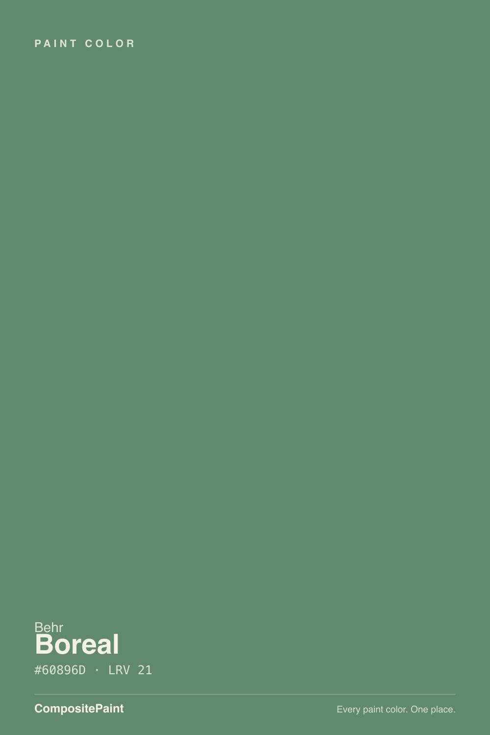
Boreal
A deep green-gray reviewed honestly: the light that turns it moss-green, the light that turns it pewter-blue, and where it actually earns its keep.

Jessica has spec'd whites and neutrals for more than 300 rooms and keeps a sample wall of painted drawdowns in her studio. Every color review is checked against real reader rooms in the comments and re-tested when a formula changes. About the testing process →
- 1Essex Green6
- 2Vintage Vogue12
- 3Boreal20
- 4Evergreen Fog30
- 5Clary Sage41
The Fast Verdict
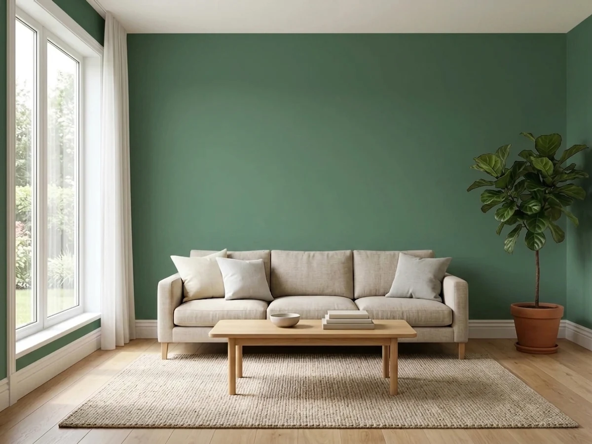
Boreal is Behr's quiet answer to the moody-cabinet-green trend — a deep green-gray built on a slate-blue undertone that decides everything. Give it south or west sun and it settles into an earthy moss green; give it a north window and no lamps and it drops the green almost entirely, reading closer to pewter-blue. There is no viral moment behind this one and no Color of the Year plaque. It is a workhorse for cabinets, offices and exteriors, and it does that job well as long as you know which color you are actually getting.
Kitchen cabinets and islands · home offices and dens that want some gravity · exterior shutters, doors and siding accents against warm brick or stone · anyone who wants a green-gray that reads sophisticated, not grassy
Your only window faces north and stays dim · you want a clean, leafy green with no gray in it · your floors or countertops run cool gray · your trim or millwork is cherry or red-toned wood
- A genuinely sophisticated deep green-gray, not a flat trend green
- Cabinet-grade semi-gloss and satin formulas exist for this exact color
- Loves brass, unlacquered nickel and warm wood — reads custom, not cheap
- Holds up on exteriors against warm brick, stone or cedar
- A quiet, undermarketed color that doesn't look like every other kitchen
- North light strips the green and leaves a flat pewter-gray
- Clashes with cherry wood and red brick — both sides go muddy
- Cool gray floors or stark white trim make it read cold, not moody
- Not a true leafy green — buyers expecting grass-green will be disappointed
What Color Is Boreal, Really?
A muted green-gray built the way most Behr N-series architectural colors are: a green pigment cut hard with a cool, slate-blue neutral until the green barely survives. That base is the whole personality. In warm, direct light the pigment reasserts itself and the wall reads as an earthy moss green with real depth. In cool, indirect light the blue base takes over and the same wall reads gray-blue, almost pewter, with the green reduced to a hint. It is not a stable color the way a warm greige is stable — it is a color that answers back to whatever light you give it.
At LRV 20 it sits at a real, working mid-depth — deep enough to hold its color instead of washing pale, not so dark it swallows a room. That is close to the depth of SW Retreat and just a step above SW Pewter Green, and it is exactly why Boreal reads well on cabinets and trim: enough saturation to look intentional, not so much that it needs a huge room to carry it.
Undertone in one line: cool, slate-blue first, moss green second — never yellow-green, never warm. If your sample looks flat gray with barely a hint of color, that is north light or overcast sky doing it, not a bad can of paint; if it looks distinctly green and a little golden, that is south or west sun doing its job.
Where It Shines
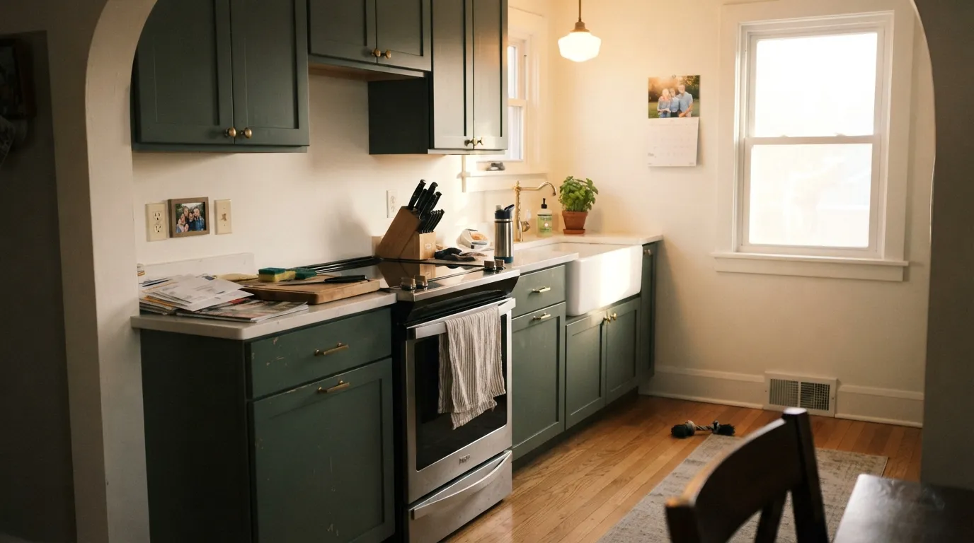
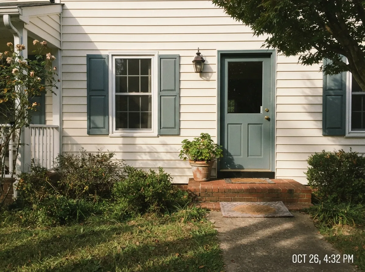
Cabinets are where this color makes the most sense: a semi-gloss or satin cabinet-grade Boreal against a lighter counter and warm brass hardware reads custom and expensive without shouting about it. It has the same appeal as a good dark den or home office — walls that add weight and quiet instead of brightness. Give it a south- or west-facing window, warm wood, brass or unlacquered nickel, and it looks like a color someone chose on purpose, not a green that happened to be on sale.
Where It Fails
Almost every disappointed review of Boreal comes down to one of three predictable mismatches, and all three show up before the first coat dries if you know to look for them.
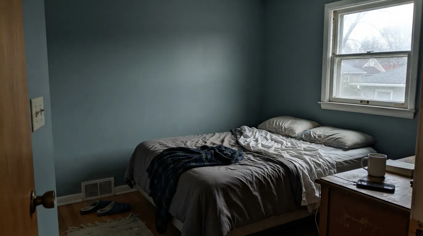
North light is cool and indirect — it strips out what little green pigment is fighting the slate-blue base and leaves a flat, almost pewter-gray wall. Buyers who picked Boreal expecting a mossy green report a color that looks nothing like the chip. The paint did not change; the light did. Sample it on the actual wall at 2pm before committing a whole kitchen of cabinets to it.
Boreal's cool, blue-leaning base sits at the opposite temperature from warm red-brown wood and brick. Next to cherry cabinetry trim or a red-brick fireplace, both sides look muddy and off — the wood reads more orange, the paint reads more gray. Walnut, white oak and unstained cedar are the safe partners; cherry is the one honest no.
Doubling down on cool tones flattens Boreal instead of grounding it — pair it with gray LVP or icy white trim and the whole room reads sterile rather than moody. It wants a warm counterweight: a warm white trim (Alabaster, Cloud White), a wood floor, or brass hardware to keep the cool undertone from taking over the room.
Room by Room
Semi-gloss or satin Boreal on shaker cabinets, paired with a lighter counter and brass or unlacquered nickel pulls, is the strongest use of this color. It reads deep and intentional without going near-black the way a lot of trend-green cabinet colors do.
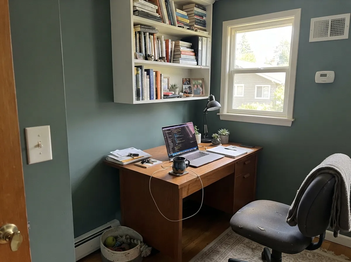
A closed room with a window and a good desk lamp is exactly the setting this color wants: enough depth to feel serious, enough green to feel calmer than a straight charcoal. Eggshell wipes clean where a chair scuffs the wall.
Works as a full-wall color in a south- or west-facing room with warm wood furniture. In a dim or north-facing living room it goes flat and cold fast — better as an accent wall or built-in color there instead of all four walls.
On siding, shutters or a front door it holds its color better outdoors than in a dim interior room, since exteriors get more direct light over the course of a day. Pairs well with warm brick, stone or cedar; skip it against cool gray stone or a red-brick facade.
Without a window, the color depends entirely on the bulb. Warm 2700K vanity lighting keeps it green and cozy; cool white LEDs push it toward flat blue-gray in a room with no daylight to correct it.
Not usually a whole-bedroom color; it works best as a single accent wall behind the bed with warm bedding and a lamp doing the work a window can't. A full bedroom of Boreal in anything but strong south light will read moodier than most people sleep well in.
Your Light Is the Risk
Warm direct light pulls the moss green forward and Boreal reads as a real, earthy green-gray, not just a dark neutral.
Cool, indirect light exposes the slate-blue base and drains the green almost entirely — expect a flat pewter-gray, not the chip's green.
The same window can read blue-gray under cloud cover and green-brown an hour later in full sun. It is one of the more weather-reactive colors in the deck.
2700K warm bulbs keep the green alive after dark and add depth. Cool white LEDs push it back toward blue-gray — swap the bulb before you swap the paint.
Most complaints about Boreal are a light mismatch. Upload a photo of your actual room and see it on your walls — then ask for the same wall in north light or evening lamps before you buy a single sample.
Need It From Another Brand?
Any paint counter can custom-tint Behr N420-5 directly. If you would rather stay in one brand's own deck, these are the closest stock matches, measured as ΔE2000. Under 2 is a difference you will not see on the wall.
| Brand | Closest color | ΔE | LRV | |
|---|---|---|---|---|
| Sherwin-Williams | TaigaSW 9654 · Sherwin-Williams | 2.3 | 21 | Color page → |
| Benjamin Moore | LushAF-475 · Benjamin Moore | 1.9 | 21 | Color page → |
| Valspar | Sage Slate8004-32F · Valspar | 3.7 | 19 | Color page → |
| PPG / Glidden | Thyme GreenPPG1128-6 · PPG / Glidden | 2.9 | 19 | Color page → |
| Glidden | Thyme GreenPPG1128-6 · Glidden | 2.8 | 19 | Color page → |
| Dutch Boy | In The Brush427-6DB · Dutch Boy | 2.0 | 20 | Color page → |
Similar Behr Colors
The nearest shades to Boreal within Behr's own range, ranked by perceptual color distance — useful when you want the same look a touch lighter, darker, or warmer.
WCAG 2.1: AA is 4.5 : 1 for normal text, 3 : 1 for large text, AAA is 7 : 1.
Boreal vs the Colors You're Also Considering
Every Boreal sample board has the same rivals on it. The numbers show the real lightness gap — then it comes down to which risk you would rather live with.
Pick this when you want the more assertive blue-gray edge Boreal carries in cool light, not a softer olive.
Sherwin-Williams SW 6207 · LRV 21RetreatPick this for nearly the same depth with more olive warmth built in and less blue drift in dim light.
Pick this when you want more gray weight in the mix, not a color that reads clearly green in every light.
Sherwin-Williams SW 9679 · LRV 20JuniperPick this for a truer cool green with less gray muddying it and less swing toward blue.
Island Palm 460F-5 at LRV 21 with hex #5A8967 is the closest neighbor, essentially the same depth with a fraction more green. Aspen Valley N430-5 at LRV 22 and Dark Jade MQ6-43 at LRV 21 both push toward blue-green and feel cooler. Forest Edge S430-6 at LRV 20 is slightly darker and more saturated, while Green Adirondack PPF-35 at LRV 22 is the grayest of the group. Bahia Grass 430F-5 at LRV 22 is the warm, yellow-green alternative.
Across brands, Dutch Boy Garden Fresh 229-6DB at LRV 21 is a deltaE of 1.73 and will look identical in normal room light. Benjamin Moore Weeping Willow 629 at LRV 21 is 2.33 and Sherwin-Williams Alexandrite SW 60 at LRV 22 is 2.72, both very close but worth sampling first.
Dunn-Edwards English Holly DE5649 at LRV 19 is 3.38 and PPG and Glidden Succulent Leaves PPG1131-6 at LRV 23 is 4.46, close but visibly different side by side, with Succulent Leaves reading lighter and more yellow-green.
Boreal Coordinating Colors
The rule for coordinating with Boreal: warm whites, warm metals, and one true dark — and keep cool grays and red-toned woods away from it. It leans on warmth to balance its own cool base, so these are the partners that keep it looking intentional rather than cold:
Boreal's Story: A Cabinet-and-Exterior Workhorse, Not a Trend Color
Boreal has never been a Color of the Year and there is no viral kitchen photo behind it — search for it and you find product pages and undertone breakdowns, not Reddit threads or Houzz debates. That absence is worth saying plainly rather than papering over: this is an honest, quiet color, not a famous one.
What it does have is a real, specific job. Behr sells it in cabinet-grade semi-gloss and satin enamel built for doors, trim and cabinetry, and that is where it is actually used — kitchen islands, built-ins, exterior shutters and doors, the kind of project where a homeowner or contractor wants a deep, sophisticated green-gray without betting an entire house on a headline color. It sits in the same lane as SW Retreat and SW Pewter Green: dependable, unglamorous, and genuinely good at the one thing it is asked to do.
Boreal With Wood Tones and Floors
Warm, mid-to-light woods are the safe answer: white oak, walnut and unstained cedar all sit comfortably against Boreal's cool base without a fight. Brass and unlacquered nickel hardware read as intentional rather than mismatched, which is most of why it works so well on cabinets.
Cherry wood and red-toned brick are the one honest no — the warm red-orange in both fights Boreal's slate-blue undertone, and both sides end up looking muddier than either would alone. Cool gray flooring is a softer risk: it doesn't clash outright, but it doubles down on the cold and can leave a room feeling flat rather than grounded. A warm rug or a wood floor gives Boreal something to react against instead of agree with.
Three Ready Palettes Built on Boreal
A color is never alone on the wall. These are complete combinations in the 60-30-10 pattern, with the reason each one holds together. Every one opens in the visualizer.
Alabaster's warmth keeps Boreal cabinets from reading cold, and brass or unlacquered nickel pulls do the rest. Wrought Iron on a hood or island gives the kitchen one near-black note so the green-gray doesn't have to carry all the contrast alone.
Try this palette in your roomCloud White's warmth is the counterweight Boreal needs on trim — a stark white would push it colder. Chelsea Gray sits at almost the same depth, so a built-in or accent wall in that color reads like a deliberate second note, not a clash.
Try this palette in your roomA warm siding neutral keeps Boreal's cool undertone from reading icy against the house, while Iron Ore trim gives the facade one true dark for contrast. Works especially well against warm brick or stone — skip this pairing on a house with cool gray stone.
Try this palette in your roomBoreal FAQ
Is Boreal green or gray?
Both, depending on your light — and that is the whole story of this color. In warm south or west sun it reads as a genuine earthy moss green. In cool north light or on an overcast day it reads gray-blue, with the green reduced to a hint. Neither reading is wrong; it is the same paint responding honestly to different light.
Is LRV 20 too dark for a small room?
Not automatically. LRV 20 is a working mid-depth, similar to SW Retreat — it holds color without needing a huge room. It reads heaviest in a small windowless room with no warm light source; there, it works better as cabinets or an accent than as all four walls.
What trim color goes with Boreal?
A warm white — Alabaster or Cloud White — rather than a stark cool white. A bright, blue-leaning white pushes Boreal colder by contrast; a warm white gives it something to balance against.
Does Boreal work on kitchen cabinets?
It's one of the strongest uses of this color. Behr sells it in cabinet-grade semi-gloss and satin enamel specifically for this. Pair it with a lighter counter and warm metal hardware, and keep it away from cherry-toned wood elsewhere in the kitchen.
Is Boreal good for exteriors?
Yes — on shutters, a front door or siding it holds its color better than in a dim interior room, since exteriors get more direct light through the day. It pairs well with warm brick, stone or cedar and clashes with cool gray stone or red brick.
How many coats does it take?
Two coats over a lighter existing wall color is typical. Going over a much darker or saturated color, or using it as an accent over a stark white, prime first — a green-gray this deep will take an extra coat to cover evenly without primer.
Have you painted with Boreal?
Rate it — one tap helps the next reader decide.
Ask a Question