CP

Two-Tone Kitchen Palette — White Uppers & Navy Lowers

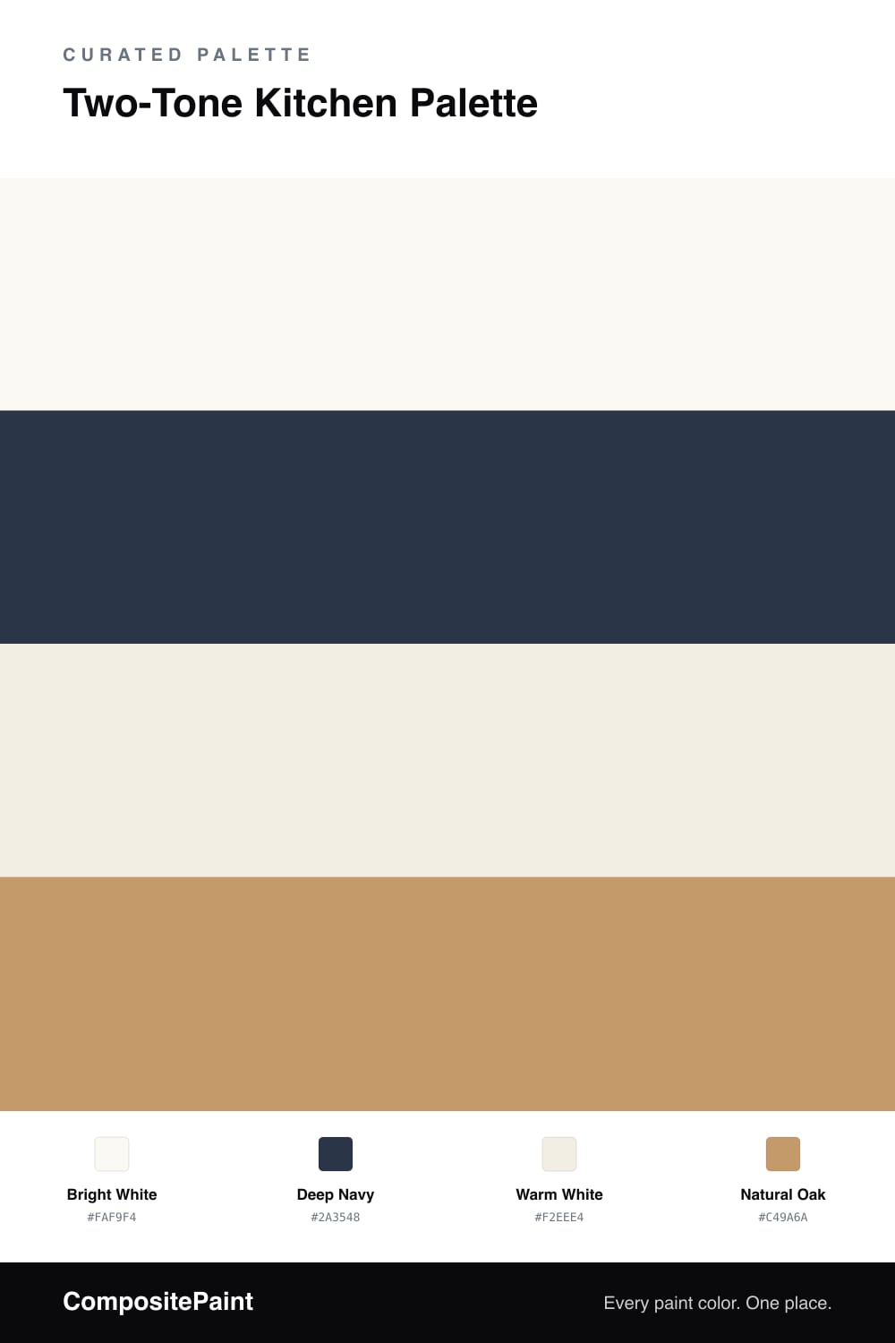
A classic, balanced 4-color scheme for two-tone kitchens: bright white upper cabinets, deep navy lowers, warm white walls, and a natural wood tan to tie it together. Every color matched to real paint you can buy.

By Jessica Williams · Color Stylist & Interior Editor

Two-tone cabinets are a classic for a reason — they give a kitchen depth without committing the whole room to a bold color. The rule of thumb is simple: dark on the bottom, light on top. Here the upper cabinets wear a bright white that keeps the room feeling tall and airy, while the lower cabinets take a deep navy that grounds everything and hides everyday wear.

The walls step back in a softer warm white, different enough from the uppers that nothing looks like a mismatch, close enough that the room stays calm. Natural oak ties the two tones together through flooring, a wood island top, or open shelves, adding warmth so the navy never feels heavy. Lead with the white uppers, anchor with navy below, and let warm wood bridge the two.

View palette in
Bright White
Upper Cabinets
Behr Crystal Cut · PR-W13
#FBF9F4
LRV 95
Deep Navy
Lower Cabinets
Benjamin Moore Winding Waterway · 2063-10
#2E3549
LRV 5
Warm White
Walls
Glidden Atrium White · PPG1020-1
#F1EEE4
LRV 85
Natural Oak
Wood & Floors
Kompozit Back to Basics · 0255
#C49A69
LRV 36

Buy These Colors

Each color matched to the closest real paint in every brand, by ΔE2000. Tap a swatch for its full guide or + to save it — take any SKU to the store, they mix on demand.

Bright White
#FAF9F4 · LRV 95 · Upper Cabinets
Sherwin-Williams · SW 7757 · ΔE 0.9
Behr · PR-W13 · ΔE 0.5
Benjamin Moore · 2144-70 · ΔE 2.36
Valspar · 7006-24 · ΔE 0.55
PPG / Glidden · PPG1001-1 · ΔE 1.98
Glidden · PPG1001-1 · ΔE 1.8
Dutch Boy · 001W · ΔE 1.1
HGTV Home by Sherwin-Williams · HGSW 4001 · ΔE 0.9
Dunn-Edwards · DEW358 · ΔE 1.22
Magnolia Home · JG-21 · ΔE 1.2
Farrow & Ball · NO. 2005 · ΔE 0.88
Diamond Vogel · 0011 · ΔE 2.48
Hirshfield's · 0011 · ΔE 1.92
Rodda · R007 · ΔE 1.4
C2 Paint · C2-692 · ΔE 1.81
Clare · PNT100-LT-02 · ΔE 1.46
Portola Paints · TABLE LINEN · ΔE 1.18
Annie Sloan · OLD OCHRE · ΔE 15.29
Backdrop · BD-TR · ΔE 3.06
Rust-Oleum · 285140 · ΔE 3.58
Kompozit · 0011 · ΔE 1.92
Deep Navy
#2A3548 · LRV 4 · Lower Cabinets
Sherwin-Williams · SW 9178 · ΔE 3.05
Behr · 760F-7 · ΔE 2.21
Benjamin Moore · 2063-10 · ΔE 2.17
Valspar · 8003-46G · ΔE 2.21
PPG / Glidden · PPG0995-7 · ΔE 10.54
Glidden · 00NN 05/000 · ΔE 10.1
Dutch Boy · 338-7DB · ΔE 2.62
HGTV Home by Sherwin-Williams · HGSW 3331 · ΔE 9.64
Dunn-Edwards · DEA185 · ΔE 2.8
Magnolia Home · JG-05 · ΔE 6.52
Farrow & Ball · NO. G18 · ΔE 10.52
Diamond Vogel · H101 · ΔE 9.72
Hirshfield's · 0522 · ΔE 7.02
Rodda · CA210 · ΔE 5.33
C2 Paint · BD49 · ΔE 9.67
Clare · PNT100-DP-54 · ΔE 13.16
Portola Paints · GHOST TREE · ΔE 8.4
Annie Sloan · NAPOLEONIC BLUE · ΔE 6.27
Backdrop · BD-AH · ΔE 13.59
Rust-Oleum · 285144 · ΔE 8.67
Kompozit · 0522 · ΔE 7.02
Warm White
#F2EEE4 · LRV 86 · Walls
Sherwin-Williams · SW 7566 · ΔE 0.55
Behr · ECC-61-2 · ΔE 1
Benjamin Moore · AF-15 · ΔE 1.43
Valspar · 7002-7 · ΔE 0.53
PPG / Glidden · PPG1020-1 · ΔE 0.61
Glidden · PPG1020-1 · ΔE 0.5
Dutch Boy · 020W · ΔE 0.9
HGTV Home by Sherwin-Williams · HGSW 4003 · ΔE 0.55
Dunn-Edwards · DEHW03 · ΔE 2.08
Magnolia Home · JG-107 · ΔE 1.45
Farrow & Ball · NO. 2003 · ΔE 0.9
Diamond Vogel · 0012 · ΔE 0.89
Hirshfield's · 0012 · ΔE 1.38
Rodda · CA013 · ΔE 0.6
C2 Paint · C2-708 · ΔE 0.52
Clare · PNT100-LT-24 · ΔE 2.9
Portola Paints · ORIGAMI · ΔE 2.26
Annie Sloan · OLD OCHRE · ΔE 12.19
Backdrop · BD-JA · ΔE 1.04
Rust-Oleum · 329598 · ΔE 4.89
Kompozit · 0012 · ΔE 1.38
Natural Oak
#C49A6A · LRV 36 · Wood & Floors
Sherwin-Williams · SW 6130 · ΔE 1.44
Behr · S270-5 · ΔE 1.35
Benjamin Moore · CW-385 · ΔE 2.58
Valspar · M139 · ΔE 1.09
PPG / Glidden · PPG1092-5 · ΔE 2.35
Glidden · PPG1092-5 · ΔE 2.18
Dutch Boy · 315-4DB · ΔE 1.02
HGTV Home by Sherwin-Williams · HGSW 2173 · ΔE 1.44
Dunn-Edwards · DE6137 · ΔE 2.98
Magnolia Home · JG-166 · ΔE 11.35
Farrow & Ball · NO. 319 · ΔE 4.26
Diamond Vogel · 0255 · ΔE 1.82
Hirshfield's · 0255 · ΔE 0.27
Rodda · CA106 · ΔE 5
C2 Paint · BD69 · ΔE 0.32
Clare · PNT100-DP-59 · ΔE 3.5
Portola Paints · PIXIE · ΔE 6.25
Annie Sloan · CHATEAU GREY · ΔE 11.82
Backdrop · BD-CT · ΔE 12.03
Rust-Oleum · 398640 · ΔE 9.41
Kompozit · 0255 · ΔE 0.27

Questions

Which cabinets go dark — uppers or lowers?

Lowers. Keeping the dark navy on the base cabinets and white on top keeps the eye lifted and the room feeling open, while the darker color visually grounds the space where it gets the most wear anyway.

Will white walls fight with white uppers?

No, because they're different whites. The bright white uppers stay crisp while the walls take a warmer white, so they sit back and let the cabinets and navy do the talking.

KEEP EXPLORING

Similar Palettes

Closest schemes by color — not by label.