CP

Tropical Color Palette — Mango Riptide

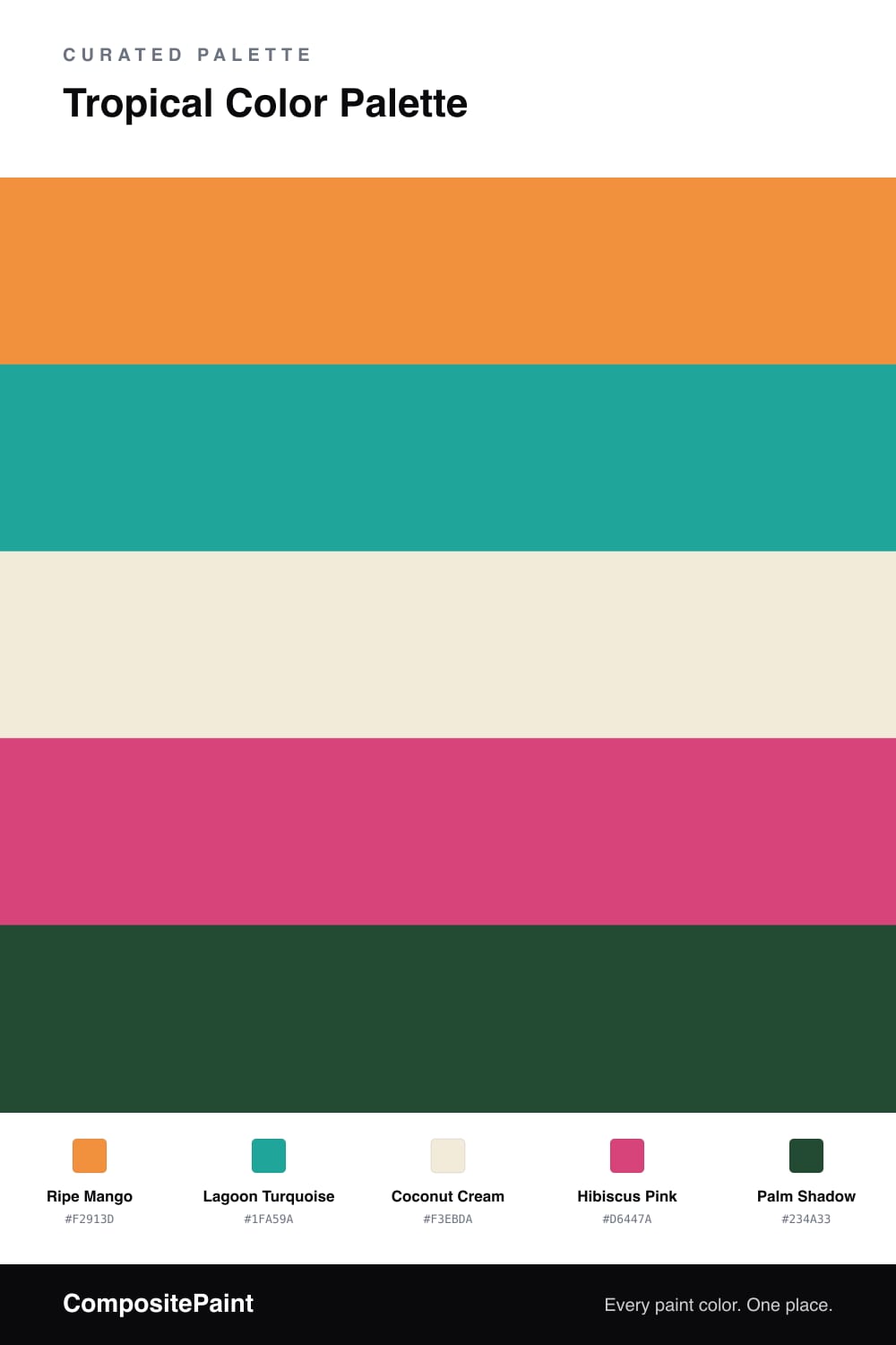
A vivid five-color tropical scheme that pairs ripe mango with turquoise, jungle green, hibiscus pink, and a deep palm shadow — every color matched to real paint you can buy.

By Maya Patel · Reviews Editor & Product Tester

Tropical color does not have to mean a wall of clashing brights. This scheme picks a winner and builds around it — Ripe Mango leads, a juicy warm orange that feels sun-soaked without tipping into neon. It is the color that carries the room.

Lagoon Turquoise is the partner, cool and clear, the water against the fruit. I keep it secondary on purpose — turquoise loves to take over, so giving it a supporting role is what keeps the palette balanced instead of busy. Coconut Cream stretches between the two as a soft base, and a deep Palm Shadow green grounds everything so the brights have something to push against.

The spark is Hibiscus Pink, and it earns its keep precisely because there is so little of it. One bold dose — a door, a cushion, a vase — and the whole palette wakes up. That restraint is the trade-off worth making: skip it and the scheme is pretty, add too much and it shouts. Used once, it is the line that makes this feel current rather than kitsch.

View palette in
Ripe Mango
Dominant
Glidden Dynamo · PPG17-22
#EF913E
LRV 39
Lagoon Turquoise
Secondary
Behr Tropical Sea · HDC-MD-22
#00A69A
LRV 30
Coconut Cream
Base
Dunn-Edwards White Blossom · DET677
#F4ECDB
LRV 84
Hibiscus Pink
Accent
Behr Italiano Rose · 140B-6
#D93D81
LRV 20
Palm Shadow
Support
Sherwin-Williams Greenhouse · SW 2933
#214B2D
LRV 6

Buy These Colors

Each color matched to the closest real paint in every brand, by ΔE2000. Tap a swatch for its full guide or + to save it — take any SKU to the store, they mix on demand.

Ripe Mango
#F2913D · LRV 39 · Dominant
Sherwin-Williams · SW 6891 · ΔE 1.78
Behr · 270B-6 · ΔE 3.21
Benjamin Moore · 140 · ΔE 2.77
Valspar · V012-3 · ΔE 3.79
PPG / Glidden · PPG17-22 · ΔE 0.89
Glidden · PPG17-22 · ΔE 0.6
Dutch Boy · 110-6DB · ΔE 1.21
HGTV Home by Sherwin-Williams · HGSW 1123 · ΔE 5.58
Dunn-Edwards · DE5200 · ΔE 2.95
Magnolia Home · JG-40 · ΔE 14.03
Farrow & Ball · NO. W76 · ΔE 7.17
Diamond Vogel · 0977 · ΔE 3.82
Hirshfield's · 0983 · ΔE 3.53
Rodda · CA120 · ΔE 12.01
C2 Paint · C2-574 · ΔE 6.75
Clare · PNT100-DP-59 · ΔE 14.14
Portola Paints · PIXIE · ΔE 11.7
Annie Sloan · ARLES · ΔE 8.92
Backdrop · BD-RO · ΔE 19.68
Rust-Oleum · 398640 · ΔE 8.1
Kompozit · 0983 · ΔE 3.53
Lagoon Turquoise
#1FA59A · LRV 30 · Secondary
Sherwin-Williams · SW 6939 · ΔE 2.19
Behr · HDC-MD-22 · ΔE 0.84
Benjamin Moore · 664 · ΔE 2.32
Valspar · 5007-10B · ΔE 1.24
PPG / Glidden · PPG1232-6 · ΔE 0.99
Glidden · PPG1232-6 · ΔE 1.04
Dutch Boy · 131-6DB · ΔE 2.91
HGTV Home by Sherwin-Williams · HGSW 1303 · ΔE 5.37
Dunn-Edwards · DEFD41 · ΔE 2.96
Magnolia Home · JG-02 · ΔE 16.06
Farrow & Ball · NO. CB7 · ΔE 13.18
Diamond Vogel · 0682 · ΔE 4.14
Hirshfield's · 0682 · ΔE 5.09
Rodda · R058 · ΔE 16.34
C2 Paint · C2-730 · ΔE 9.7
Clare · PNT100-MD-75 · ΔE 7.63
Portola Paints · BLUE HERON · ΔE 18.49
Annie Sloan · PROVENCE · ΔE 10.4
Backdrop · BD-PW · ΔE 19.63
Rust-Oleum · 371675 · ΔE 15.32
Kompozit · 0682 · ΔE 5.09
Coconut Cream
#F3EBDA · LRV 84 · Base
Sherwin-Williams · SW 7558 · ΔE 0.96
Behr · ECC-42-2 · ΔE 0.92
Benjamin Moore · 912 · ΔE 0.49
Valspar · 7002-5 · ΔE 1.56
PPG / Glidden · PPG1203-1 · ΔE 0.41
Glidden · 45YY 83/094 · ΔE 0.75
Dutch Boy · 007W · ΔE 0.45
HGTV Home by Sherwin-Williams · HGSW 1187 · ΔE 0.78
Dunn-Edwards · DET677 · ΔE 0.21
Magnolia Home · JG-33 · ΔE 1.86
Farrow & Ball · NO. 203 · ΔE 1.93
Diamond Vogel · 0292 · ΔE 0.4
Hirshfield's · 0009 · ΔE 0.79
Rodda · CA006 · ΔE 1.06
C2 Paint · C2-563 · ΔE 0.51
Clare · PNT100-LT-62 · ΔE 1.65
Portola Paints · CASA FORMA · ΔE 0.51
Annie Sloan · OLD OCHRE · ΔE 9.83
Backdrop · BD-DS · ΔE 2.67
Rust-Oleum · 329598 · ΔE 3.41
Kompozit · 0009 · ΔE 0.79
Hibiscus Pink
#D6447A · LRV 20 · Accent
Sherwin-Williams · SW 6860 · ΔE 5.83
Behr · 140B-6 · ΔE 2.23
Benjamin Moore · 1348 · ΔE 2.99
Valspar · 1002-1B · ΔE 6.83
PPG / Glidden · PPG1181-7 · ΔE 3.78
Glidden · 43RR 19/444 · ΔE 3.64
Dutch Boy · 103-6DB · ΔE 9.46
HGTV Home by Sherwin-Williams · HGSW 1054 · ΔE 11.06
Dunn-Edwards · DE5048 · ΔE 3.04
Magnolia Home · JG-25 · ΔE 13.89
Farrow & Ball · NO. W92 · ΔE 6.04
Diamond Vogel · 1100 · ΔE 10.87
Hirshfield's · 1100 · ΔE 10.78
Rodda · CA224 · ΔE 20.86
C2 Paint · BD58 · ΔE 10
Clare · PNT100-DP-29 · ΔE 15.22
Portola Paints · MESA · ΔE 24.24
Annie Sloan · CAPRI PINK · ΔE 8.87
Backdrop · BD-BH · ΔE 19.17
Rust-Oleum · 329211 · ΔE 19.49
Kompozit · 1100 · ΔE 10.78
Palm Shadow
#234A33 · LRV 5 · Support
Sherwin-Williams · SW 2933 · ΔE 2.46
Behr · 480F-7 · ΔE 2.76
Benjamin Moore · 2052-10 · ΔE 5.21
Valspar · V063-6 · ΔE 4.71
PPG / Glidden · PPG1134-7 · ΔE 7.26
Glidden · 30GG 06/113 · ΔE 8.82
Dutch Boy · 329-6DB · ΔE 6.56
HGTV Home by Sherwin-Williams · HGSW 2271 · ΔE 3.08
Dunn-Edwards · DEA180 · ΔE 9.06
Magnolia Home · JG-97 · ΔE 18.9
Farrow & Ball · NO. W55 · ΔE 8.06
Diamond Vogel · H098 · ΔE 15.53
Hirshfield's · 0711 · ΔE 5.54
Rodda · R018 · ΔE 18.25
C2 Paint · C2-694 · ΔE 8.23
Clare · PNT100-DP-54 · ΔE 18.13
Portola Paints · NOSTALGIA · ΔE 15.67
Annie Sloan · AUBUSSON BLUE · ΔE 16.91
Backdrop · BD-NE · ΔE 7.87
Rust-Oleum · 285144 · ΔE 18.26
Kompozit · 0711 · ΔE 5.54

Questions

How do I keep this palette from feeling like a beach souvenir shop?

Let one bright lead and pull the rest back. Use Ripe Mango on the largest surface, keep Lagoon Turquoise to about one-fifth of the space, and treat Hibiscus Pink as a single pop on a door or a chair. Coconut Cream and Palm Shadow do the calming work so the brights read fresh, not loud.

Which color should I use the least of?

Hibiscus Pink. It is the loudest note here, so it works best as a true accent — a stool, a stripe, a single piece of art. A little goes a long way, and holding it back is what makes the mango and turquoise feel grown-up.

KEEP EXPLORING

Similar Palettes

Closest schemes by color — not by label.