CP

Summer Color Palette — Poolside

A breezy five-color scheme pairing bright pool blue and sun-warmed coral with crisp white and a citrus pop — every color matched to real paint you can buy.

By Jessica Williams · Color Stylist & Interior Editor

Pool Blue
Dominant
Kompozit Sarah's Garden · 0674
#00AAC1
LRV 33
Sun Coral
Secondary
Kompozit Ballet Cream · 1046
#FC8258
LRV 37
Crisp White
Base
Kompozit Sugar Dust · 0011
#F8F6ED
LRV 92
Citrus Zest
Support
Kompozit I'm a Local · 0863
#EBBF5C
LRV 56
Deep Marine
Accent
Kompozit Blue Period · 0690
#075158
LRV 7
View palette in

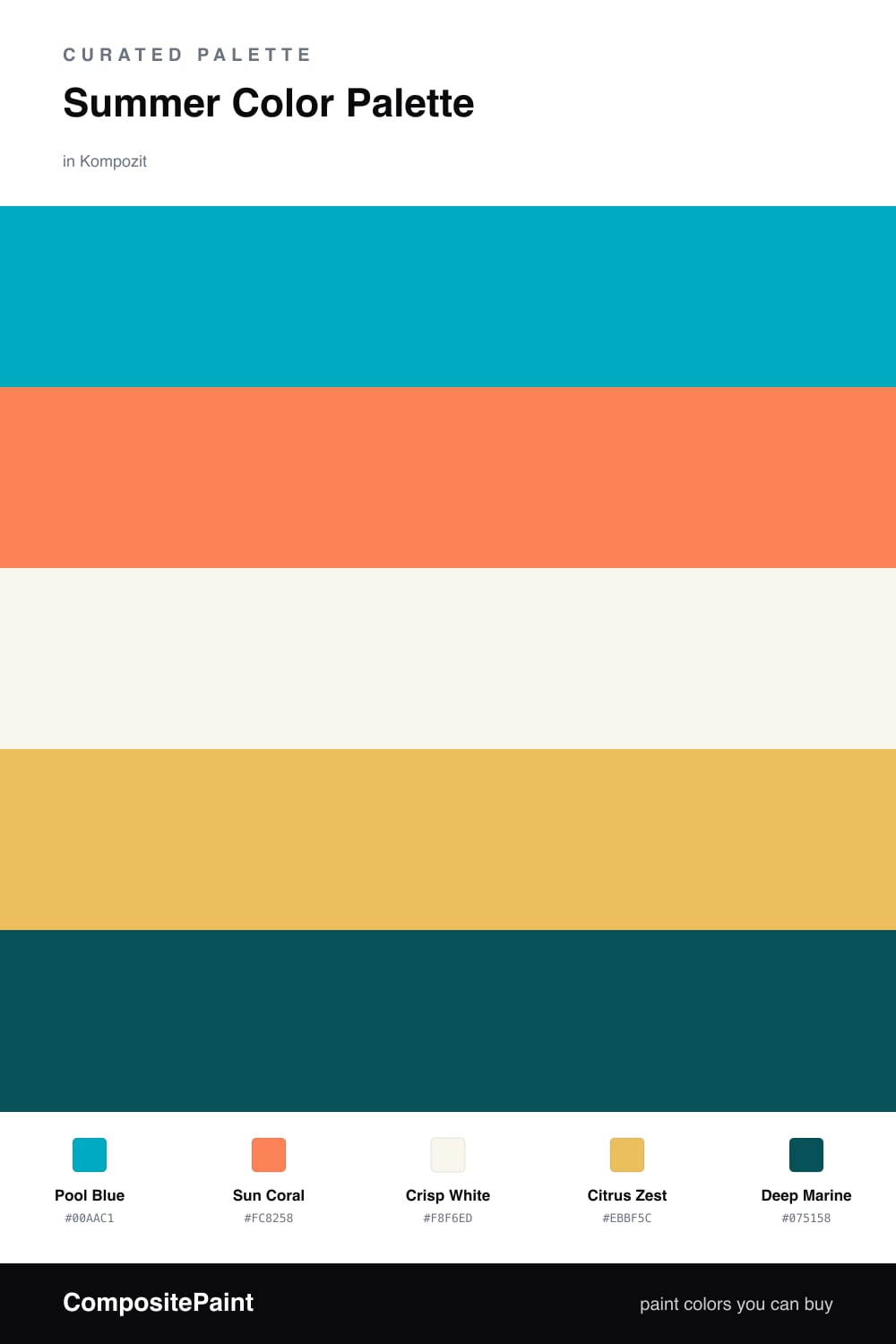
Summer is the easiest season to chase with color, and Pool Blue is where this one starts — that clean, lit-from-within turquoise you see in the shallow end at noon. It carries the whole scheme, fresh and watery without tipping into baby blue.

Against it, Sun Coral is the warm flush of skin after a long afternoon outside, and Citrus Zest is the squeeze of lemon on top — just enough to make everything feel alive. I keep both in small, deliberate doses so they spark rather than shout. Crisp White is the towel-and-tile backdrop that lets the brights breathe, warm enough to feel sunlit rather than clinical.

To stop a palette this lively from floating away, I drop in Deep Marine as the anchor — the deep-water blue at the far end of the pool. A little goes a long way on a door, a frame, or a band of trim, and it gives the brighter colors something solid to push against. Lead with the blue, keep the warm colors as accents, and the whole scheme stays summer-bright without ever feeling like a poster.

Buy These Colors

Each color matched to the closest real paint in every brand, by ΔE2000. Kompozit first; take any SKU to the store — these mix on demand.

Pool Blue
#3FA9C9 · LRV 34 · Dominant
Kompozit Sarah's Garden · 0674 ΔE 4.84
Backdrop Polly Wants · BD-PW ΔE 14.71
Behr Blue Chaise · 550D-6 ΔE 1.4
Benjamin Moore Baltimore Sky · 760 ΔE 5.27
Clare Blue Ivy · PNT100-MD-39 ΔE 8.84
Dunn-Edwards Frozen Wave · DE5829 ΔE 2.03
Farrow & Ball St Giles Blue · No. 280 ΔE 5.9
Magnolia Home Winter Solstice · JG-89 ΔE 11.05
PPG / Glidden Mystic Blue · 1237-5 ΔE 3.12
Sherwin-Williams Jamaica Bay · SW 6781 ΔE 5.13
Valspar Ocean Sigh · 5002-10A ΔE 1.37
Sun Coral
#F08562 · LRV 36 · Secondary
Kompozit Ballet Cream · 1046 ΔE 2.6
Backdrop Rosita · BD-RO ΔE 13.35
Behr Florida Mango · 250D-5 ΔE 3.24
Benjamin Moore Tangerine Fusion · 083 ΔE 1.93
Clare Pink Sky · PNT100-MD-28 ΔE 12.2
Dunn-Edwards Orange Daylily · DE5145 ΔE 2.23
Farrow & Ball Red Earth · No. 64 ΔE 8.93
Magnolia Home Rosy Pink · JG-154 ΔE 16.87
PPG / Glidden Indiana Clay · 1195-6 ΔE 4.58
Sherwin-Williams Sunset · SW 6626 ΔE 5.64
Valspar Orange Slice · 2002-1B ΔE 2.41
Crisp White
#F7F4ED · LRV 91 · Base
Kompozit Sugar Dust · 0011 ΔE 1.22
Backdrop Tabula Rasa · BD-TR ΔE 2.08
Behr Whisper White · HDC-MD-08 ΔE 0.62
Benjamin Moore Mountain Peak White · 2148-70 ΔE 1.59
Clare Timeless · PNT100-LT-04 ΔE 1.21
Dunn-Edwards Droplets · DEW381 ΔE 0.95
Farrow & Ball Wimborne White · No. 239 ΔE 1.76
Magnolia Home True White · JG-21 ΔE 1.97
PPG / Glidden Delicate White · 1001-1 ΔE 2.19
Sherwin-Williams High Reflective White · SW 7757 ΔE 1.52
Valspar Ivory Keys · 8007-4A ΔE 0.93
Citrus Zest
#F2C14E · LRV 58 · Support
Kompozit I'm a Local · 0863 ΔE 2.22
Backdrop Eames · BD-EA ΔE 7.37
Behr Golden Chalice · 360D-5 ΔE 4.34
Benjamin Moore Luminous Days · 300 ΔE 1.66
Clare Golden Hour · PNT100-MD-23 ΔE 5.41
Dunn-Edwards Sunflower · DE5391 ΔE 1.9
Farrow & Ball Babouche · No. 223 ΔE 2.83
Magnolia Home Amber · JG-39 ΔE 8.6
PPG / Glidden Indian Maize · 1214-6 ΔE 3.92
Sherwin-Williams Rayo de Sol · SW 9020 ΔE 0.8
Valspar Sweet Lemon · 3006-3B ΔE 1.2
Deep Marine
#1E4E60 · LRV 7 · Accent
Kompozit Blue Period · 0690 ΔE 7.52
Backdrop Last Call · BD-LC ΔE 14.54
Behr Kingfisher · 520F-7 ΔE 3.19
Benjamin Moore Slate Teal · 2058-20 ΔE 2.41
Clare Blackish · PNT100-DP-54 ΔE 15.48
Dunn-Edwards Deep Ocean · DEA135 ΔE 3.82
Farrow & Ball Hague Blue · No. 30 ΔE 6.79
Magnolia Home Signature · JG-91 ΔE 6.07
PPG / Glidden Plymouth Blue · 13-27 ΔE 2.45
Sherwin-Williams Seaworthy · SW 7620 ΔE 3.78
Valspar Newport Gray · 4011-5 ΔE 1.39

Questions

How do I keep a bright summer palette from feeling like a kids room?

Anchor it with the deep marine and let the crisp white carry most of the wall space. When the brights sit against a calm, slightly warm white instead of stark gray-white, they read fresh and grown-up rather than primary and loud.

Which color should I actually paint the most of?

Lead with the crisp white as your base, bring in pool blue as the dominant color on one feature wall or cabinetry, then use sun coral and citrus zest in small doses on a door, trim, or accent piece. The deep marine grounds it all in the smallest amount.

Similar Palettes

Closest schemes by color — not by label.