Summer Color Palette — Citrus Tide
A bright five-color summer scheme pairing warm citrus orange and clear sky blue with sun-washed neutrals, every color matched to real paint you can buy.
By David Chen · Formulation Lead & Resident Chemist
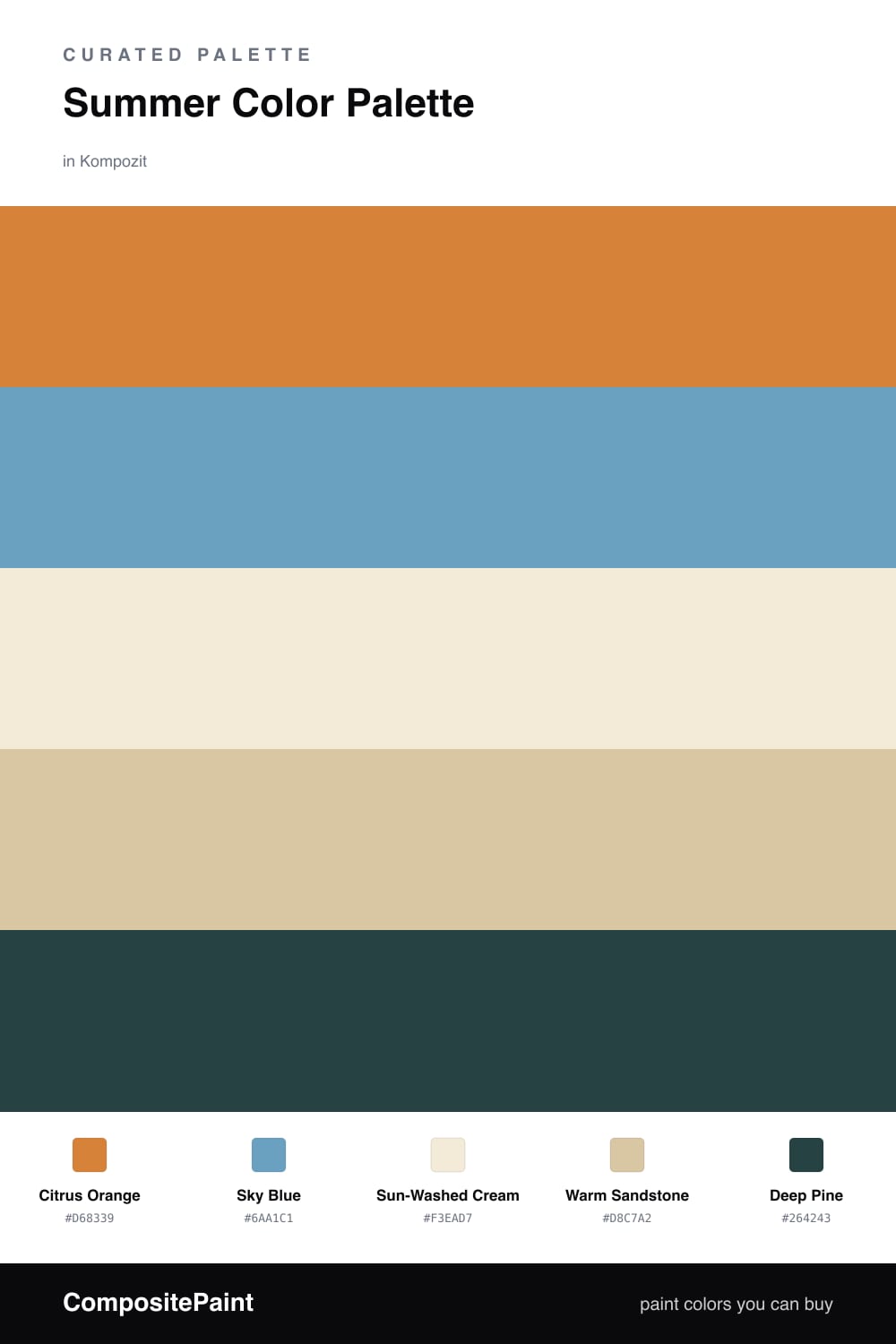
Summer is really about light, so I built this scheme around two colors that bounce off each other the way sun bounces off water. Citrus Orange brings the heat of a ripe peach, and Sky Blue answers it with the cool of a clear afternoon. They sit on opposite sides of the color wheel, and that tension is exactly what makes them feel alive together.
To keep all that energy from tipping into noise, I leaned on Sun-Washed Cream and Warm Sandstone as the calm middle ground. Think of them as the warm sand under your feet — soft, neutral, and forgiving. They let the brighter colors do their work without competing.
For 2026 I like one quiet anchor instead of a hard black, so I reached for Deep Pine as the accent. It reads almost like a deep shadow at the edge of a garden, and a small dose is all you need to give the whole palette weight and make the citrus glow.
Buy These Colors
Each color matched to the closest real paint in every brand, by ΔE2000. Kompozit first; take any SKU to the store — these mix on demand.
Questions
Orange and blue sit across from each other on the color wheel, so each one makes the other look cleaner and brighter. The cream and sandstone give your eye a place to rest, which keeps the bright pair feeling sunny instead of busy.
Let the warm cream and sandstone carry most of the room, then bring in citrus orange as the lead color and use sky blue in smaller doses. The deep pine works best as a single grounding touch, like a door or a piece of trim.
Similar Palettes
Closest schemes by color — not by label.