Aqua Color Palette — Flax & Tide
A soft five-color scheme led by a clear aqua, softened with warm flax and linen neutrals and grounded by a deep teal accent — every color matched to real paint you can buy.
By Emily Roberts · DIY Editor & First-Timer's Guide
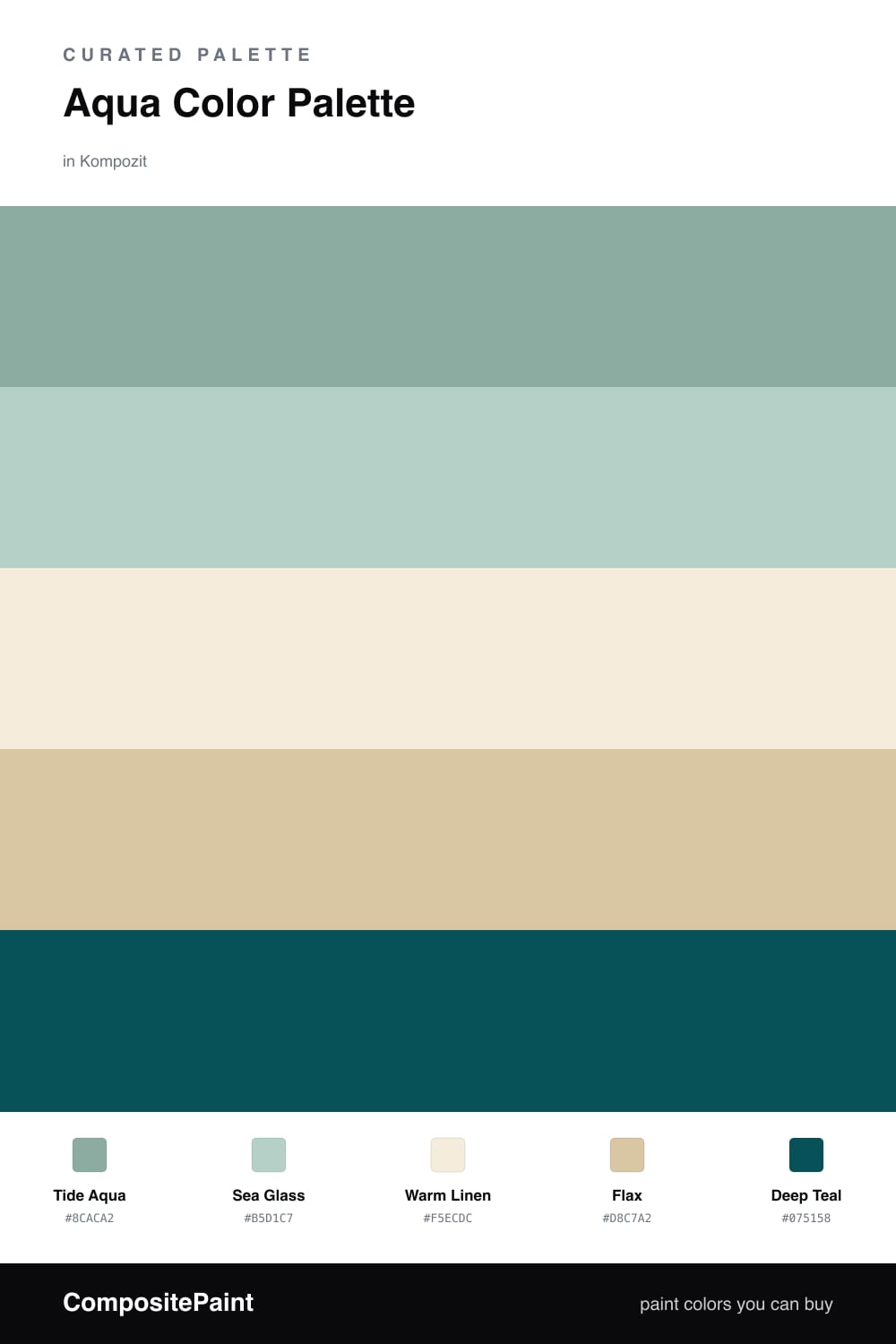
Aqua is having a real moment heading into 2026, and this scheme shows why it is so easy to live with. Tide Aqua does the heavy lifting here as a fresh, clear blue-green, with a lighter Sea Glass layered in so the aqua feels like it has some depth instead of being one flat note.
The warm neutrals are what make it work. Warm Linen keeps things bright and open, while Flax adds a soft, sandy warmth that stops the cool aqua from feeling chilly. Together they read like a quiet beach house rather than a swimming pool.
Then there is Deep Teal, which is the same family as your aqua but turned way down. Use it in small doses, on a front door, a built-in shelf, or the trim around a window, and it pulls the whole palette together without ever fighting the soft colors for attention.
Buy These Colors
Each color matched to the closest real paint in every brand, by ΔE2000. Kompozit first; take any SKU to the store — these mix on demand.
Questions
Aqua is a cool color, so on its own it can read a little cold. Flax and warm linen add a soft golden warmth that balances it out and keeps the whole scheme feeling calm and lived-in instead of clinical.
Let aqua lead but not take over. A good rule of thumb is to use it on roughly half to two-thirds of your surfaces, fill the rest with the warm neutrals, and save the deep teal for small moments like a door or a piece of trim.
Similar Palettes
Closest schemes by color — not by label.