CP

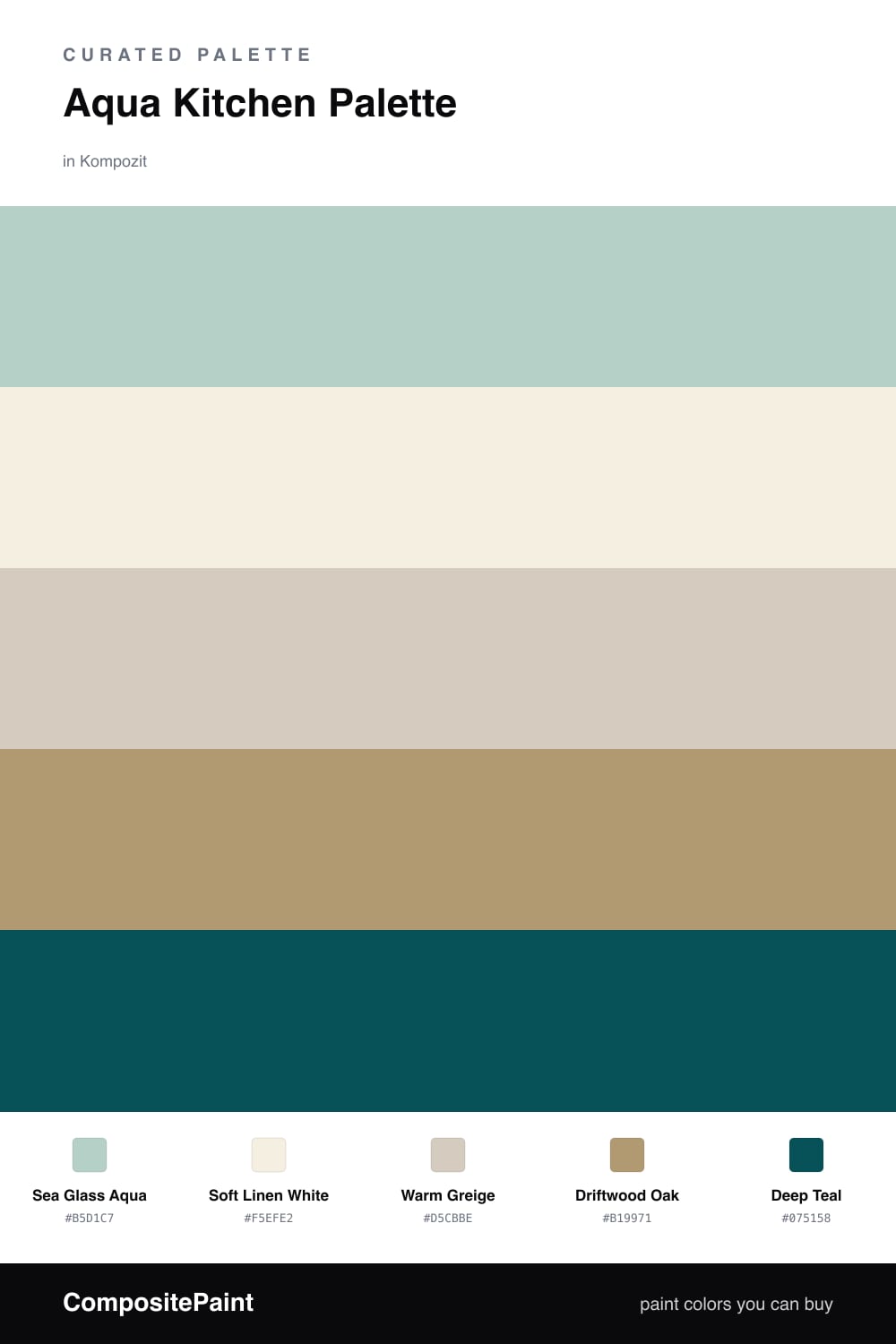
Aqua Kitchen Palette — Sea Glass Aqua & Driftwood Oak

A fresh five-color kitchen scheme led by soft sea glass aqua, warmed with oak and grounded by a deep teal accent — every color matched to real paint you can buy.

By Maya Patel · Reviews Editor & Product Tester

Sea Glass Aqua
Walls
Kompozit Uninhibited · 0700
#B5D1C7
LRV 60
Soft Linen White
Trim & Ceiling
Kompozit Bunny Cake · 0012
#F5EFE2
LRV 87
Warm Greige
Cabinets or Vanity
Kompozit Awakening · 0560
#D5CBBE
LRV 61
Driftwood Oak
Wood & Floors
Kompozit Gold Season · 0297
#B19971
LRV 33
Deep Teal
Accent
Kompozit Blue Period · 0690
#075158
LRV 7
View palette in

Aqua is having a real moment in kitchens right now, and this scheme keeps it grown-up. Sea Glass Aqua leads on the walls — soft, slightly grayed, and easy to live with — while Soft Linen White on the trim and ceiling keeps everything crisp.

For the cabinets I went with Warm Greige instead of plain white. It bridges the cool aqua and the wood tones so nothing fights, and it photographs warm in morning light. Driftwood Oak carries the floors and any open shelving, adding the natural texture that stops a cool palette from feeling clinical.

The move that makes this kitchen feel current is the Deep Teal accent. Drop it on an island or a back door and the whole room snaps into focus — same color story as the walls, just dialed up. Lead with the aqua, let the neutrals do the quiet work, and save the teal for one bold gesture.

Buy These Colors

Each color matched to the closest real paint in every brand, by ΔE2000. Kompozit first; take any SKU to the store — these mix on demand.

Sea Glass Aqua
#A7CFC9 · LRV 57 · Walls
Kompozit Uninhibited · 0700 ΔE 3.63
Backdrop Lost in the 80s · BD-LO ΔE 11.3
Behr Prelude · 740E-3 ΔE 2.42
Benjamin Moore Thunderbird · 675 ΔE 2.12
Clare Views · PNT100-LT-35 ΔE 5.79
Dunn-Edwards Steamy Spring · DE5709 ΔE 2.71
Farrow & Ball Blue Ground · No. 210 ΔE 4.81
Magnolia Home Vibrant Horizon · JG-88 ΔE 5.93
PPG / Glidden Cassiopeia · 1141-3 ΔE 1.62
Sherwin-Williams Blue Sky · SW 63 ΔE 1.08
Valspar Wave Runner · 8002-35C ΔE 2.15
Soft Linen White
#F3EFE6 · LRV 87 · Trim & Ceiling
Kompozit Bunny Cake · 0012 ΔE 1.72
Backdrop Tabula Rasa · BD-TR ΔE 1.59
Behr Nude W-f-210 · W-F-210 ΔE 1.21
Benjamin Moore Alabaster · 876 ΔE 0.91
Clare Wing It · PNT100-LT-24 ΔE 2.52
Dunn-Edwards Latte Froth · DE6239 ΔE 0.59
Farrow & Ball Pointing · No. 2003 ΔE 2.13
Magnolia Home Silos White · JG-107 ΔE 1.14
PPG / Glidden Crumb Cookie · 18-01 ΔE 1.21
Sherwin-Williams White Flour · SW 7102 ΔE 0.55
Valspar Wedding Cake · V151 ΔE 0.5
Warm Greige
#D6CCBC · LRV 61 · Cabinets or Vanity
Kompozit Awakening · 0560 ΔE 1.34
Backdrop Real Real · BD-RR ΔE 1.79
Behr Almond Wisp · PPU5-12 ΔE 1.29
Benjamin Moore Rocking Chair · CSP-400 ΔE 1.34
Clare Flatiron · PNT100-LT-17 ΔE 2.11
Dunn-Edwards Porous Stone · DE6220 ΔE 1.91
Farrow & Ball Cromarty · No. 285 ΔE 4.31
Magnolia Home Plaster · JG-156 ΔE 1.15
PPG / Glidden In The Buff · 1019-2 ΔE 2.06
Sherwin-Williams Sedate Gray · SW 6169 ΔE 2.83
Valspar Desert Fortress · 2008-10B ΔE 2.73
Driftwood Oak
#B79770 · LRV 33 · Wood & Floors
Kompozit Gold Season · 0297 ΔE 3.11
Backdrop Anita · BD-AN ΔE 7.62
Behr Artisan Crafts · N250-4 ΔE 1.12
Benjamin Moore Baked Cumin · 1062 ΔE 1.38
Clare Good as Gold · PNT100-DP-59 ΔE 4.69
Dunn-Edwards New Cork · DE6180 ΔE 3.25
Farrow & Ball Dead Salmon · No. 28 ΔE 8.02
Magnolia Home Antiquing · JG-128 ΔE 10.14
PPG / Glidden Creamy Caramel · 1096-5 ΔE 1.37
Sherwin-Williams Woven Wicker · SW 9104 ΔE 0.91
Valspar Doe Eyes · 3002-9C ΔE 2.21
Deep Teal
#1F4E4A · LRV 6 · Accent
Kompozit Blue Period · 0690 ΔE 5.47
Backdrop North End · BD-NE ΔE 9.12
Behr Thermal · S440-7 ΔE 4.66
Benjamin Moore Mallard Green · 2053-10 ΔE 3.71
Clare Blackish · PNT100-DP-54 ΔE 16.47
Dunn-Edwards Deep Pine · DEA180 ΔE 2.29
Farrow & Ball Hague Blue · No. 30 ΔE 12.57
Magnolia Home Arches · JG-97 ΔE 14.89
PPG / Glidden Deep Emerald · 1148-7 ΔE 7.21
Sherwin-Williams Hunt Club · SW 6468 ΔE 4.09
Valspar Peacock House · 5010-4 ΔE 4.37

Questions

Why does aqua work so well in a kitchen?

Aqua reads clean and fresh, which suits a room built around water and food prep. It stays calm in daylight and warms up beautifully under cabinet lighting, so the space feels bright without going cold.

Where should the deep teal go?

Use it in small, high-impact spots — an island base, a back door, or open shelving. A deeper version of the same family anchors all that soft aqua and keeps the room from feeling washed out.

Similar Palettes

Closest schemes by color — not by label.