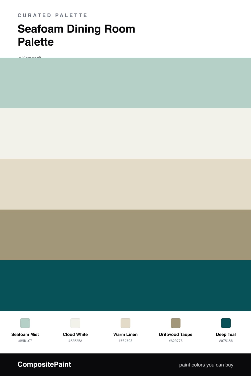
Seafoam Dining Room Palette — Seafoam Mist & Driftwood Taupe
A soft five-color dining room scheme led by airy seafoam, layered with warm cream, crisp white, weathered wood, and a deep teal accent — every color matched to real paint you can buy.
By Jessica Williams · Color Stylist & Interior Editor
Seafoam is having a quiet moment in 2026, and the dining room is where it feels most at home. There is something about sharing a meal in a soft, watery green that slows everyone down. Seafoam Mist sets that tone on the walls — pale, a little grayed, restful without going sleepy.
Around it I keep things warm so the green never feels clinical. Cloud White on the trim and ceiling lifts the whole room, Warm Linen softens any cabinetry or built-ins, and Driftwood Taupe underfoot ties the seafoam back to something earthy and grounded.
The spark is Deep Teal. Use it sparingly — a chair, a sideboard, the dining chairs themselves — and let it deepen the seafoam by contrast. That single rich note is what turns this from a pretty backdrop into a room you remember.
Buy These Colors
Each color matched to the closest real paint in every brand, by ΔE2000. Kompozit first; take any SKU to the store — these mix on demand.
Questions
Yes, but keep it soft. A pale seafoam like this one stays gentle in low light because it carries enough gray to read as a calm neutral rather than a cold mint. Pair it with warm wood and a creamy white so the room never tips chilly.
Warm wood tones and aged brass are the easy win here. The taupe floor and brass hardware echo the warmth in the seafoam, while the deep teal accent gives those metals something rich to sit against.
Similar Palettes
Closest schemes by color — not by label.