CP

Aqua Color Palette — Aqua Quartz

A serene five-color scheme led by clear aqua, softened with warm greige and oat neutrals and lifted by a deep teal accent, with every color matched to real paint you can buy.

By Jessica Williams · Color Stylist & Interior Editor

Quartz Aqua
Dominant
Kompozit Stillwater · 0687
#8CC1C2
LRV 48
Sea Glass
Secondary
Kompozit Outerspace · 0686
#B4DCDA
LRV 66
Warm Oat
Base
Kompozit Hint of Vanilla · 0001
#EEE8DC
LRV 81
Soft Greige
Support
Kompozit Overgrown · 0196
#CEC6B8
LRV 57
Deep Teal
Accent
Kompozit Frozen Stream · 0669
#30555D
LRV 8
View palette in

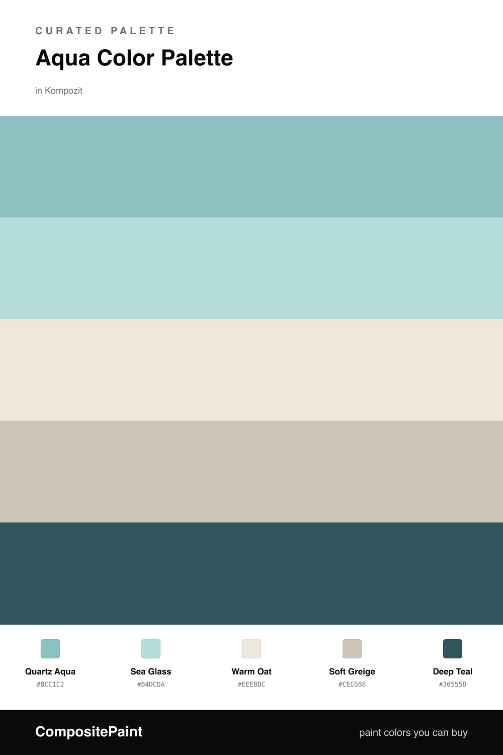
Aqua is having a quiet moment in 2026, and this scheme leans all the way into it. Quartz Aqua leads — a clear, watery shade that feels like sea glass held up to the light. It carries the room on its own, so let it cover the largest surfaces.

Sea Glass is its softer echo, a half-step paler for trim or a secondary wall, while Warm Oat and Soft Greige settle underneath as quiet, grounding neutrals. Those warm tones are what keep the aqua from reading chilly.

A touch of Deep Teal is the anchor — use it sparingly on a door, a cabinet, or a single piece of furniture. It gives the palette depth and makes the lighter aquas feel intentional rather than washed out.

Buy These Colors

Each color matched to the closest real paint in every brand, by ΔE2000. Kompozit first; take any SKU to the store — these mix on demand.

Quartz Aqua
#7FC4C2 · LRV 48 · Dominant
Kompozit Stillwater · 0687 ΔE 3.23
Backdrop Lost in the 80s · BD-LO ΔE 13.08
Behr Crashing Waves · S450-4 ΔE 2.11
Benjamin Moore Oceanic Teal · 669 ΔE 1.23
Clare Vacay · PNT100-LT-44 ΔE 6.77
Dunn-Edwards Tranquil Teal · DE5703 ΔE 4.16
Farrow & Ball Blue Ground · No. 210 ΔE 7.57
Magnolia Home Morning Calm · JG-77 ΔE 6.88
PPG / Glidden Caribbean Crush · 17-31 ΔE 2.53
Sherwin-Williams Holiday Turquoise · SW 75 ΔE 3.1
Valspar Enchanted Isle · V065-4 ΔE 1.73
Sea Glass
#AEDAD4 · LRV 64 · Secondary
Kompozit Outerspace · 0686 ΔE 2.18
Backdrop Real Real · BD-RR ΔE 17.32
Behr Spring Storm · S450-3 ΔE 2.62
Benjamin Moore Maritime Blue · 667 ΔE 0.86
Clare Nairobi Blue · PNT100-LT-36 ΔE 7.43
Dunn-Edwards Jaded Clouds · DE5702 ΔE 1.84
Farrow & Ball Teresa's Green · No. 236 ΔE 9.31
Magnolia Home Mineral Green · JG-67 ΔE 9.9
PPG / Glidden Minerva · 1231-3 ΔE 1.61
Sherwin-Williams Spa · SW 6765 ΔE 2.88
Valspar Aqua Glow · 5007-9B ΔE 2.46
Warm Oat
#EFE8DA · LRV 81 · Base
Kompozit Hint of Vanilla · 0001 ΔE 0.83
Backdrop Don't Eat the Yellow Snow · BD-DS ΔE 3.75
Behr Chenille Spread · HDC-NT-03 ΔE 0.91
Benjamin Moore Stoneware · CSP-245 ΔE 1.23
Clare Like Buttah · PNT100-LT-62 ΔE 2.04
Dunn-Edwards Ball of String · DE6190 ΔE 0.52
Farrow & Ball James White · No. 2010 ΔE 2.19
Magnolia Home Antique Rose · JG-23 ΔE 0.53
PPG / Glidden Angel Food · 1088-1 ΔE 0.52
Sherwin-Williams Creamy · SW 7012 ΔE 0.43
Valspar Dover White · 7007-1 ΔE 0.22
Soft Greige
#CFC6B6 · LRV 57 · Support
Kompozit Overgrown · 0196 ΔE 0.82
Backdrop Real Real · BD-RR ΔE 2.41
Behr Coliseum Marble · PPU8-16 ΔE 0.95
Benjamin Moore Ice Formations · 973 ΔE 1.9
Clare Flatiron · PNT100-LT-17 ΔE 2.62
Dunn-Edwards Desert Suede · DE6206 ΔE 2.35
Farrow & Ball Old White · No. 4 ΔE 2.41
Magnolia Home Southern Grown · JG-104 ΔE 0.5
PPG / Glidden Synchronicity · 1021-2 ΔE 0.8
Sherwin-Williams Accessible Beige · SW 7036 ΔE 0.85
Valspar Rippling Stone · V146-2 ΔE 1.97
Deep Teal
#1F5C5E · LRV 9 · Accent
Kompozit Frozen Stream · 0669 ΔE 6.37
Backdrop We Three Kings · BD-WK ΔE 16.06
Behr Tsunami · S450-7 ΔE 1.64
Benjamin Moore Oasis Blue · 2049-20 ΔE 1.1
Clare Deep Dive · PNT100-MD-40 ΔE 7.63
Dunn-Edwards Enchanting Ivy · DEA179 ΔE 3.92
Farrow & Ball Hague Blue · No. 30 ΔE 12.52
Magnolia Home Under The Stars · JG-82 ΔE 7.4
PPG / Glidden Emerald Pool · 1146-7 ΔE 1.29
Sherwin-Williams Really Teal · SW 6489 ΔE 3.16
Valspar Toadstool Teal · 8002-37G ΔE 2.05

Questions

Why does aqua work as the lead color here?

Aqua sits right between blue and green, so it feels fresh and calm at the same time. Letting one clear aqua dominate keeps the whole scheme cohesive instead of scattered.

How do I keep aqua from feeling cold?

Pair it with warm neutrals — the oat and greige here add softness, while a small dose of deep teal gives the space weight and stops it from drifting too breezy.

Similar Palettes

Closest schemes by color — not by label.