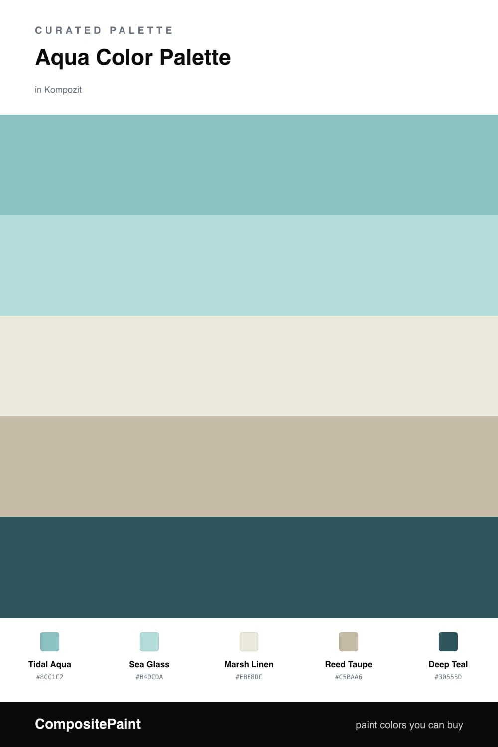
Aqua Color Palette — Tidal Marsh
A calming five-color scheme led by soft aqua and grounded in warm marsh neutrals with a single deep teal accent — every color matched to real paint you can buy.
By Jessica Williams · Color Stylist & Interior Editor
There is something quieting about aqua. It carries the cool of blue and the ease of green at the same time, and that in-between quality is exactly what makes this scheme feel like a slow morning by the water. Tidal Aqua leads, soft and a little misty, with Sea Glass layered just beside it to keep the cool tones from feeling flat.
The neutrals are where the warmth lives. Marsh Linen is a creamy off-white that lets the aqua breathe, and Reed Taupe adds a grounded, grassy weight underneath. Together they stop the palette from tipping into anything chilly or clinical, which feels right for where rooms are heading in 2026 — soft, lived-in, a touch organic.
When you want contrast, reach for Deep Teal. Used sparingly on a single door, a frame, or a piece of furniture, it deepens the whole story and makes the lighter aquas glow.
Buy These Colors
Each color matched to the closest real paint in every brand, by ΔE2000. Kompozit first; take any SKU to the store — these mix on demand.
Questions
Aqua sits between blue and green, so it reads cool and restful while still feeling alive. Leaning on it as the dominant tone gives the whole scheme a soft, watery calm, and the warm neutrals keep it from drifting cold.
Let the aqua carry most of the space and treat the deep teal as a small spark — think roughly a 70/30 feel, with the linen and taupe doing the quiet background work.
Similar Palettes
Closest schemes by color — not by label.