Color spec
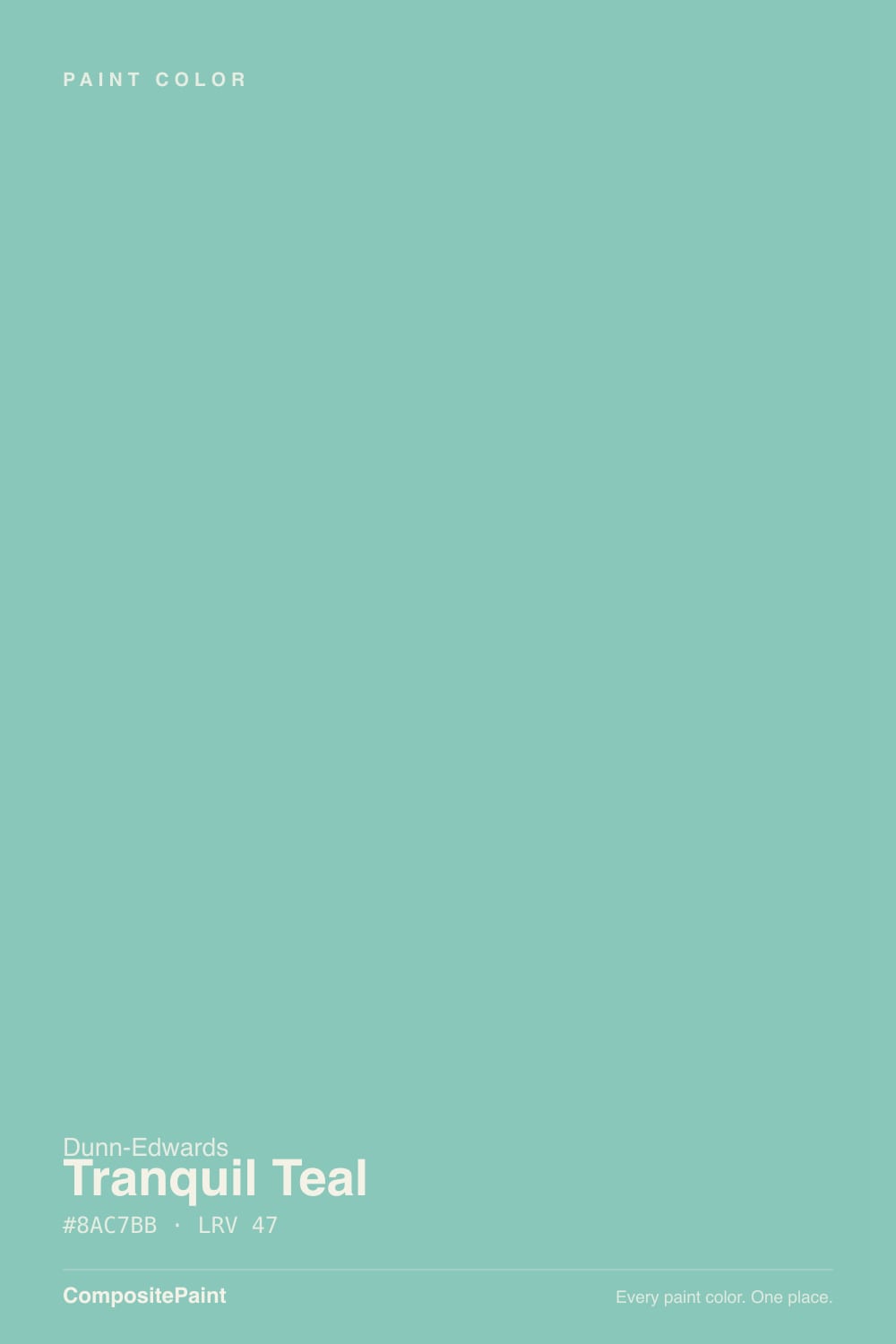
| Brand | Dunn-Edwards |
| Name | Tranquil Teal |
| SKU | DE5703 |
| Hex | #8AC7BB |
| RGB | 138, 199, 187 |
| HSL | 168°, 35%, 66% |
| LRV | 47 |
| Undertone | cool blue-green tone |
| Family | Teal |
About Dunn-Edwards Tranquil Teal
Tranquil Teal sits in the mid-range at LRV 47, so it shifts visibly through the day — lighter and more open in morning light, deeper and moodier after dark. Its teal undertone is the part to watch: it gets picked up by whatever sits next to it, so test it against your trim, floor and the room's main light before committing. South-facing rooms will pull it lighter and warmer, while north light cools it down.
Tranquil Teal is versatile enough for full rooms but has enough depth to anchor a space, so it suits living rooms, bedrooms and cabinetry alike. Teals add character without shouting — good for a vanity, an island or a feature wall.
Closest matches by brand
10 brands within ΔE 5The closest matches per brand by ΔE2000, computed against each brand's full deck. Only colors within ΔE 5 (close enough to substitute on a wall) are shown — brands with no real match are left off. Tap any swatch for its full single-color spec; tap the brand title to browse all teal from that brand.
Sherwin-Williams
Behr
Benjamin Moore
Valspar
PPG / Glidden
Glidden
HGTV Home by Sherwin-Williams
Diamond Vogel
Hirshfield's
Kompozit
Similar Dunn-Edwards colors
closest in the Dunn-Edwards deckThe nearest shades to Tranquil Teal within Dunn-Edwards's own range, ranked by perceptual color distance — useful when you want the same look a touch lighter, darker, or warmer.
Coordinated palette
Generated by hue-rotating #8AC7BB in HSL space. Pair Tranquil Teal with one accent and one neutral — the swatches below are starting points, not final picks.
Accessibility (WCAG contrast)
WCAG 2.1: AA = 4.5:1 normal text · AA Large = 3:1 large text · AAA = 7:1 normal text.
Dunn-Edwards Tranquil Teal Equivalents at Other Brands
Matching Tranquil Teal from a different paint counter? Below is the single closest color in each major US deck and how close it really is. Remember that any paint store can also custom-tint Dunn-Edwards DE5703 directly — these equivalents are for when you'd rather stay inside one brand's own deck.
Sherwin-Williams Equivalent of Tranquil Teal
Sherwin-Williams's nearest match is Holiday Turquoise (SW 75), visually identical in normal room light (ΔE 1.18). It runs slightly lighter (LRV 49 vs 47) and carries a cool blue-green undertone, so it substitutes for Tranquil Teal without repainting risk. See the full Holiday Turquoise swatch →
Behr Equivalent of Tranquil Teal
Behr's nearest match is Bon Voyage (510F-4), visually identical in normal room light (ΔE 1.6). It runs slightly lighter (LRV 51 vs 47) and carries a cool blue-green undertone, so it substitutes for Tranquil Teal without repainting risk. See the full Bon Voyage swatch →
Benjamin Moore Equivalent of Tranquil Teal
Benjamin Moore's nearest match is Hazy Blue (2040-50), visually identical in normal room light (ΔE 1.69). It runs slightly lighter (LRV 50 vs 47) and carries a cool blue-green undertone, so it substitutes for Tranquil Teal without repainting risk. See the full Hazy Blue swatch →
Valspar Equivalent of Tranquil Teal
At Valspar, the closest color to Tranquil Teal is Gentle Wave (5007-7C) — very close at ΔE 2.78, though not an exact twin. It runs slightly lighter (LRV 50.7 vs 47) and carries a cool blue-green undertone; sample both side by side if the room gets strong natural light. See the full Gentle Wave swatch →
PPG / Glidden Equivalent of Tranquil Teal
PPG / Glidden's nearest match is Caribbean Crush (PPG17-31), visually identical in normal room light (ΔE 1.98). It runs slightly lighter (LRV 49 vs 47) and carries a cool blue-green undertone, so it substitutes for Tranquil Teal without repainting risk. See the full Caribbean Crush swatch →
Glidden Equivalent of Tranquil Teal
Glidden's nearest match is Caribbean Crush (PPG17-31), visually identical in normal room light (ΔE 1.68). It runs slightly lighter (LRV 50 vs 47) and carries a cool blue-green undertone, so it substitutes for Tranquil Teal without repainting risk. See the full Caribbean Crush swatch →
HGTV Home by Sherwin-Williams Equivalent of Tranquil Teal
The closest HGTV Home by Sherwin-Williams equivalent of Tranquil Teal is Geyser Mist (HGSW 1315). At ΔE 0.66 the two are indistinguishable on a wall — it carries the same cool blue-green undertone and runs slightly lighter (LRV 49 vs 47). If HGTV Home by Sherwin-Williams is your counter, order Geyser Mist and you'll get the same color. See the full Geyser Mist swatch →
Diamond Vogel Equivalent of Tranquil Teal
At Diamond Vogel, the closest color to Tranquil Teal is Catarina Green (0708) — very close at ΔE 2.98, though not an exact twin. It runs slightly lighter (LRV 51 vs 47) and carries a cool blue-green undertone; sample both side by side if the room gets strong natural light. See the full Catarina Green swatch →
Hirshfield's Equivalent of Tranquil Teal
At Hirshfield's, the closest color to Tranquil Teal is Catarina Green (0708) — very close at ΔE 2.34, though not an exact twin. It runs slightly lighter (LRV 50 vs 47) and carries a cool blue-green undertone; sample both side by side if the room gets strong natural light. See the full Catarina Green swatch →
Kompozit Equivalent of Tranquil Teal
At Kompozit, the closest color to Tranquil Teal is Catarina Green (0708) — very close at ΔE 2.34, though not an exact twin. It runs slightly lighter (LRV 49 vs 47) and carries a cool blue-green undertone; sample both side by side if the room gets strong natural light. See the full Catarina Green swatch →