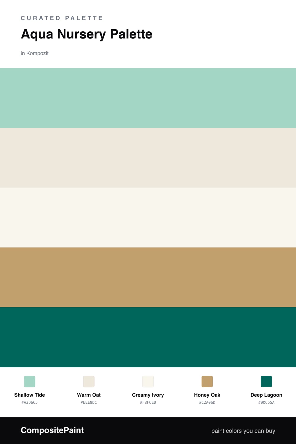
Aqua Nursery Palette — Shallow Tide & Warm Oat
A gentle, sunlit 5-color scheme for a nursery: soft aqua walls, warm oat backdrop, creamy trim, honeyed wood, and a deep teal anchor, with every color matched to real paint you can buy.
By Maya Patel · Reviews Editor & Product Tester
A nursery should feel like a held breath — soft, warm, and quiet enough to fall asleep in. This palette leads with Shallow Tide, a gentle grayed aqua that I reach for over the candy-bright blues you see in most baby rooms. It has just enough gray in it to stay calm on the walls all day, going soft and dim at bedtime and fresh in the morning sun.
Around that aqua I wrap Warm Oat as a backdrop and a slightly cleaner Creamy Ivory on the trim and ceiling, so the room glows instead of glares. Honey Oak on floors and the crib grounds everything with real warmth, which is the trick to keeping aqua from tipping cold.
For depth, Deep Lagoon does the anchoring — and only in small doses. Use it on a single accent wall behind the crib, on shelf brackets, or a painted dresser, never on more than about a fifth of the room. That restraint is what keeps the aqua leading and the whole space feeling cocooned rather than busy.
Buy These Colors
Each color matched to the closest real paint in every brand, by ΔE2000. Kompozit first; take any SKU to the store — these mix on demand.
Questions
Aqua works beautifully as the main wall here because Shallow Tide is a soft, slightly grayed aqua rather than a bright pool blue. Paired with Warm Oat and Honey Oak it reads soothing and warm, not chilly. Keep the lighting warm-white and the room will feel calm at nap time and bright at play time.
Lean on the warm neutrals and wood tones to mature the room. Shallow Tide on the walls stays timeless, and you can swap the Deep Lagoon accent from a crib wall or shelf trim to bigger-kid furniture later without repainting. The aqua grows up with them as long as the surrounding colors stay grounded.
Similar Palettes
Closest schemes by color — not by label.