Seafoam Color Palette — Tidepool Moss
A soft five-color scheme led by airy seafoam, supported by warm greige and moss with a deep teal accent — every color matched to real paint you can buy.
By David Chen · Formulation Lead & Resident Chemist
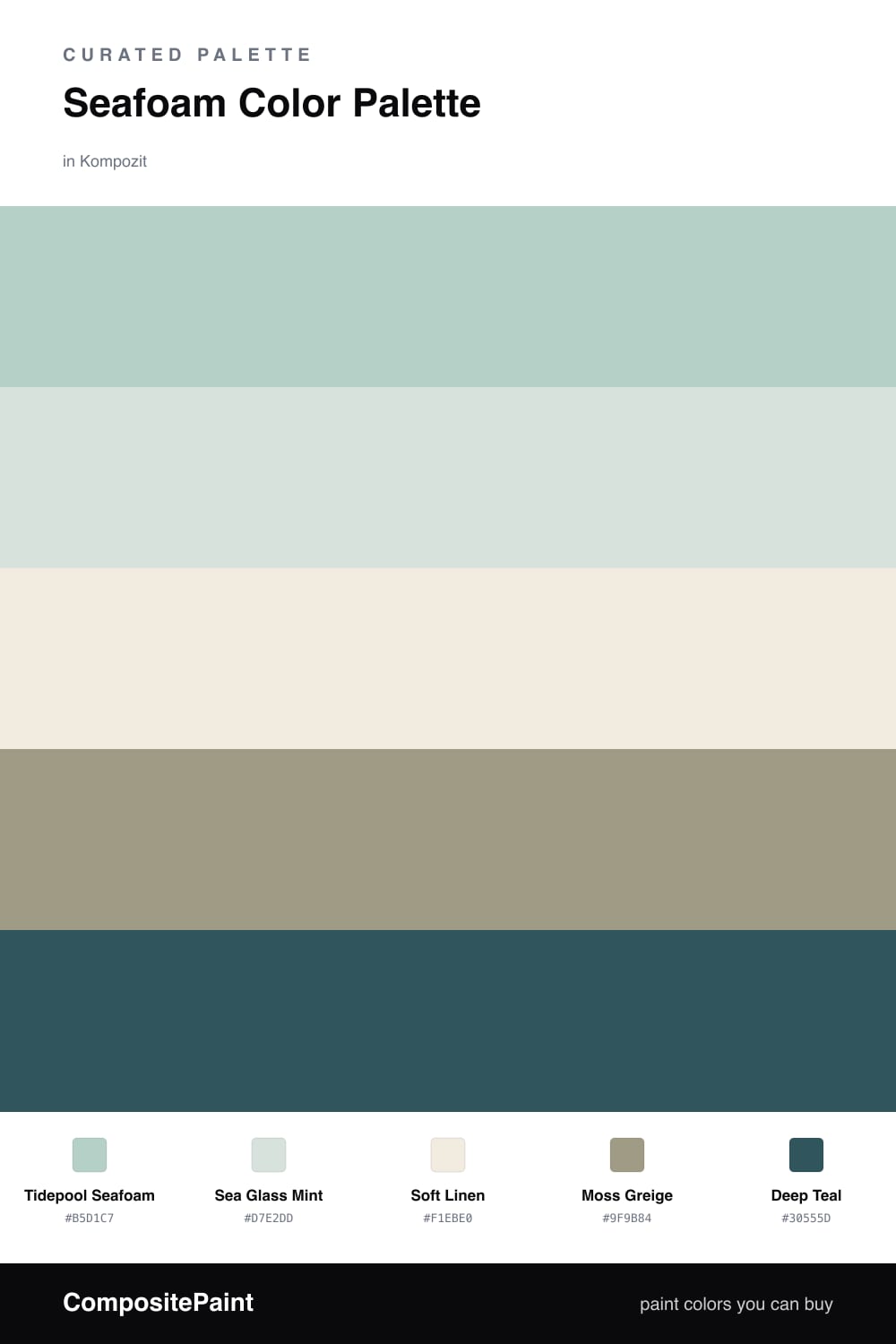
Think of seafoam as the quietest member of the green family — it has the freshness of mint with the calm of a foggy morning. In this scheme I let Tidepool Seafoam lead and carry the largest surfaces, with Sea Glass Mint layered just a shade lighter so the two greens feel like one soft wash of color rather than a hard contrast.
To keep things grounded, Soft Linen acts as the clean base, and Moss Greige brings a warm, earthy weight that stops the greens from drifting into pastel territory. This is the part people skip, and it is exactly why their seafoam rooms can feel flat — you need that olive-leaning neutral to give the lighter tones something to push against.
The spark is Deep Teal. Use it in small, deliberate places and it does the work of a much bolder color without shouting. It feels right for 2026 — calm and natural, but with one confident, saturated note that keeps the whole palette from reading too soft.
Buy These Colors
Each color matched to the closest real paint in every brand, by ΔE2000. Kompozit first; take any SKU to the store — these mix on demand.
Questions
Seafoam sits between blue and green, so it reads cool and calm but never cold. Because it is so light, it acts almost like a tinted neutral, which means you can pour it across walls and large areas without the space feeling closed in.
Lean on the moss greige and the deep teal. The greige adds a warm, earthy weight underneath the soft greens, and a small dose of deep teal — think a door, a chair, or trim — gives your eye a place to land.
Similar Palettes
Closest schemes by color — not by label.