CP

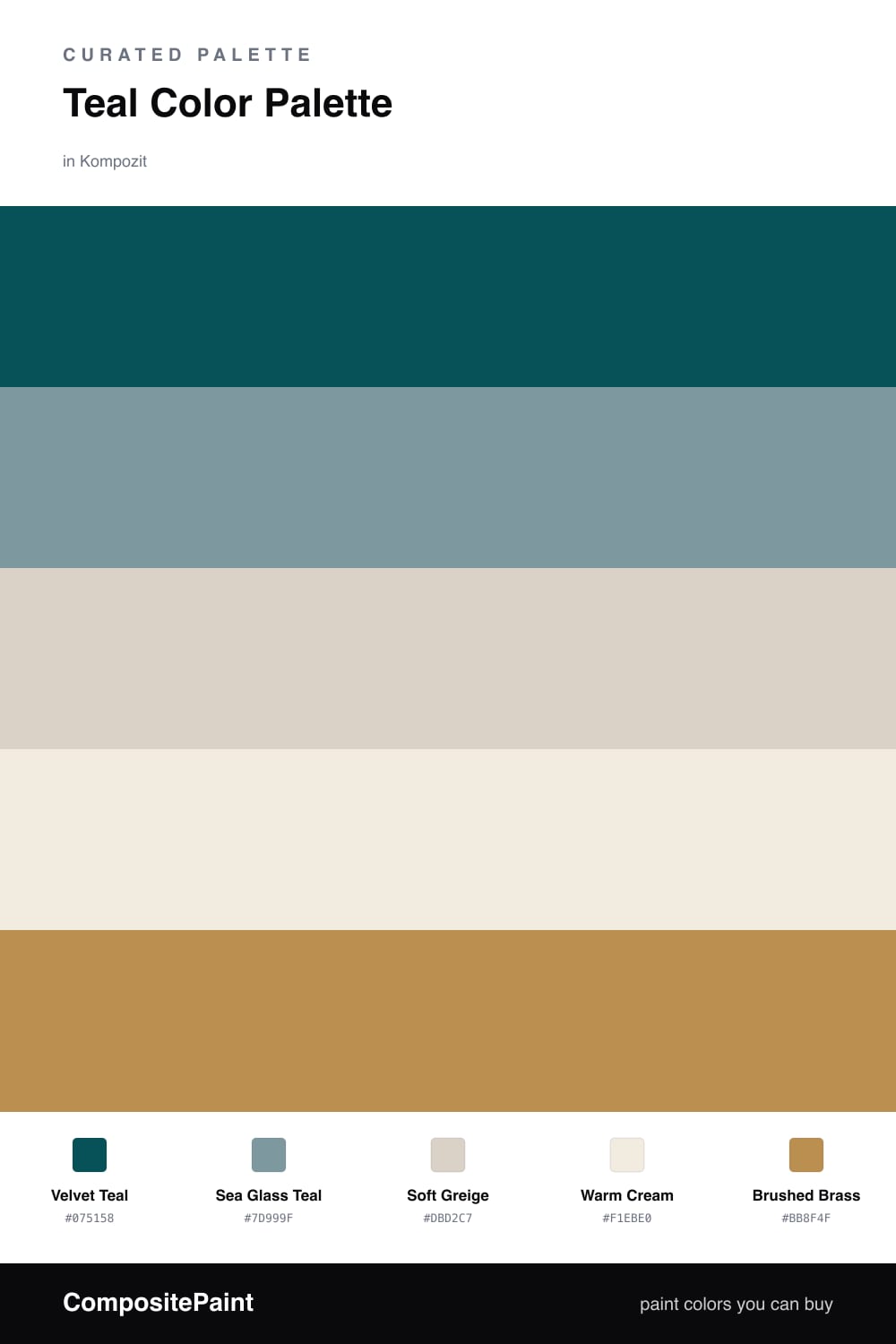
Teal Color Palette — Velvet Teal Lounge

A rich five-color scheme led by deep velvet teal, softened with warm greige and cream and lifted by a brushed-brass accent — every color matched to real paint you can buy.

By Emily Roberts · DIY Editor & First-Timer's Guide

Velvet Teal
Dominant
Kompozit Blue Period · 0690
#075158
LRV 7
Sea Glass Teal
Secondary
Kompozit Ocean Melody · 0499
#7D999F
LRV 30
Soft Greige
Base
Kompozit Mossy Shade · 0195
#DBD2C7
LRV 65
Warm Cream
Support
Kompozit Nilla Vanilla · 0003
#F1EBE0
LRV 83
Brushed Brass
Accent
Kompozit Bugle Boy · 0899
#BB8F4F
LRV 31
View palette in

There is something about a deep teal that feels both grown-up and cozy, and that is exactly what this palette leans into. Velvet Teal is the star — a rich, slightly dusty teal that looks gorgeous on a feature wall, a built-in, or a moody bedroom. It is having a real moment in 2026 because it gives you color without the chill of a true blue.

To keep it from feeling too serious, I pulled in Sea Glass Teal as a softer echo and let Soft Greige and Warm Cream do the quiet, breathing-room work. Those two neutrals are your safety net — they stop the deep teal from closing in and give your eye somewhere calm to land.

The little surprise here is Brushed Brass. Just a touch of that warm gold in a lamp base, a cabinet pull, or a picture frame makes the whole scheme feel finished and intentional. Use it sparingly and let the teal stay in charge.

Buy These Colors

Each color matched to the closest real paint in every brand, by ΔE2000. Kompozit first; take any SKU to the store — these mix on demand.

Velvet Teal
#1F4E4C · LRV 6 · Dominant
Kompozit Blue Period · 0690 ΔE 4.54
Backdrop North End · BD-NE ΔE 9.54
Behr Thermal · S440-7 ΔE 3.97
Benjamin Moore Mallard Green · 2053-10 ΔE 2.88
Clare Blackish · PNT100-DP-54 ΔE 16.22
Dunn-Edwards Deep Pine · DEA180 ΔE 2.1
Farrow & Ball Hague Blue · No. 30 ΔE 11.82
Magnolia Home Under The Stars · JG-82 ΔE 8.61
PPG / Glidden Deep Emerald · 1148-7 ΔE 6.24
Sherwin-Williams Blue Peacock · SW 64 ΔE 2.93
Valspar Peacock House · 5010-4 ΔE 4.65
Sea Glass Teal
#6F9B97 · LRV 29 · Secondary
Kompozit Ocean Melody · 0499 ΔE 7.18
Backdrop Polly Wants · BD-PW ΔE 11.49
Behr Norwegian Blue · N470-5 ΔE 3.92
Benjamin Moore Azure Water · 677 ΔE 1.58
Clare Keep It Teal · PNT100-MD-75 ΔE 3.93
Dunn-Edwards Up North · DE5711 ΔE 4.82
Farrow & Ball Stone Blue · No. 86 ΔE 8.53
Magnolia Home Sir Drake · JG-02 ΔE 6.97
PPG / Glidden Palmetto · 1146-5 ΔE 2.25
Sherwin-Williams Peacock Plume · SW 20 ΔE 2.72
Valspar Secluded Garden · 5002-4A ΔE 3.61
Soft Greige
#D8D1C4 · LRV 64 · Base
Kompozit Mossy Shade · 0195 ΔE 1.64
Backdrop Real Real · BD-RR ΔE 1.79
Behr Mineral · UL170-15 ΔE 1.39
Benjamin Moore Bruton White · CW-710 ΔE 1.65
Clare Turbinado · PNT100-LT-21 ΔE 2.34
Dunn-Edwards Fine Grain · DE6213 ΔE 1.01
Farrow & Ball Shaded White · No. 201 ΔE 1.7
Magnolia Home Stoneware Pieces · JG-55 ΔE 3.42
PPG / Glidden Cool Concrete · 1023-2 ΔE 1.06
Sherwin-Williams Natural Tan · SW 7567 ΔE 1.45
Valspar Warm Putty · 6006-1A ΔE 0.58
Warm Cream
#F1EBDD · LRV 83 · Support
Kompozit Nilla Vanilla · 0003 ΔE 1.31
Backdrop Jane · BD-JA ΔE 2.21
Behr Papier Blanc · HDC-NT-08 ΔE 1.08
Benjamin Moore Collector's Item · AF-45 ΔE 0.52
Clare Like Buttah · PNT100-LT-62 ΔE 2.54
Dunn-Edwards Bone China · DEW339 ΔE 0.58
Farrow & Ball White Tie · No. 2002 ΔE 2.04
Magnolia Home Pearly Cotton · JG-33 ΔE 1.47
PPG / Glidden Macaroon Cream · 15-05 ΔE 0.94
Sherwin-Williams Classic Light Buff · SW 50 ΔE 0.21
Valspar Statuesque · 7002-5 ΔE 0.52
Brushed Brass
#B68A4E · LRV 29 · Accent
Kompozit Bugle Boy · 0899 ΔE 1.82
Backdrop Anita · BD-AN ΔE 13.1
Behr Rice Curry · MQ4-9 ΔE 1.19
Benjamin Moore Golden Retriever · 2165-30 ΔE 1.48
Clare Good as Gold · PNT100-DP-59 ΔE 6.59
Dunn-Edwards Bread Crust · DE5370 ΔE 2.52
Farrow & Ball Red Earth · No. 64 ΔE 16.79
Magnolia Home Vintage Crown · JG-152 ΔE 5.24
PPG / Glidden Allegro · 1090-6 ΔE 2.77
Sherwin-Williams Rookwood Amber · SW 2817 ΔE 4.87
Valspar Sand Mountain · 8003-21E ΔE 1.36

Questions

Why does deep teal work as the main color here?

Teal is calming like a blue but a little warmer and earthier, so it feels cozy instead of cold. That makes it easy to live with on big walls or a feature piece, and the lighter teal, cream, and greige keep it from feeling heavy.

How much of each color should I use?

Let the deep teal lead — think roughly two-thirds of the space — then fill in with the cream and greige neutrals. Save the brushed brass for small touches like a lamp, a frame, or hardware so it reads as a spark, not a theme.

Similar Palettes

Closest schemes by color — not by label.