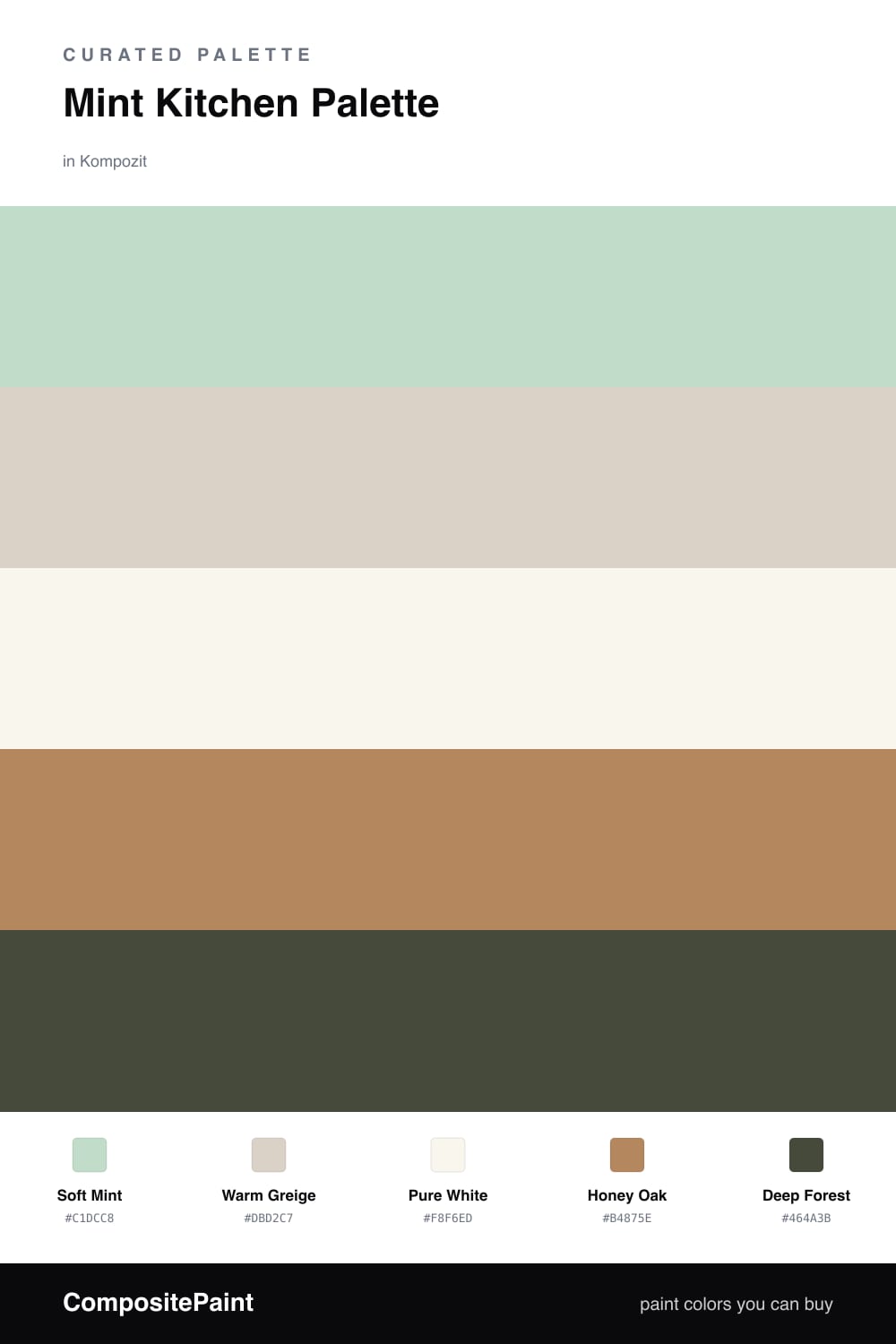
Mint Kitchen Palette — Soft Mint & Warm Oak
A bright five-color kitchen scheme led by soft mint walls, balanced with a warm greige backdrop, crisp white trim, honey oak, and a deep forest accent, with every color matched to real paint you can buy.
By Emily Roberts · DIY Editor & First-Timer's Guide
Mint is having a quiet moment in 2026, and the kitchen is the best place to use it. A soft, slightly grayed Soft Mint on the walls feels clean and a little nostalgic without tipping into baby-pastel territory.
To keep it grounded, I paired it with a Warm Greige on the cabinets and a crisp Pure White on the trim and ceiling. That mix of cool mint and warm neutral is what makes the room feel calm instead of cute.
The warmth and the spark come from the last two. Honey Oak floors or open shelving add coziness, and a little Deep Forest on a pantry door, island, or hardware gives the whole palette some depth. Use that dark green sparingly and it will tie everything together beautifully.
Buy These Colors
Each color matched to the closest real paint in every brand, by ΔE2000. Kompozit first; take any SKU to the store — these mix on demand.
Questions
Not the way it is used here. A soft, muted mint reads more like a calm neutral than a loud pastel, so it stays fresh for years instead of feeling dated.
A warm white or light greige counter is the easy win — it keeps the mint feeling crisp and lets the wood tones bring the warmth.
Similar Palettes
Closest schemes by color — not by label.