Color spec
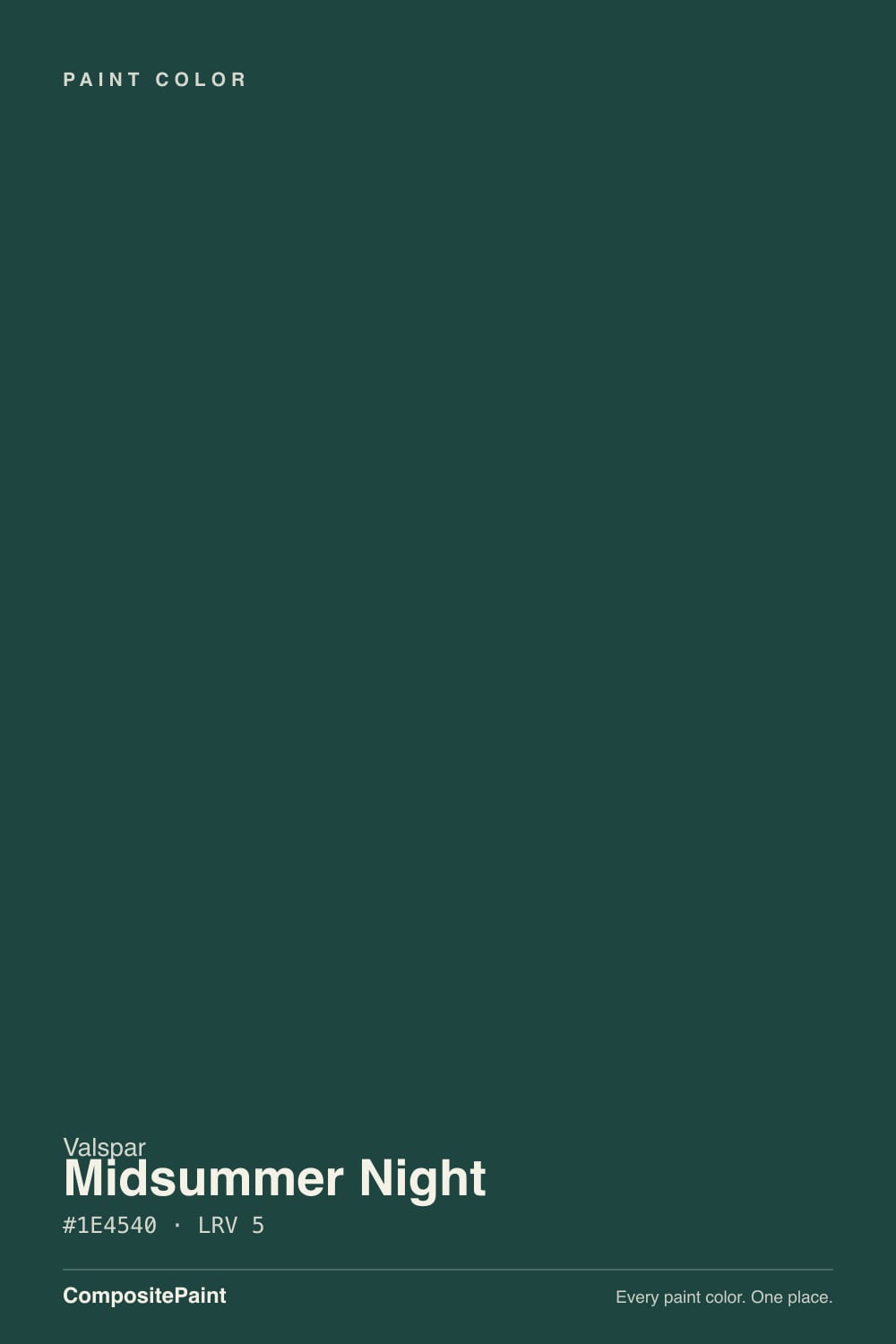
| Brand | Valspar |
| Name | Midsummer Night |
| SKU | 8003-37G |
| Hex | #1E4540 |
| RGB | 30, 69, 64 |
| HSL | 172°, 39%, 19% |
| LRV | 5 |
| Undertone | cool blue-green tone |
| Family | Teal |
About Valspar Midsummer Night
At LRV 5, Midsummer Night is about as dark as paint gets — it reads near-black on a wall and reveals its character only in direct daylight or under warm bulbs. Its teal undertone is the part to watch: it gets picked up by whatever sits next to it, so test it against your trim, floor and the room's main light before committing. In rooms with little natural light it can feel heavy, so reserve it for spaces you want to feel enveloping.
Midsummer Night earns its keep as a statement: accent walls, a front door, cabinetry, a moody powder room, or exterior trim where you want sharp contrast. Teals add character without shouting — good for a vanity, an island or a feature wall.
Closest matches by brand
8 brands within ΔE 5The closest matches per brand by ΔE2000, computed against each brand's full deck. Only colors within ΔE 5 (close enough to substitute on a wall) are shown — brands with no real match are left off. Tap any swatch for its full single-color spec; tap the brand title to browse all teal from that brand.
Sherwin-Williams
Behr
Benjamin Moore
Dutch Boy
HGTV Home by Sherwin-Williams
Dunn-Edwards
Hirshfield's
Kompozit
Similar Valspar colors
closest in the Valspar deckThe nearest shades to Midsummer Night within Valspar's own range, ranked by perceptual color distance — useful when you want the same look a touch lighter, darker, or warmer.
Coordinated palette
Generated by hue-rotating #1E4540 in HSL space. Pair Midsummer Night with one accent and one neutral — the swatches below are starting points, not final picks.
Accessibility (WCAG contrast)
WCAG 2.1: AA = 4.5:1 normal text · AA Large = 3:1 large text · AAA = 7:1 normal text.
Valspar Midsummer Night Equivalents at Other Brands
Matching Midsummer Night from a different paint counter? Below is the single closest color in each major US deck and how close it really is. Remember that any paint store can also custom-tint Valspar 8003-37G directly — these equivalents are for when you'd rather stay inside one brand's own deck.
Sherwin-Williams Equivalent of Midsummer Night
Sherwin-Williams has no exact twin of Midsummer Night. The nearest is Westhaven (SW 9675) at ΔE 3.89 — close, but the difference shows next to trim and in side light. It sits at the same lightness (LRV 5 vs 5). Compare large swatches before substituting. See the full Westhaven swatch →
Benjamin Moore Equivalent of Midsummer Night
Benjamin Moore's nearest match is Bavarian Forest (2054-10), visually identical in normal room light (ΔE 1.56). It runs slightly lighter (LRV 7 vs 5) and carries a cool blue-green undertone, so it substitutes for Midsummer Night without repainting risk. See the full Bavarian Forest swatch →
HGTV Home by Sherwin-Williams Equivalent of Midsummer Night
At HGTV Home by Sherwin-Williams, the closest color to Midsummer Night is Bucolic Green (HGSW 2301) — very close at ΔE 3.38, though not an exact twin. It sits at the same lightness (LRV 5 vs 5) and carries a cool blue-green undertone; sample both side by side if the room gets strong natural light. See the full Bucolic Green swatch →
Dunn-Edwards Equivalent of Midsummer Night
At Dunn-Edwards, the closest color to Midsummer Night is Deep Pine (DEA180) — very close at ΔE 2.14, though not an exact twin. It sits at the same lightness (LRV 5 vs 5) and carries a cool blue-green undertone; sample both side by side if the room gets strong natural light. See the full Deep Pine swatch →
Hirshfield's Equivalent of Midsummer Night
Hirshfield's has no exact twin of Midsummer Night. The nearest is Atlantic Waves (0473) at ΔE 4.76 — close, but the difference shows next to trim and in side light. It runs slightly lighter (LRV 7 vs 5). Compare large swatches before substituting. See the full Atlantic Waves swatch →
Kompozit Equivalent of Midsummer Night
Kompozit has no exact twin of Midsummer Night. The nearest is Atlantic Waves (0473) at ΔE 4.76 — close, but the difference shows next to trim and in side light. It sits at the same lightness (LRV 5 vs 5). Compare large swatches before substituting. See the full Atlantic Waves swatch →