Summer Color Palette — Summer Coast
A breezy five-color scheme that mixes bright sky blue with warm citrus and sandy neutrals, finished with a deep navy anchor — every color matched to real paint you can buy.
By Jessica Williams · Color Stylist & Interior Editor
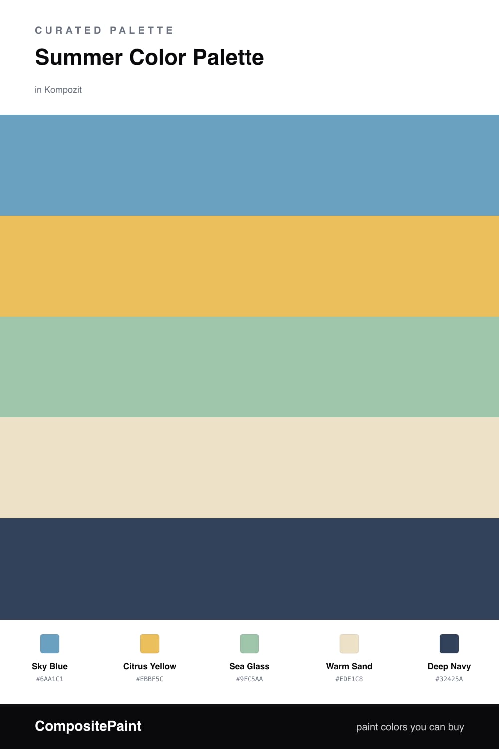
Summer has a feeling before it has a color — warm air, water moving, fruit on the counter. This scheme tries to hold all of that at once. A clear Sky Blue leads, the kind of blue that looks like the hour just before the heat sets in, and it sets the easy, open mood for everything else.
Against it, Citrus Yellow is the spark — bright and a little juicy, used in small amounts so it stays joyful instead of loud. Sea Glass softens the gap between the two, that pale green you find in tide pools, while Warm Sand does the calm, grounding work across the largest surfaces so the brights have somewhere to land.
For 2026 I like keeping the brights a touch dustier than a beachy cliche, then dropping in Deep Navy as the anchor — on a door, a frame, a single bold piece. It pulls the whole palette back to evening and keeps the summer in it warm rather than sugary.
Buy These Colors
Each color matched to the closest real paint in every brand, by ΔE2000. Kompozit first; take any SKU to the store — these mix on demand.
Questions
Let the sky blue lead and keep the citrus yellow to small doses, like a single accent wall or a few pieces. The warm sand carries most of the quiet space, so the brights read as sunny rather than busy.
Warm sand makes the softest trim and keeps everything light, but if you want more edge, the deep navy on trim or a door gives the blues and yellow something solid to push against.
Similar Palettes
Closest schemes by color — not by label.