Green & Blue Color Palette — Lagoon Drift
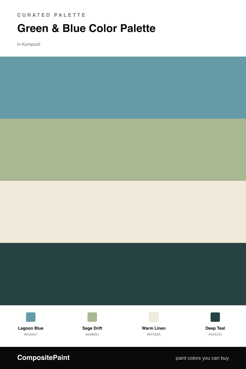
A serene four-color scheme pairing soft lagoon blue with a leafy sage green, settled on warm linen and a deep teal accent — every color matched to real paint you can buy.
By Jessica Williams · Color Stylist & Interior Editor
Green and blue are nature’s own pairing, and this scheme leans all the way into that ease. A soft Lagoon Blue sets the tone — watery, calm, a little contemporary — while a leafy Sage Drift keeps it grounded and alive, like light moving over shallow water and reeds at the edge.
Warm Linen is the quiet hero here. Its gentle undertone warms the whole palette so the cooler greens and blues never tip into chilly, and it gives your eye somewhere soft to land between them. This is the color to reach for on the largest, plainest surfaces.
For depth, a single Deep Teal anchors everything. Use it sparingly — a door, a built-in, one bold chair — and it makes the lighter shades feel intentional rather than washed out. Lead with the lagoon, let the sage answer, and keep the teal for the moment you want the room to hold its breath.
Buy These Colors
Each color matched to the closest real paint in every brand, by ΔE2000. Kompozit first; take any SKU to the store — these mix on demand.
Questions
Warm them up with the right neutral. Here the linen base has a soft yellow undertone that takes the chill off, so the lagoon blue and sage read calm and inviting rather than icy. A little wood or rattan in the room does the same job.
Let the lagoon blue carry most of the space, with sage as the gentle second voice and deep teal saved for one grounding moment, like a door or a single piece of furniture. Roughly a 60/25/15 split keeps it restful.
Similar Palettes
Closest schemes by color — not by label.