Seafoam Color Palette — Coastal Quiet
A soft five-color scheme led by cool seafoam green, steadied by warm slate and pale neutrals with one deep teal accent — every color matched to real paint you can buy.
By Maya Patel · Reviews Editor & Product Tester
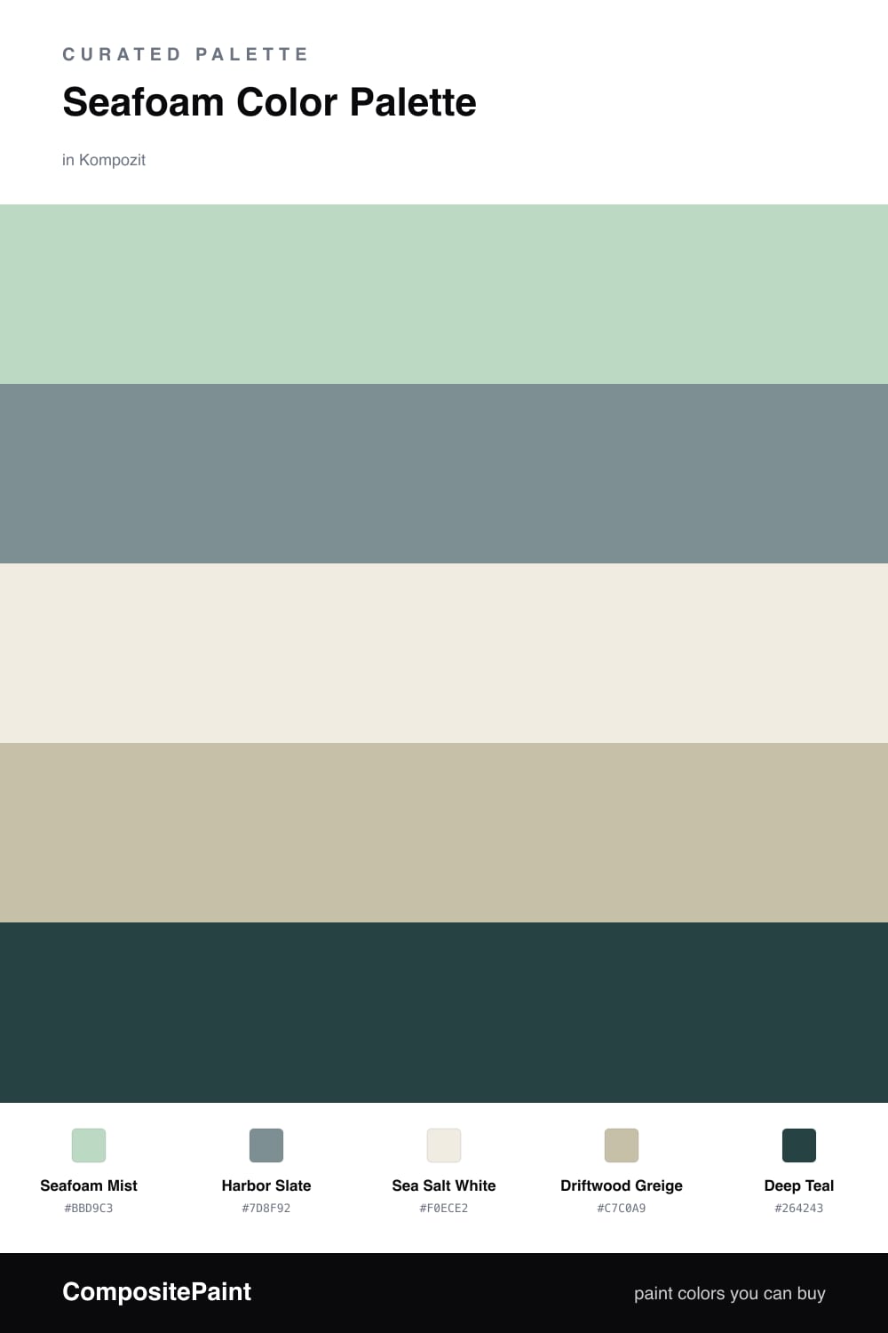
Seafoam is having a real moment in 2026, but it lives or dies on what you put beside it. This scheme builds around Seafoam Mist, a soft cool green that feels fresh without tipping into mint, and lets it carry most of the room.
Harbor Slate is the smart move here. That muted gray-green keeps the seafoam from feeling sweet or coastal-themed, and it reads as grown-up. Sea Salt White and Driftwood Greige fill in as the quiet base, one cool and one warm, so the palette has enough range to feel layered instead of flat.
The one place to be bold is Deep Teal. Use it sparingly — a single piece of cabinetry, an inside-of-the-door surprise, or trim against the seafoam — and it gives the whole scheme a spine. Lead with the seafoam, lean on the slate, and let the teal do its work in small doses.
Buy These Colors
Each color matched to the closest real paint in every brand, by ΔE2000. Kompozit first; take any SKU to the store — these mix on demand.
Questions
The trick is the slate. A clean seafoam on its own can feel retro, but pairing it with a cool gray-green slate and a warm greige pulls it into a quieter, more current direction.
Let it lead but not blanket the space. Roughly two-thirds seafoam and neutrals, with slate as the steady second, and save the deep teal for small moments like a door or shelf interior.
Similar Palettes
Closest schemes by color — not by label.