CP

Teal Color Palette — Teal Haze

A soft, contemporary five-color scheme led by a hazy teal, warmed with sand and clay and grounded by deep pine — every color matched to real paint you can buy.

By Emily Roberts · DIY Editor & First-Timer's Guide

Hazy Teal
Dominant
Kompozit Mountain Meadow · 0703
#66887B
LRV 22
Misty Sage
Secondary
Kompozit Ocean Cruise · 0477
#ACB8B2
LRV 46
Warm Linen
Base
Kompozit Onion Skin · 0418
#EBE8DC
LRV 81
Soft Clay
Support
Kompozit Cowhide · 0155
#CDA688
LRV 42
Deep Pine
Accent
Kompozit Atlantic Waves · 0473
#264243
LRV 5
View palette in

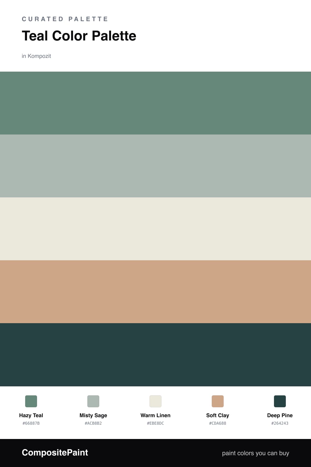
There is something about a soft teal that just makes a space exhale. This palette leans on Hazy Teal as the star, a muted blue-green that feels current without trying too hard, and lets Misty Sage echo it a shade lighter so the walls have some quiet movement.

To keep things warm and livable, Warm Linen is your easy base, the color you reach for on trim and ceilings, while Soft Clay adds a sun-warmed touch that stops the cool tones from feeling chilly. It is the little bit of warmth that makes a teal room feel like a hug instead of an ice bath.

Finally, Deep Pine is your anchor. Use it in small, confident doses on a cabinet, a door, or a single piece of furniture. It gives the whole scheme a grown-up edge and makes the lighter teals look even softer by comparison.

Buy These Colors

Each color matched to the closest real paint in every brand, by ΔE2000. Kompozit first; take any SKU to the store — these mix on demand.

Hazy Teal
#5E8B89 · LRV 23 · Dominant
Kompozit Mountain Meadow · 0703 ΔE 5.36
Backdrop Hartford · BD-HF ΔE 11.86
Behr Courtyard Blue · BXC-48 ΔE 3.25
Benjamin Moore Mayo Teal · CW-570 ΔE 2.07
Clare Keep It Teal · PNT100-MD-75 ΔE 4.94
Dunn-Edwards Aspen Hush · DE5746 ΔE 2.79
Farrow & Ball De Nimes · No. 299 ΔE 9.72
Magnolia Home Spontaneous · JG-70 ΔE 4.57
PPG / Glidden Twilight Stroll · 10-03 ΔE 7.06
Sherwin-Williams Surf Green · SW 6473 ΔE 4.17
Valspar Classic Damask · V101-5 ΔE 4.72
Misty Sage
#A9BCB5 · LRV 48 · Secondary
Kompozit Ocean Cruise · 0477 ΔE 2.78
Backdrop Underdog · BD-UD ΔE 6.92
Behr Zen · PPU11-14 ΔE 1.7
Benjamin Moore Catalina Blue · 703 ΔE 1.45
Clare Money Moves · PNT100-MD-48 ΔE 7.32
Dunn-Edwards Lake Placid · DE6318 ΔE 6.43
Farrow & Ball Green Blue · No. 84 ΔE 2.02
Magnolia Home Texas Summer · JG-64 ΔE 2.49
PPG / Glidden Blue Willow · 1145-4 ΔE 2.89
Sherwin-Williams Quietude · SW 6212 ΔE 1.96
Valspar Mediterranean Dusk · M313 ΔE 0.6
Warm Linen
#EDE6D8 · LRV 80 · Base
Kompozit Onion Skin · 0418 ΔE 1.91
Backdrop Don't Eat the Yellow Snow · BD-DS ΔE 3.81
Behr Exclusive Ivory · HDC-MD-11 ΔE 1.59
Benjamin Moore White Down · 970 ΔE 1.2
Clare Like Buttah · PNT100-LT-62 ΔE 2.01
Dunn-Edwards Antique White · DEW351 ΔE 1.49
Farrow & Ball James White · No. 2010 ΔE 2.24
Magnolia Home Carter Crème · JG-16 ΔE 1.65
PPG / Glidden China White · 1101-1 ΔE 1.4
Sherwin-Williams Ivory Lace · SW 7013 ΔE 0.48
Valspar Cozy White · 3008-10C ΔE 0.88
Soft Clay
#C9A98C · LRV 43 · Support
Kompozit Cowhide · 0155 ΔE 2.34
Backdrop Rosita · BD-RO ΔE 11.26
Behr Riviera Clay · UL130-8 ΔE 1.44
Benjamin Moore Hidden Oaks · 1129 ΔE 1.94
Clare Subrosa · PNT100-MD-76 ΔE 10.25
Dunn-Edwards Cliff Brown · DEC711 ΔE 1.75
Farrow & Ball Jitney · No. 293 ΔE 6.03
Magnolia Home Embossed Letter · JG-106 ΔE 6.54
PPG / Glidden Yosemite Trailhead · 15-04 ΔE 0.67
Sherwin-Williams Beige Intenso · SW 9096 ΔE 1.1
Valspar Gentility · T516 ΔE 0.79
Deep Pine
#2C3E3B · LRV 4 · Accent
Kompozit Atlantic Waves · 0473 ΔE 3.52
Backdrop After Hours · BD-AH ΔE 6.2
Behr Black Sable · 730F-7 ΔE 3
Benjamin Moore Salamander · 2050-10 ΔE 2.43
Clare Blackish · PNT100-DP-54 ΔE 10.48
Dunn-Edwards Black · DEA187 ΔE 10.26
Farrow & Ball Pitch Black · No. 256 ΔE 10.66
Magnolia Home Blackboard · JG-05 ΔE 10.53
PPG / Glidden Black Magic · 1001-7 ΔE 10.41
Sherwin-Williams Cascades · SW 7623 ΔE 2.14
Valspar Deep River Green · 5010-3 ΔE 2.36

Questions

Why does teal feel so calm in a room?

Teal sits between blue and green, so it borrows the restful quality of both. Pairing it with soft neutrals keeps it gentle instead of bold, which is why it reads as quiet and easy to live with.

How much teal should I actually use?

Let the teal lead on the biggest surfaces, then keep the warm neutrals as your supporting cast and save the clay and pine for smaller doses. A rough 60/30/10 split keeps the whole scheme feeling balanced.

Similar Palettes

Closest schemes by color — not by label.