CP

Teal Color Palette — Teal Dawn

A soft five-color scheme led by a calm dawn teal, balanced by warm neutrals and a single deep accent — every color matched to real paint you can buy.

By Jessica Williams · Color Stylist & Interior Editor

Dawn Teal
Dominant
Kompozit Mountain Meadow · 0703
#66887B
LRV 22
Misty Aqua
Secondary
Kompozit Dreaming of the Day · 0470
#ABC1BD
LRV 50
Warm Linen
Base
Kompozit Hint of Vanilla · 0001
#EEE8DC
LRV 81
Soft Greige
Support
Kompozit Desert Mirage · 0231
#D2CABC
LRV 60
Deep Pine
Accent
Kompozit Atlantic Waves · 0473
#264243
LRV 5
View palette in

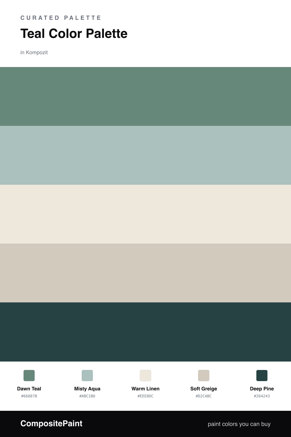
There is a quiet hour just before the day fully wakes, when the light is soft and a little blue-green, and that is the feeling this palette holds. Dawn Teal leads it — gentle, lived-in, never loud — the kind of teal that looks expensive without trying.

Around it, Misty Aqua carries the same softness in a lighter key, while Warm Linen and Soft Greige warm the whole thing up so the cool teal never tips into chilly. These neutrals are the breathing room, and they matter as much as the color itself.

Then comes Deep Pine, used sparingly, to give the scheme a little weight and a little drama. This is a very 2026 way to use teal — restful, tonal, grounded — color you can live inside all day rather than just admire on a wall.

Buy These Colors

Each color matched to the closest real paint in every brand, by ΔE2000. Kompozit first; take any SKU to the store — these mix on demand.

Dawn Teal
#5A8B89 · LRV 22 · Dominant
Kompozit Mountain Meadow · 0703 ΔE 5.69
Backdrop Hartford · BD-HF ΔE 12.57
Behr Coney Island · N440-5 ΔE 3.54
Benjamin Moore Mayo Teal · CW-570 ΔE 1.73
Clare Keep It Teal · PNT100-MD-75 ΔE 4.62
Dunn-Edwards Aspen Hush · DE5746 ΔE 3.53
Farrow & Ball De Nimes · No. 299 ΔE 10.33
Magnolia Home Spontaneous · JG-70 ΔE 5.16
PPG / Glidden Jericho Jade · 1142-6 ΔE 3.2
Sherwin-Williams Surf Green · SW 6473 ΔE 4.25
Valspar Spa Green · 5004-6A ΔE 5.05
Misty Aqua
#A9C4BE · LRV 52 · Secondary
Kompozit Dreaming of the Day · 0470 ΔE 1.97
Backdrop Lost in the 80s · BD-LO ΔE 10.03
Behr Flint Smoke · 730F-4 ΔE 1.18
Benjamin Moore Warm Springs · 682 ΔE 1.4
Clare Summer Friday · PNT100-LT-37 ΔE 5.67
Dunn-Edwards Blue Spruce · DE5772 ΔE 5.11
Farrow & Ball Blue Ground · No. 210 ΔE 4.37
Magnolia Home It Is Well · JG-76 ΔE 4.04
PPG / Glidden Crystal Oasis · 1138-3 ΔE 1.51
Sherwin-Williams Hazel · SW 6471 ΔE 1.96
Valspar New-Age Green · M315 ΔE 2.08
Warm Linen
#EFE9DD · LRV 82 · Base
Kompozit Hint of Vanilla · 0001 ΔE 0.22
Backdrop Jane · BD-JA ΔE 2.03
Behr Ivory Palace · PPU10-14 ΔE 0.5
Benjamin Moore Stoneware · CSP-245 ΔE 1.52
Clare Like Buttah · PNT100-LT-62 ΔE 2.82
Dunn-Edwards Abstract White · DE6232 ΔE 1
Farrow & Ball James White · No. 2010 ΔE 2.57
Magnolia Home Antique Rose · JG-23 ΔE 0.5
PPG / Glidden Cream Puff · 1078-1 ΔE 0.77
Sherwin-Williams Downy · SW 7002 ΔE 0.8
Valspar Shell White · 7007-12 ΔE 0.54
Soft Greige
#D5CABA · LRV 60 · Support
Kompozit Desert Mirage · 0231 ΔE 1.4
Backdrop Real Real · BD-RR ΔE 2.4
Behr Almond Wisp · PPU5-12 ΔE 0.79
Benjamin Moore Litchfield Gray · HC-78 ΔE 0.44
Clare Flatiron · PNT100-LT-17 ΔE 2.08
Dunn-Edwards Dry Creek · DE6122 ΔE 2.73
Farrow & Ball Cornforth White · No. 228 ΔE 3.55
Magnolia Home Plaster · JG-156 ΔE 1.19
PPG / Glidden Moth Gray · 1024-4 ΔE 1.43
Sherwin-Williams Simplify Beige · SW 6085 ΔE 2.5
Valspar Desert Fortress · 2008-10B ΔE 2.24
Deep Pine
#2C3E3A · LRV 4 · Accent
Kompozit Atlantic Waves · 0473 ΔE 3.84
Backdrop After Hours · BD-AH ΔE 6.3
Behr Black Swan · 710F-7 ΔE 2.65
Benjamin Moore Salamander · 2050-10 ΔE 2.95
Clare Blackish · PNT100-DP-54 ΔE 10.65
Dunn-Edwards Black · DEA187 ΔE 10.5
Farrow & Ball Pitch Black · No. 256 ΔE 10.87
Magnolia Home Blackboard · JG-05 ΔE 10.92
PPG / Glidden Black Magic · 1001-7 ΔE 10.65
Sherwin-Williams Cascades · SW 7623 ΔE 2.56
Valspar Deep River Green · 5010-3 ΔE 2.93

Questions

Why does teal work so well as a main color?

Teal sits between blue and green, so it feels both cool and grounded at once. That balance is why it reads calm rather than cold, and why warm neutrals beside it make a room feel settled instead of clinical.

How much teal is too much?

Let the dawn teal lead on the largest surfaces and keep the deep pine for small moments — a door, a frame, a single piece of furniture. Roughly a 60/30/10 split between teal, neutrals, and the accent keeps everything in easy balance.

Similar Palettes

Closest schemes by color — not by label.