CP

Summer Color Palette — Summer Sunray

A bright five-color summer scheme pairing sunny citrus yellow with sky and sea blues, balanced by cool white and a soft coral spark — every color matched to real paint you can buy.

By Emily Roberts · DIY Editor & First-Timer's Guide

Sunray Yellow
Secondary
Kompozit Sunny Mood · 0822
#F7C84A
LRV 62
Clear Sky Blue
Dominant
Kompozit Acapulco Dive · 0639
#65A7DD
LRV 36
Sea Glass
Support
Kompozit Shimmering Glade · 0707
#A3D6C5
LRV 60
Cool White
Base
Kompozit Sugar Dust · 0011
#F8F6ED
LRV 92
Coral Spark
Accent
Kompozit Sari · 1066
#E47C64
LRV 32
View palette in

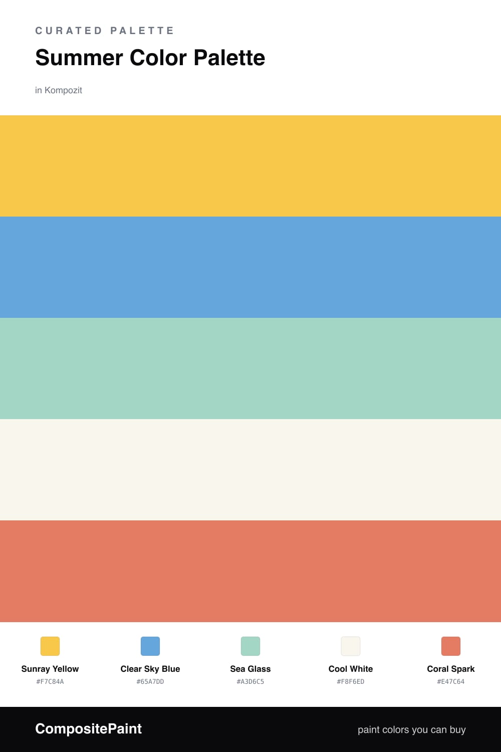
This is summer turned into a color scheme. Clear Sky Blue leads the way like a wide-open afternoon, and Cool White keeps everything feeling bright and airy, the way a beach house does with the windows open.

Then come the fun parts. Sunray Yellow is your warm shot of sunshine, and Coral Spark is the little pop of citrus and sunset that makes you smile. In between sits Sea Glass, that soft blue-green you see in shallow water, which softens the jump from the cool blues to the warm yellows so nothing feels jarring.

The 2026 way to use this is restraint, not rainbow. Lean on the blue and white for your big surfaces, and let the yellow, sea glass, and coral show up in smaller, swappable pieces. That keeps the whole thing feeling fresh and easy, which is the whole point of summer.

Buy These Colors

Each color matched to the closest real paint in every brand, by ΔE2000. Kompozit first; take any SKU to the store — these mix on demand.

Sunray Yellow
#F2C84B · LRV 61 · Secondary
Kompozit Sunny Mood · 0822 ΔE 1.32
Backdrop Eames · BD-EA ΔE 8.07
Behr Little Sun Dress · P280-5 ΔE 1.81
Benjamin Moore Yellow Brick Road · 349 ΔE 1.56
Clare Golden Hour · PNT100-MD-23 ΔE 6.57
Dunn-Edwards Yellow Brick Road · DE5424 ΔE 2.18
Farrow & Ball Babouche · No. 223 ΔE 3.83
Magnolia Home Amber · JG-39 ΔE 7.55
PPG / Glidden Crushed Pineapple · 1213-7 ΔE 2.45
Sherwin-Williams Rayo de Sol · SW 9020 ΔE 2.63
Valspar Lime Drop · V019-2 ΔE 1.81
Clear Sky Blue
#5C9FD6 · LRV 32 · Dominant
Kompozit Acapulco Dive · 0639 ΔE 2.45
Backdrop Polly Wants · BD-PW ΔE 14.41
Behr Alpha Blue · M520-5 ΔE 1.91
Benjamin Moore Nova Scotia Blue · 796 ΔE 2.26
Clare Blue Ivy · PNT100-MD-39 ΔE 11.45
Dunn-Edwards Marina · DE5857 ΔE 2.18
Farrow & Ball St Giles Blue · No. 280 ΔE 4.54
Magnolia Home Winter Solstice · JG-89 ΔE 12.62
PPG / Glidden Windjammer · 1241-4 ΔE 1.98
Sherwin-Williams Jacaranda · SW 6802 ΔE 5.74
Valspar Infinity · V033-2 ΔE 5.43
Sea Glass
#A8D5C8 · LRV 60 · Support
Kompozit Shimmering Glade · 0707 ΔE 1.9
Backdrop Real Real · BD-RR ΔE 17.38
Behr Greenwich Village · N440-3 ΔE 2.49
Benjamin Moore Copper Patina · 619 ΔE 1.42
Clare Views · PNT100-LT-35 ΔE 7.76
Dunn-Edwards Fountain City · DE5723 ΔE 3.82
Farrow & Ball Teresa's Green · No. 236 ΔE 9.32
Magnolia Home Vibrant Horizon · JG-88 ΔE 8.97
PPG / Glidden Whirlpool · 1230-3 ΔE 1.57
Sherwin-Williams Aqueduct · SW 6758 ΔE 1.88
Valspar Lake Breeze · 5007-7B ΔE 3
Cool White
#F6F4EE · LRV 90 · Base
Kompozit Sugar Dust · 0011 ΔE 1.44
Backdrop Tabula Rasa · BD-TR ΔE 2.34
Behr Whisper White · HDC-MD-08 ΔE 0.21
Benjamin Moore Opulence · 879 ΔE 0.88
Clare Timeless · PNT100-LT-04 ΔE 1.18
Dunn-Edwards Droplets · DEW381 ΔE 0.49
Farrow & Ball Wimborne White · No. 239 ΔE 2.22
Magnolia Home True White · JG-21 ΔE 1.46
PPG / Glidden Delicate White · 1001-1 ΔE 1.64
Sherwin-Williams High Reflective White · SW 7757 ΔE 1.12
Valspar Cuddle Down · 8007-6F ΔE 1
Coral Spark
#E8765A · LRV 31 · Accent
Kompozit Sari · 1066 ΔE 2.01
Backdrop Rosita · BD-RO ΔE 14.8
Behr Cosmic Coral · HDC-SM14-12 ΔE 4.52
Benjamin Moore Fresno · 020 ΔE 1.65
Clare Fire Sign · PNT100-DP-74 ΔE 6.18
Dunn-Edwards Orangeville · DE5138 ΔE 2.04
Farrow & Ball Red Earth · No. 64 ΔE 7.15
Magnolia Home Work Worn Wood · JG-35 ΔE 10.8
PPG / Glidden Clay Pot · 1194-6 ΔE 2.05
Sherwin-Williams Rejuvenate · SW 6620 ΔE 2.44
Valspar Peach Posey · M214 ΔE 4.79

Questions

How do I keep this many bright colors from feeling like a kids playroom?

Let the blue lead and the white do most of the quiet work, then use Sunray Yellow and Coral Spark in small doses, like a chair, a pillow, or a piece of art. When the brights only cover about one-fifth of what you see, they read fresh and grown-up instead of busy.

Which two colors should I paint and which should stay as accents?

Paint with Clear Sky Blue and Cool White, since they cover the most surface and stay easy on the eye. Keep Sunray Yellow, Sea Glass, and Coral Spark as the fun extras you bring in through smaller items you can swap out later.

Similar Palettes

Closest schemes by color — not by label.