CP

Summer Color Palette — Summer Sorbet

A fresh five-color summer scheme pairing zesty citrus orange with clear sky blue and creamy neutrals — every color matched to real paint you can buy.

By Emily Roberts · DIY Editor & First-Timer's Guide

Citrus Orange
Dominant
Kompozit Cheddar Cheese · 0977
#F0843A
LRV 35
Clear Sky Blue
Secondary
Kompozit Calm Tint · 0645
#8DB1CE
LRV 42
Coconut Cream
Base
Kompozit Kiara · 0005
#F5ECDC
LRV 85
Soft Melon
Support
Kompozit Pastel Peach · 1007
#F1CAAD
LRV 64
Cool Mint
Accent
Kompozit Belladonna's Leaf · 0743
#ADC3A7
LRV 51
View palette in

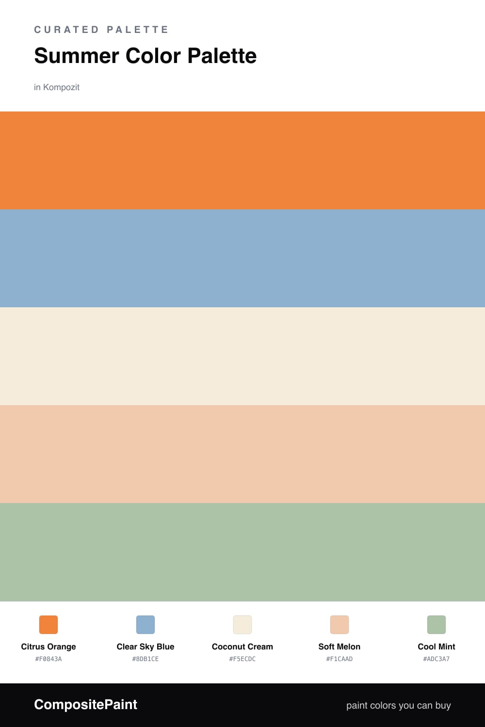
Summer Sorbet is exactly what it sounds like — those soft, fruity colors you get from a scoop of sorbet on a hot afternoon. Citrus Orange leads the way, warm and sunny without going neon, and Clear Sky Blue brings in that just-looked-up-at-a-blue-sky feeling that makes the orange pop even more.

To keep it easy on the eyes, Coconut Cream is your quiet base — think of it as the bowl that holds everything together — and Soft Melon bridges the orange and the cream so nothing feels like a hard jump. A little Cool Mint at the end is the surprise scoop, the fresh green note that feels very 2026 and stops the whole thing from feeling too sweet.

Use it the way you would scoop a dessert: a generous helping of the warm tones, a clear pour of blue, and just a spoonful of mint where you want a little lift. It is a happy, breezy combination that works as well on a front door as it does inside.

Buy These Colors

Each color matched to the closest real paint in every brand, by ΔE2000. Kompozit first; take any SKU to the store — these mix on demand.

Citrus Orange
#E8804A · LRV 33 · Dominant
Kompozit Cheddar Cheese · 0977 ΔE 4.27
Backdrop Rosita · BD-RO ΔE 16.52
Behr Amiable Orange · M230-6 ΔE 3.48
Benjamin Moore Orange Blossom · 2168-30 ΔE 2.55
Clare Fire Sign · PNT100-DP-74 ΔE 8.36
Dunn-Edwards Orange Daylily · DE5145 ΔE 6.24
Farrow & Ball Red Earth · No. 64 ΔE 10.67
Magnolia Home Vintage Crown · JG-152 ΔE 16.31
PPG / Glidden Orange Poppy · 1196-7 ΔE 2.13
Sherwin-Williams Navel · SW 6887 ΔE 6.13
Valspar Autumn Glimmer · 2003-1A ΔE 2.13
Clear Sky Blue
#7FB5D4 · LRV 42 · Secondary
Kompozit Calm Tint · 0645 ΔE 3.82
Backdrop Underdog · BD-UD ΔE 10.36
Behr Simply Posh · MQ5-55 ΔE 1.72
Benjamin Moore Tidal Wave · 2061-50 ΔE 1.01
Clare Vacay · PNT100-LT-44 ΔE 12.61
Dunn-Edwards Bonnie Blue · DE5807 ΔE 3.35
Farrow & Ball Lulworth Blue · No. 89 ΔE 7.08
Magnolia Home Winter Solstice · JG-89 ΔE 7.52
PPG / Glidden Harbor Sky · 1238-4 ΔE 2.02
Sherwin-Williams Regale Blue · SW 6801 ΔE 0.65
Valspar Tribute · V071-3 ΔE 1.85
Coconut Cream
#F4EDDD · LRV 85 · Base
Kompozit Kiara · 0005 ΔE 0.98
Backdrop Jane · BD-JA ΔE 2.94
Behr Vanilla Frost · BWC-23 ΔE 0.75
Benjamin Moore October Sky · 2162-70 ΔE 0.98
Clare Wing It · PNT100-LT-24 ΔE 4.38
Dunn-Edwards Bone China · DEW339 ΔE 0.52
Farrow & Ball White Tie · No. 2002 ΔE 1.25
Magnolia Home Pearly Cotton · JG-33 ΔE 1.56
PPG / Glidden Spun Cotton · 1203-1 ΔE 0.21
Sherwin-Williams Paperwhite · SW 7105 ΔE 0.67
Valspar Dairy Belle · V164 ΔE 0.9
Soft Melon
#F2C9A6 · LRV 63 · Support
Kompozit Pastel Peach · 1007 ΔE 1.91
Backdrop August · BD-AU ΔE 6.19
Behr Almond Biscuit · S250-2 ΔE 2.37
Benjamin Moore Desert View · 108 ΔE 0.65
Clare Before Sunrise · PNT100-LT-71 ΔE 1.91
Dunn-Edwards Sundown · DE5268 ΔE 2.24
Farrow & Ball String · No. 8 ΔE 8.85
Magnolia Home Lemony · JG-42 ΔE 7.27
PPG / Glidden Caramel Ice · 1202-4 ΔE 1.37
Sherwin-Williams Avid Apricot · SW 6639 ΔE 1.55
Valspar Apricot Soufflé · M235 ΔE 1.25
Cool Mint
#A9CBB0 · LRV 54 · Accent
Kompozit Belladonna's Leaf · 0743 ΔE 3.67
Backdrop Lost in the 80s · BD-LO ΔE 18.76
Behr Alpine Air · BXC-38 ΔE 1.19
Benjamin Moore Spruce Green · 2035-50 ΔE 2.27
Clare Avocado Toast · PNT100-MD-49 ΔE 5.53
Dunn-Edwards Spinach Dip · DE5611 ΔE 2.65
Farrow & Ball Cooking Apple Green · No. 32 ΔE 10.28
Magnolia Home Clean Lines · JG-56 ΔE 10.04
PPG / Glidden Taffy Twist · 1132-3 ΔE 2.34
Sherwin-Williams Retro Mint · SW 9036 ΔE 2.75
Valspar Green Supreme · 6001-7C ΔE 2.5

Questions

Can I really use a bright orange like this on a whole wall?

Yes, but pick one wall to start. Citrus Orange is happiest as the star on a single feature wall, with Coconut Cream on the other three walls so the room stays bright and not overwhelming. If you love it, you can always add more later.

Which colors should I use the most and the least?

Lead with the warm orange and cream as your big areas, let the sky blue do the supporting work on a piece of furniture or a door, and save Cool Mint for the smallest touches like a vase or a chair. That keeps everything feeling fresh instead of busy.

Similar Palettes

Closest schemes by color — not by label.