PROFESSIONAL-GRADE PAINT
ONE COAT COVERAGE
MADE FOR REAL RESULTS
CompositePaint

Spring Living Room Palette — Soft Green & Blush

A fresh 5-color spring scheme for living rooms: soft green walls, warm cream trim, a gentle blush accent, and natural wood tan for bright days. Every color matched to real paint you can buy.

By Jessica Williams · Color Stylist & Interior Editor

Soft Green
Walls
Kompozit Wispy Mint · 0750
#BCC7A4
LRV 54
Warm Cream
Trim & Ceiling
Kompozit Kiara · 0005
#F5ECDC
LRV 85
Gentle Blush
Accent
Kompozit Empire Rose · 0069
#E7C5C1
LRV 61
Wood Tan
Wood & Floors
Kompozit Back to Basics · 0255
#C49A69
LRV 36
Soft Sage
Furnishings
Kompozit Green Glass · 0751
#AAB892
LRV 45
View palette in

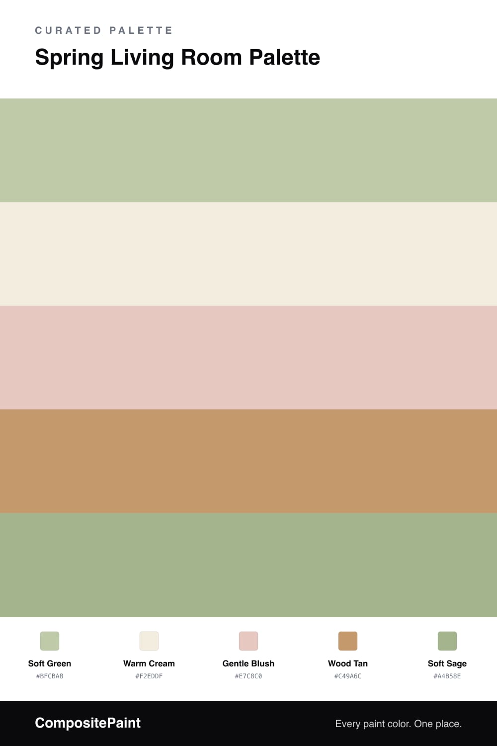
A spring living room should feel like the first warm week of the year — new growth, soft light, the windows finally open. This palette leads with a soft green on the walls, a muted, slightly gray shade that feels like new leaves rather than a bold statement.

A warm cream on the trim and ceiling keeps the green light and fresh, and a gentle blush accent — pillows, a throw, fresh flowers — adds a hint of color without tipping into sweet. Wood tan grounds the scheme through floors, a coffee table, or shelving, keeping everything natural and warm underfoot.

A touch of soft sage in the furnishings echoes the walls and ties the room together. Lead with green, let cream brighten it, and use blush in small, happy doses. The whole scheme feels like spring even in the middle of winter.

Buy These Colors

Each color matched to the closest real paint in every brand, by ΔE2000. Kompozit first; take any SKU to the store — these mix on demand.

Soft Green
#BFCBA8 · LRV 57 · Walls
Kompozit Wispy Mint · 0750 ΔE 1.01
Backdrop Real Real · BD-RR ΔE 10.81
Behr Minted Lemon · PPU10-08 ΔE 2.89
Benjamin Moore Kittery Point Green · HC-119 ΔE 1.51
Clare All The Sage · PNT100-LT-70 ΔE 5.91
Dunn-Edwards Watercress · DE5528 ΔE 4.4
Farrow & Ball Cooking Apple Green · No. 32 ΔE 3.72
Magnolia Home Sour Apple · JG-50 ΔE 5.63
PPG / Glidden Sage Splendor · 1115-4 ΔE 3.31
Sherwin-Williams Baize Green · SW 6429 ΔE 2.3
Valspar Freshwater Green · V061-2 ΔE 1.48
Warm Cream
#F2EDDF · LRV 85 · Trim & Ceiling
Kompozit Kiara · 0005 ΔE 1.83
Backdrop Jane · BD-JA ΔE 1.91
Behr Parchment Paper · 710C-1 ΔE 0.82
Benjamin Moore Arbor White · ES-01 ΔE 0
Clare Wing It · PNT100-LT-24 ΔE 4.1
Dunn-Edwards Bone China · DEW339 ΔE 0.53
Farrow & Ball White Tie · No. 2002 ΔE 2.27
Magnolia Home Pearly Cotton · JG-33 ΔE 1.19
PPG / Glidden Candlelit Beige · 1207-1 ΔE 0.54
Sherwin-Williams Westhighland White · SW 7566 ΔE 1.32
Valspar Statuesque · 7002-5 ΔE 0.21
Gentle Blush
#E7C8C0 · LRV 62 · Accent
Kompozit Empire Rose · 0069 ΔE 2.29
Backdrop August · BD-AU ΔE 4.42
Behr Tapestry Beige · S210-2 ΔE 1.74
Benjamin Moore Rosetone · 1186 ΔE 0.93
Clare Meet Cute · PNT100-LT-60 ΔE 3.23
Dunn-Edwards Galveston Tan · DE6101 ΔE 3.51
Farrow & Ball Calamine · No. 230 ΔE 3.77
Magnolia Home Ella Rose · JG-24 ΔE 4.4
PPG / Glidden Tangy Taffy · 1058-3 ΔE 0.8
Sherwin-Williams Quaint Peche · SW 6330 ΔE 2.4
Valspar Harmony · 2001-8C ΔE 1.13
Wood Tan
#C49A6C · LRV 36 · Wood & Floors
Kompozit Back to Basics · 0255 ΔE 0.83
Backdrop Carry the Two · BD-CT ΔE 11.9
Behr Gingersnap · S270-5 ΔE 1.81
Benjamin Moore Butternut Squash · 1090 ΔE 1.92
Clare Good as Gold · PNT100-DP-59 ΔE 3.93
Dunn-Edwards Tan Plan · DE6137 ΔE 2.63
Farrow & Ball India Yellow · No. 66 ΔE 5.33
Magnolia Home Juniper Tree · JG-166 ΔE 11.37
PPG / Glidden Welcome Home · 1092-5 ΔE 2.55
Sherwin-Williams Caramelized · SW 9186 ΔE 2.14
Valspar Western Wear · M139 ΔE 1.58
Soft Sage
#A4B58E · LRV 43 · Furnishings
Kompozit Green Glass · 0751 ΔE 1.39
Backdrop Le Freak · BD-LF ΔE 6.5
Behr Willow Grove · PPU11-06 ΔE 2.28
Benjamin Moore Seedling · AF-450 ΔE 1.14
Clare Matcha Latte · PNT100-DP-50 ΔE 5.74
Dunn-Edwards Mistletoe Kiss · DE5620 ΔE 3.17
Farrow & Ball French Gray · No. 18 ΔE 9.54
Magnolia Home Seasonal · JG-51 ΔE 6.36
PPG / Glidden Sparrow Song · 11-13 ΔE 5.21
Sherwin-Williams Haven · SW 6437 ΔE 0.41
Valspar Rolling Glen · 5007-5C ΔE 1.8

Questions

Is soft green a safe wall color for a living room?

It is one of the easiest greens to live with. This shade is muted and slightly gray, so it reads as a soft neutral rather than a bold statement, and it pairs happily with both warm woods and cooler accents.

How do I use blush without it looking too sweet?

Keep it as an accent and pair it with green and natural wood. Against those grounded tones the blush reads fresh and grown-up, more dusty rose than candy, so the room feels cheerful instead of childish.

Similar Palettes

Closest schemes by color — not by label.