CP

Summer Color Palette — Sunlit Willow

A fresh five-color summer scheme pairing soft willow green with citrus orange and clear sky blue, balanced by warm cream — every color matched to real paint you can buy.

By Jessica Williams · Color Stylist & Interior Editor

Willow Green
Dominant
Kompozit Glendale · 0758
#A1BB8B
LRV 45
Sky Blue
Secondary
Kompozit Bluette · 0616
#9EBED8
LRV 49
Warm Cream
Base
Kompozit Casa Blanca · 0008
#F4ECD8
LRV 84
Citrus Orange
Support
Kompozit Cheddar Cheese · 0977
#F0843A
LRV 35
Sunlit Gold
Accent
Kompozit I'm a Local · 0863
#EBBF5C
LRV 56
View palette in

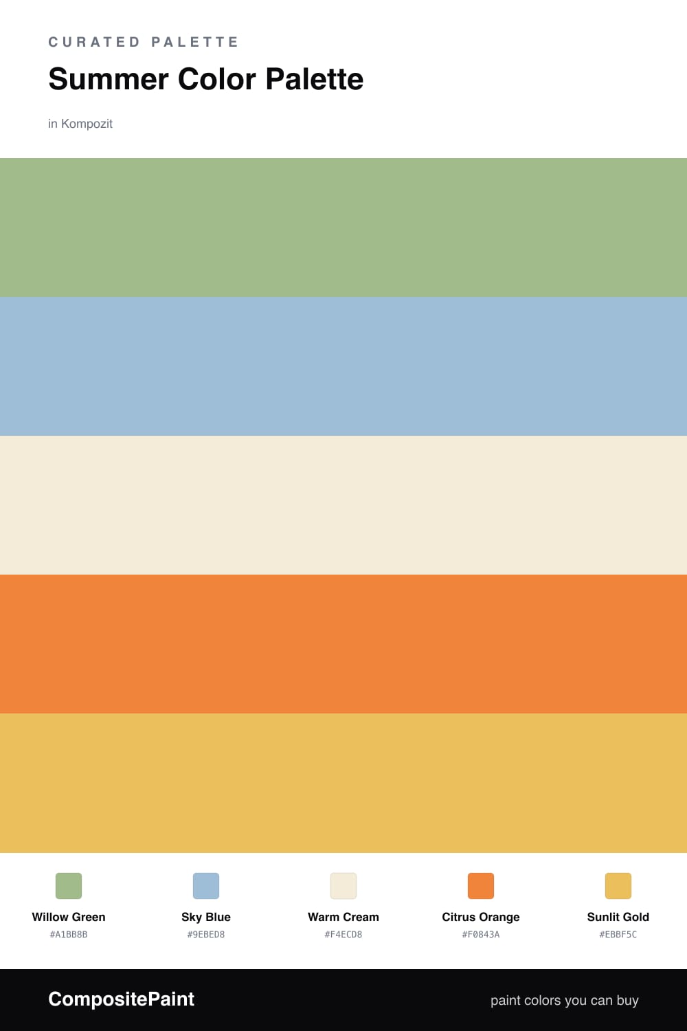
There is a moment in early summer when the willow trees go soft and silvery green, and the light turns everything golden. That is the feeling I wanted to bottle here. Willow Green leads the whole scheme — gentle, leafy, and easy to live with on a big wall.

Against that green, Sky Blue opens the room up like a clear afternoon, and Warm Cream keeps everything light and breathable. These three are your quiet majority, the calm backdrop you can sit in all season.

Then come the sparks. Citrus Orange and Sunlit Gold are the warmth of the sun cutting through the leaves — use them small, in a cushion or a piece of pottery, and the whole palette suddenly feels like July. It is a fresh, slightly modern take on the classic green-and-blue garden look, and it carries beautifully into 2026.

Buy These Colors

Each color matched to the closest real paint in every brand, by ΔE2000. Kompozit first; take any SKU to the store — these mix on demand.

Willow Green
#9FB58A · LRV 42 · Dominant
Kompozit Glendale · 0758 ΔE 1.99
Backdrop Le Freak · BD-LF ΔE 7.93
Behr Promenade · 400F-5 ΔE 0.57
Benjamin Moore Seedling · AF-450 ΔE 2.09
Clare Matcha Latte · PNT100-DP-50 ΔE 5.2
Dunn-Edwards Mistletoe Kiss · DE5620 ΔE 1.68
Farrow & Ball Arsenic · No. 214 ΔE 9.03
Magnolia Home Seasonal · JG-51 ΔE 7.96
PPG / Glidden Sparrow Song · 11-13 ΔE 5.71
Sherwin-Williams Haven · SW 6437 ΔE 1.51
Valspar Rolling Glen · 5007-5C ΔE 2
Sky Blue
#8FBFD6 · LRV 48 · Secondary
Kompozit Bluette · 0616 ΔE 4.75
Backdrop Lost in the 80s · BD-LO ΔE 4.26
Behr Gentle Sky · PPU14-11 ΔE 2.46
Benjamin Moore Turquoise Powder · 2057-50 ΔE 3.62
Clare Cloud Watching · PNT100-MD-73 ΔE 7.82
Dunn-Edwards Eastern Sky · DE5786 ΔE 2.63
Farrow & Ball Lulworth Blue · No. 89 ΔE 6.09
Magnolia Home It Is Well · JG-76 ΔE 8.92
PPG / Glidden Horizon Haze · 1237-4 ΔE 3.26
Sherwin-Williams After the Rain · SW 9047 ΔE 5.16
Valspar Angel Sol · 8002-43C ΔE 0.72
Warm Cream
#F3ECDA · LRV 84 · Base
Kompozit Casa Blanca · 0008 ΔE 0.76
Backdrop Don't Eat the Yellow Snow · BD-DS ΔE 2.19
Behr Cottage White 1813 · 1813 ΔE 0.5
Benjamin Moore Linen White · 912 ΔE 0.44
Clare Like Buttah · PNT100-LT-62 ΔE 2.23
Dunn-Edwards White Sand · DEW336 ΔE 1.35
Farrow & Ball White Tie · No. 2002 ΔE 0.9
Magnolia Home Pearly Cotton · JG-33 ΔE 1.45
PPG / Glidden Adobe White · 1100-2 ΔE 0.71
Sherwin-Williams Medici Ivory · SW 7558 ΔE 1.54
Valspar Dairy Belle · V164 ΔE 1.22
Citrus Orange
#E68A3C · LRV 35 · Support
Kompozit Cheddar Cheese · 0977 ΔE 3.62
Backdrop Rosita · BD-RO ΔE 19.2
Behr Pumpkin Toast · 270D-6 ΔE 2.23
Benjamin Moore Jack O'Lantern · 2156-30 ΔE 4.25
Clare Good as Gold · PNT100-DP-59 ΔE 13.58
Dunn-Edwards Brushed Clay · DE5243 ΔE 4.1
Farrow & Ball India Yellow · No. 66 ΔE 11.56
Magnolia Home Cottage Feel · JG-40 ΔE 14.67
PPG / Glidden Orange Poppy · 1196-7 ΔE 5.3
Sherwin-Williams Carnival · SW 6892 ΔE 1.95
Valspar Carrot Cake · 2007-3A ΔE 4.3
Sunlit Gold
#E8C566 · LRV 58 · Accent
Kompozit I'm a Local · 0863 ΔE 2.71
Backdrop Eames · BD-EA ΔE 4.37
Behr Summer Field · 370D-5 ΔE 1.53
Benjamin Moore Showtime · 293 ΔE 0.91
Clare Golden Hour · PNT100-MD-23 ΔE 4.23
Dunn-Edwards Dijon Mustard · DE5451 ΔE 3.29
Farrow & Ball Babouche · No. 223 ΔE 1.69
Magnolia Home Amber · JG-39 ΔE 4.8
PPG / Glidden Sun Salutation · 12-03 ΔE 2.24
Sherwin-Williams Quilt Gold · SW 6696 ΔE 1.24
Valspar Fall Meadow · 3007-3B ΔE 2.23

Questions

Why do these colors feel so fresh together?

They borrow from a summer afternoon — soft green leaves, open sky, and the warm glow of citrus. Green leads while the orange and gold add heat, so the room feels alive without tipping into loud.

How do I use them in a real space?

Let Willow Green carry most of the room, then bring in Sky Blue on a second surface. Use the orange and gold in small doses — a chair, a vase, a striped cushion — so they read as sparks of sunlight.

Similar Palettes

Closest schemes by color — not by label.