CP

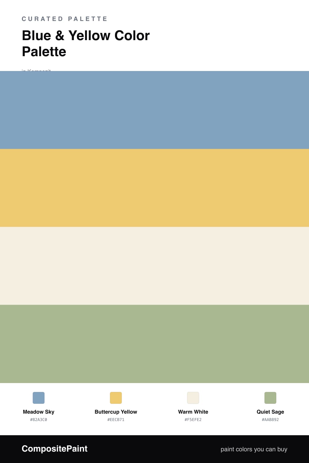
Blue & Yellow Color Palette — Meadow Morning

A fresh four-color scheme pairing soft sky blue with a sunlit buttercup yellow, settled on warm white and gentle sage — every color matched to real paint you can buy.

By Jessica Williams · Color Stylist & Interior Editor

Meadow Sky
Dominant
Kompozit John's Blue · 0617
#82A3C0
LRV 35
Buttercup Yellow
Secondary
Kompozit Golden Glow · 0814
#EECB71
LRV 62
Warm White
Base
Kompozit Bunny Cake · 0012
#F5EFE2
LRV 87
Quiet Sage
Support
Kompozit Green Glass · 0751
#AAB892
LRV 45
View palette in

Blue and yellow is the pairing that feels like a clear morning outdoors, and it reads as easy rather than loud when you keep both colors a little softened. This scheme leads with Meadow Sky, a calm mid blue that holds the room without weighing it down, and lets Buttercup Yellow come through like sunlight catching the grass.

Warm White keeps everything from feeling too sweet, giving your eye a place to rest between the blue and the yellow. A touch of Quiet Sage ties the two back to the natural world they came from, bridging the cool blue and the warm yellow so the contrast stays gentle.

For a contemporary 2026 feel, let the blue do most of the work and keep the yellow to smaller, deliberate moments. The white and sage carry the quiet middle, so the palette stays fresh and lived-in rather than primary or playful.

Buy These Colors

Each color matched to the closest real paint in every brand, by ΔE2000. Kompozit first; take any SKU to the store — these mix on demand.

Meadow Sky
#7FA3C4 · LRV 35 · Dominant
Kompozit John's Blue · 0617 ΔE 1.15
Backdrop Nuevo · BD-NU ΔE 19.05
Behr Hawaiian Sky · PPU14-07 ΔE 1.4
Benjamin Moore Soft Jazz · 809 ΔE 2.2
Clare Blue Ivy · PNT100-MD-39 ΔE 7.86
Dunn-Edwards Wandering River · DE5850 ΔE 2.96
Farrow & Ball St Giles Blue · No. 280 ΔE 6.45
Magnolia Home Winter Solstice · JG-89 ΔE 7.79
PPG / Glidden Serene Sea · 1158-4 ΔE 4.01
Sherwin-Williams Baby Blue Eyes · SW 9070 ΔE 5.27
Valspar Violetta · V073-4 ΔE 2.71
Buttercup Yellow
#E9C66B · LRV 59 · Secondary
Kompozit Golden Glow · 0814 ΔE 1.23
Backdrop Eames · BD-EA ΔE 3.77
Behr Wild Bamboo · 350D-4 ΔE 1.65
Benjamin Moore Firefly · 299 ΔE 1.96
Clare Golden Hour · PNT100-MD-23 ΔE 3.68
Dunn-Edwards Dijon Mustard · DE5451 ΔE 3.18
Farrow & Ball Babouche · No. 223 ΔE 1.75
Magnolia Home Amber · JG-39 ΔE 4.5
PPG / Glidden Sun Salutation · 12-03 ΔE 1.79
Sherwin-Williams Quilt Gold · SW 6696 ΔE 1.26
Valspar Fall Meadow · 3007-3B ΔE 2.89
Warm White
#F4EFE4 · LRV 87 · Base
Kompozit Bunny Cake · 0012 ΔE 0.84
Backdrop Tabula Rasa · BD-TR ΔE 1.56
Behr Nude W-f-210 · W-F-210 ΔE 1.42
Benjamin Moore Pink Damask · 890 ΔE 1.22
Clare Wing It · PNT100-LT-24 ΔE 2.83
Dunn-Edwards Trite White · DE6204 ΔE 1.13
Farrow & Ball Pointing · No. 2003 ΔE 1.29
Magnolia Home Silos White · JG-107 ΔE 1.97
PPG / Glidden Crumb Cookie · 18-01 ΔE 1.42
Sherwin-Williams Whitetail · SW 7103 ΔE 0
Valspar Wings of an Angel · V153 ΔE 0.5
Quiet Sage
#AEB79A · LRV 45 · Support
Kompozit Green Glass · 0751 ΔE 3.12
Backdrop Le Freak · BD-LF ΔE 3.97
Behr Moss Print · PPU11-08 ΔE 1.01
Benjamin Moore Urban Nature · AF-440 ΔE 2.04
Clare Avocado Toast · PNT100-MD-49 ΔE 3.28
Dunn-Edwards Pistachio Shell · DE6263 ΔE 3.88
Farrow & Ball French Gray · No. 18 ΔE 6.12
Magnolia Home Seasonal · JG-51 ΔE 3.13
PPG / Glidden Mellow Mood · 1030-3 ΔE 2.69
Sherwin-Williams Koi Pond · SW 7727 ΔE 6.64
Valspar Green Trellis · 5006-3C ΔE 3.2

Questions

How much yellow should I use with the blue?

Let the blue lead and keep the yellow as the accent, roughly a 70/30 split. Meadow Sky covers the larger surfaces while Buttercup Yellow shows up in smaller doses, so the pairing feels sunlit instead of busy.

What keeps blue and yellow from looking too playful?

Softening both colors and adding a buffer. These are muted, slightly grayed versions rather than primary brights, and the Warm White and Quiet Sage in between calm the contrast so it reads grown-up and fresh.

Similar Palettes

Closest schemes by color — not by label.