CP

Summer Color Palette — Summer Meadow

A fresh five-color scheme pairing sun-warmed citrus and sky blue with green grass and creamy white — every color matched to real paint you can buy.

By Maya Patel · Reviews Editor & Product Tester

Meadow Green
Dominant
Kompozit Totally Cool · 0787
#909853
LRV 29
Sky Blue
Secondary
Kompozit Bluette · 0616
#9EBED8
LRV 49
Citrus Yellow
Accent
Kompozit Sunny Mood · 0822
#F7C84A
LRV 62
Creamy White
Base
Kompozit Bunny Cake · 0012
#F5EFE2
LRV 87
Clay Coral
Support
Kompozit Summer Memory · 1052
#DF856E
LRV 34
View palette in

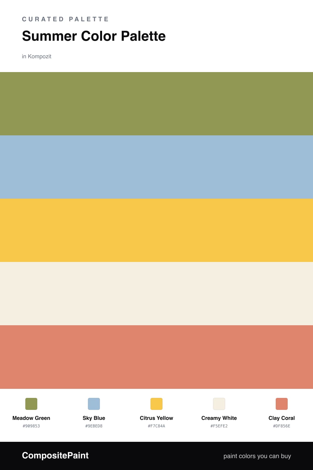
Summer is the easiest season to over-do, so this scheme keeps the brights honest. Meadow Green leads as a soft, sunlit grass tone, and Sky Blue sits beside it like a clear afternoon — the two cool colors that do most of the heavy lifting here.

The warmth comes in small doses. Citrus Yellow is the spark you notice first, while Clay Coral adds a sun-on-skin glow that keeps the green and blue from feeling cold. Used sparingly, these two carry all the heat without overwhelming the room.

Creamy White ties it together and gives your eye somewhere to rest. Let the green and white cover the most ground, drop the blue in as a secondary, and save the citrus and coral for the moments you actually want to pop.

Buy These Colors

Each color matched to the closest real paint in every brand, by ΔE2000. Kompozit first; take any SKU to the store — these mix on demand.

Meadow Green
#7BA05B · LRV 30 · Dominant
Kompozit Totally Cool · 0787 ΔE 7.27
Backdrop Carry the Two · BD-CT ΔE 18.57
Behr Parakeet · MQ4-47 ΔE 2.94
Benjamin Moore Pleasant Grove · 552 ΔE 2.81
Clare Extra Virgin · PNT100-MD-64 ΔE 10.01
Dunn-Edwards Garden of Eden · DE5607 ΔE 4.34
Farrow & Ball Yeabridge Green · No. 287 ΔE 6.6
Magnolia Home Magnolia Green · JG-08 ΔE 10.38
PPG / Glidden Grassy Meadow · 1223-6 ΔE 2.13
Sherwin-Williams Pickle · SW 6725 ΔE 3.33
Valspar Spring Leaves · 5008-6B ΔE 4.28
Sky Blue
#8EC6D9 · LRV 51 · Secondary
Kompozit Bluette · 0616 ΔE 7.43
Backdrop Lost in the 80s · BD-LO ΔE 5.77
Behr Cotton Denim · BIC-10 ΔE 0.86
Benjamin Moore Blue Rapids · 745 ΔE 3.37
Clare Cloud Watching · PNT100-MD-73 ΔE 9.6
Dunn-Edwards Winter Chime · DE5828 ΔE 2
Farrow & Ball Blue Ground · No. 210 ΔE 6.42
Magnolia Home It Is Well · JG-76 ΔE 8.13
PPG / Glidden Idyllic Isle · 1235-4 ΔE 3.4
Sherwin-Williams Sky Fall · SW 9049 ΔE 1.95
Valspar Hydrangea Blue · P106 ΔE 2.02
Citrus Yellow
#F2C744 · LRV 60 · Accent
Kompozit Sunny Mood · 0822 ΔE 1.35
Backdrop Eames · BD-EA ΔE 8.63
Behr Little Sun Dress · P280-5 ΔE 1.65
Benjamin Moore Sunrays · 343 ΔE 2.15
Clare Golden Hour · PNT100-MD-23 ΔE 7.11
Dunn-Edwards Yellow Brick Road · DE5424 ΔE 2.58
Farrow & Ball Babouche · No. 223 ΔE 4.31
Magnolia Home Amber · JG-39 ΔE 8.14
PPG / Glidden Crushed Pineapple · 1213-7 ΔE 2.45
Sherwin-Williams Rayo de Sol · SW 9020 ΔE 2.89
Valspar Lime Drop · V019-2 ΔE 1.86
Creamy White
#F5F0E1 · LRV 87 · Base
Kompozit Bunny Cake · 0012 ΔE 1.11
Backdrop Tabula Rasa · BD-TR ΔE 1.92
Behr Confection · BWC-02 ΔE 0.82
Benjamin Moore White Blush · 904 ΔE 0.49
Clare Wing It · PNT100-LT-24 ΔE 4.41
Dunn-Edwards Trite White · DE6204 ΔE 0.82
Farrow & Ball Pointing · No. 2003 ΔE 0.79
Magnolia Home Lit Candles · JG-37 ΔE 3.06
PPG / Glidden White Chip · 15-06 ΔE 0.41
Sherwin-Williams Roman Column · SW 7562 ΔE 0.74
Valspar Warm Milk · 8007-8B ΔE 0.74
Clay Coral
#E08A6B · LRV 35 · Support
Kompozit Summer Memory · 1052 ΔE 3
Backdrop Rosita · BD-RO ΔE 10.9
Behr Candied Yams (m210-5) · M210-5 ΔE 2.5
Benjamin Moore Golden Cherry · 069 ΔE 2.41
Clare Pink Sky · PNT100-MD-28 ΔE 9.95
Dunn-Edwards Bronzed Orange · DE5179 ΔE 1.82
Farrow & Ball Red Earth · No. 64 ΔE 6.8
Magnolia Home Juniper Tree · JG-166 ΔE 21.74
PPG / Glidden Indiana Clay · 1195-6 ΔE 4.44
Sherwin-Williams Sunset · SW 6626 ΔE 3.53
Valspar Desert Rose · 2004-3C ΔE 3.7

Questions

How do I keep this palette from looking too busy?

Let Meadow Green lead on the big surfaces and treat Citrus Yellow as a small spark, not a wall. Creamy White does the cooling work between them, so the bright notes read as cheerful instead of loud.

Which color should I use the least?

Citrus Yellow. It is the highlight that wakes everything up, so a roughly one-fifth share is plenty. A little goes a long way, and more than that starts to tip the whole scheme toward sour.

Similar Palettes

Closest schemes by color — not by label.