CP

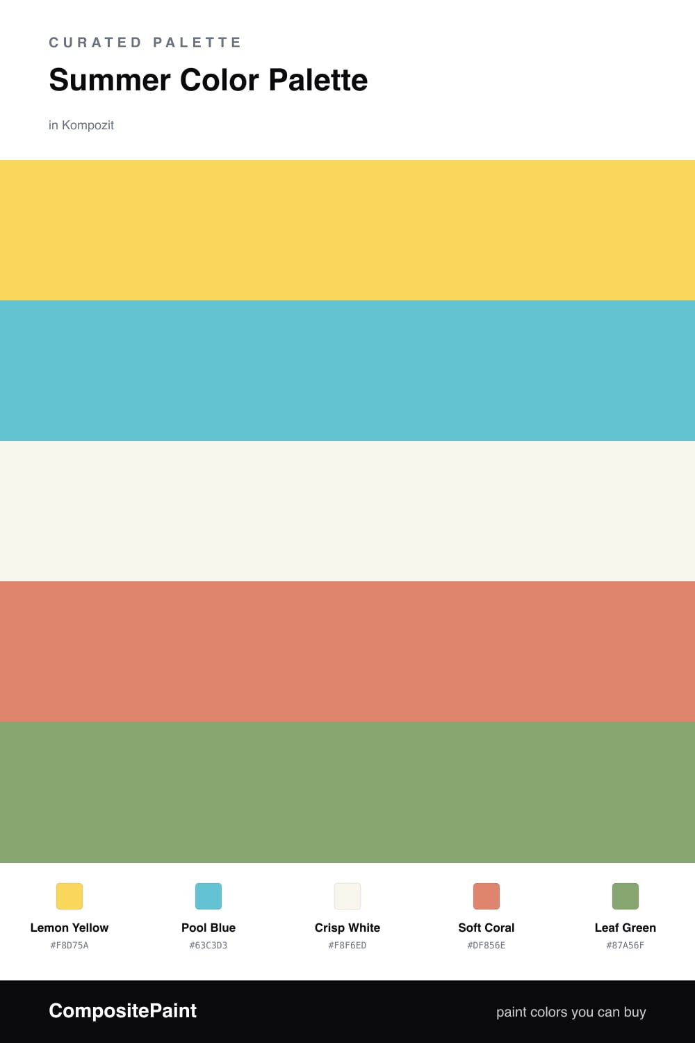
Summer Color Palette — Summer Lemonade

A bright, citrus-fresh five-color scheme built around lemon yellow, pool blue, and warm white — every color matched to real paint you can buy.

By David Chen · Formulation Lead & Resident Chemist

Lemon Yellow
Dominant
Kompozit Glitter Yellow · 0835
#F8D75A
LRV 69
Pool Blue
Secondary
Kompozit Enchanted Evening · 0673
#63C3D3
LRV 46
Crisp White
Base
Kompozit Sugar Dust · 0011
#F8F6ED
LRV 92
Soft Coral
Support
Kompozit Summer Memory · 1052
#DF856E
LRV 34
Leaf Green
Accent
Kompozit Perennial Garden · 0759
#87A56F
LRV 33
View palette in

Summer lemonade is all about that first cold sip on a hot afternoon, and this scheme bottles it. Lemon Yellow leads like sunlight on a kitchen counter, while Pool Blue cools it right back down, the way a glass of water sits beside the pitcher.

I always think of color like flavor balance: too much sweet and you lose the freshness. So Crisp White is the soda water here, the thing that keeps the bright notes from going syrupy. It gives your eye a place to rest between the yellow and the blue.

For the finishing touches, a Soft Coral adds a squeeze of warmth and a Leaf Green drops in like a sprig of mint. Use them sparingly, in cushions, a planter, or a single accent piece, and the whole palette stays bright, modern, and easy to live with all season.

Buy These Colors

Each color matched to the closest real paint in every brand, by ΔE2000. Kompozit first; take any SKU to the store — these mix on demand.

Lemon Yellow
#F4D35E · LRV 67 · Dominant
Kompozit Glitter Yellow · 0835 ΔE 1.27
Backdrop Eames · BD-EA ΔE 7.94
Behr Squash Blossom · P290-5 ΔE 2.77
Benjamin Moore Majestic Yellow · 355 ΔE 2.88
Clare Golden Hour · PNT100-MD-23 ΔE 6.99
Dunn-Edwards Rubber Ducky · DE5390 ΔE 2.73
Farrow & Ball Citron · No. 74 ΔE 4.42
Magnolia Home Amber · JG-39 ΔE 5.47
PPG / Glidden Beach Party · 1211-6 ΔE 2.76
Sherwin-Williams Funky Yellow · SW 6913 ΔE 2.68
Valspar Hive Delight · V018-2 ΔE 1.71
Pool Blue
#5BBBC4 · LRV 42 · Secondary
Kompozit Enchanted Evening · 0673 ΔE 3.47
Backdrop Underdog · BD-UD ΔE 15.02
Behr North Wind · HDC-WR14-6 ΔE 2.34
Benjamin Moore Harbor Side Blue · 740 ΔE 2.46
Clare Vacay · PNT100-LT-44 ΔE 9.24
Dunn-Edwards Faded Jeans · DE5752 ΔE 1.99
Farrow & Ball Arsenic · No. 214 ΔE 14.68
Magnolia Home Morning Calm · JG-77 ΔE 9.23
PPG / Glidden High Dive · 1236-5 ΔE 3.75
Sherwin-Williams Nautilus · SW 6780 ΔE 4.48
Valspar Rapids · 5004-10A ΔE 1.56
Crisp White
#F7F4EC · LRV 91 · Base
Kompozit Sugar Dust · 0011 ΔE 0.84
Backdrop Tabula Rasa · BD-TR ΔE 1.64
Behr Simply White · BWC-01 ΔE 0.61
Benjamin Moore Mountain Peak White · 2148-70 ΔE 1.16
Clare Timeless · PNT100-LT-04 ΔE 1
Dunn-Edwards Droplets · DEW381 ΔE 1.37
Farrow & Ball Wimborne White · No. 239 ΔE 1.31
Magnolia Home True White · JG-21 ΔE 2.13
PPG / Glidden Delicate White · 1001-1 ΔE 2.42
Sherwin-Williams High Reflective White · SW 7757 ΔE 1.61
Valspar Ivory Keys · 8007-4A ΔE 0.46
Soft Coral
#E8826B · LRV 34 · Support
Kompozit Summer Memory · 1052 ΔE 1.95
Backdrop Rosita · BD-RO ΔE 11.88
Behr Cosmic Coral · HDC-SM14-12 ΔE 2.79
Benjamin Moore Fan Coral · 013 ΔE 3.12
Clare Pink Sky · PNT100-MD-28 ΔE 9.15
Dunn-Edwards Orange Daylily · DE5145 ΔE 2.99
Farrow & Ball Red Earth · No. 64 ΔE 6.84
Magnolia Home Vintage Crown · JG-152 ΔE 19.14
PPG / Glidden Smoked Salmon · 1189-5 ΔE 4.94
Sherwin-Williams Rejuvenate · SW 6620 ΔE 3.15
Valspar Coral Passion · 2001-1B ΔE 1.71
Leaf Green
#7FA56A · LRV 32 · Accent
Kompozit Perennial Garden · 0759 ΔE 1.9
Backdrop Le Freak · BD-LF ΔE 12.92
Behr Olivine · 420F-5 ΔE 0.23
Benjamin Moore Buckingham Gardens · 545 ΔE 3.4
Clare Extra Virgin · PNT100-MD-64 ΔE 9.09
Dunn-Edwards Garden of Eden · DE5607 ΔE 1.51
Farrow & Ball Yeabridge Green · No. 287 ΔE 5.88
Magnolia Home Countryside · JG-52 ΔE 13
PPG / Glidden Grassy Meadow · 1223-6 ΔE 3.19
Sherwin-Williams Pickle · SW 6725 ΔE 2.24
Valspar Spring Leaves · 5008-6B ΔE 2.61

Questions

Is lemon yellow too bold to use on a wall?

It can be, so let the white do most of the heavy lifting and keep the yellow to one feature wall or a built-in. A soft, slightly chalky lemon like this reads as sunshine rather than a highlighter, especially next to a calm pool blue.

How do I keep this palette from feeling like a kids room?

Lean on the warm white as your base and use the coral and leaf green in small, grown-up doses, like a single chair or a planter. The trick is restraint — one bright leads, the rest just season it.

Similar Palettes

Closest schemes by color — not by label.