Summer Color Palette — Citrus & Sky
A bright five-color summer scheme pairing sun-washed citrus and clear sky blue with cool aqua and crisp cream — every color matched to real paint you can buy.
By Emily Roberts · DIY Editor & First-Timer's Guide
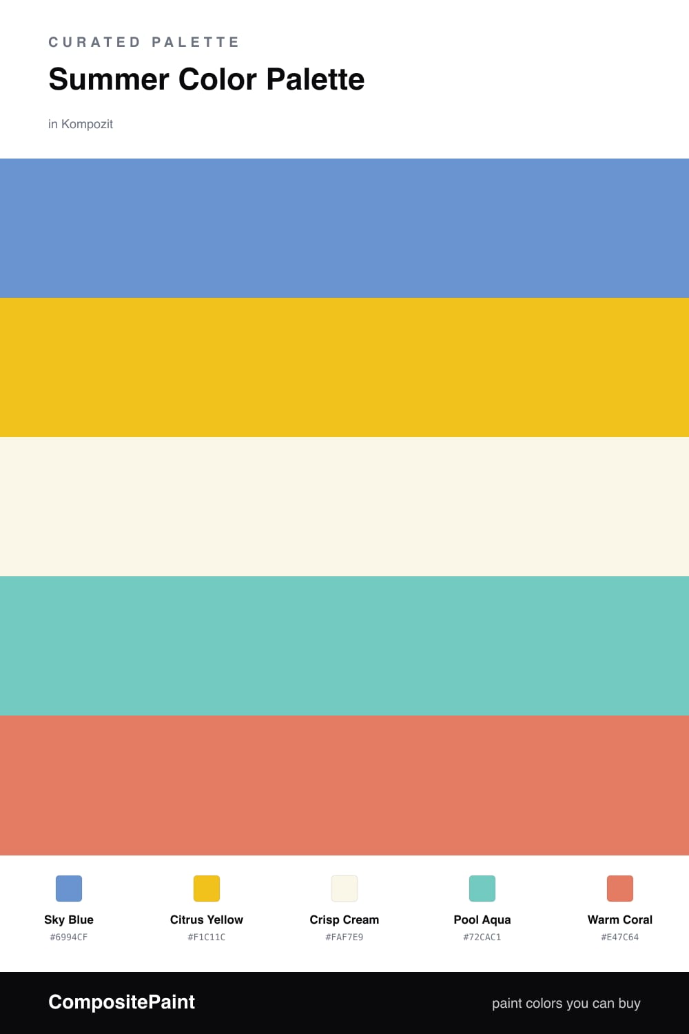
Summer is the easiest season to pull a palette from — just picture a clear afternoon. This scheme starts with a soft Sky Blue as the anchor, the kind of blue that feels like an open window and never tries too hard.
From there, Citrus Yellow brings the sunshine and Pool Aqua brings the water, while a clean Crisp Cream keeps everything light and breathable behind them. Cream is your friend here — it gives your eyes a place to rest so the brights don’t compete.
Then a little Warm Coral does the spark work. Coral is the 2026 way to add warmth without going full orange — soft, a touch dusty, and very current. Use it sparingly, on a chair or a few accents, and the whole room will feel like a good summer day.
Buy These Colors
Each color matched to the closest real paint in every brand, by ΔE2000. Kompozit first; take any SKU to the store — these mix on demand.
Questions
They borrow straight from a sunny day — clear sky blue, bright citrus, cool pool water, and a warm coral pop. Together they read fresh and cheerful without tipping into loud.
Let the sky blue lead and the cream do the quiet background work. Keep citrus and coral in smaller doses — think pillows, a door, or a single wall — so the brights stay a treat, not the whole show.
Similar Palettes
Closest schemes by color — not by label.